
🚀 My impact
By experimenting and optimising the PDP entry experiences starting in April 2025, the LPO initiative delivered a measurable uplift across key business KPIs by January 2026.
OP25 delivered:
• BR: -5%
• CVR: +4%
• GMV: 9M EUR
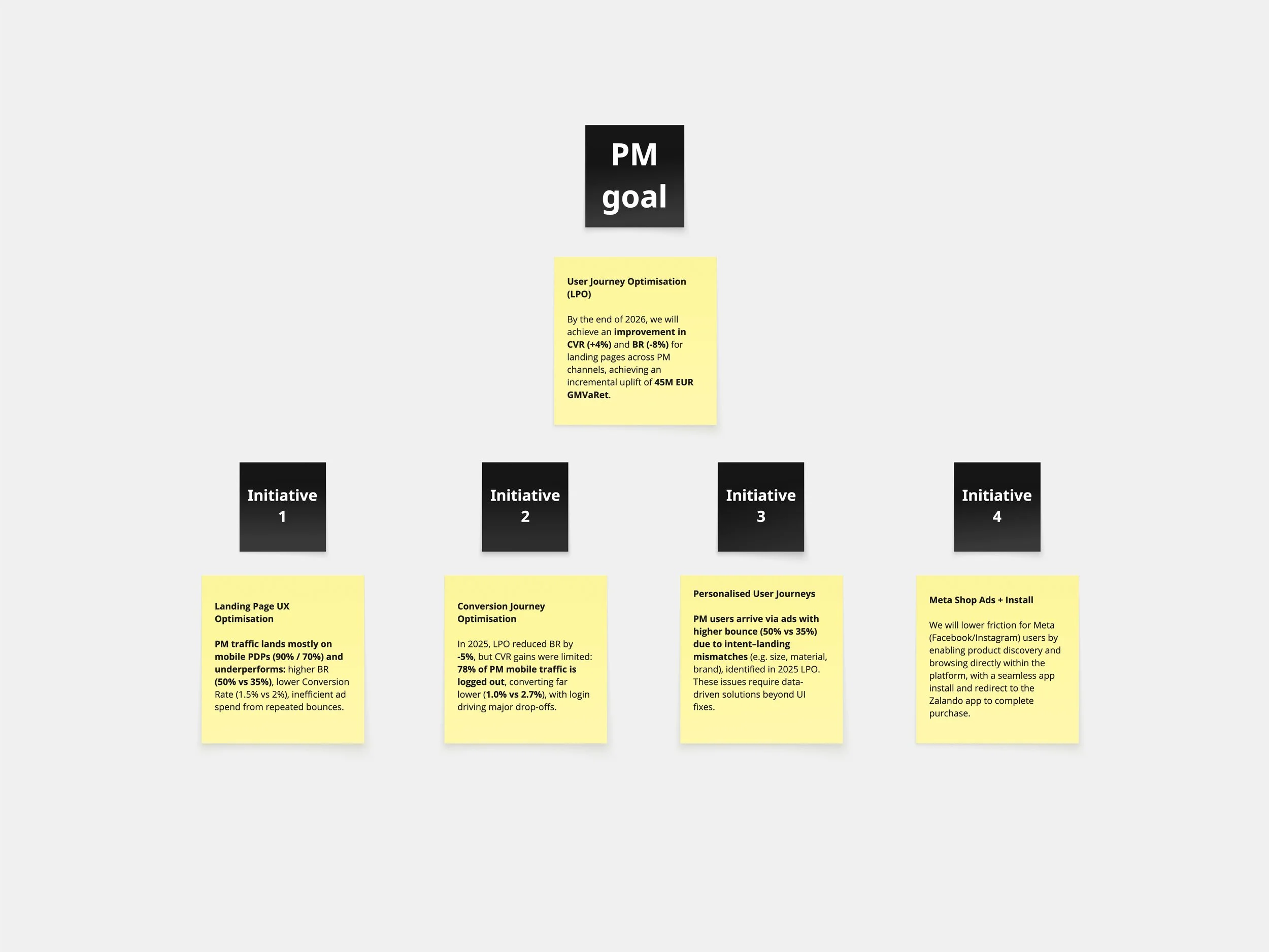
For 2026, the initiative expanded with a more comprehensive strategy that introduces personalisation models and deeper intent-aligned experiences.
Projected to deliver:
• BR: -8%
• CVR: +4%
• GMV: 45M EUR
Background
Zalando data revealed a misalignment at PDP and Catalog entry points: users arriving from Performance Marketing (Meta / SEA) and SEO often bounced immediately, with PDP bounce rates around 50% and Meta traffic exceeding 56%. Around half of PDP entry sessions came from Performance Marketing, with most users logged out and landing on pages that did not reflect their search intent.
The Challenge
Align PDP landings with logged-out paid traffic, removing friction to reduce bounce and increase CVR and GMV.
Role
AI-driven Lead Product Designer.
I led the bundle strategy and CRO experimentation at Zalando, applying a data-driven product design approach to reduce friction and improve conversion at scale for paid traffic landing on PDP (SEA and Meta) on mobile web, while laying the foundation for personalised design architecture in 2026.
• AI-Powered UX Designer
• Systems Thinking Designer
Deliverables
These are all the deliverables:
• Consolidated experiment Roadmap LPO initiatives 2025 and 2026 (influenced its definition)
• UX strategy initiatives 2026 (influenced its definition)
• Strategic Design Bundles for the PDP
• EDD (Experiment Design Document) for each bundle
• Defining KPIs per bundle and setting up control vs. variant experiments
• Analysis results and learnings
• Used AI-assisted ideation to speed up prototyping cycles and align stakeholders on product direction
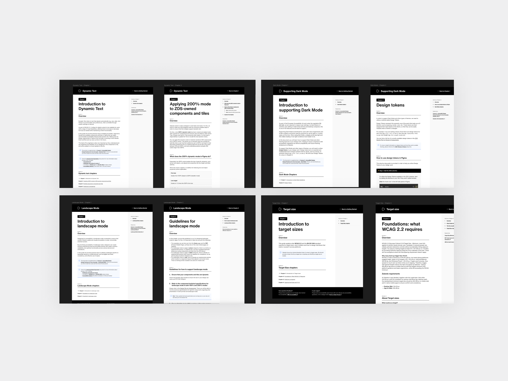
• A11y documentation: Dark mode, Landscape view, 200 % Dynamic text, Screenreader annotations.
• Bounce behaviour - analytic document (influenced its definition)
• Workshops with Meta and internal workshops on bundle prioritisation and ideation
• UAT and QA documentation evaluating functional performance, design, error-handling logic, and A11y compliance
• Creation of the holdout group approach (influenced its definition)
• Rollout Guidelines for the LPO (influenced its definition)
• Handoff Documentation to engineers
Tools
Figma, Figma AI, Figma Make, Miro AI, Chat GPT 5.1, Gemini 2.5, Claude, Attention insight, Github, Eppo to run experiments, BigQuery data from Curated Base Table (CBT), Synapse internal data tool.
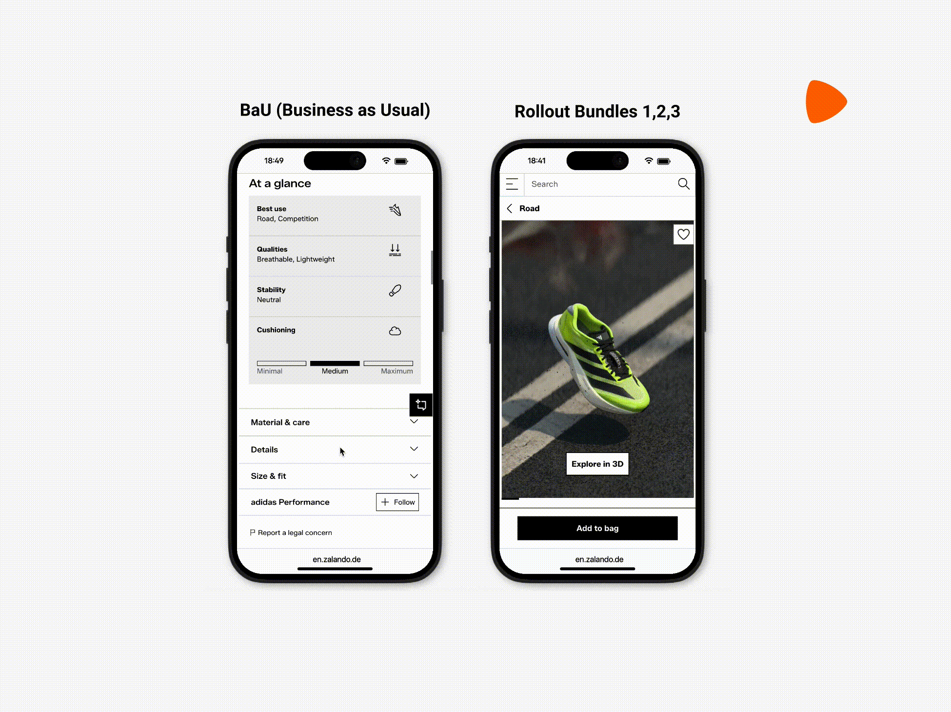
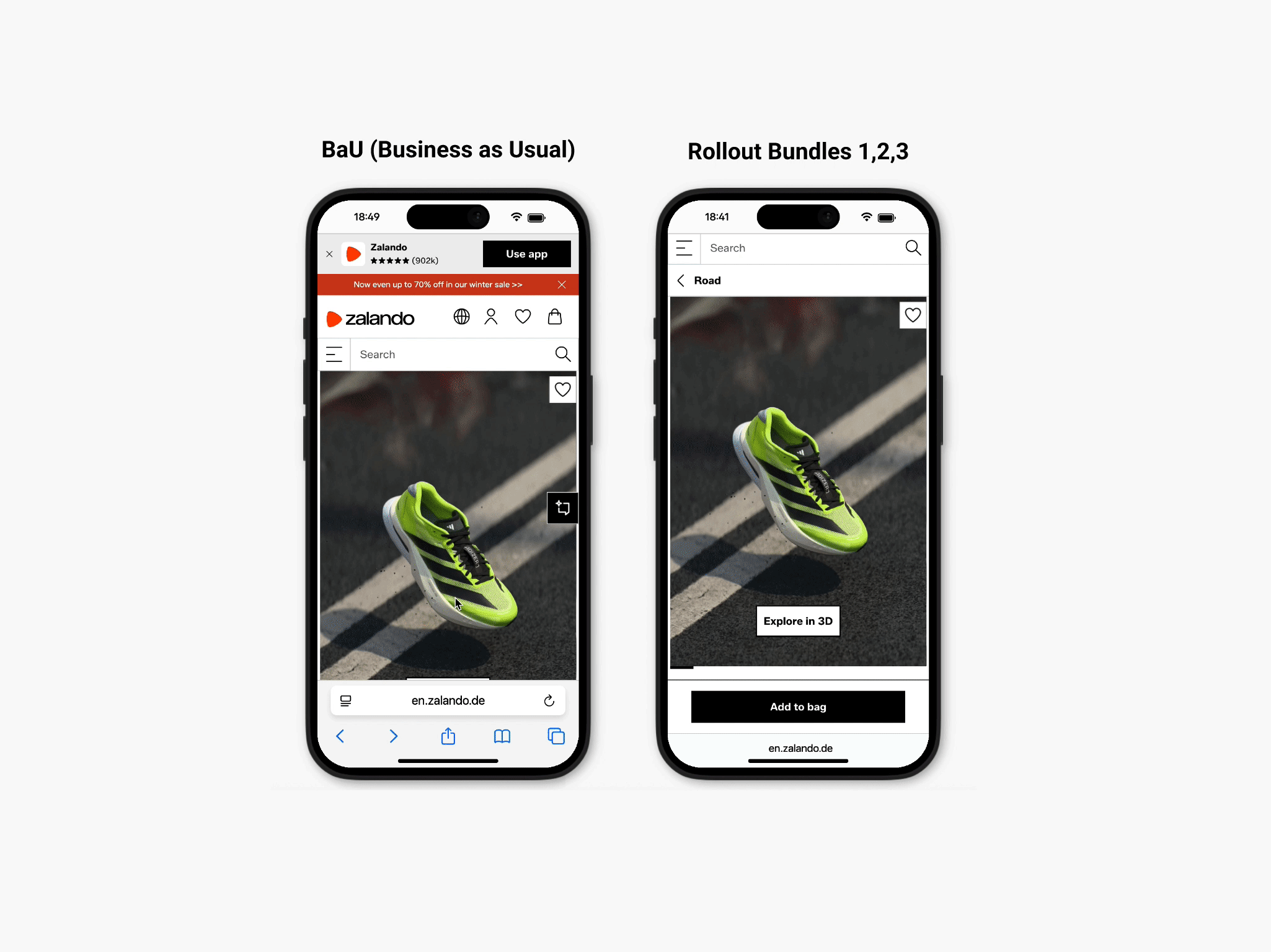
Final UI
This UI reflects the consolidated rollout of Bundles 1, 2, and 3, aligned with the broader Zalando brand refresh.
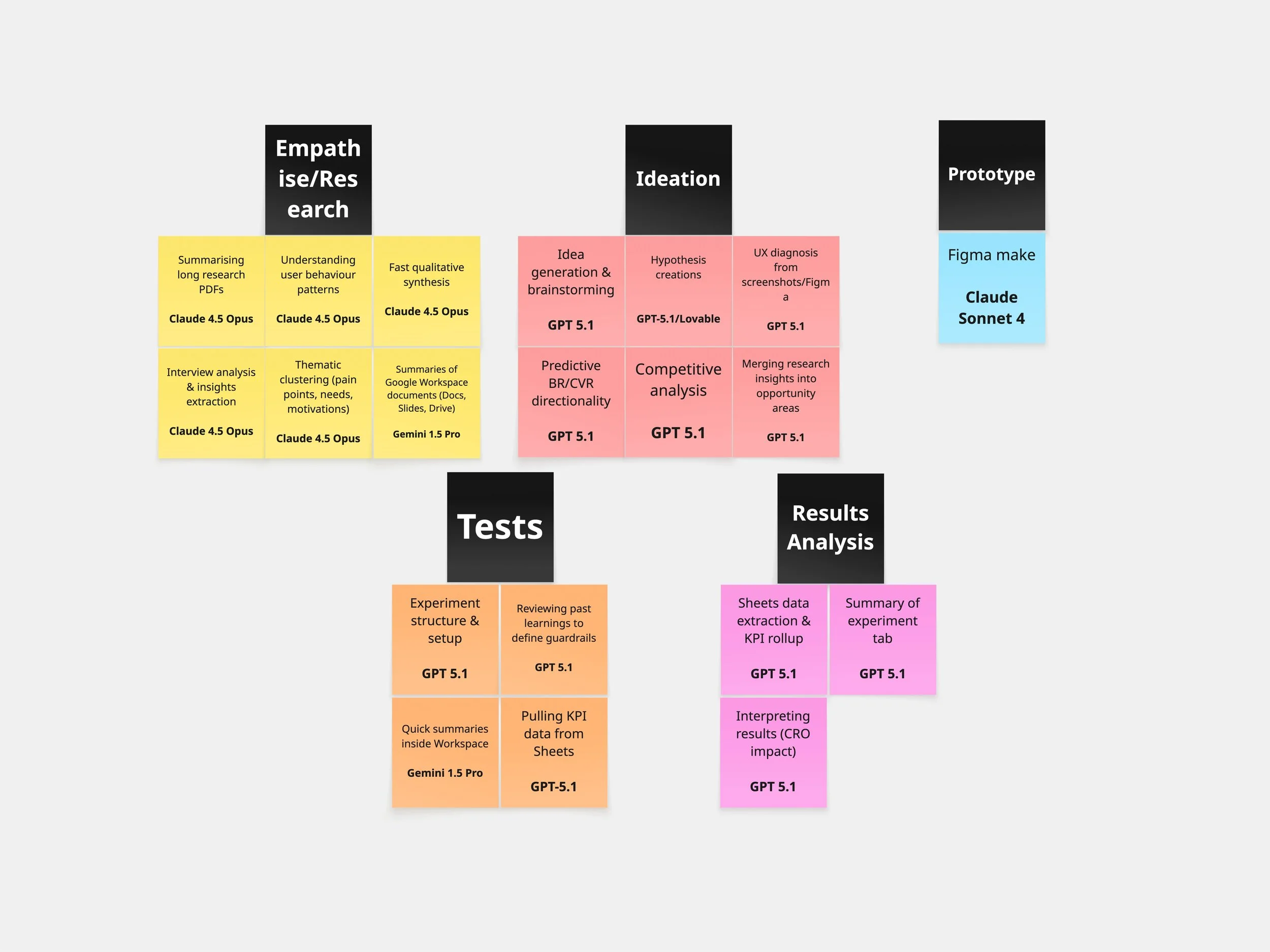
AI tools Design thinking phases
I used AI tools to streamline parts of the design thinking process, treating them as decision-support rather than answers in themselves. I selected tools based on their model strengths and used them only where they added clear value.
✅ UX Strategy
When I joined Zalando in April 2025, the vision for the Performance Marketing Channel — including the why and what — as part of the strategy had already been defined through Google/Meta workshops Baymard audit and and internal prioritisation.
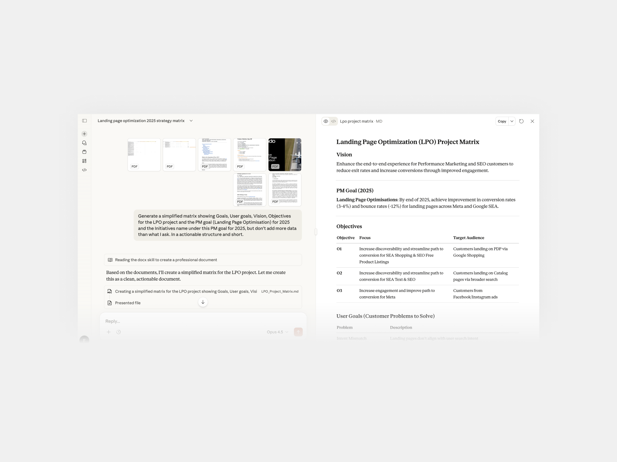
With information scattered across different PDFs, I used ✦ Claude Opus 4.5 to generate a simplified matrix showing Goals, Vision, and Objectives for the LPO project
Goals LPO project
So I translated that in a understandable structure after reviewing it with the PM and the Head of Design.
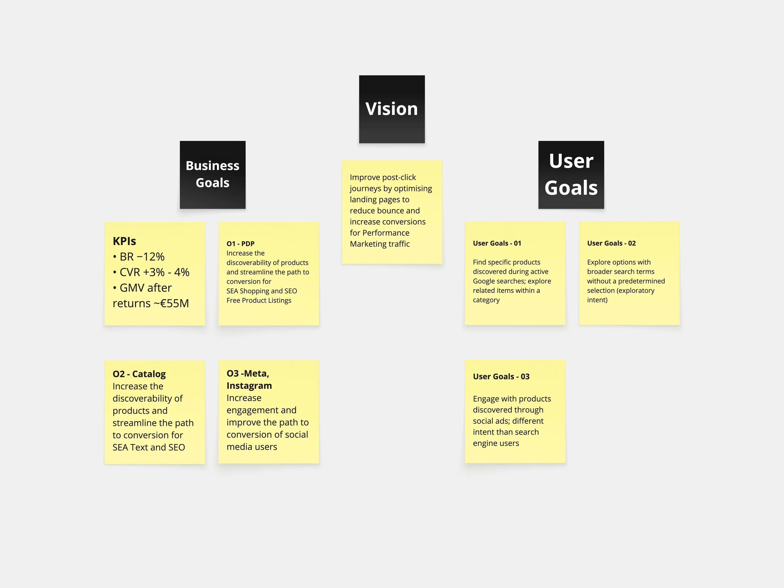
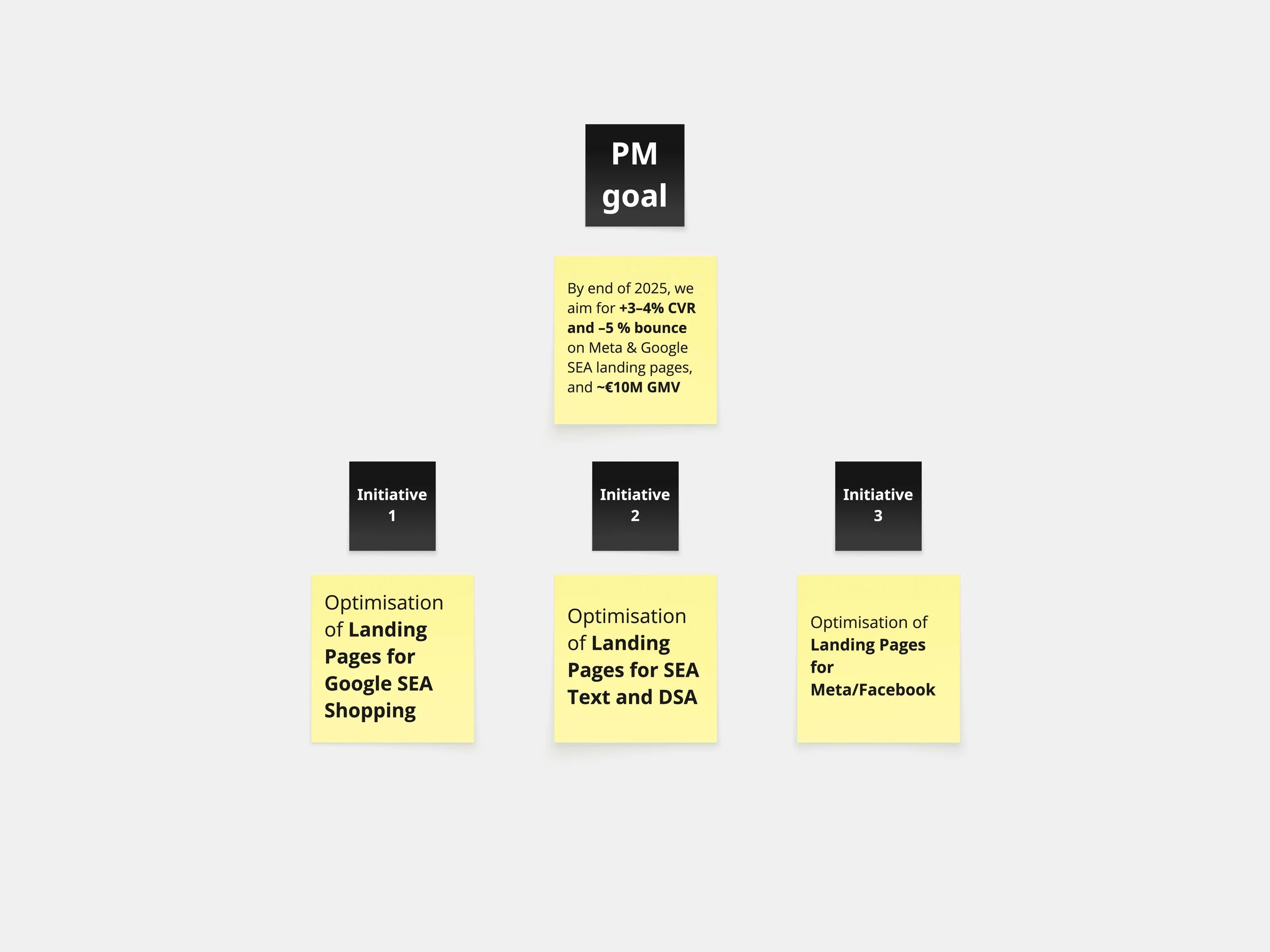
We had to re-prioritise along the way. After reviewing initial KPI estimates with Analytics, we recalibrated the end of 2026 goals to –8% BR, +4% CVR, and ~€45M GMV. Due to a potential cloaking risk, SEO traffic was excluded from experiments, which removed Catalog tests and shifted focus to PDP experiments using paid traffic only. Goals were recalculated accordingly.
• Goals to initiatives 2025
For 2025, targets were BR −5%, CVR +4%, and ~€10M GMV, adjusted after cancelling SEO catalog tests. The roadmap evolved from three initial bundle hypotheses, iterating on learnings and constraints, while future bundles were designed to enable 2026 personalisation. Impact was estimated using historical CRO benchmarks, traffic data, and Baymard insights.
The how and when were still to be defined, meaning the next step was to lay out the execution plan and timeline for delivering the strategy. With financial pressure to deliver impact quickly, I accelerated Bundles 1–3 by prioritising bounce-rate reduction, recognising that lowering early drop-off was the necessary first step to unlock conversion and GMV uplift.
• Goals to initiatives 2026
So around October 2025 we started to create the OP planning 2026.
I co-led a workshop with a PM focused on hypothesis definition and initiative grouping for end-to-end customer journey OP planning, helping structure early thinking and opportunity areas using insights from Google and Meta workshops and 2025 data.
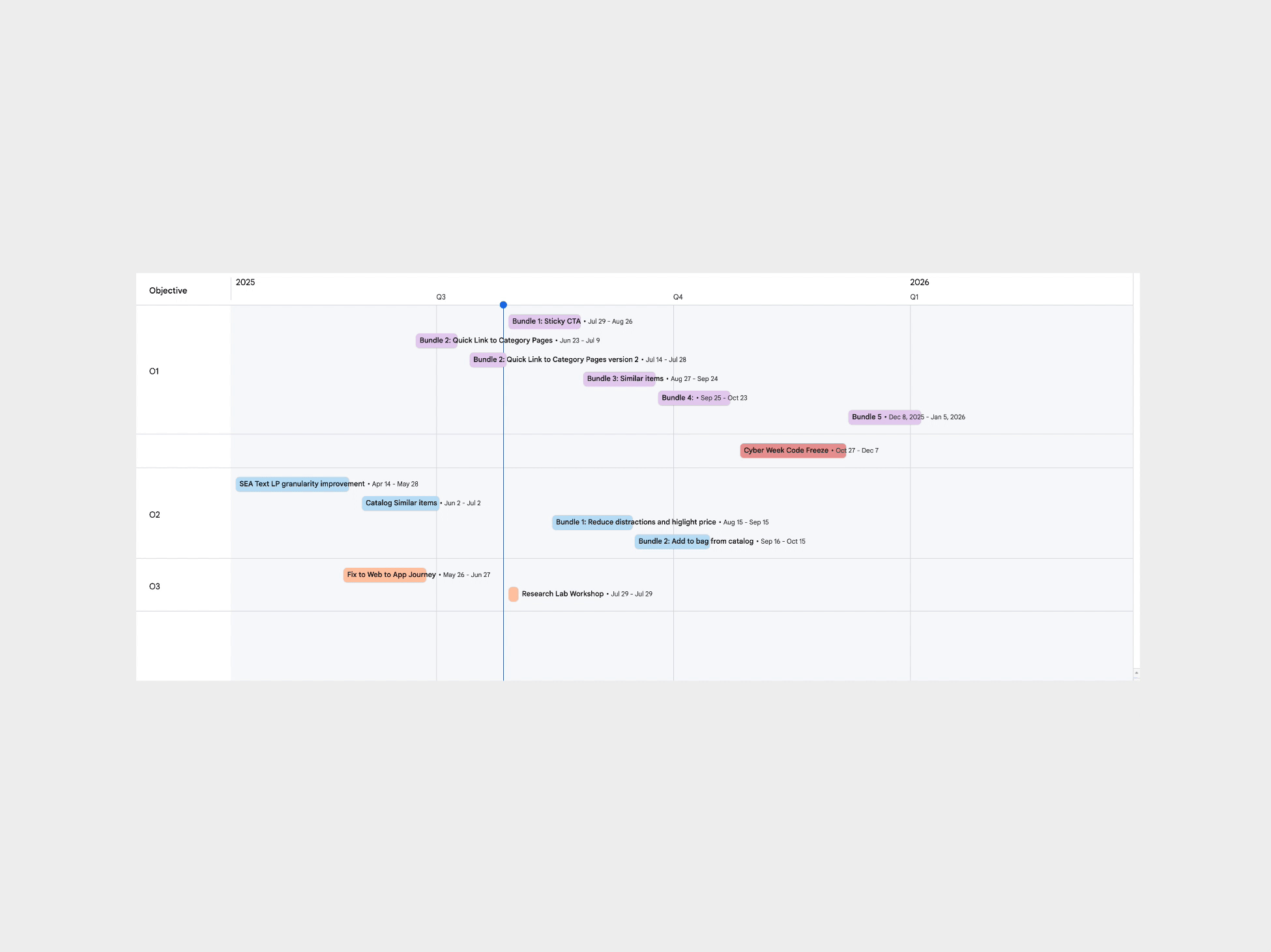
Around November 2025, we consolidated the 2026 roadmap by carrying over approved but unshipped Bundles (4–7), prioritised by BR and CVR impact and kept as a flexible backlog, while assessing their applicability to the native app.
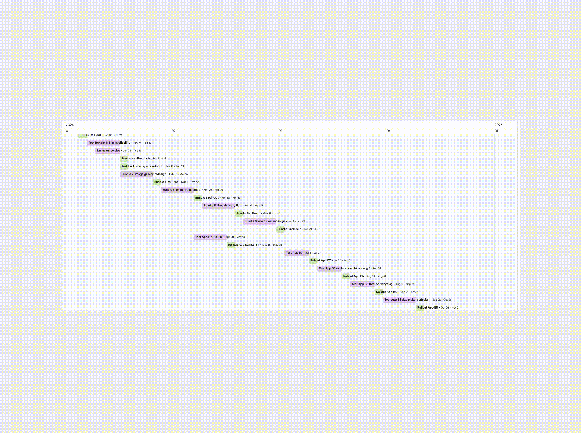
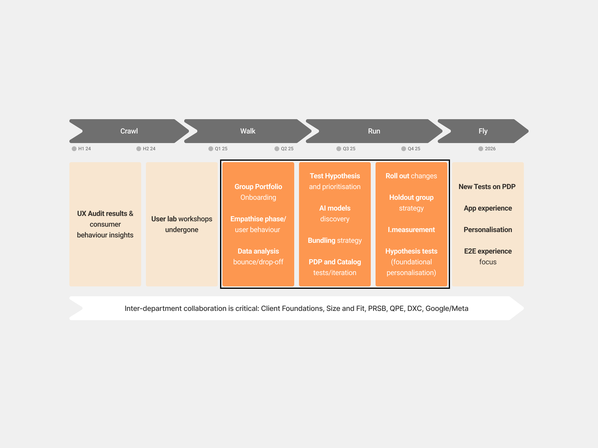
We created this maturity-phase roadmap, moving from discovery → optimisation → AI-driven scale.
✅ Empathise
• Data analysis and quantitative research
At Zalando, we didn’t have Hotjar or similar behaviour-tracking tools, but we did have internal analytics. I collaborated closely with the analytics team to analyse the data in the sheets
To prepare for ideation, we compiled the key insights regarding the BR PDP into a Google Slides deck so the team could align on what mattered most
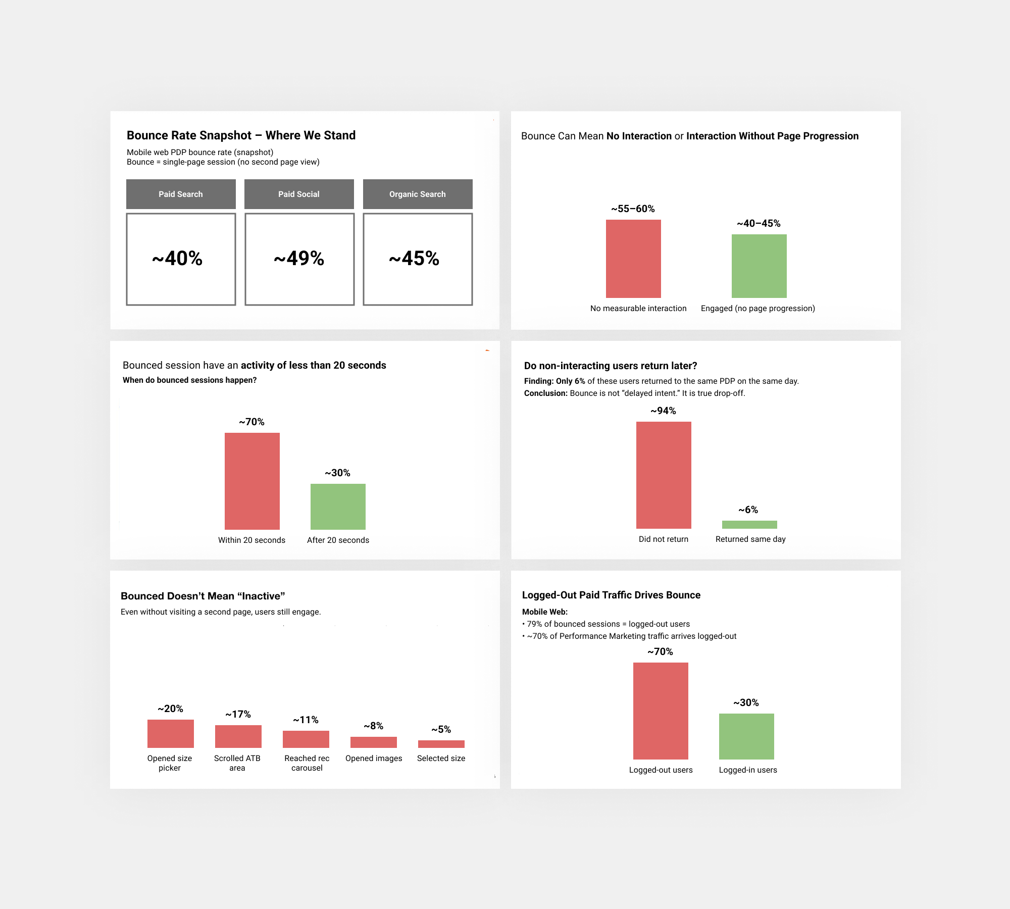
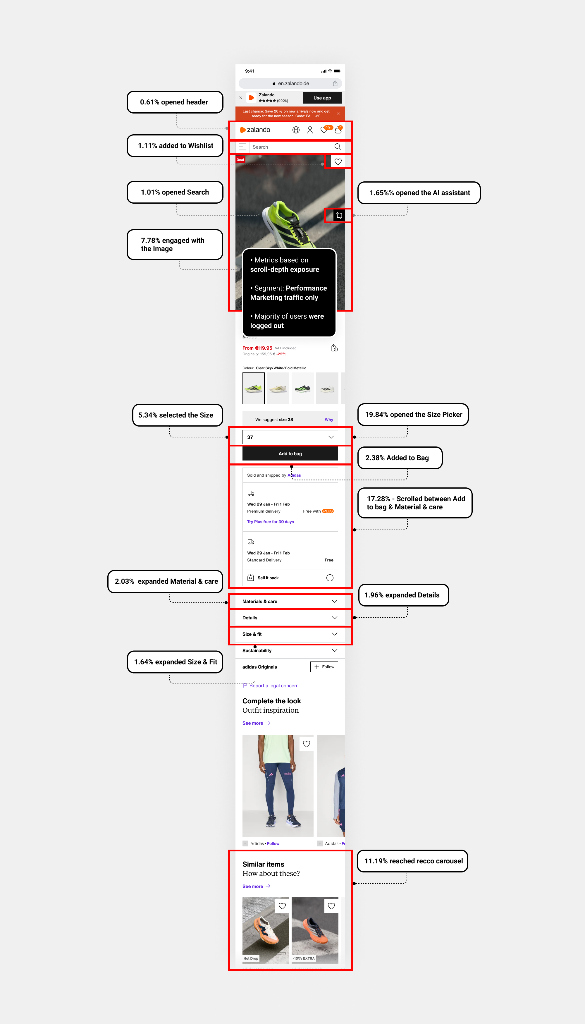
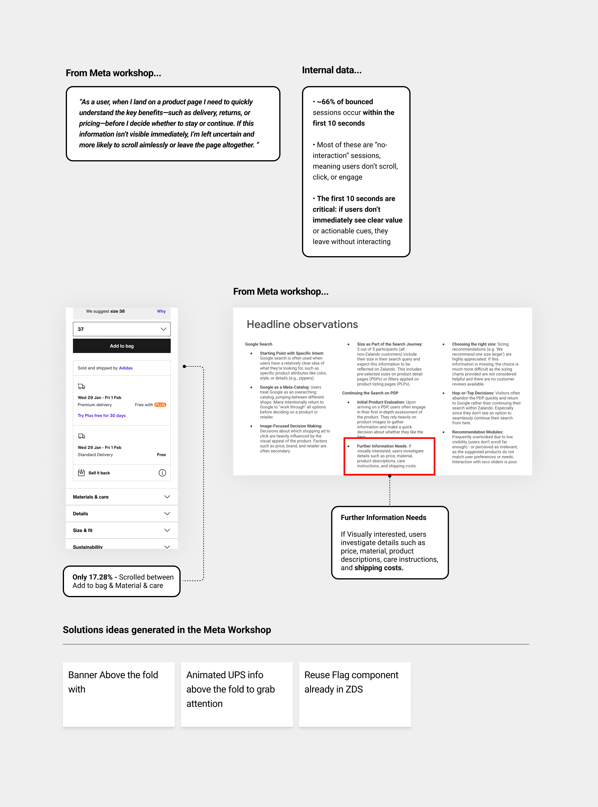
So I analysed the interactions before the user bounce across the key areas of the PDP.
• Qualitative Research
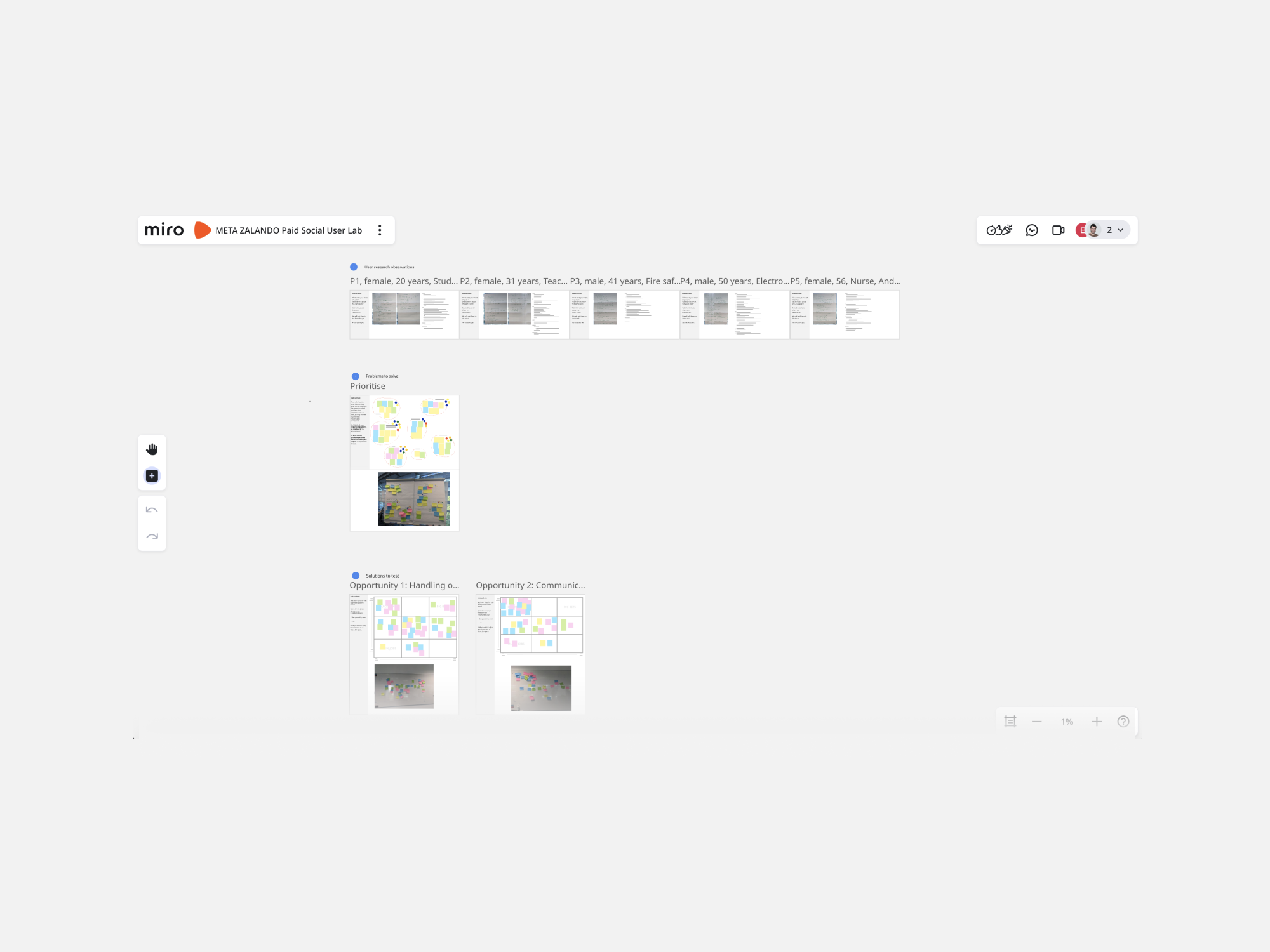
We already had solid research from Google’s mobile lab and prior interviews. I focused on extracting key insights—understanding user intent when landing on the PDP and identifying the main problems. Some proposals emerged from this workshop, but I re-evaluated them when I joined the company.
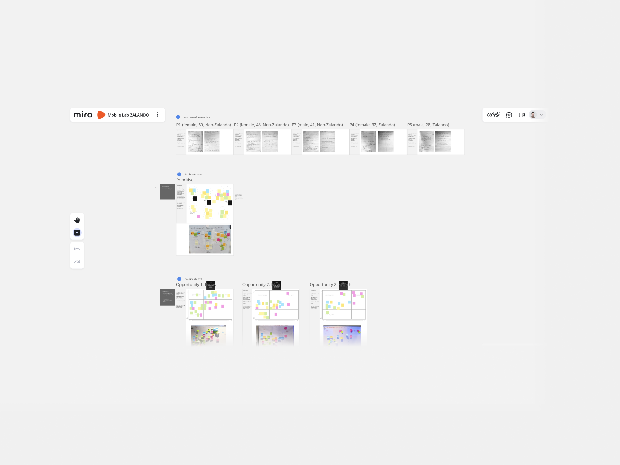
So I used ✦ Claude Opus 4.5 to extract all this information from a PDF report that Google created, Key insights, user behaviour, main problems to solve...just to have it more simplified and clear.
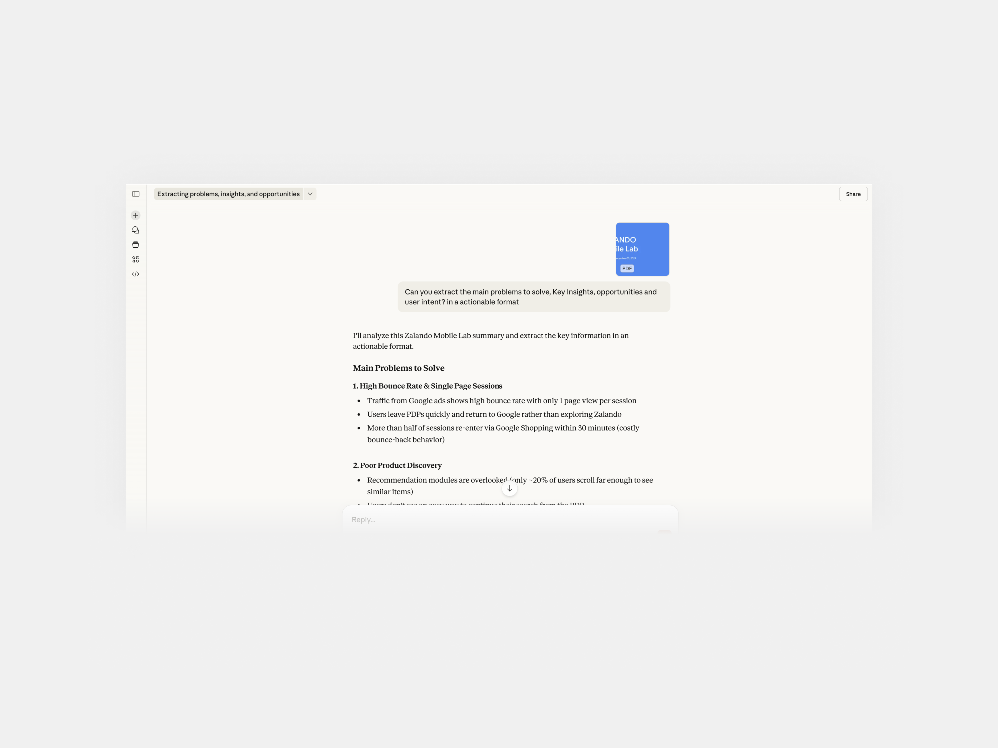
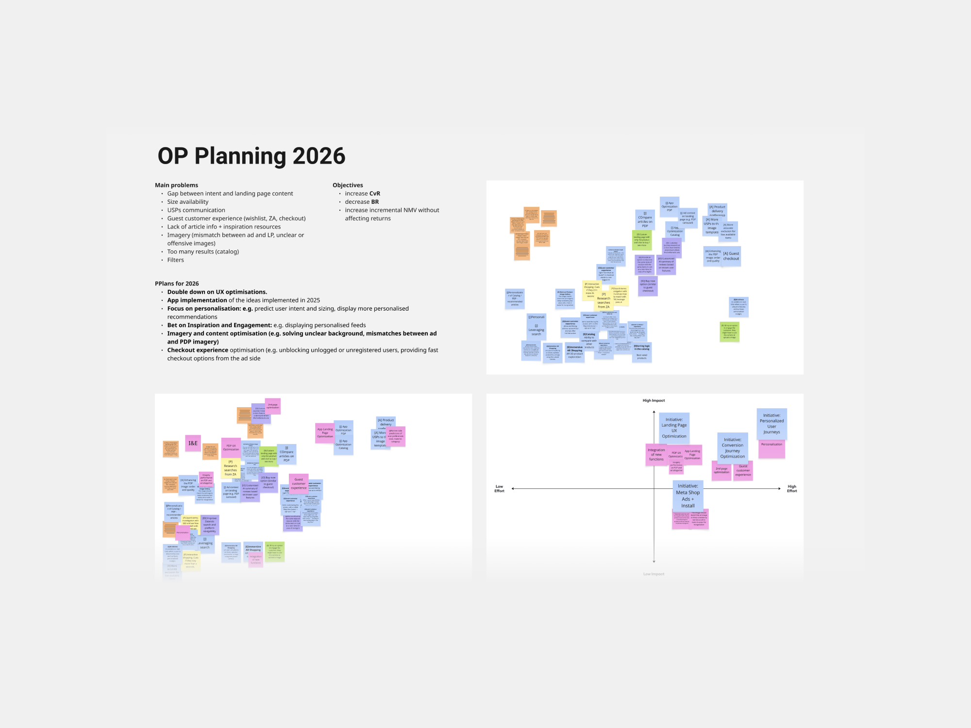
Afterwards I placed it into Miro, and using ✦ AI I mapped it out with post its an clustered them by key words...
Although we had an action plan from Google, we started to narrow down the opportunities to quick wins for PDP (O1) based on impact and effort
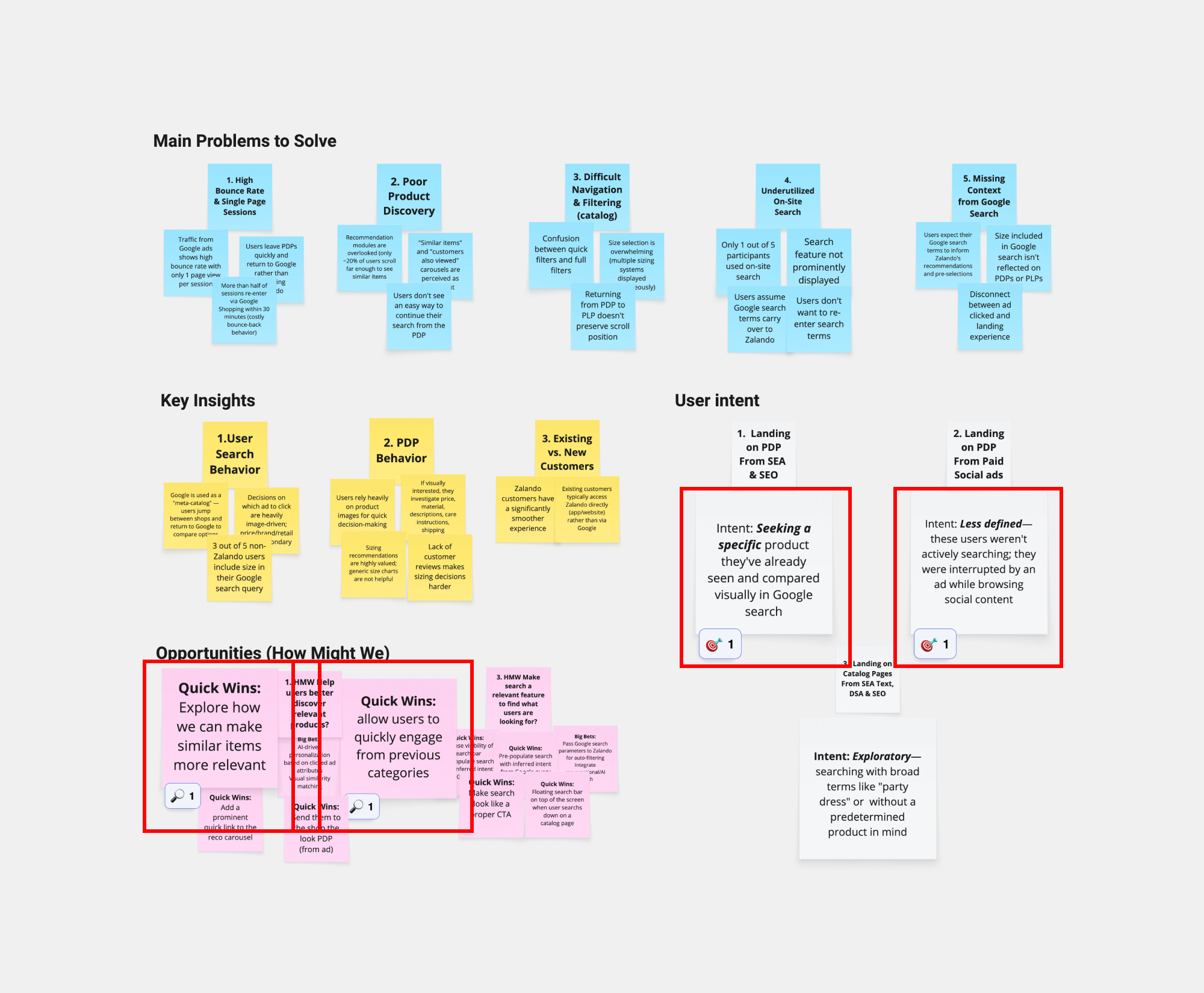
With SEO removed from the experimentation roadmap (Catalog O2), I focused on mapping the key sub-problems for PDP (O1) extracting insights from the workshop documentation.
Then, simplified everything into two pivotal problem for the PDP landing experience for users arriving from SEA. As a team, we focused on O1(PDP), holding O3 (Meta/facebook) until we could evaluate the results from O1.
✅ Define
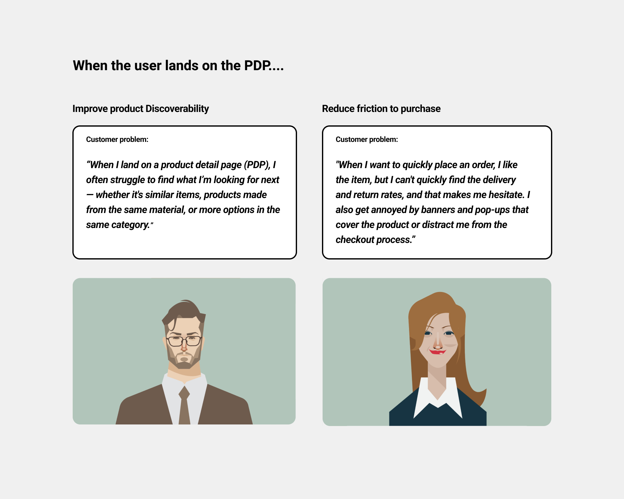
User: Users landing from Performance Marketing channels (SEA, Meta) arrive with an intent to either explore or purchase, expecting relevant products, easy discovery and a fast path to decision.
Needs: They need landing experiences that match their search intent, surface similar alternatives effortlessly, provide enough information to evaluate options, and minimise friction when continuing the journey or deciding to buy.
Insights: Research and analytics show high bounce rates, repeated return to Google/Meta, and friction in discovery flows — indicating that current PDP page often fail to meet intent quickly or support confident product exploration, resulting in drop-off before conversion.
☝Before ideation…
• Ways of working
As the team was new and I was working remotely, I established structured workflows with the Head of Product and PM to ensure clear iteration steps, cross-team alignment, and smooth delivery from exploration to launch.
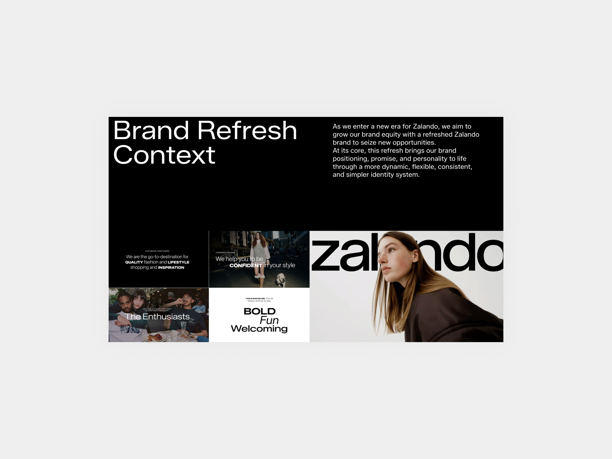
• ZDS (Zalando Design system) and Brand Refresh
At Zalando, we worked with a large, mature design system containing all tokens, tiles, variables, and core components. When exploring hypotheses for Bundle experimentation, applying this system was mandatory.
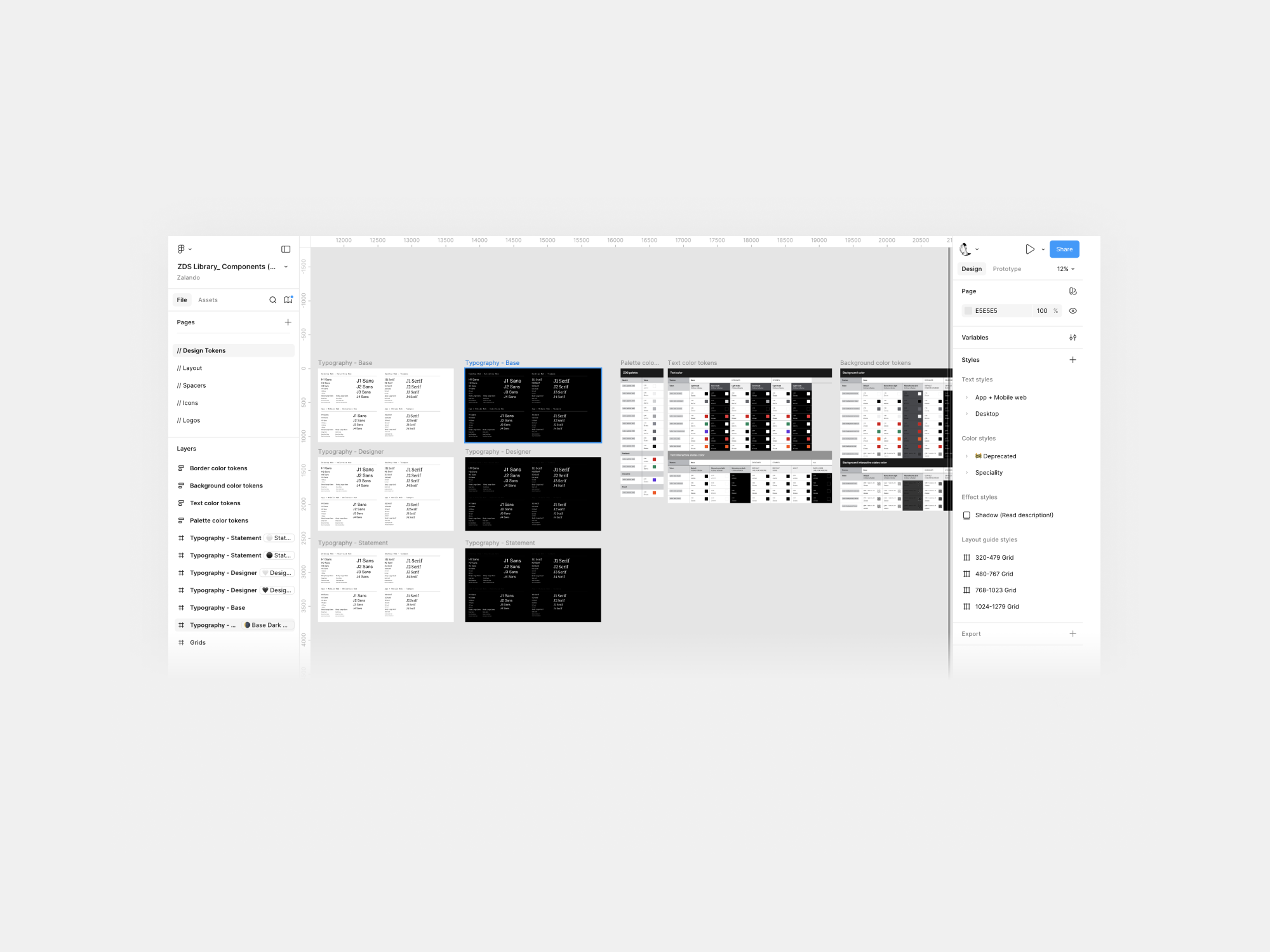
An added complexity was the ongoing brand refresh delivered through continuous test-and-release. Close alignment with the ZDS team was required, but by using existing design system components and tokens, updates would automatically inherit the new styling when components were refreshed.
• Accessibility compliance
Following EAA (WCAG 2.2) requirements, each bundle included dark mode, landscape, 200% dynamic text, and screen-reader specs, reviewed weekly.
• Cross-team experimentation visibility
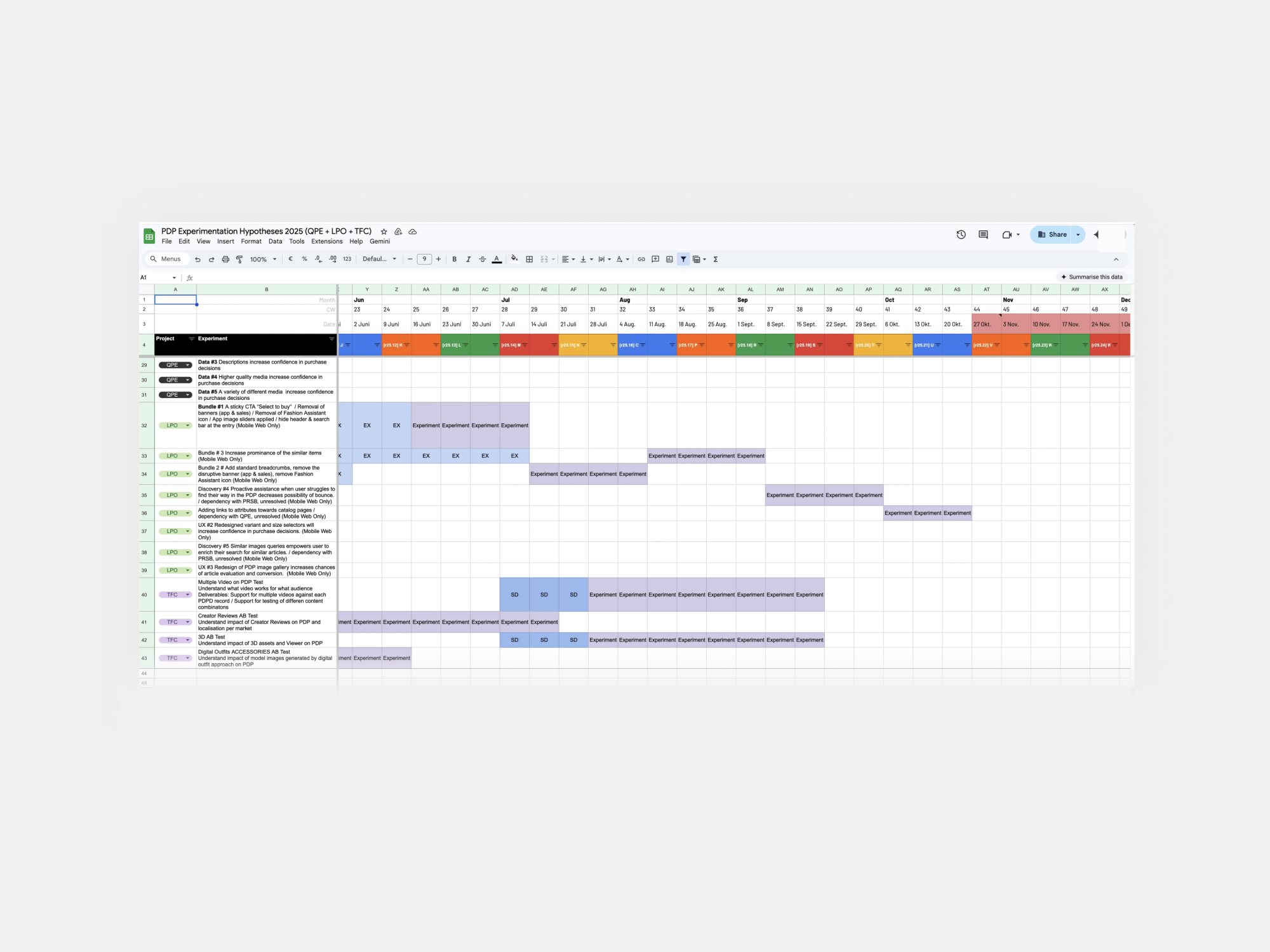
The LPO project ran experiments alongside other PDP initiatives, including QPE and TFC, each with different goals and audiences. To avoid overlap, manage dependencies, and maintain a holistic view of the PDP, we aligned closely across teams with a tracking artifact
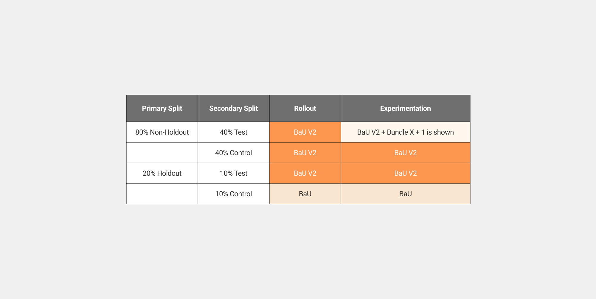
• Holdout group set up and approach
We created a holdout group to maintain a clean baseline and accurately measure the incremental impact of our experiments.
Holdout setup & measurement approach
• Holdout group created to preserve a clean BaU baseline
• Holdout traffic excluded from LPO experimentation and feature exposure
• Purpose: measure true incremental impact over time
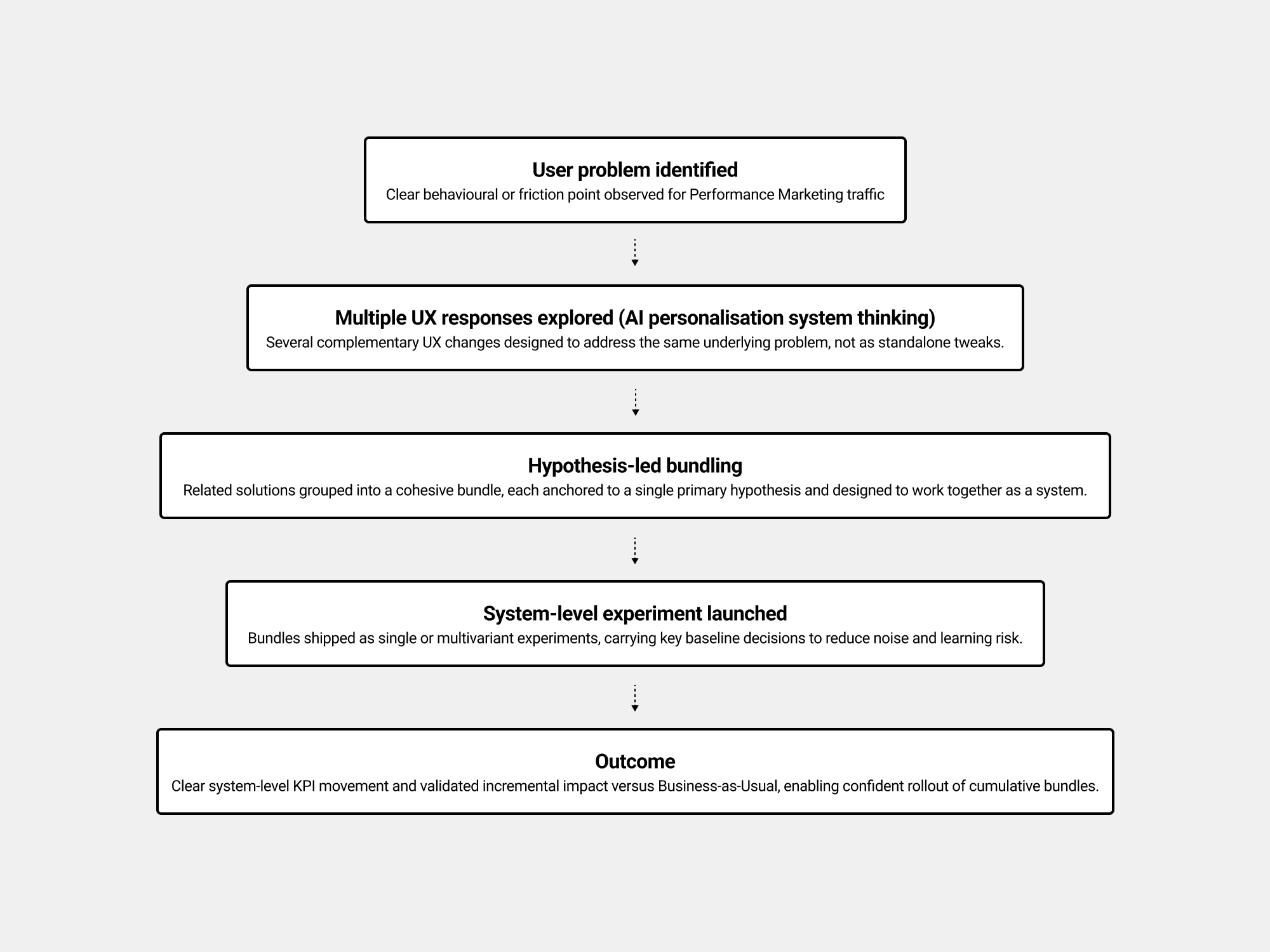
✅ Ideation Bundle 1-3 strategy
With financial pressure to deliver impact by August 2025, the approach was to explore Bundles 1, 2, and 3 in parallel to validate their potential impact and accelerate the creation of the roadmap—clarifying which bundle should be prioritised and run first based on expected impact.
• Bundle Strategy framework
I optimised the PDP as a system, assessing scalable solutions for Performance Marketing and their potential to scale to the wider Zalando audience.
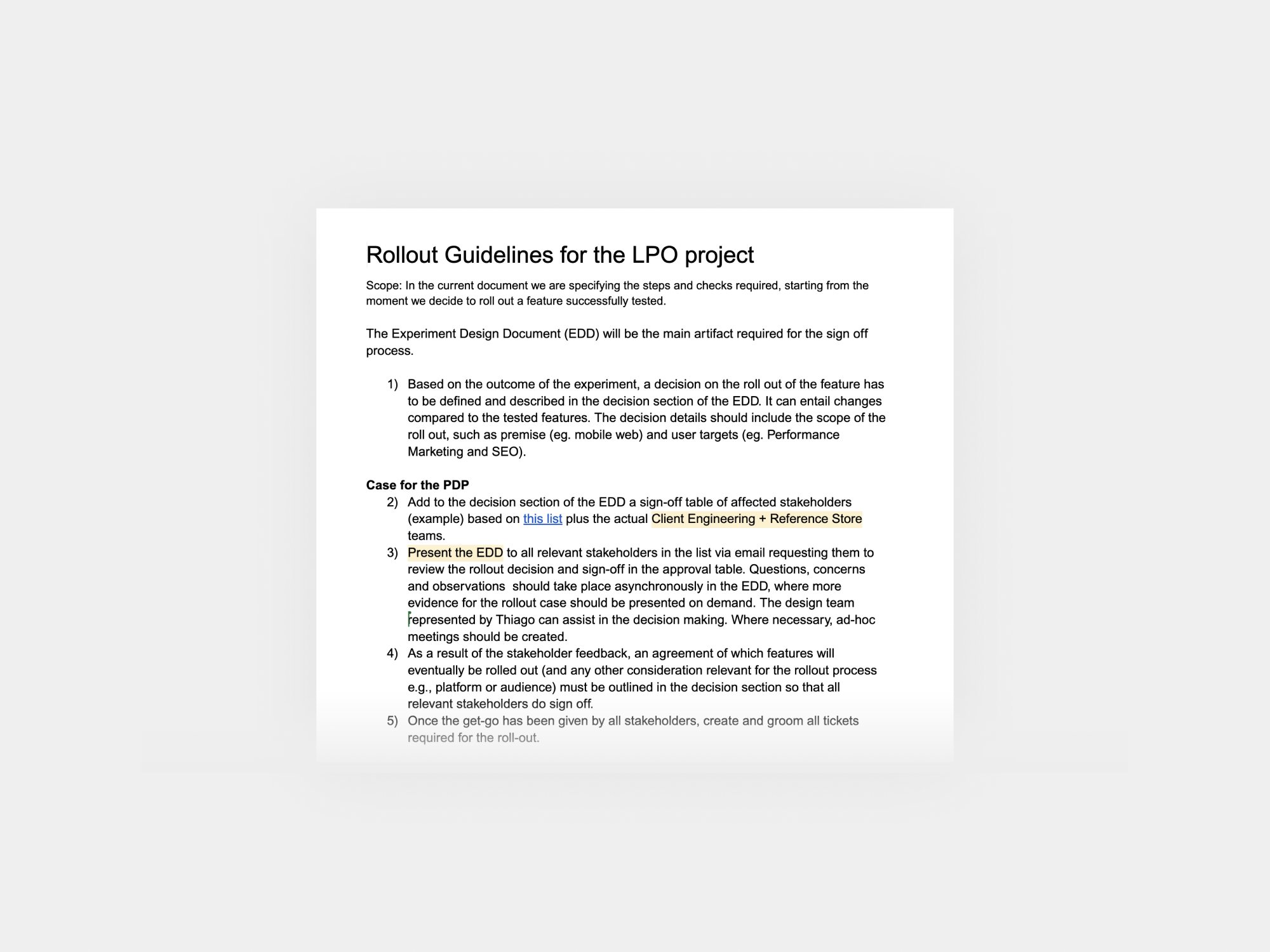
• Rollout Governance & Strategy
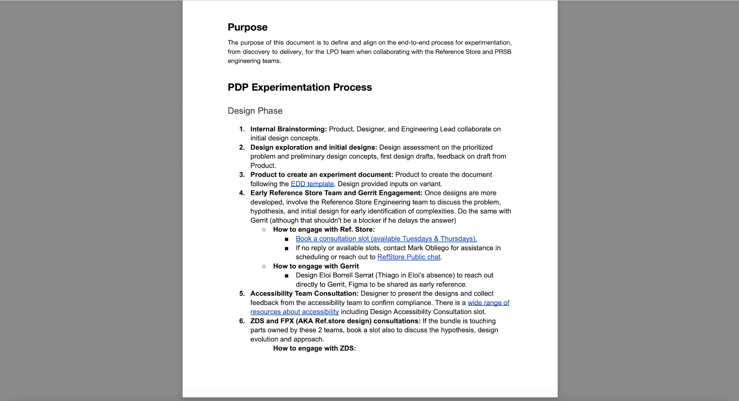
We created this document that defines a clear and consistent process for rolling out successfully tested features. It ensures decisions are evidence-based, aligned across stakeholders, and low-risk. The goal was to enable faster and more confident rollouts.
• Hypothesis generation
While the Google workshop helped identify quick wins and high-impact opportunities, my focus was on validating hypotheses through early feedback.
I used ✦ Figma Make as a thinking accelerator to explore directions rapidly—prioritising speed over polish to initiate design conversations.
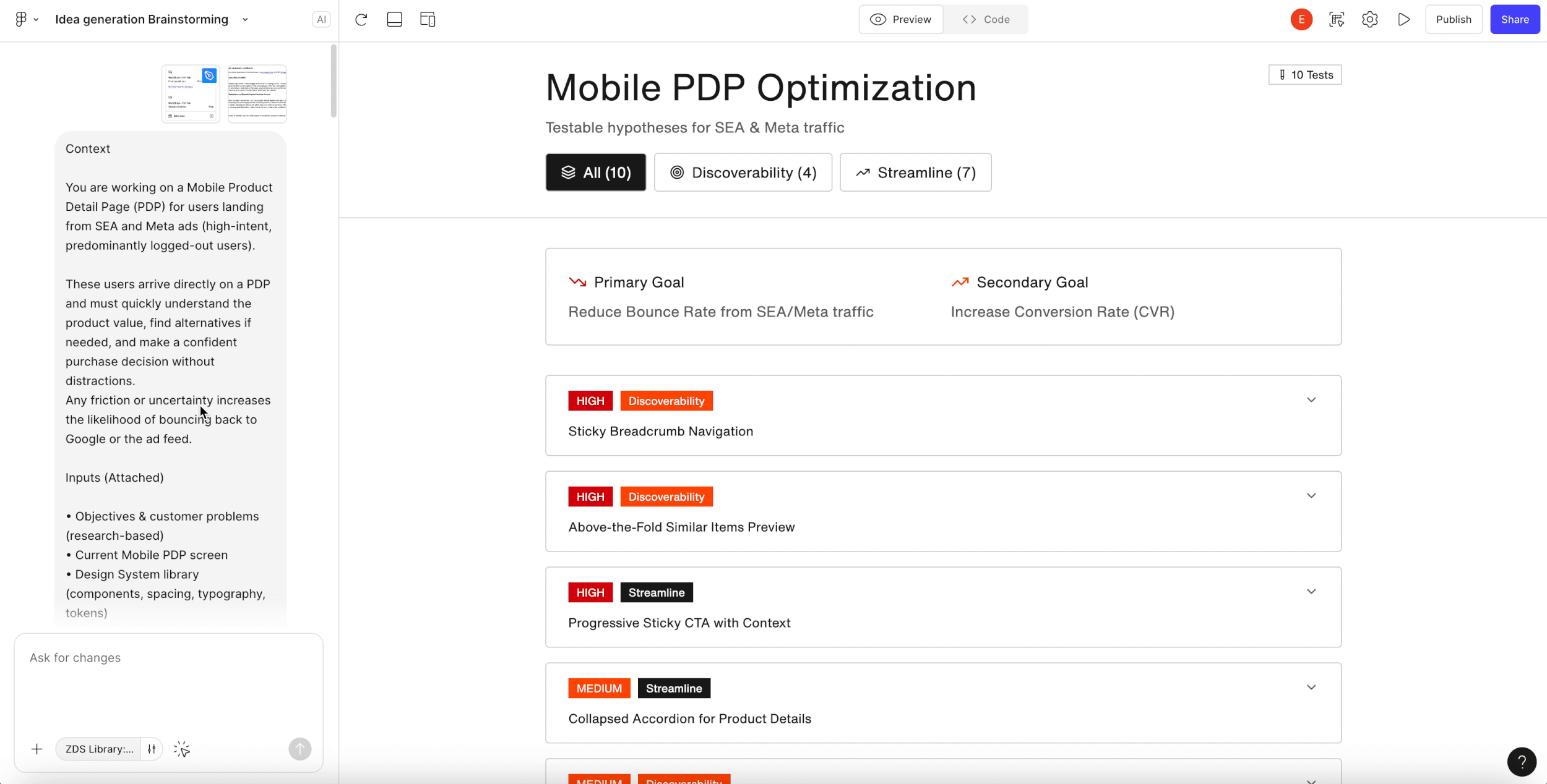
After rapid hypothesis generation in Figma make, I aligned with the PM and lead engineer to prioritise PDP improvements by impact and feasibility, informed by Baymard report and Google research—sequencing Sticky CTA, Breadcrumbs, and Similar Items into Bundles 1–3 on the roadmap.
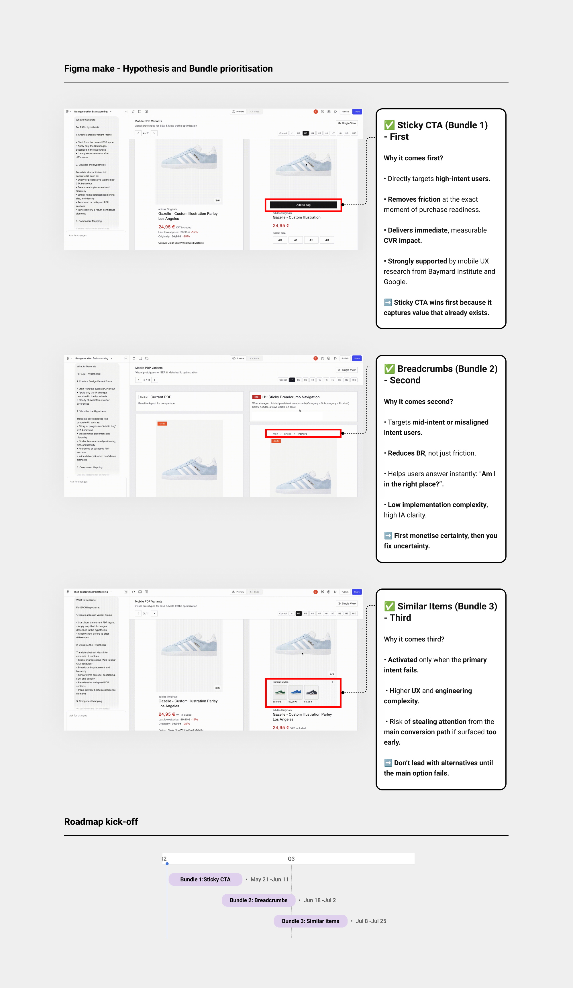
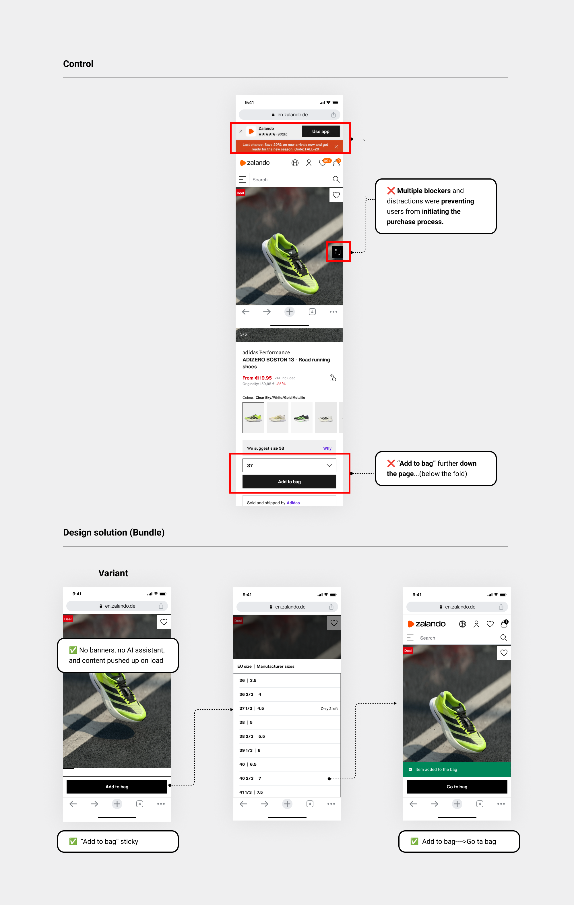
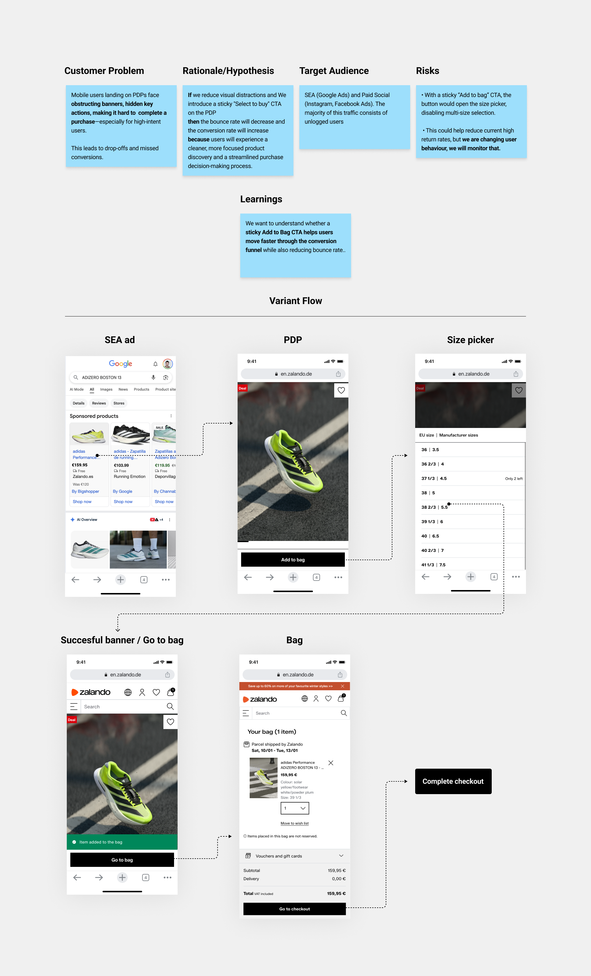
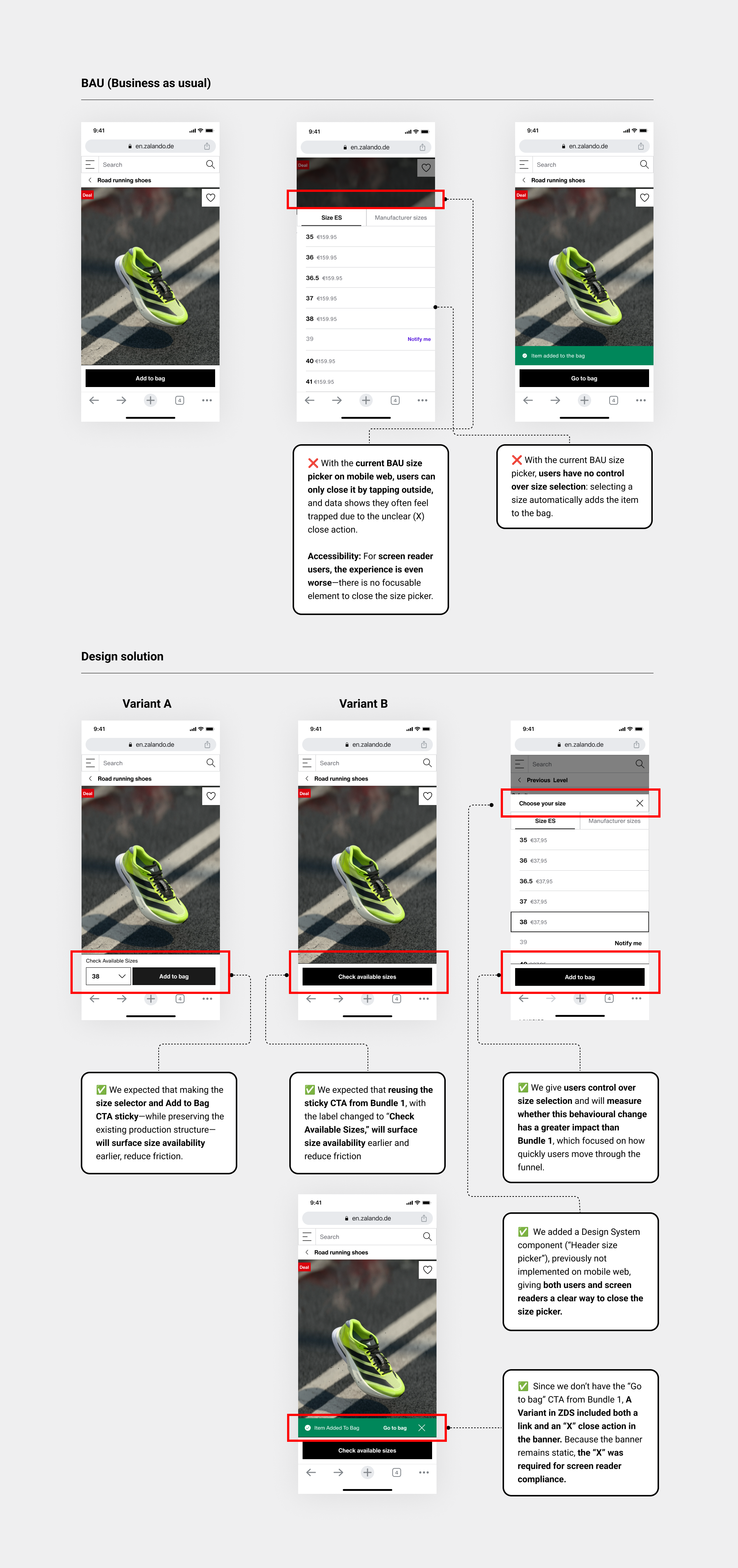
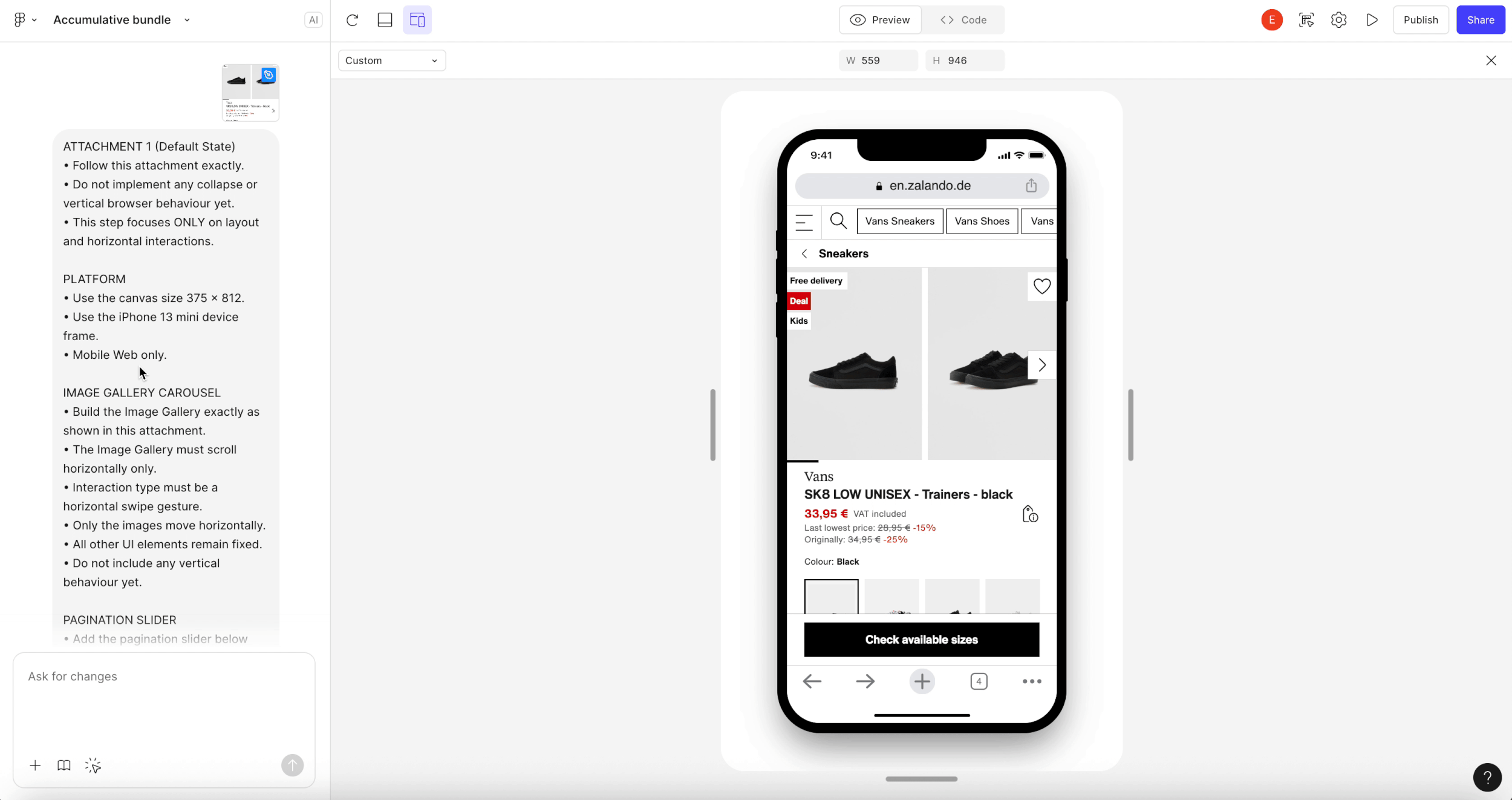
Bundle 1 (Sticky CTA)
For Bundle 1, I focused on a clear learning objective: understanding how quickly we could move users through the conversion funnel when they land on the PDP from SEA and Meta channels.
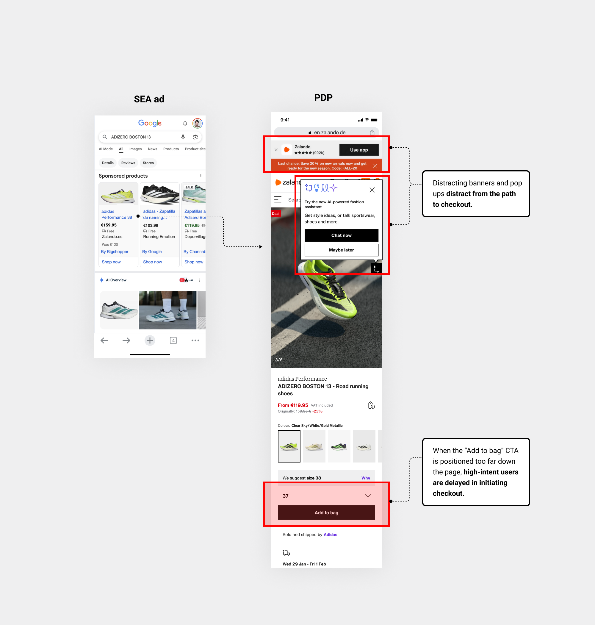
• Context
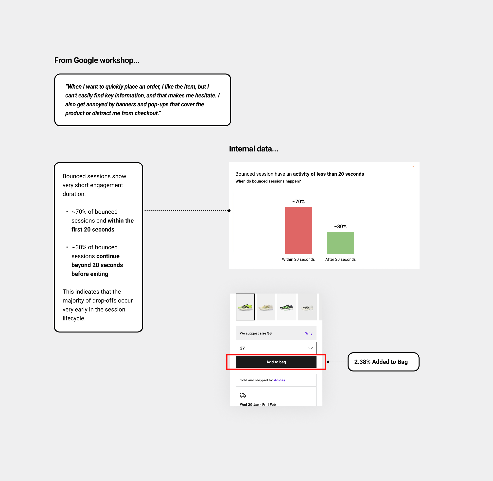
When viewing a specific product, users struggle to quickly access key information, while banners and pop-ups distract from the path to checkout, causing hesitation.
• Data/Insights
Early research signals and insights from the initial Google workshop pointed to this behaviour...
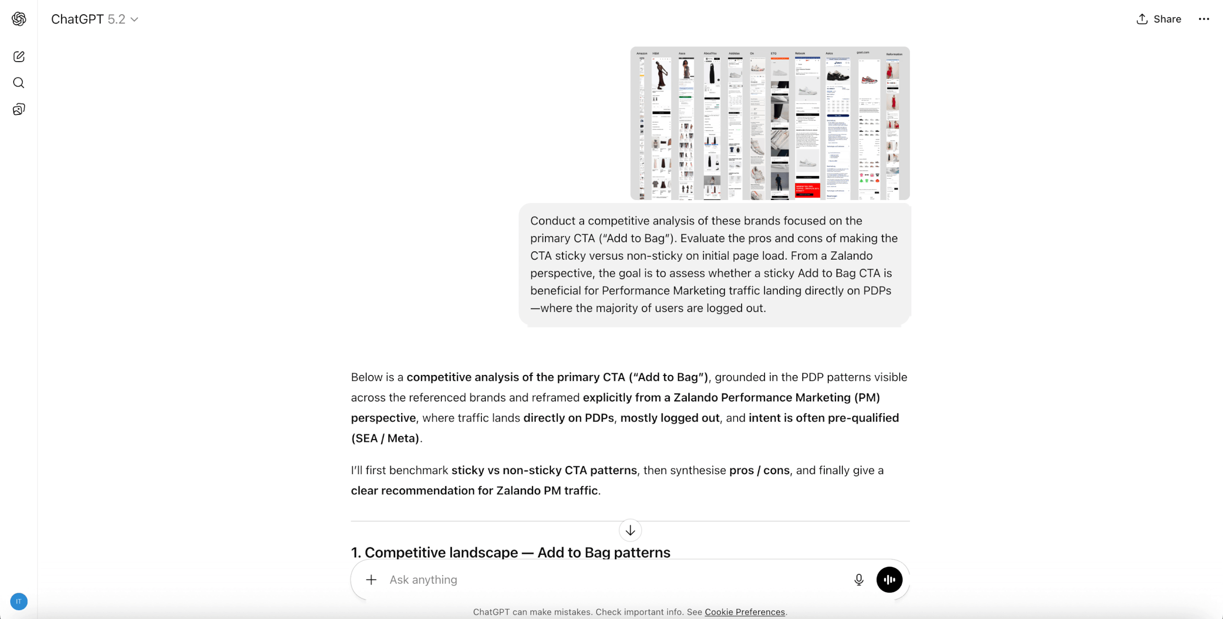
• Competitive analysis
I used ✦ ChatGPT to analyse the pros and cons of introducing a sticky CTA, assessing its suitability for our specific use case, user intent, and the Performance Marketing channel.
• Let’s analyse banners and other distractions, and assess whether they can be removed.
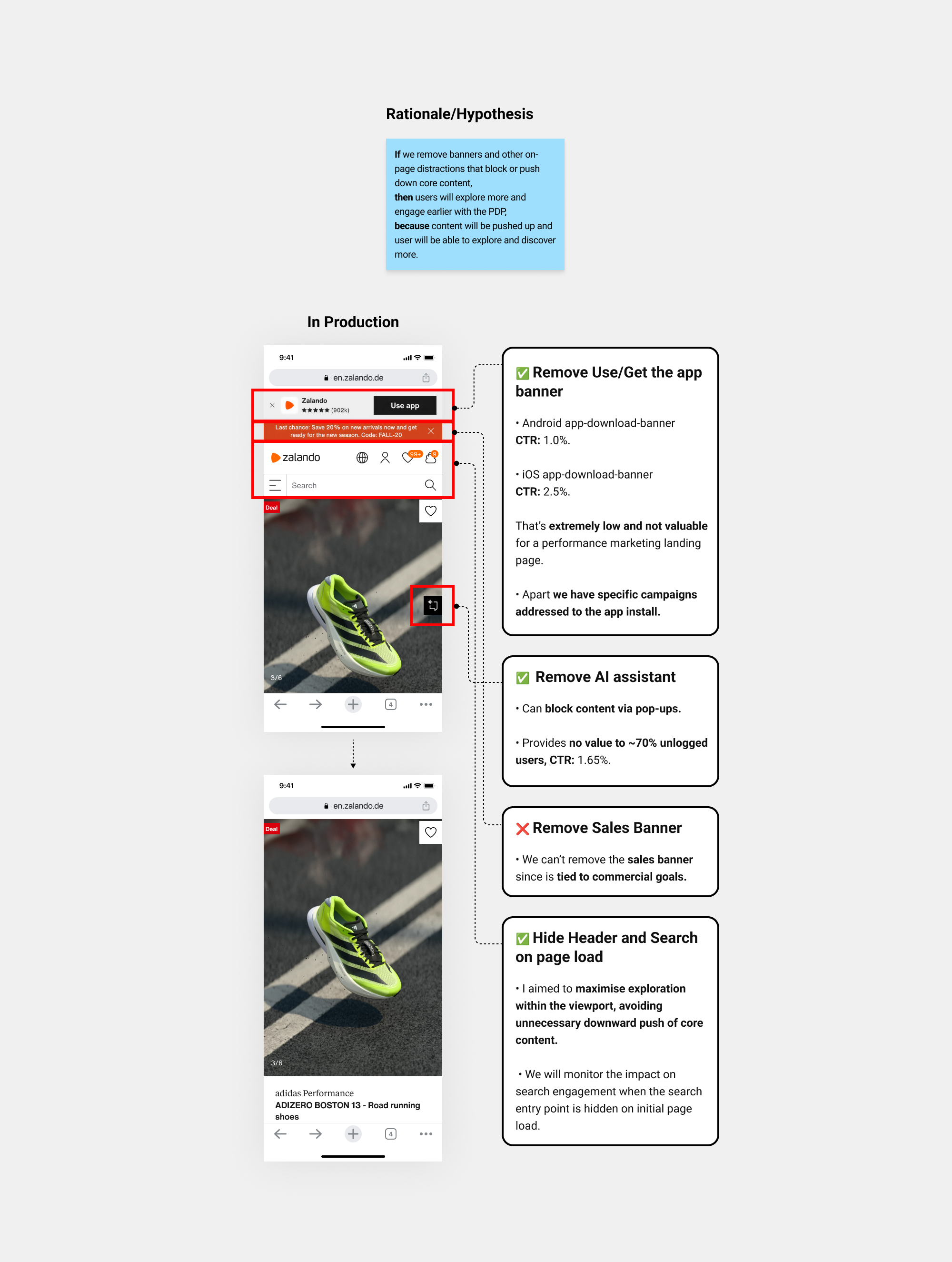
The initial hypothesis was that removing non-essential elements would improve discoverability and focus user attention.
• Iteration
Highlighting the most representative iteration to speed up progression through the conversion funnel
We aligned on exploring how “the sticky add to bag ” could be leveraged to create greater impact. So I created a quick prototype in Figma to gather early feedback applying removed banners and AI assistant and hide search on page load...
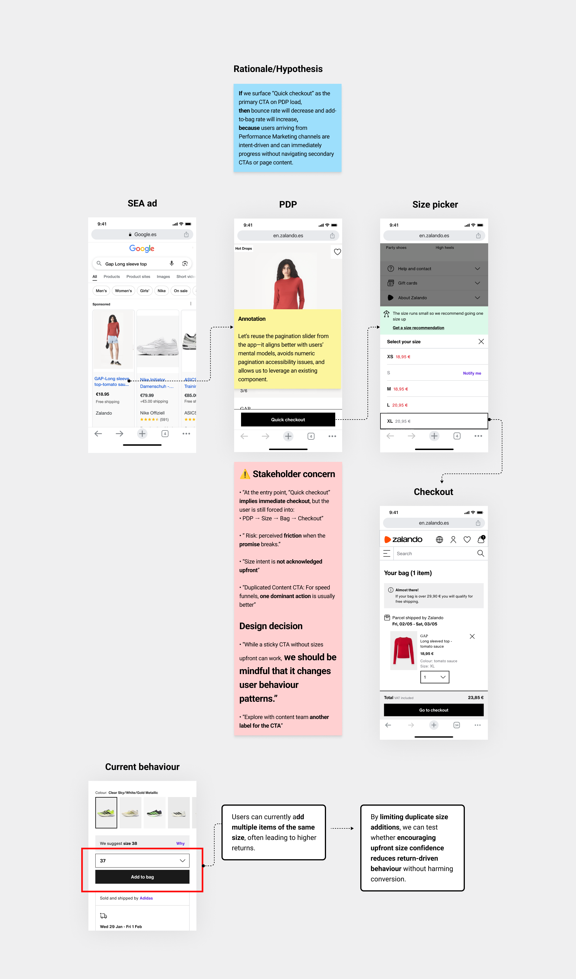
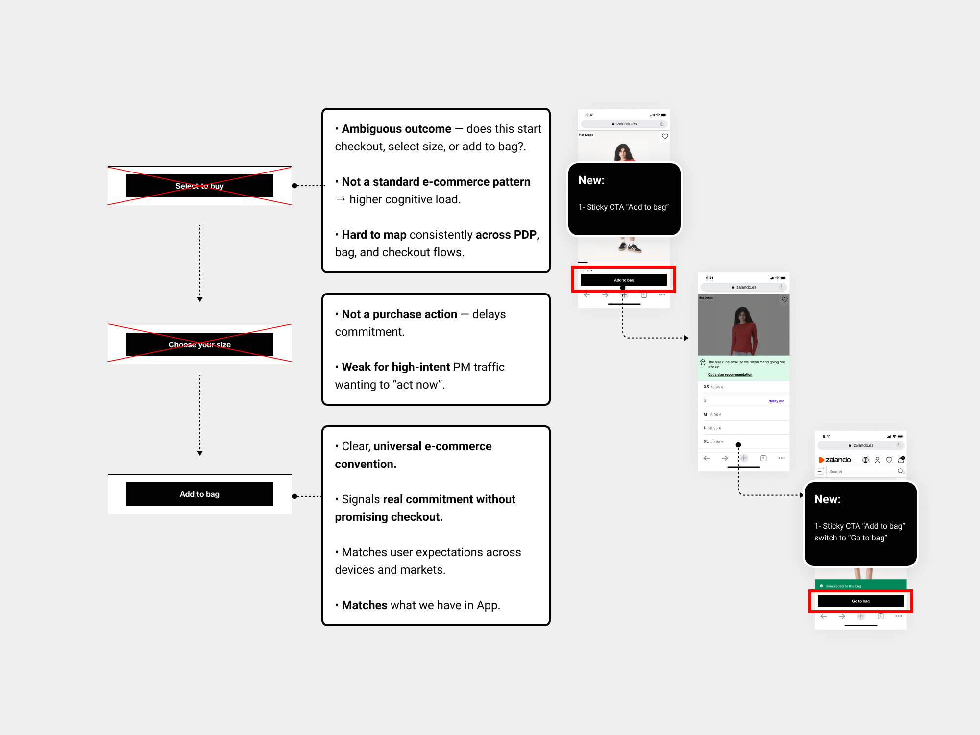
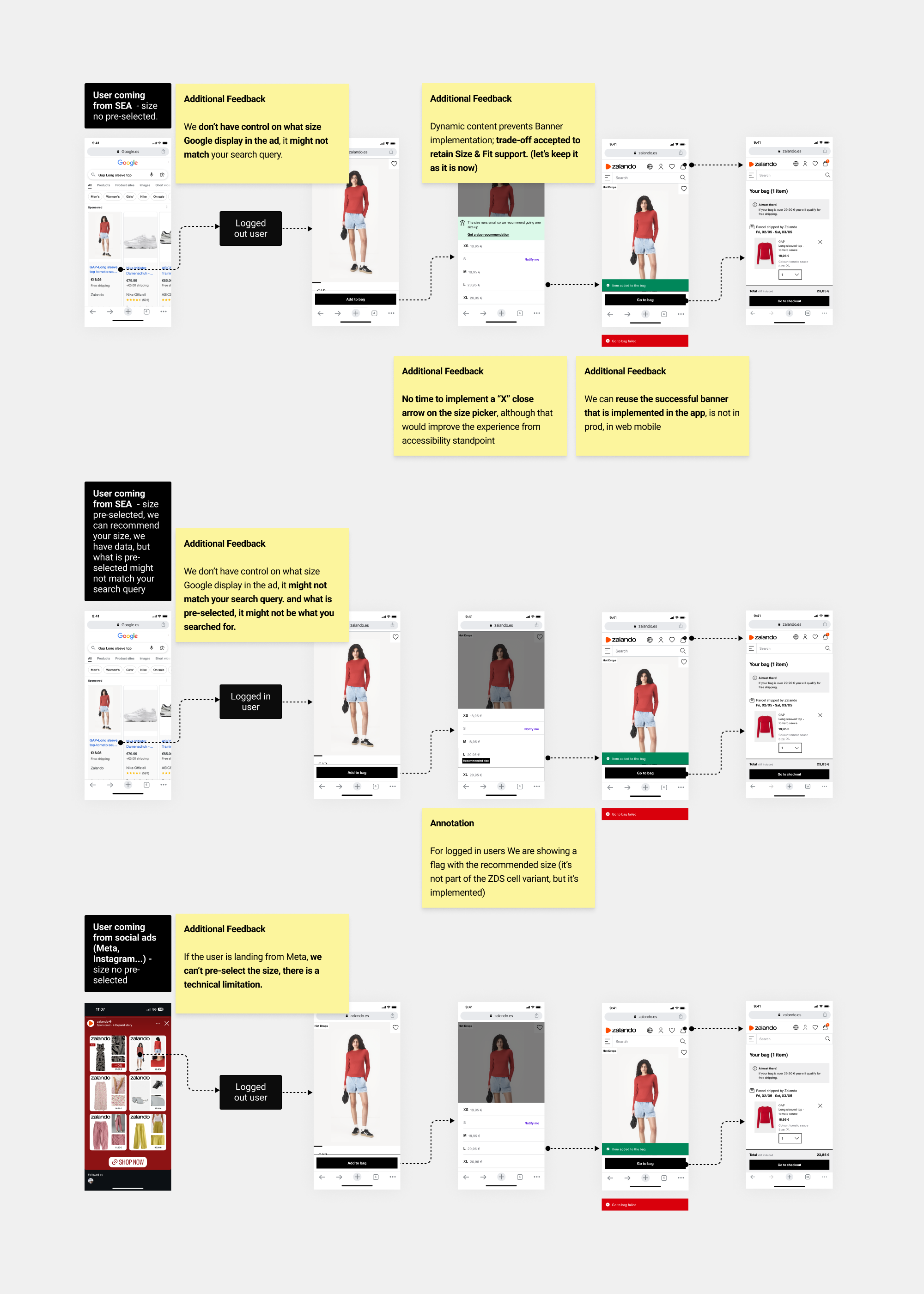
Despite resistance from most departments, since we were changing the user behaviour, the change was justified for the LPO team to evaluate how fast users could be moved through the conversion funnel. So Based on feedback, I aligned with the content team to refine the copy, and redo the flow with “Add to bag”——> “Go to bag”
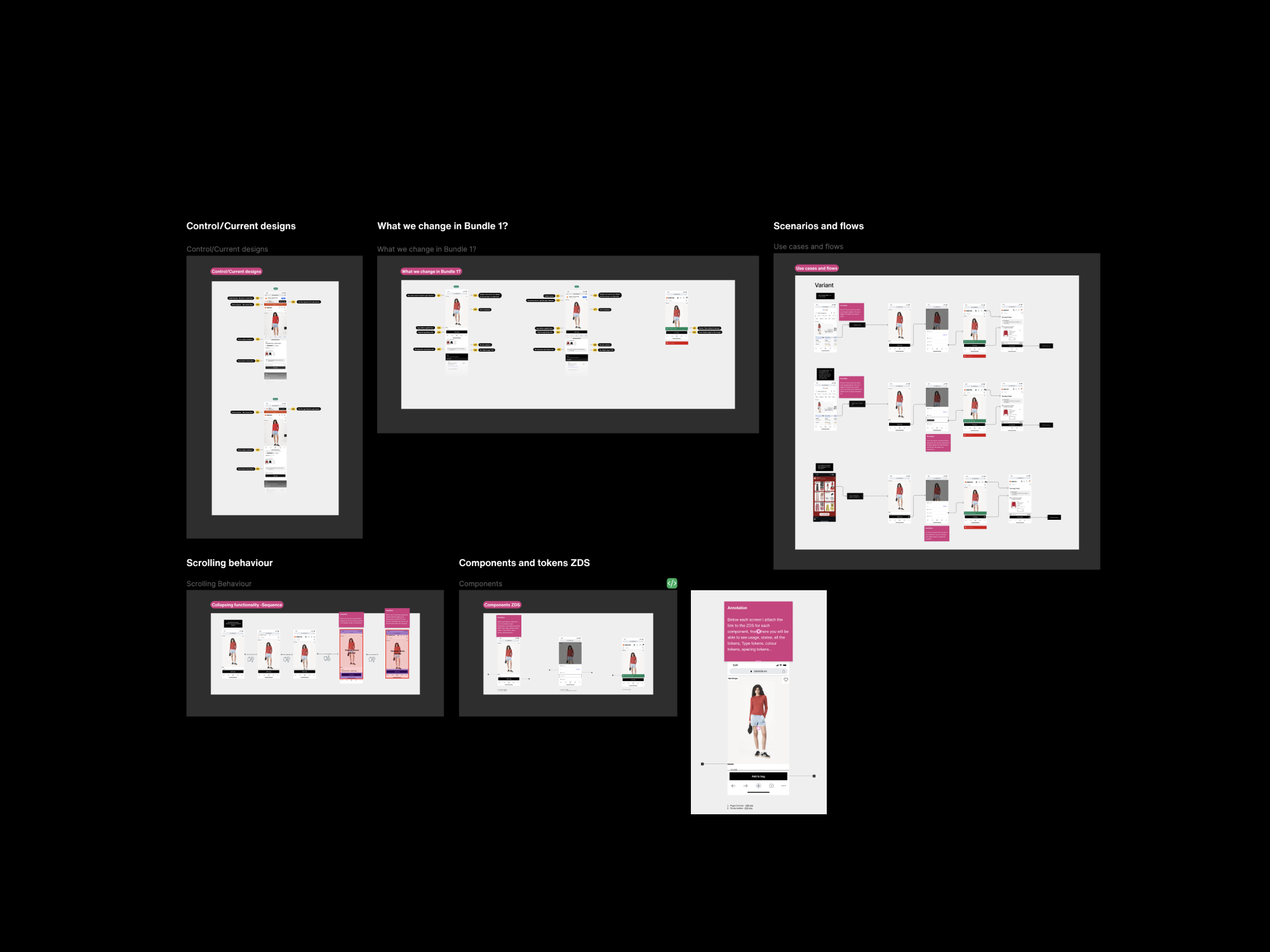
• Prototype
To create the Bundle 1 prototype, I worked directly in Figma using existing design system components, which was faster and more accurate than Figma Make, as it does not yet fully preserve ZDS components, tokens, and spacing. A high-fidelity prototype was required for EDD inclusion and design sign-off.
A key part of each bundle was aligning with the LPO engineering lead and Reference Store engineers to review scenarios, flows, and edge cases (logged-out vs. logged-in), assess technical constraints, identify blockers, and ensure alignment between production and design-system components.
• Design solution
So I ended up with this design solution...
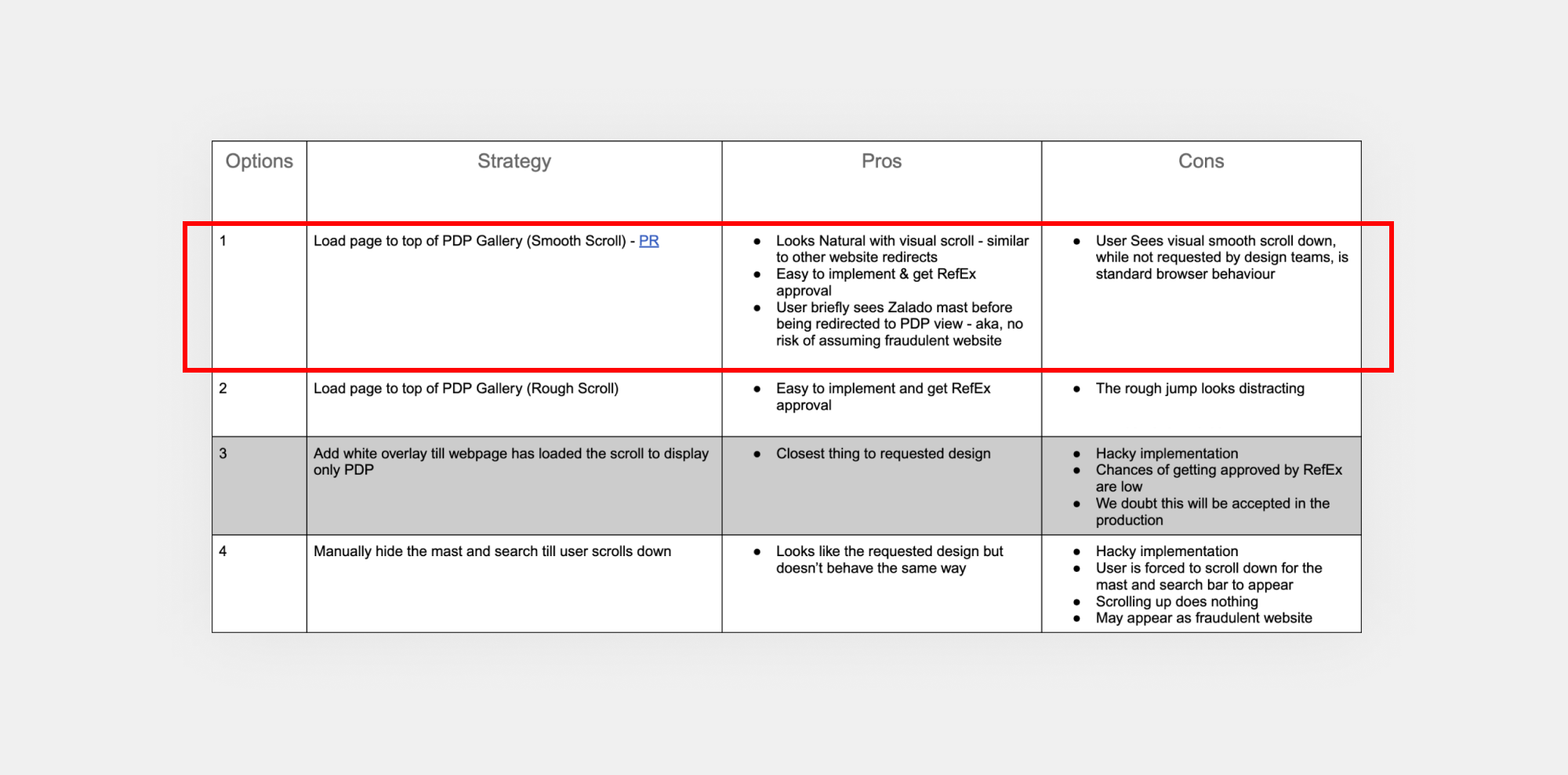
• Trade-off
From an implementation standpoint, I worked closely with engineers to iterate on the auto-scrolling behaviour when users land on the PDP. We explored several technical approaches with a focus on keeping the solution lightweight and maintainable within the Reference Store. To compare options, we created a table outlining the trade-offs, and ultimately leaned toward Solution 1.
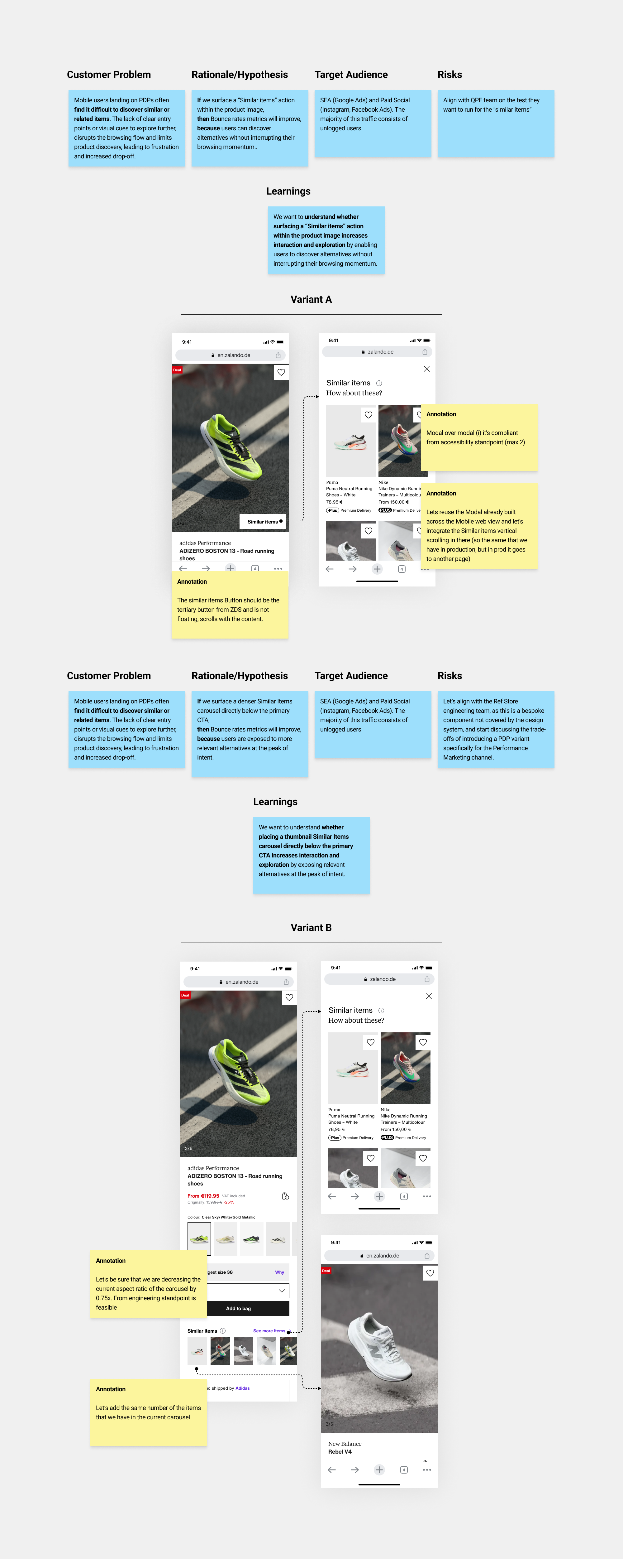
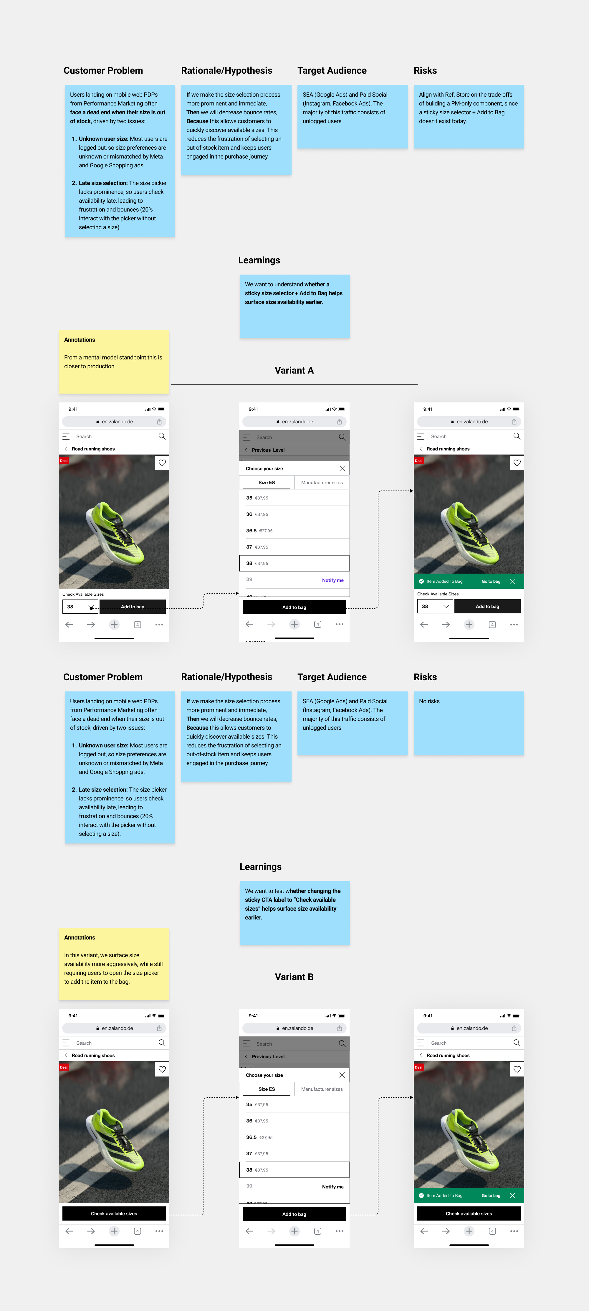
• Experiment / Hypothesis-led
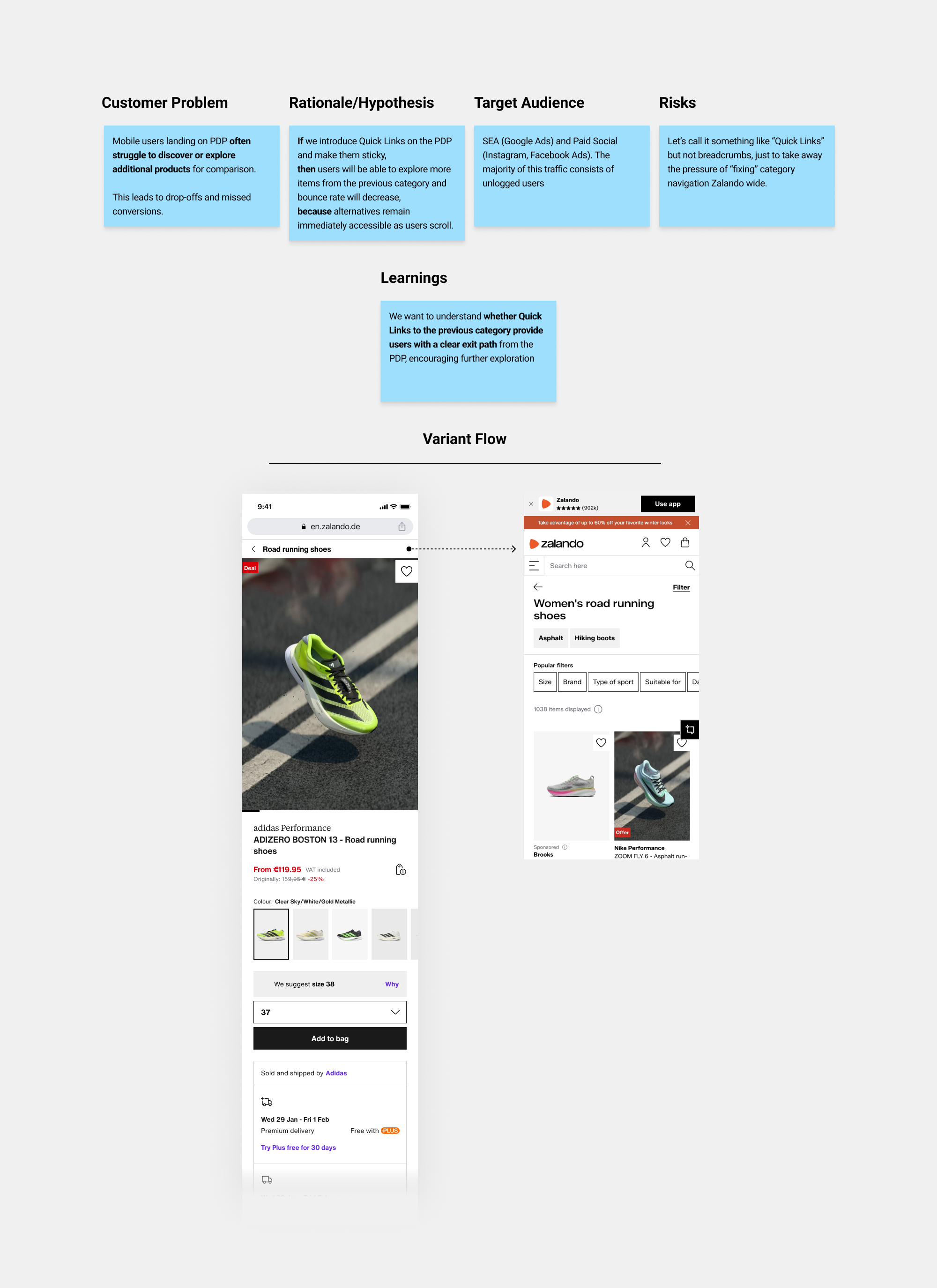
I structured each bundle around 5 key elements: the customer problem, the underlying rationale or hypothesis, the target audience, the associated risks and learnings we want to understand.
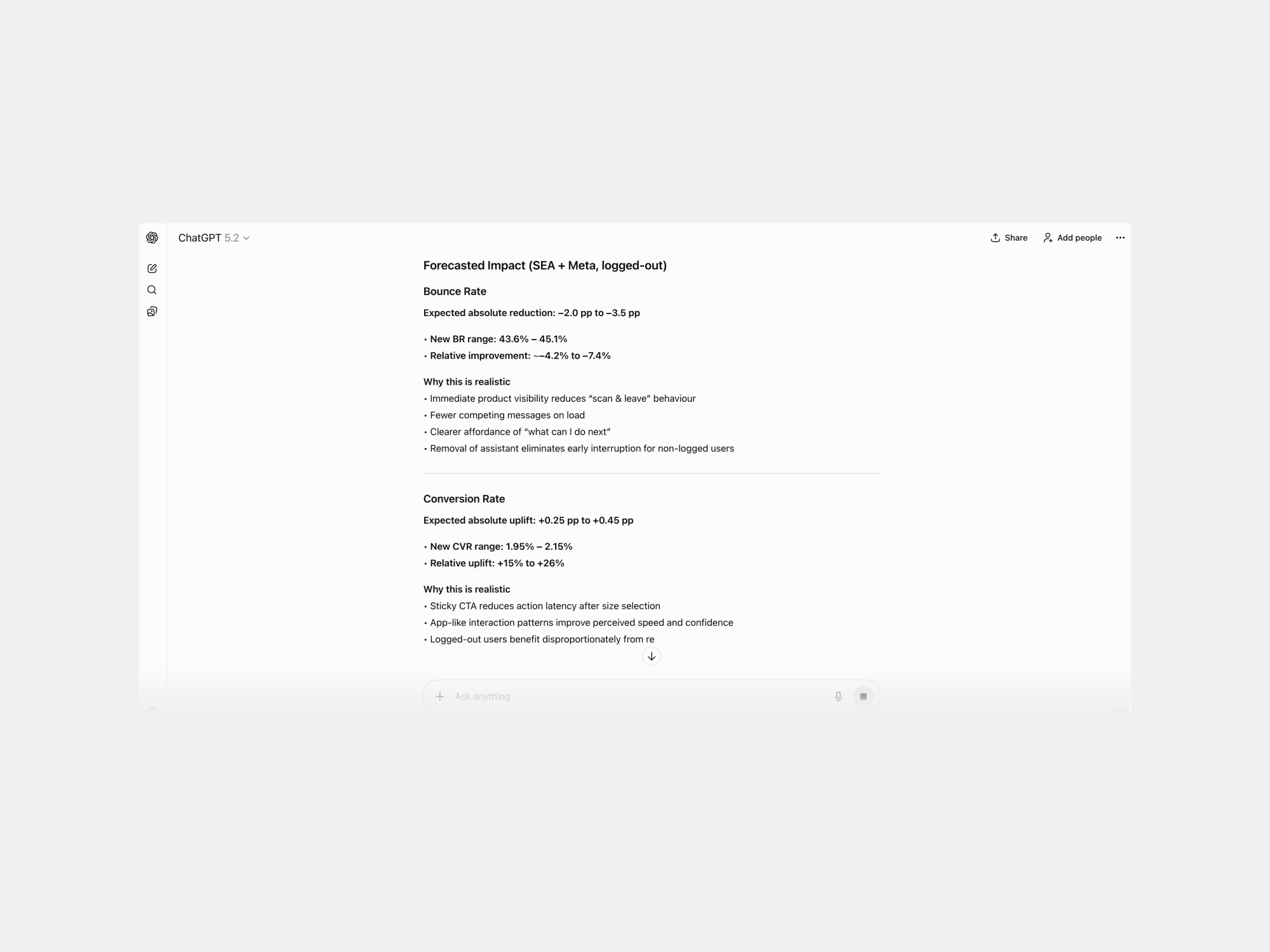
• Bundle forecast impact
Representative example applied across all bundles
I used ChatGPT as an analytical aid to evaluate whether the proposed changes were likely to drive measurable impact
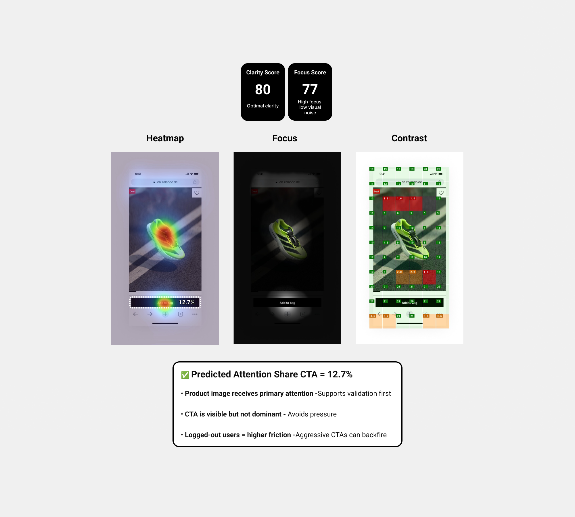
• Predictive attention
Representative example applied across all bundles
I also used the ✦ Attention Insight plugin to validate visual hierarchy, attention distribution, and CTA prominence before moving into experimentation Document.
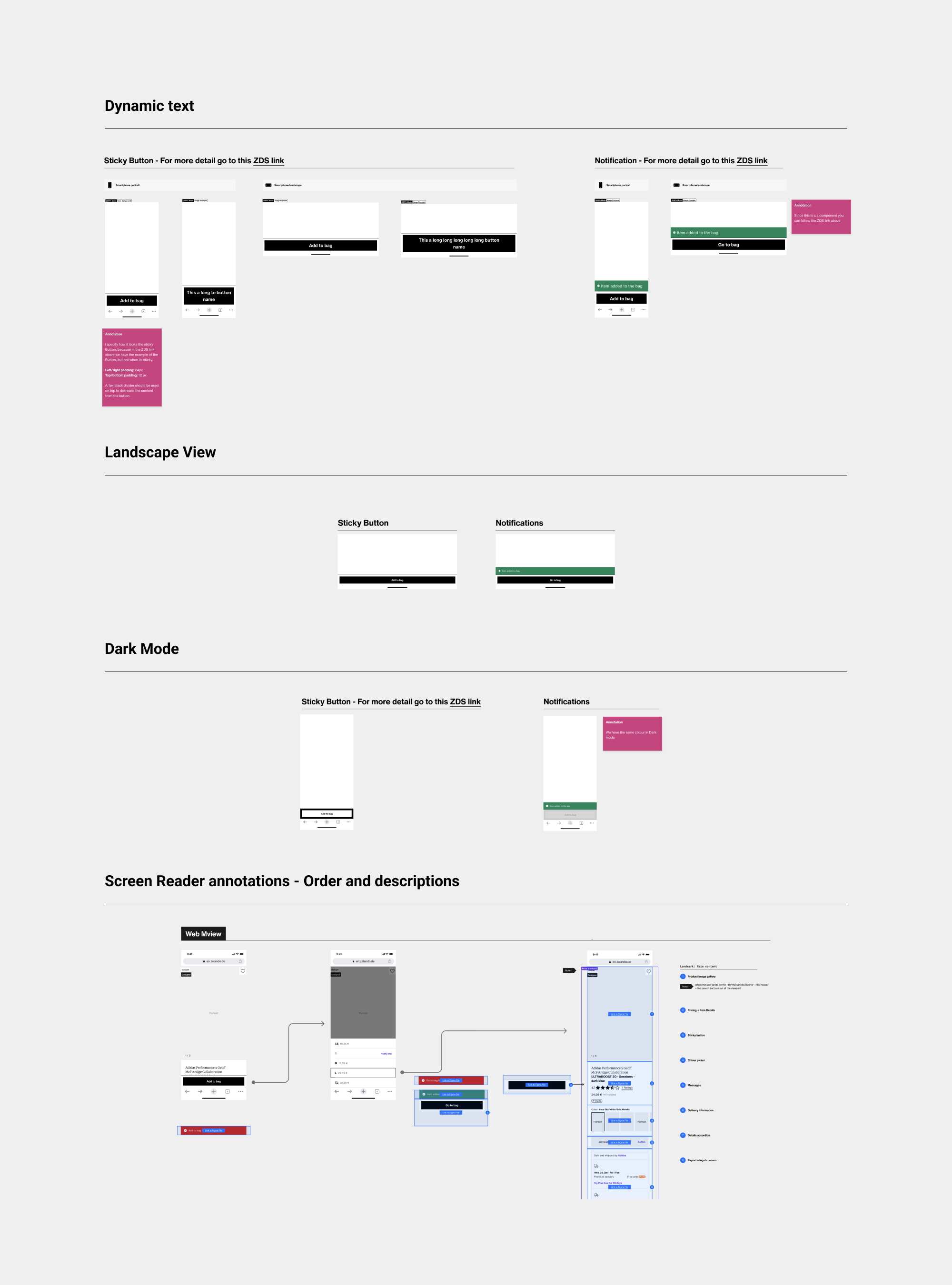
• Handoff to engineers and A11y compliance
Representative example applied across all bundles
Accessibility compliance was mandatory at Zalando, so I focused on screen reader annotations and ensuring the required handoff aspects for engineering. Since we used design system components, dark mode and 200% dynamic text were already implemented, leaving mainly annotation order and guidance notes to refine.
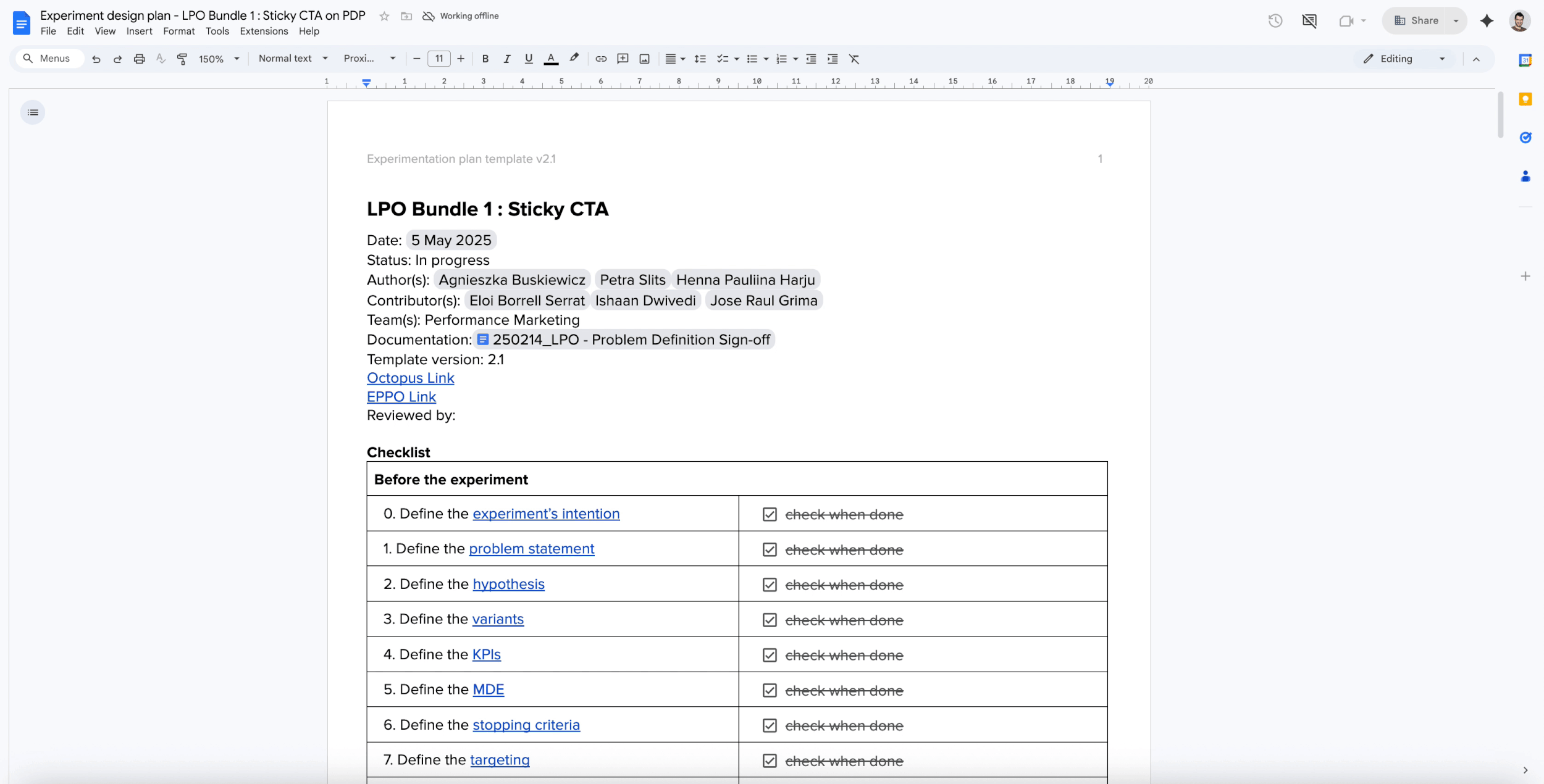
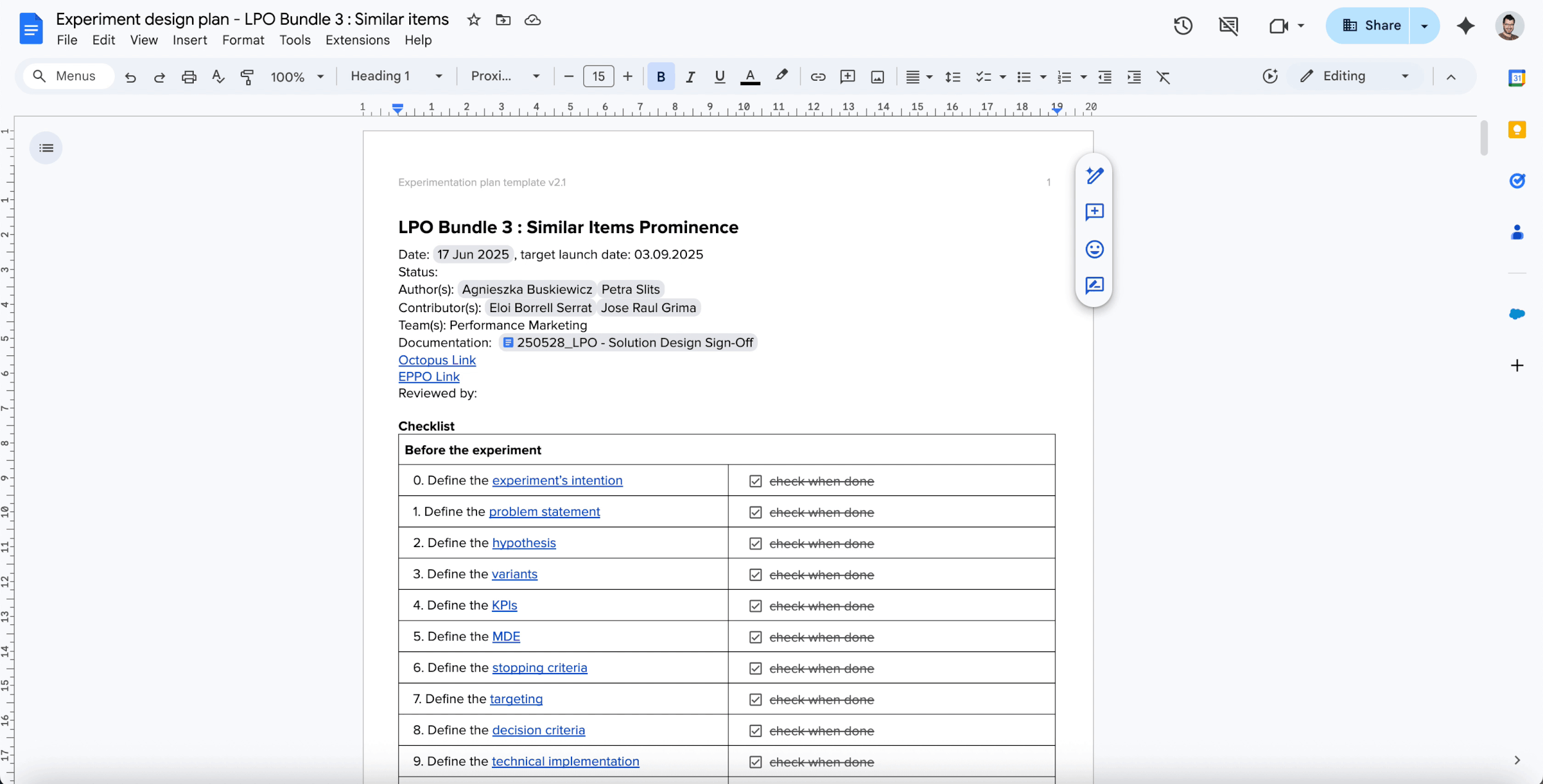
• EDD (Experiment design document) Rollout decision and & KPIs
This document defines the experimentation framework for the Sticky “Add to Bag” CTA on mobile PDPs for Performance Marketing traffic. I worked closely with the PM and analyst on problem statement, hypothesis, KPI definition, guardrails, and decision criteria.
➡ I challenged the measurement strategy (new flow intentionally limited multi-size selection), by introducing GMV before cancellations and return rate alongside GMV after returns, ensuring that conversion gains were evaluated against order quality and long-term GMV impact.
• AI Analysis results
Representative example applied across all bundles
Although the learnings were documented in the EDD, I captured screenshots of the key EPPO metrics and used ✦ ChatGPT to extract preliminary insights as guidance before reviewing the results in depth with the analytics team.
• EPPO Results and Key insights
Analysis results experiment Bundle 1
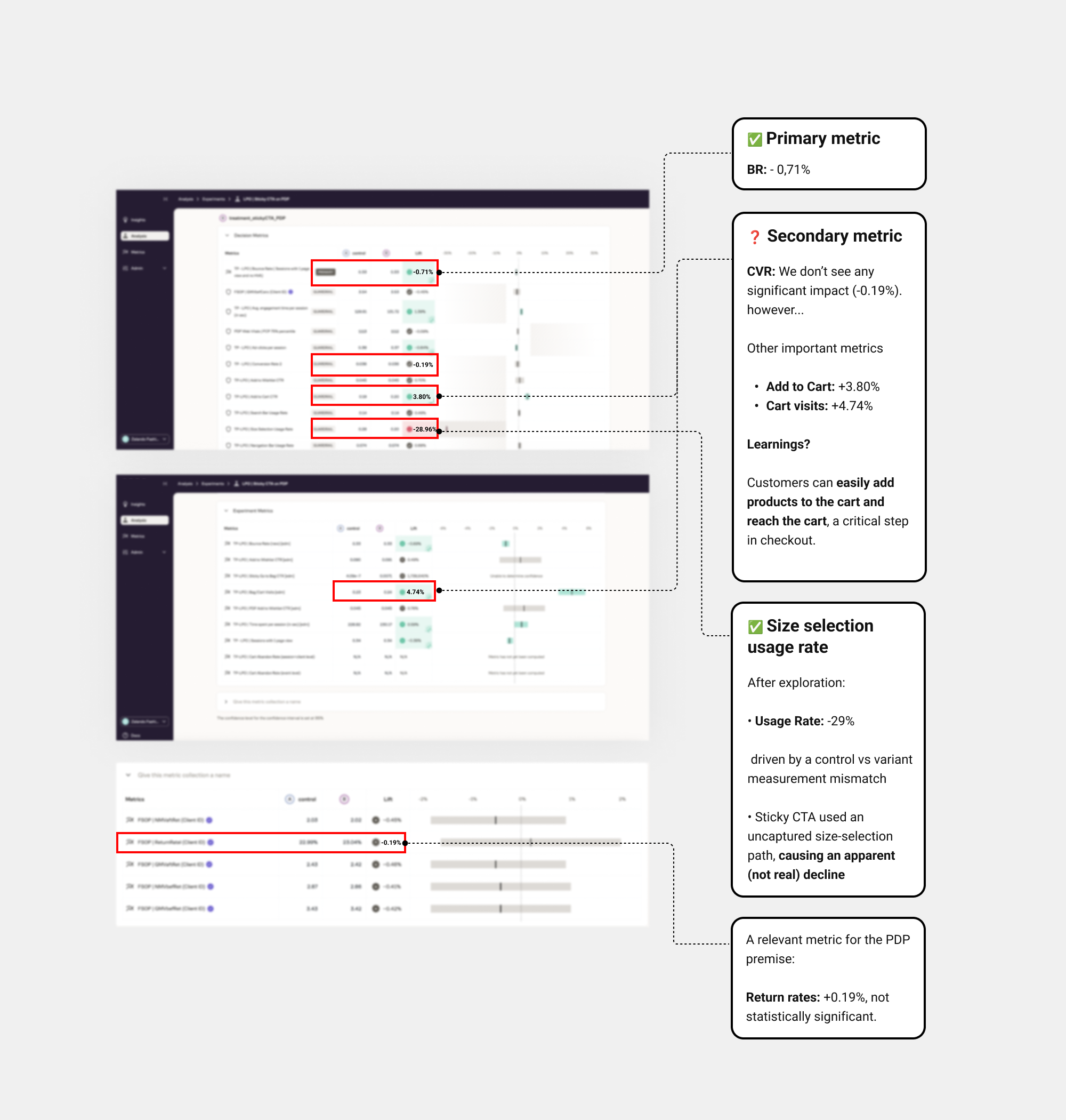
• 🚀 Learnings and Rollout decision
A sticky Add-to-Bag CTA that opens the size picker helps users move faster into the purchase flow by making the primary action constantly accessible. Engagement improved and return rates showed no significant impact, validating rollout with GMV quality guardrails.
• BR: -0.71%
• CVR: CVR is treated as neutral / inconclusive.
Rollout decision: The hypothesis was validated and we rolled out this feature to PM channel.
☝ In the end, Bundle 1 was released after Bundle 2 and positioned accordingly in the roadmap, as it required more time to implement than initially expected.

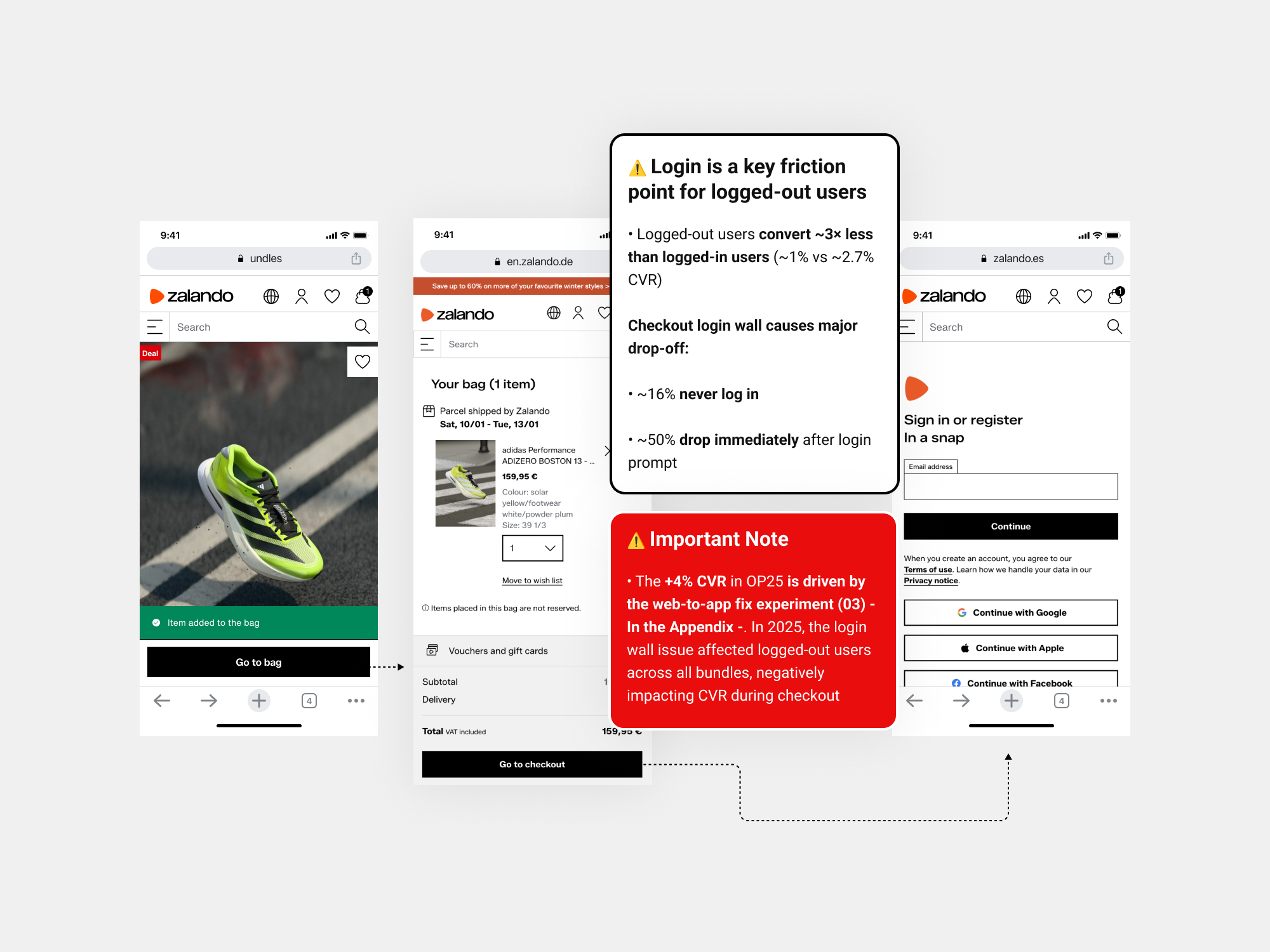
• 🚩 Why the Conversion Rate remained neutral?
This forced login gating interrupts purchase intent for logged-out and directly suppresses mobile web CVR by blocking high-intent users at critical moments. In 2026, we plan to address this by exploring alternative solutions—such as guest checkout—. This change will affect all bundles and is expected to deliver a significant uplift in CVR.
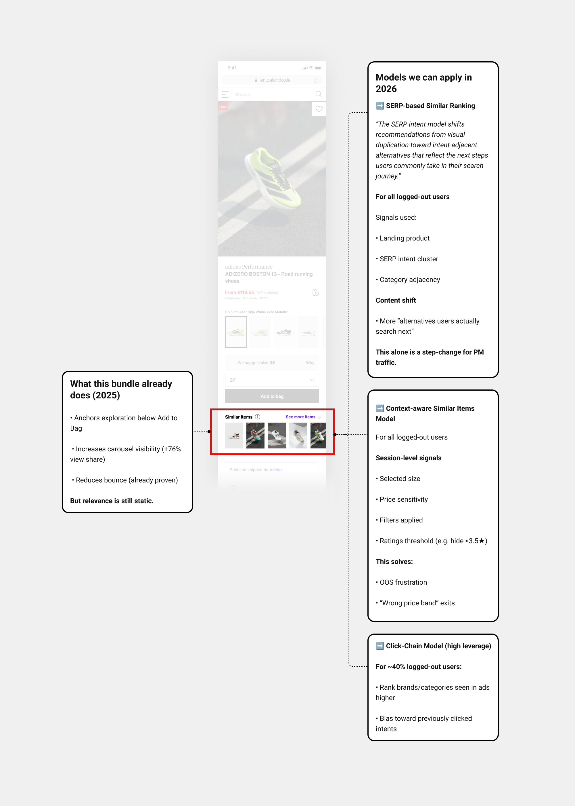
• Foundational personalisation architecture
After Bundle 1, we began talks on 2026 model capabilities, shifting Performance Marketing toward dynamic, intent-aware, session-adaptive system
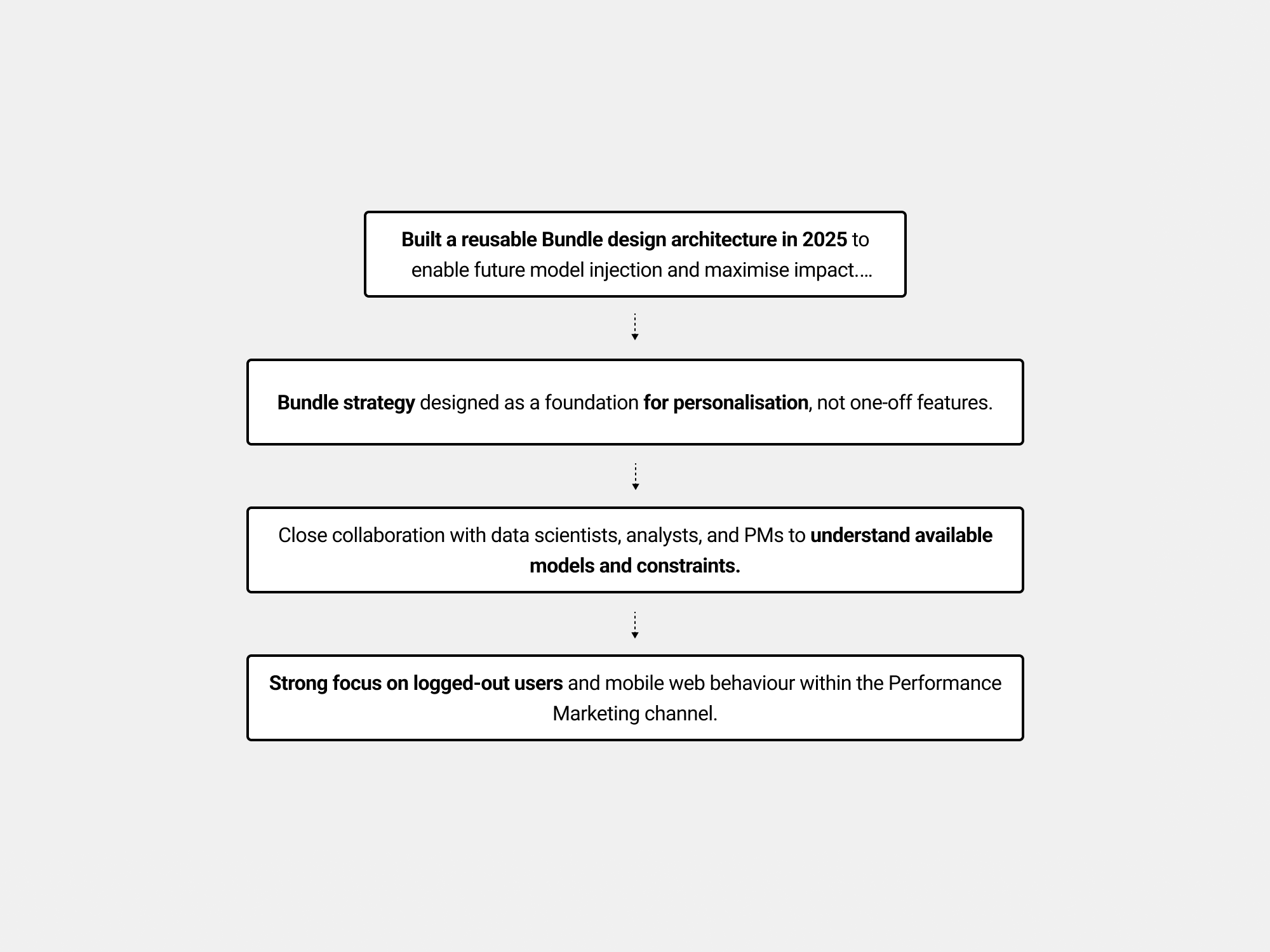
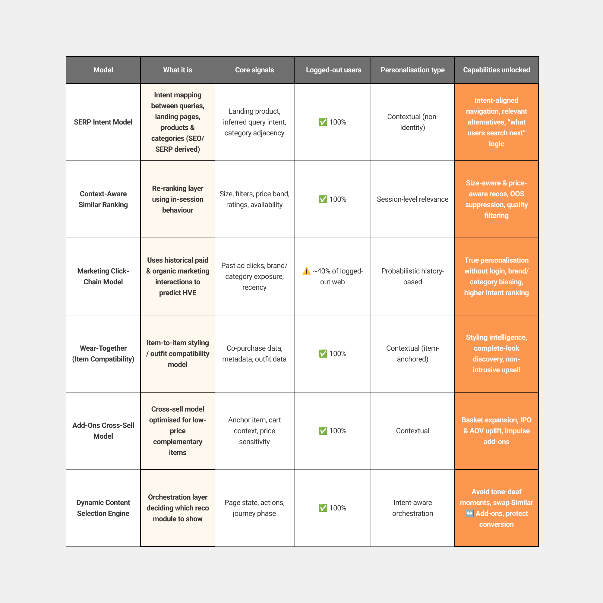
To ensure the PDP could scale beyond short-term optimisation in 2026, I mapped the capabilities of the underlying personalisation models—distinguishing between session-level intent, history-based signals, and what works reliably for logged-out PM users.
The effects of personalisation will not be fully felt or visible until the end of 2026
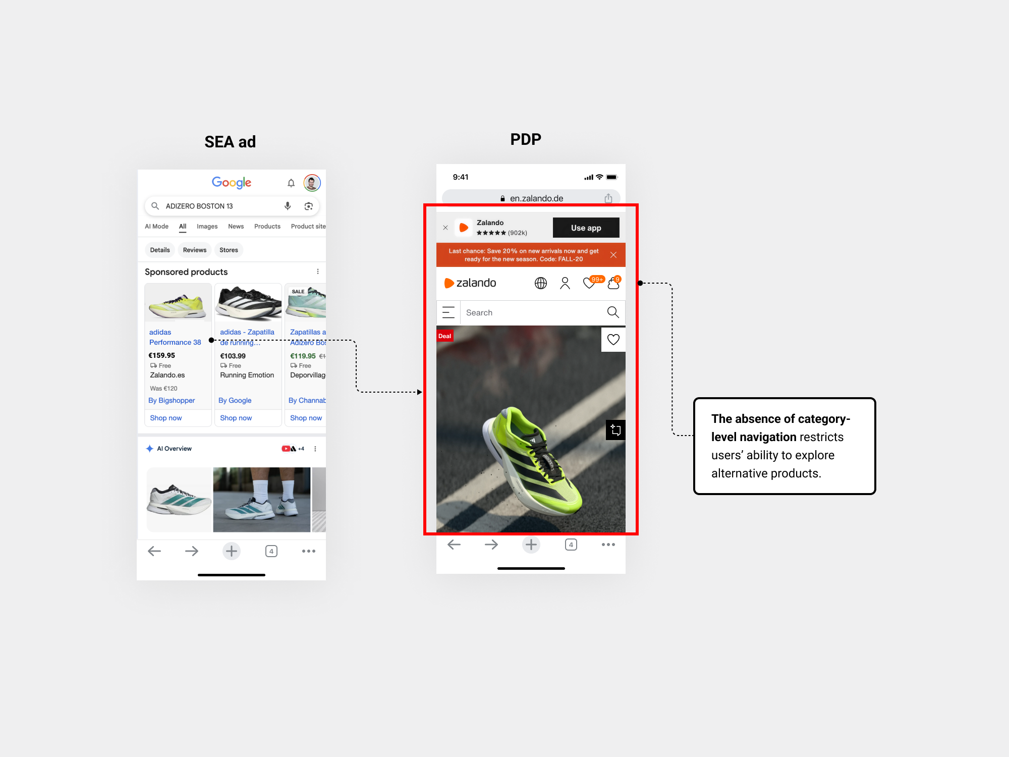
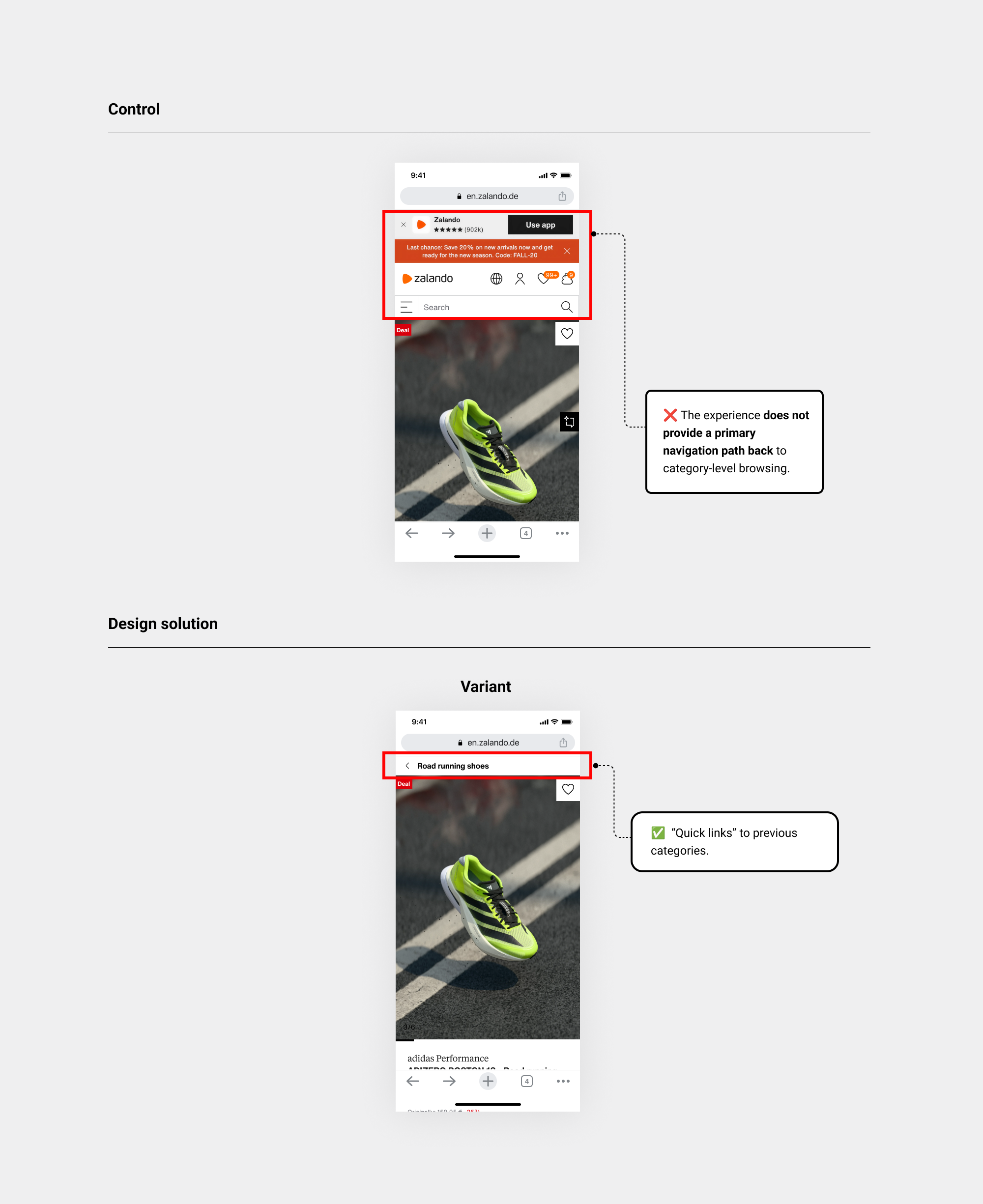
Bundle 2 (Quick Links)
• Context
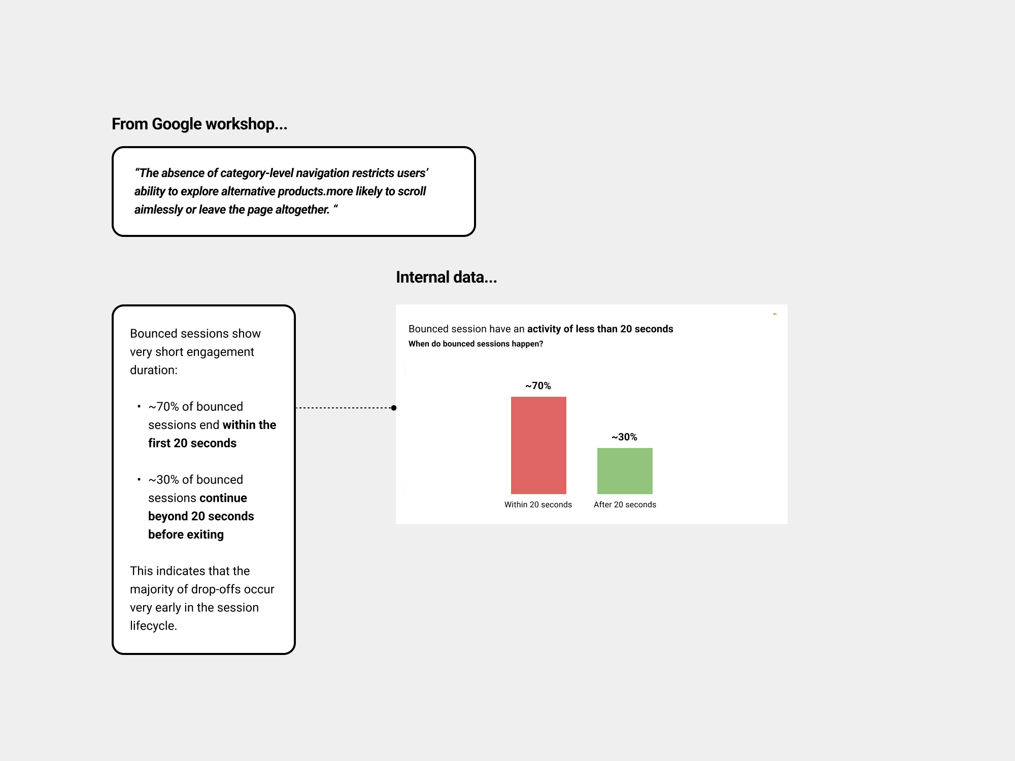
Users who land directly on PDPs struggle to find clear pathways to explore alternative products.
• Data/Insights
Early research signals and insights from the initial Google workshop pointed to this behaviour...
• Iteration
For Bundle 2, the solution was straightforward. Insights from Google interviews had already shown that introducing breadcrumbs would be valuable, especially in addressing several issues users were encountering.
I started by exploring the components available in the design system and reviewing their behaviour in the desktop experience, while gathering feedback from the Ref. Store team and the ZDS (Zalando Design System) team.
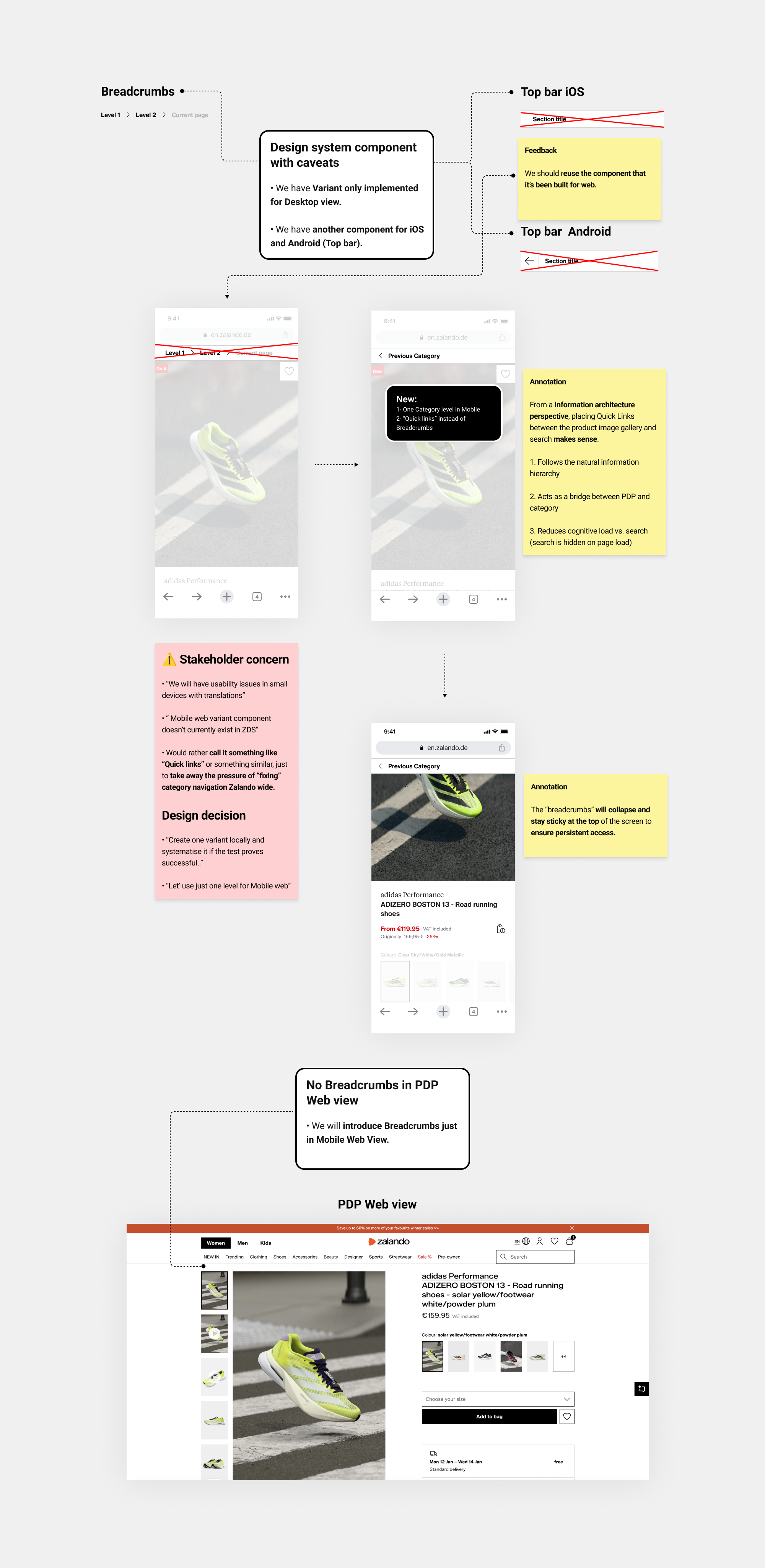
• Prototype
Once aligned with ZDS and Ref.Store on limiting this navigation feature to mobile, I developed a prototype and presented it to LPO stakeholders to validate the approach.
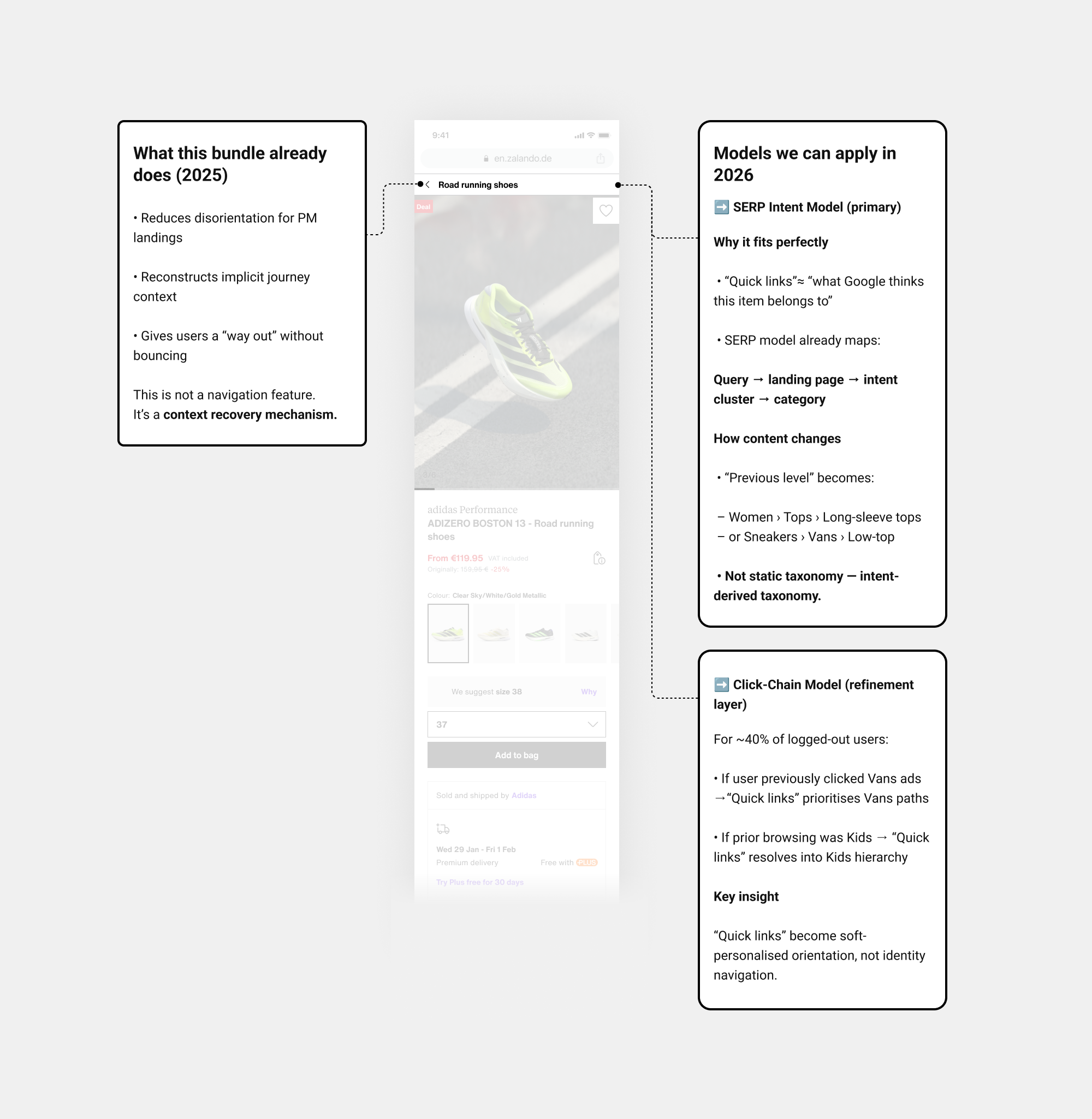
• Personalisation 2026: What models can be leveraged in 2026 for Bundle 2?
“Quick Links” enable personalisation at scale by acting as an intent-aware layer rather than a static navigation element. Driven by SERP intent and behavioural signals, they will adapt category context per user and entry point.
• Design solution
So I ended up with this design solution... I carried over the changes applied in Bundle 1, such as removing banners and the AI assistant.
• Experiment / Hypothesis-led
• EPPO Results and Key insights
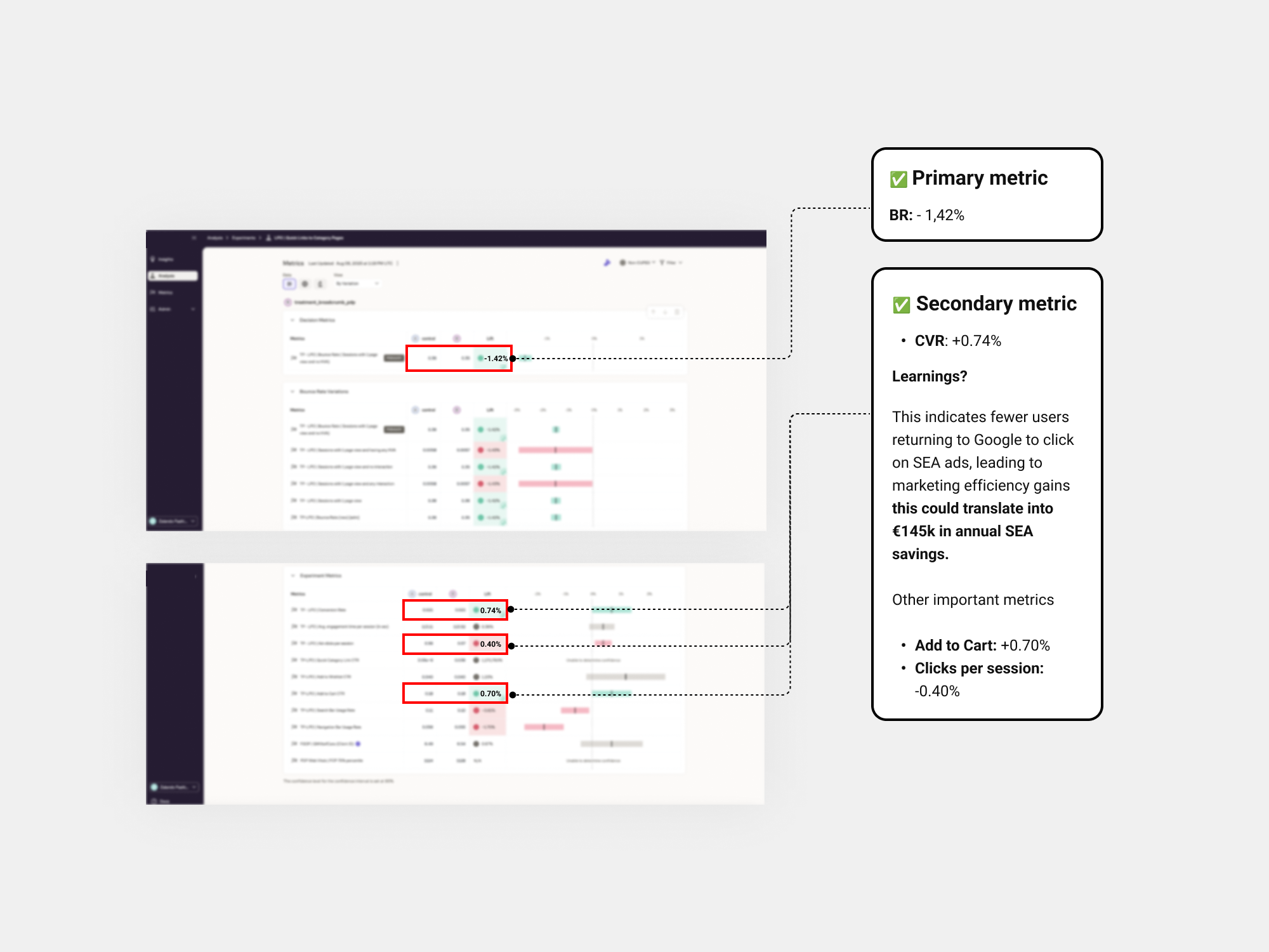
• 🚀 Learnings and Rollout decision
3.6% of sessions used the quick link to category pages, a strong signal that this feature is helpful and positively contributing to navigation.
• BR:-1.42%
• CVR: CVR is treated as neutral / inconclusive
Rollout decision: We had a slightly drop on Search usage -0.61%,
likely to not being visible on page load.
☝ The next iteration will reintroduce both elements and relaunch the test under a new experiment ID to validate whether this drives a greater BR reduction while resolving usability concerns.
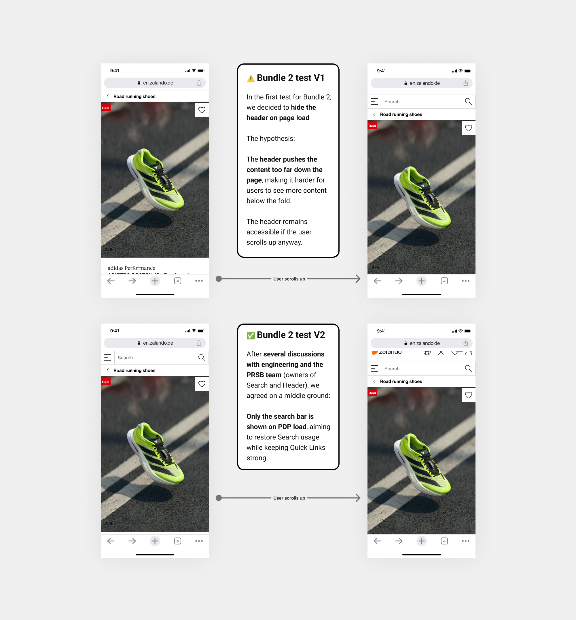
• 🚀 Learnings and Rollout decision
While no other metrics showed significant change, “quick links” were used in 3.9% of sessions—consistent with the original test and the search usage had a significant improvement.
• BR:-1.50%
• CVR: + 0.12%
Rollout decision: The hypothesis was validated and we rolled out V2 this feature to PM channel (Only the search bar is shown on PDP load)
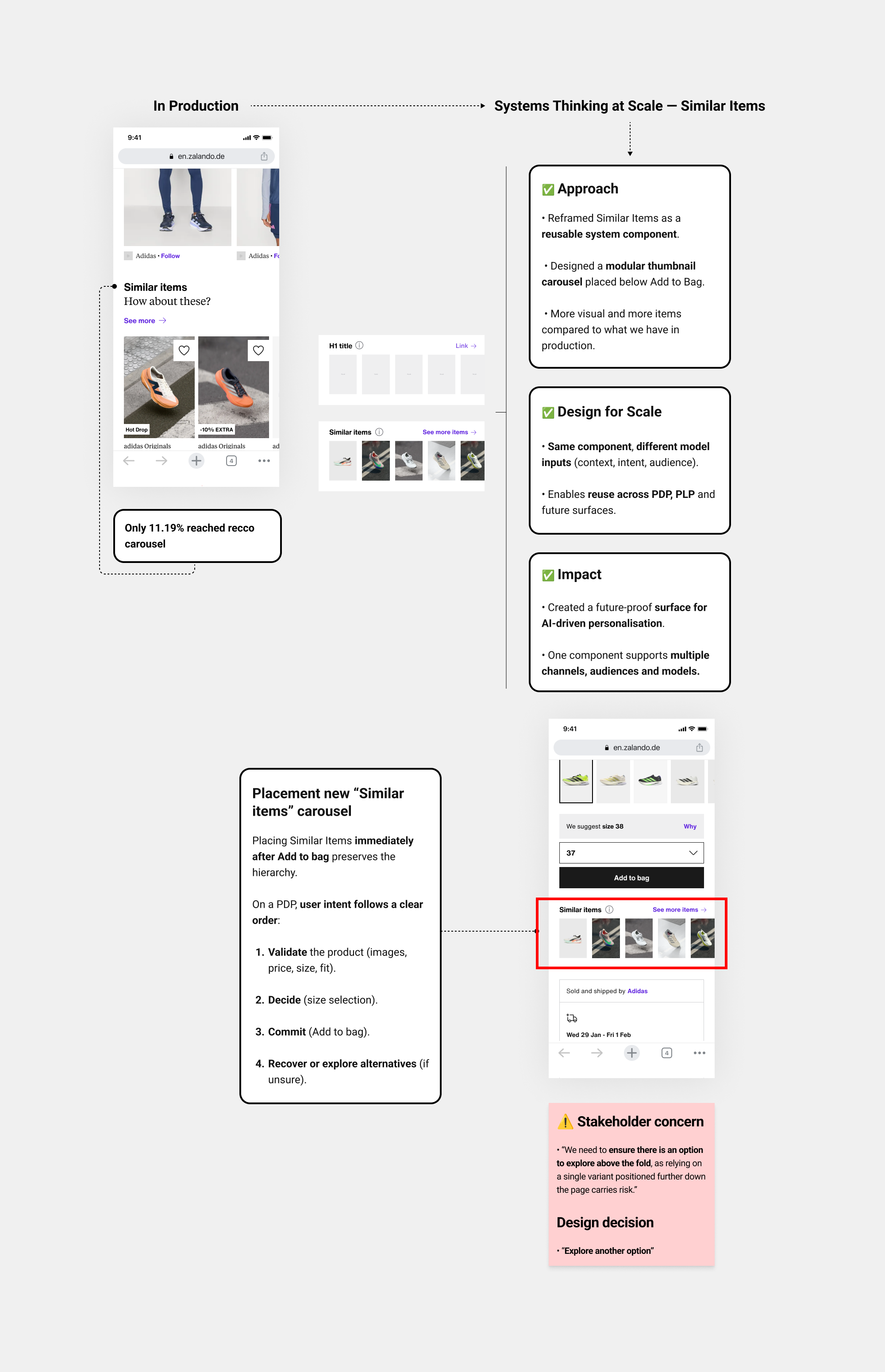
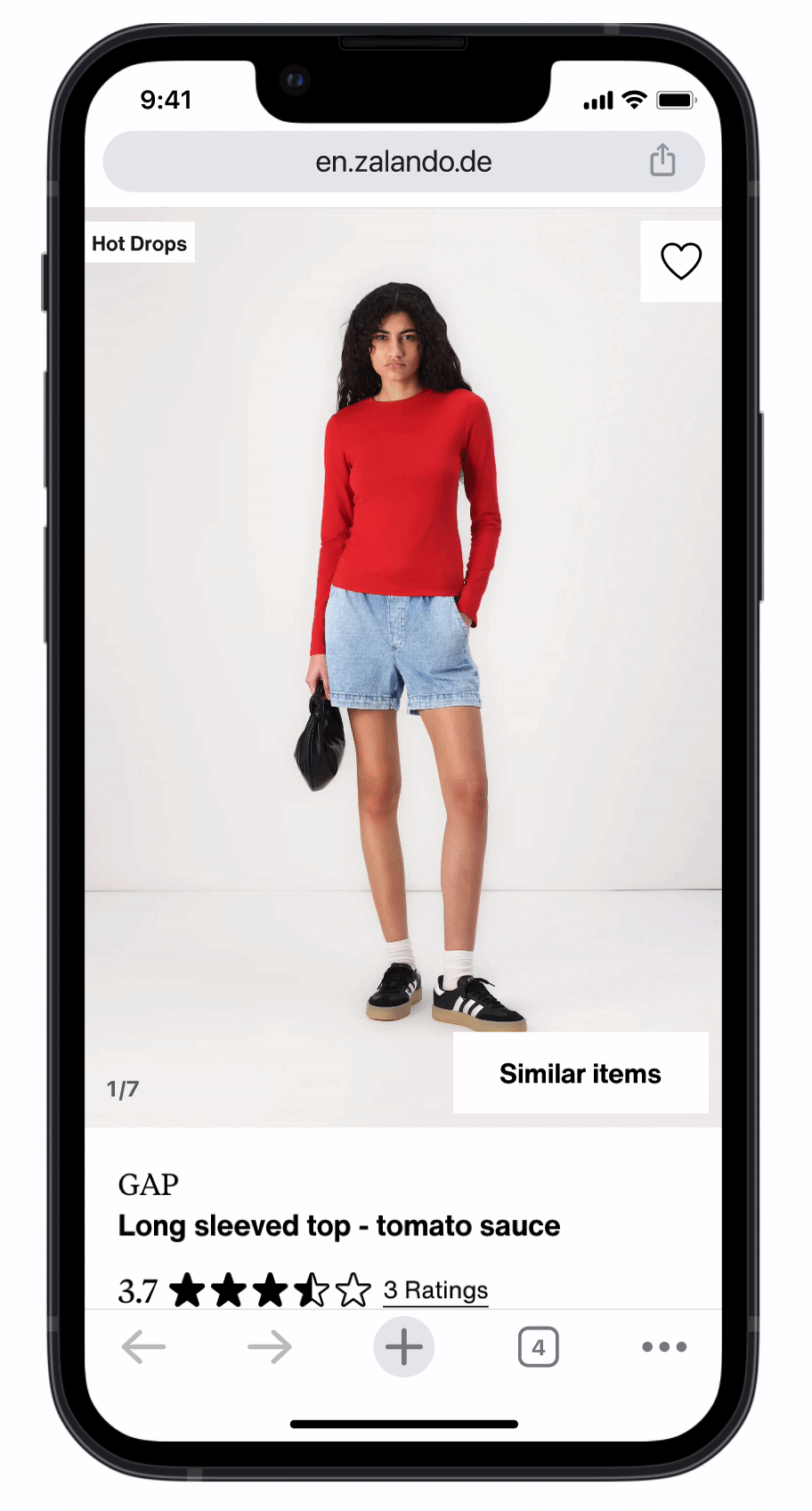
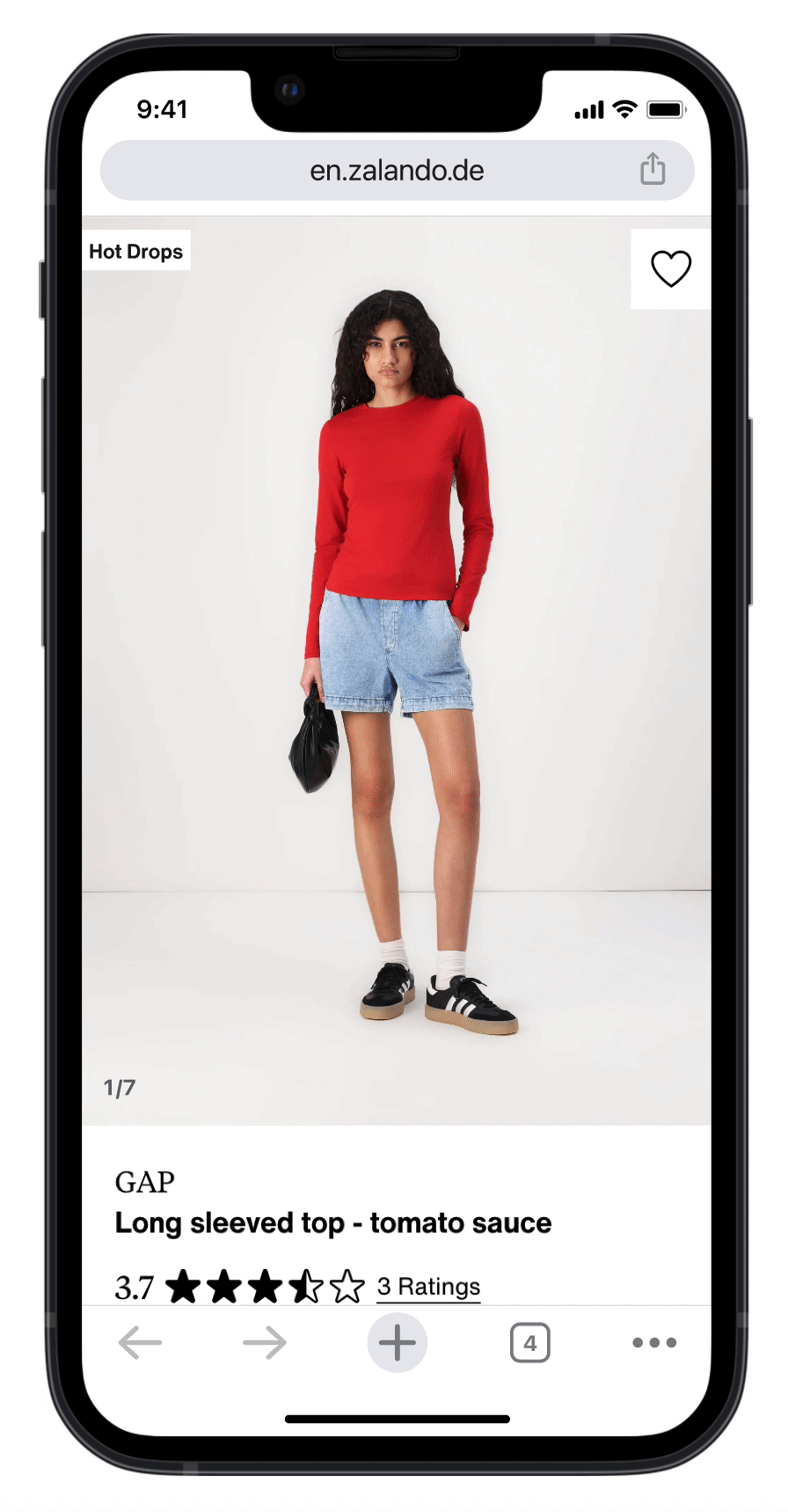
Bundle 3 (Similar items carousel)
• Context
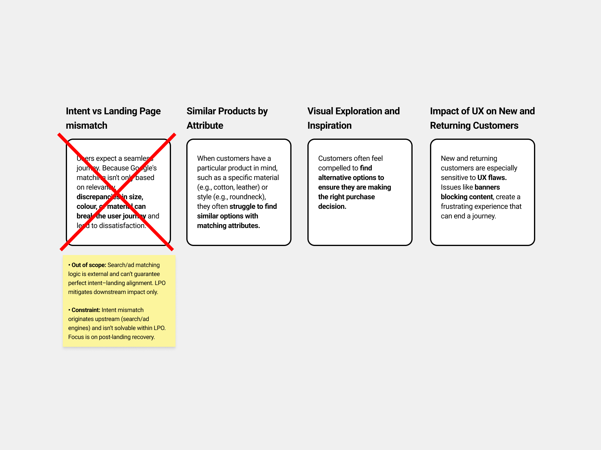
Workshop interviews indicated that when users consider alternatives, they tend to prioritise options with similar core attributes.
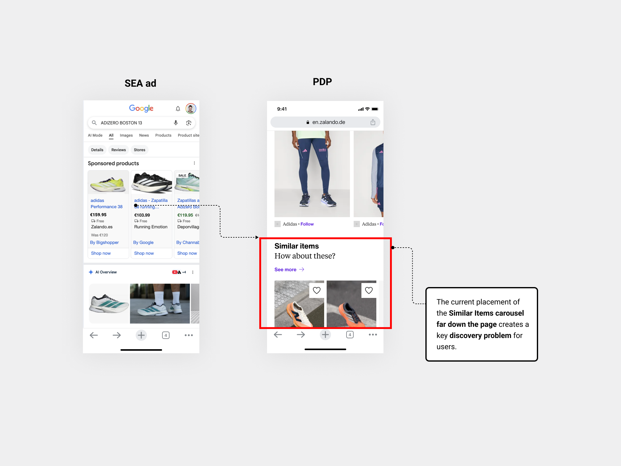
• Data/Insights
Early research signals and insights from the initial Google workshop pointed to this behaviour...

• Iteration
Through idea generation sessions in Figma Make and a Google workshop, we aligned on exploring how “Similar Items” could be leveraged to create greater impact.
I explored several hypotheses, but I’m highlighting the most representative one to focus on the key learnings, so I created two a quick prototypes in Figma to gather early feedback...
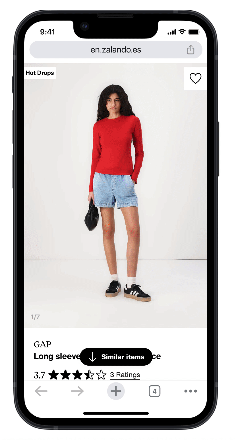
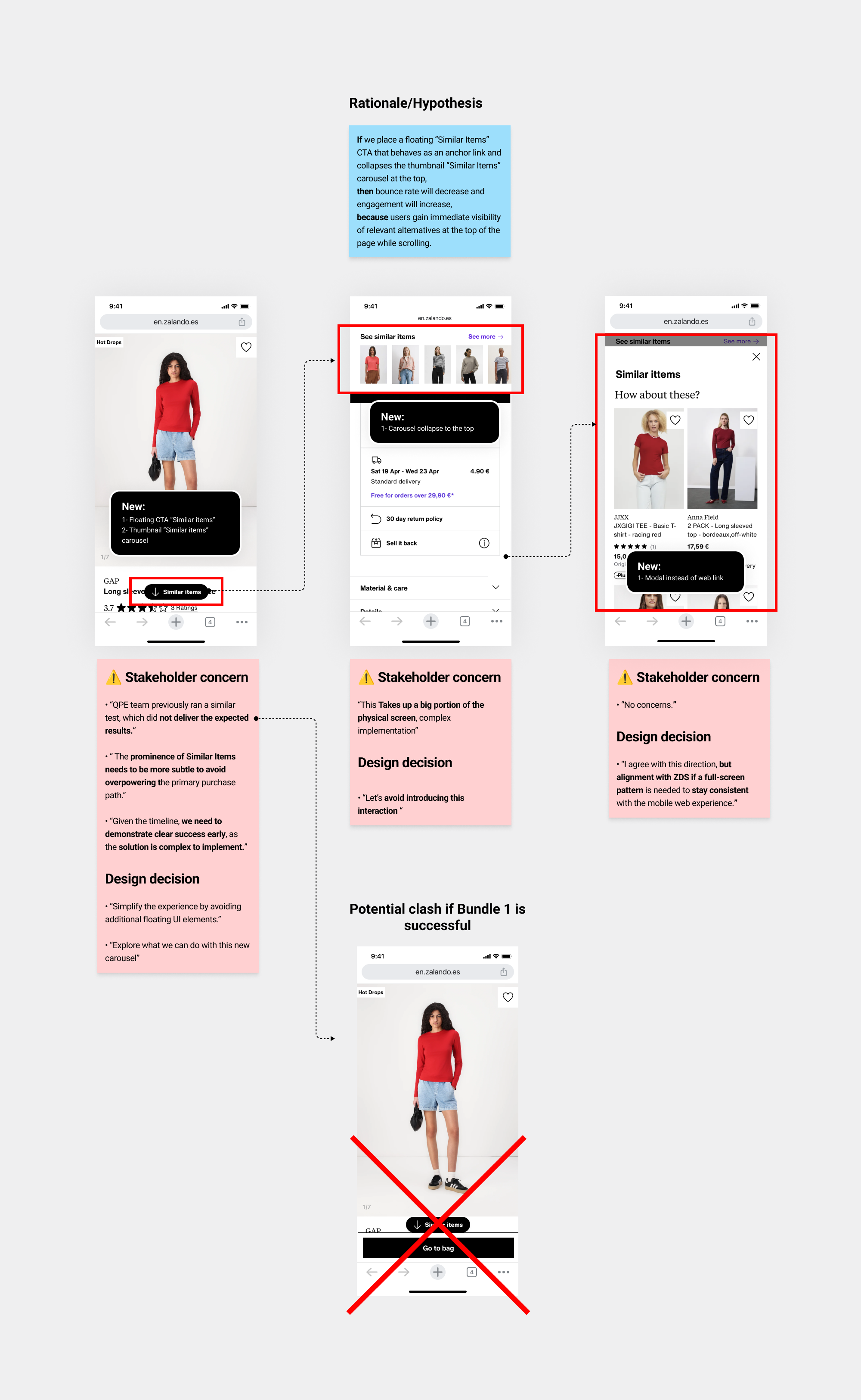
Based on the feedback, we aligned that a new thumbnail “Similar Items” carousel was a strong component to pursue. We then focused on clarifying the design thinking behind the iteration approach...
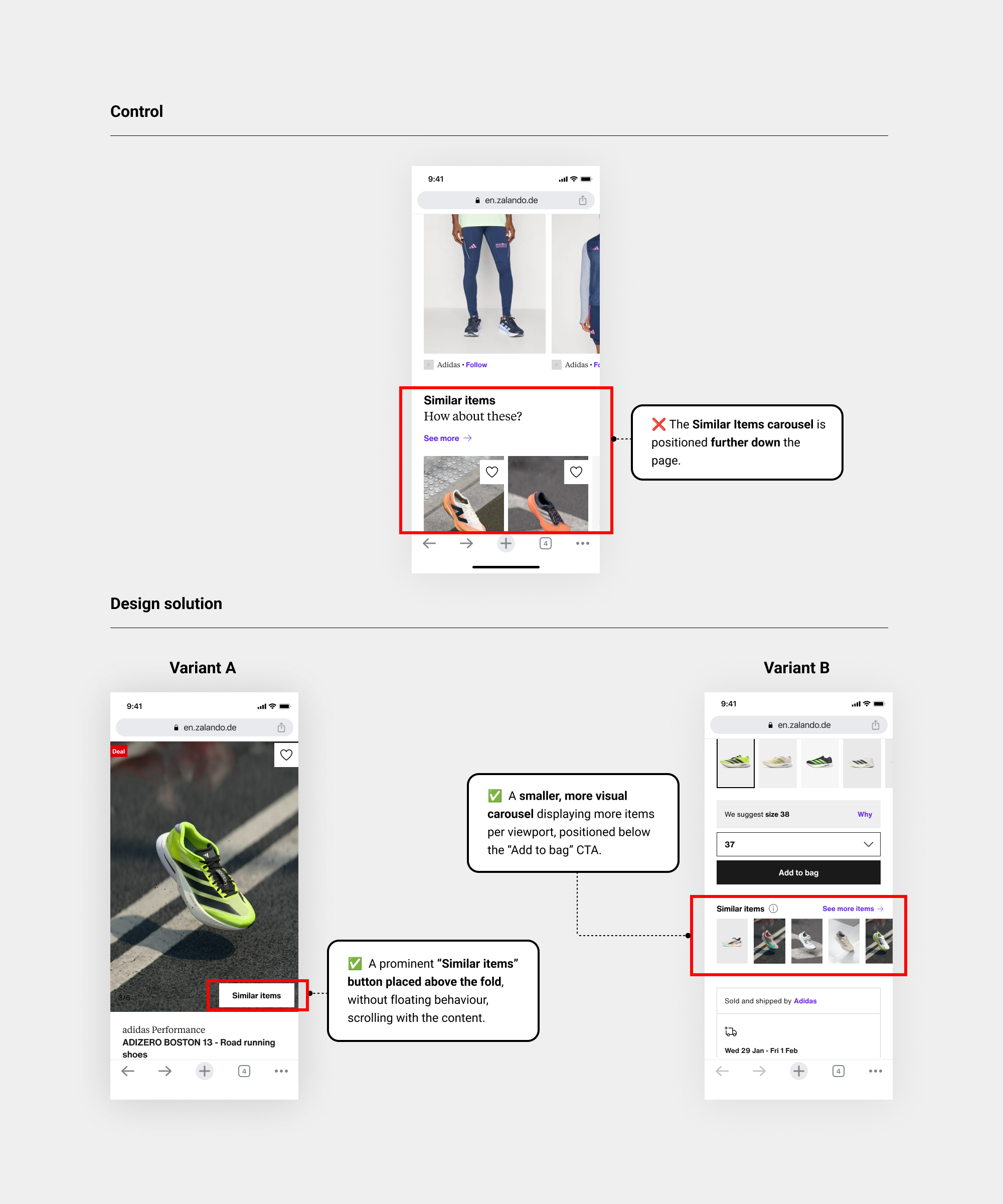
• Prototype
In the second iteration, I explored Variant A by placing a “Similar items” button above the fold to increase visibility and Variant B.
Personalisation 2026: What models can be leveraged in 2026 for Bundle 3?
I designed the Similar Items thumbnail carousel as a system-level architecture, enabling the strategic rollout of personalisation models planned for 2026 and how we can anticipate from user actions. That’s exactly how we wanted scale learning without UX debt.
• Design solution
So I ended up with this design solution... I carried over the changes applied in Bundle 1, such as removing banners and the AI assistant.
• Experiment / Hypothesis-led
Given the committed business timeline and finance expectations, it was critical to launch a Similar Items test by August. This urgency helped drive alignment across teams and ensured progress toward a solution that could be tested at scale, avoiding delays and maintaining stakeholder confidence
• EDD (Experiment design document) Rollout decision and & KPIs
• EPPO Results and Key insights
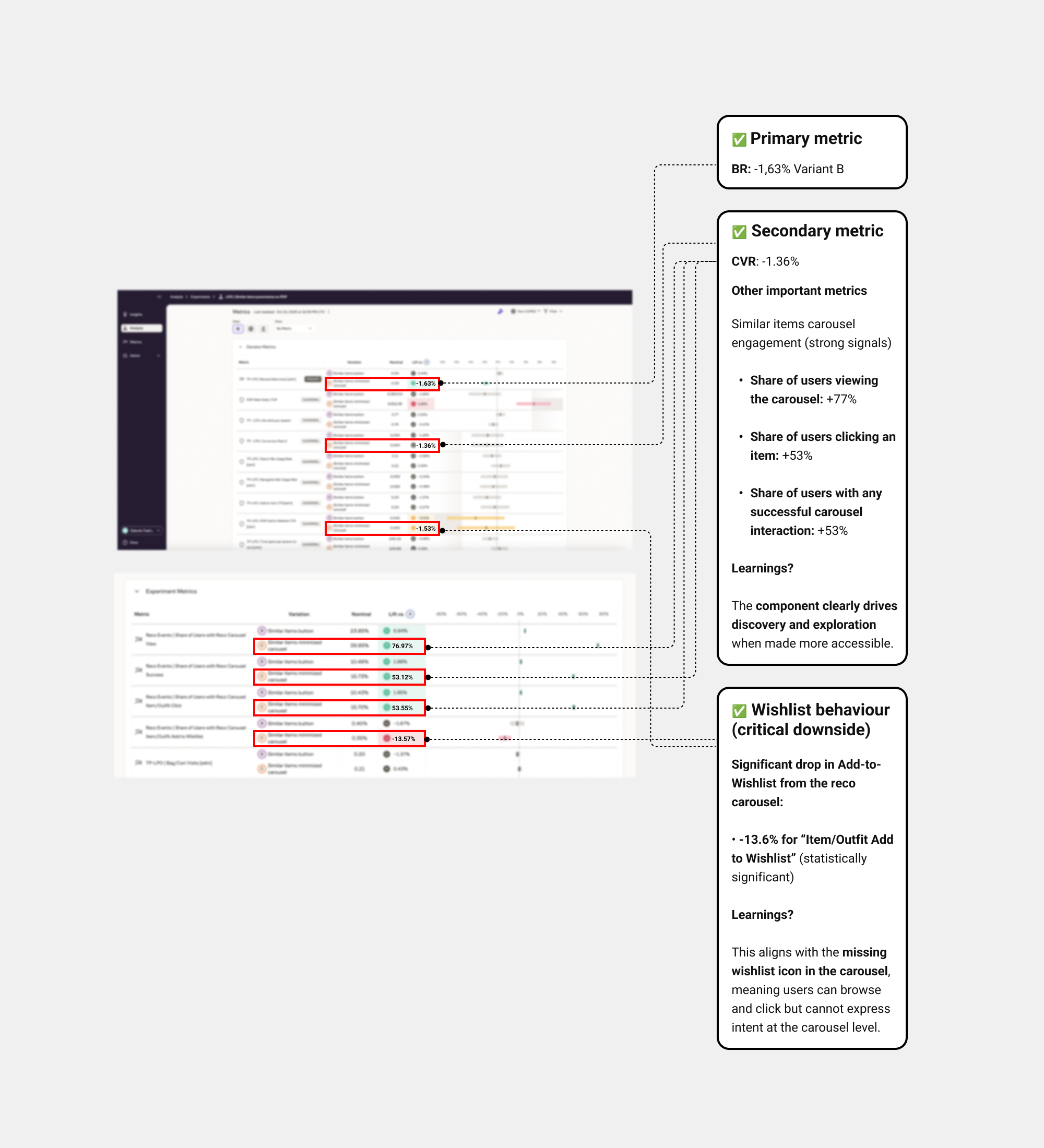
• 🚀 Learnings and Rollout decision
Variant B performed better, confirming that a a more visual Similar Items outperforms a text button entry point..
• BR:-1,63%
• CVR: CVR is treated as neutral / inconclusive
Rollout decision: The hypothesis was validated and we rolled out this feature to PM channel.
☝ In 2026, we will iterate on this test by adding a wishlist icon to each item in the Similar Items carousel to assess whether it increases wishlist adds both within the carousel and on the PDP overall.
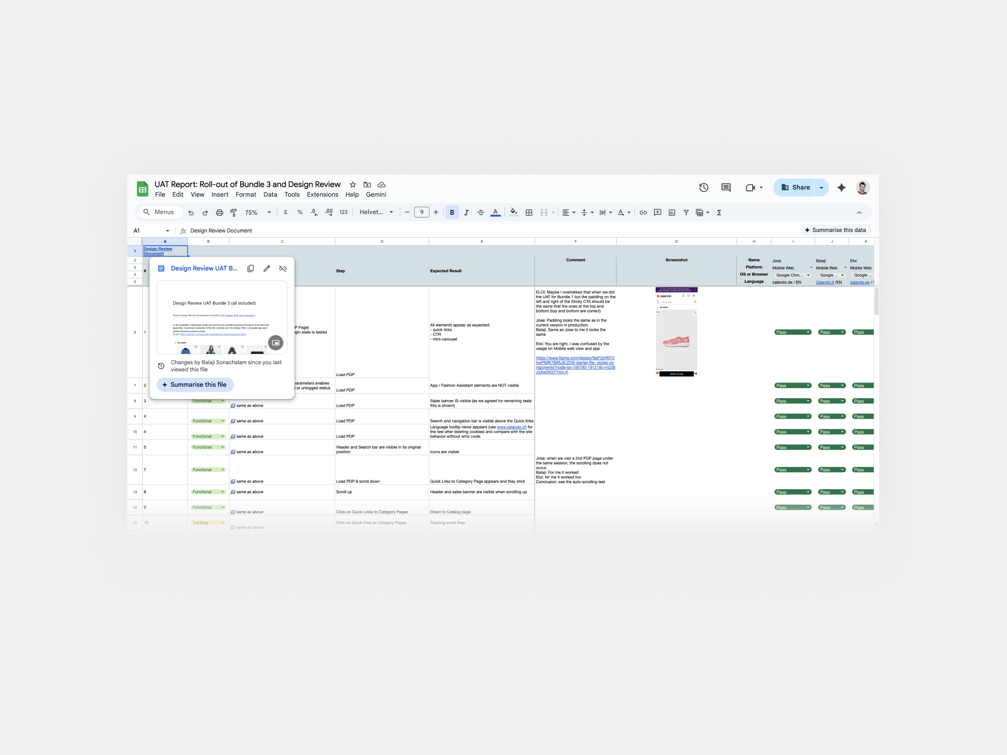
Although earlier bundles had completed UAT and design reviews, the merged rollout required broader stakeholder alignment. I led the end-to-end design review with the PM, flagging UI, functional, and accessibility issues, and—thanks to prior close collaboration with engineering—most points passed, enabling a successful rollout!!
🚀 Rollout with cumulative features Bundle 1, 2, 3
Following the successful individual validation of Bundles 1–3, we advanced to a cumulative rollout, integrating them into a single, streamlined PDP experience. This enhanced experience combined Sticky Add-to-Bag, Quick Links, and the Similar Items thumbnail carousel, while removing banners and the AI assistant and prioritizing Search on page load to maximize clarity, discoverability, and end-to-end impact.
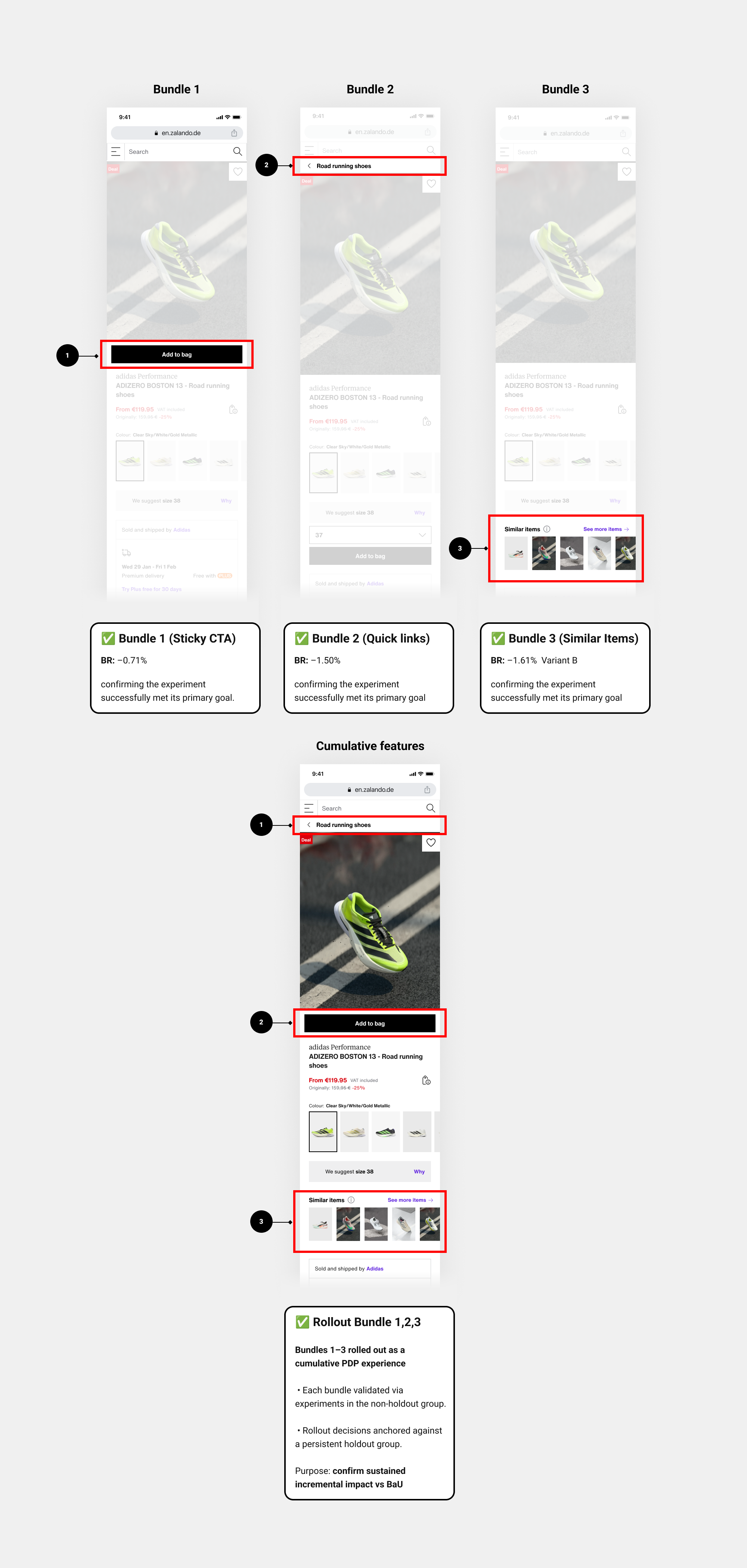
Bundles 1, 2, and 3 were rolled out as a cumulative foundation. Going forward, all validated and successful changes from these bundles will be systematically carried over into future bundles as part of the LPO roadmap.
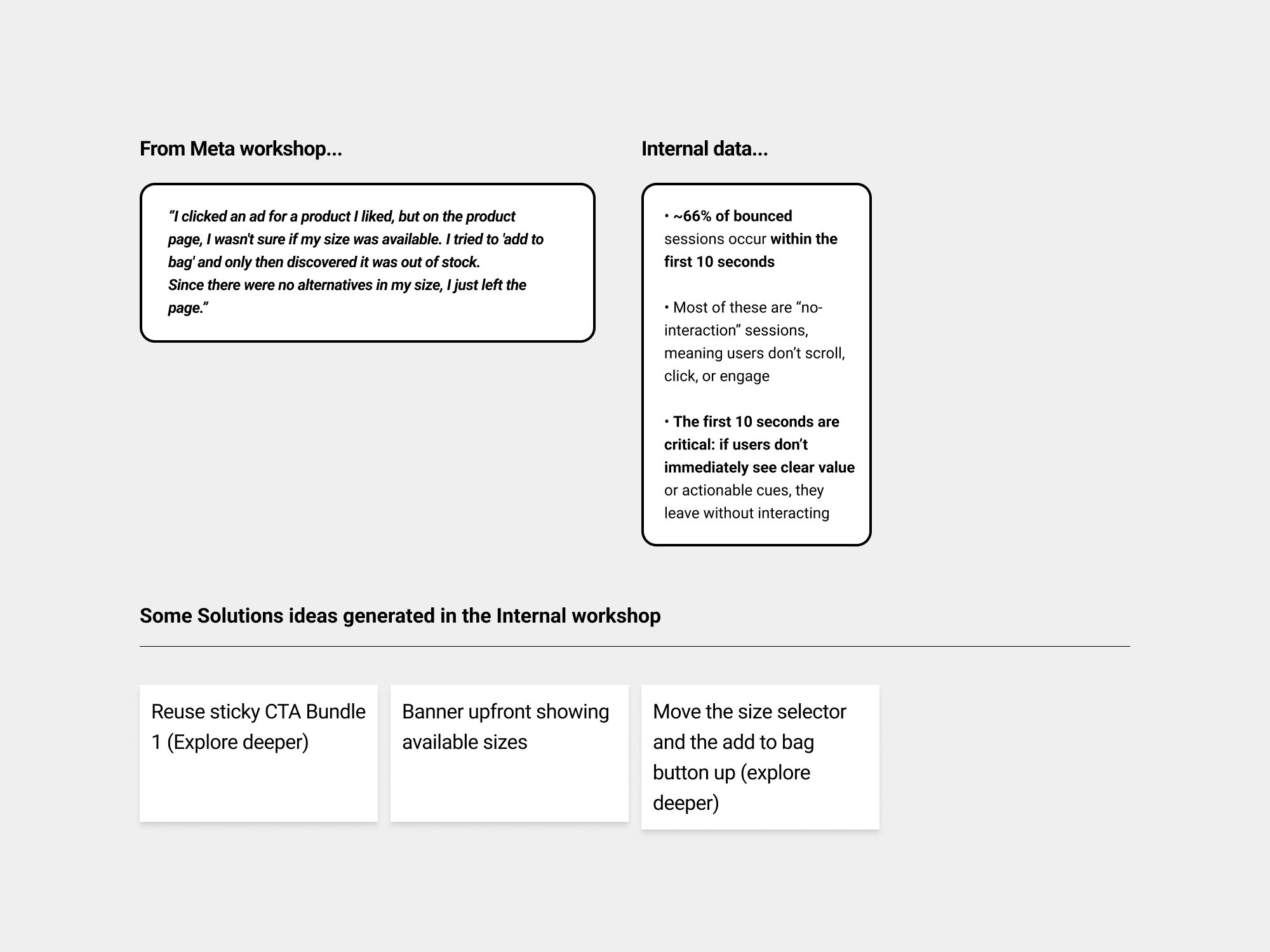
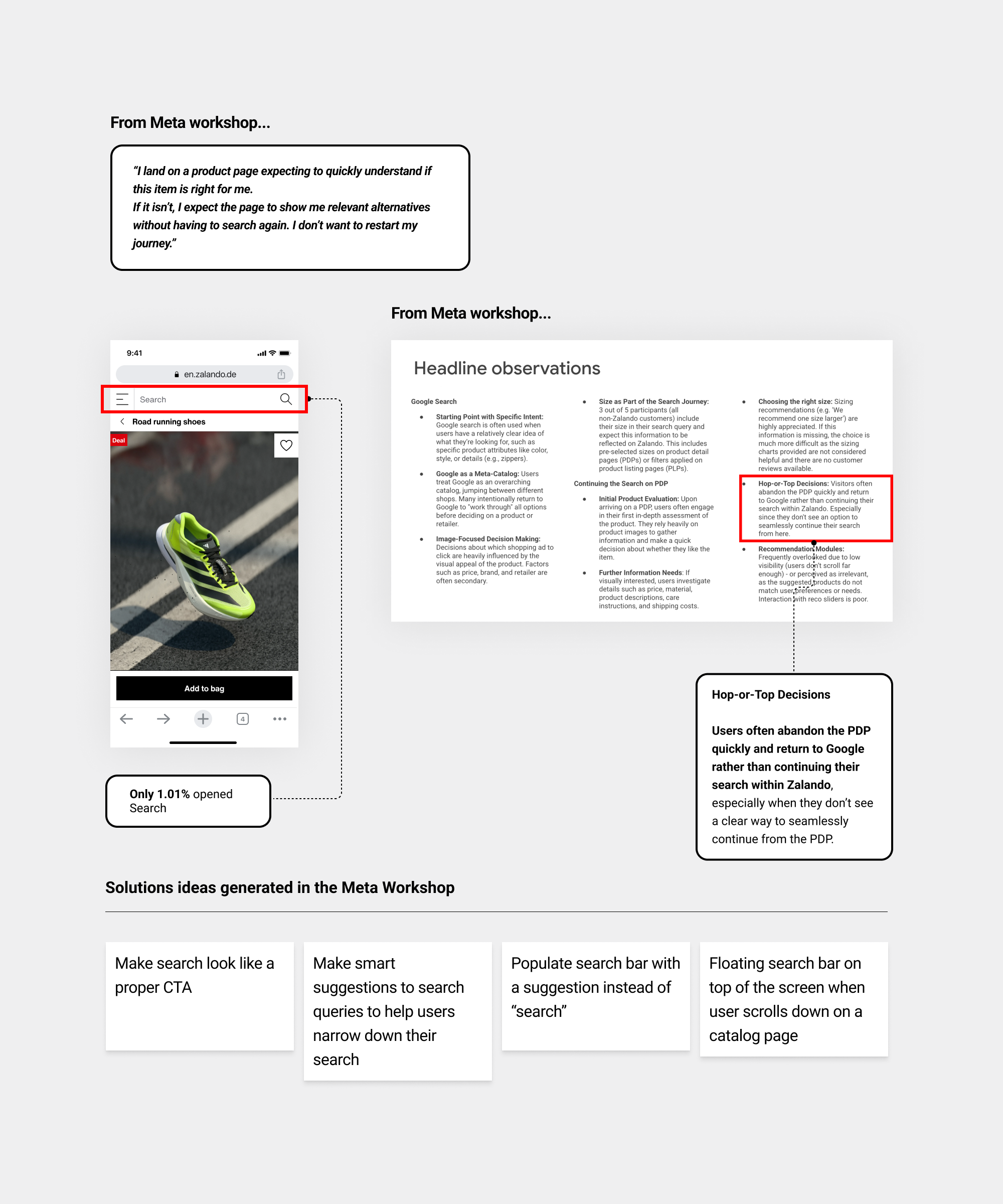
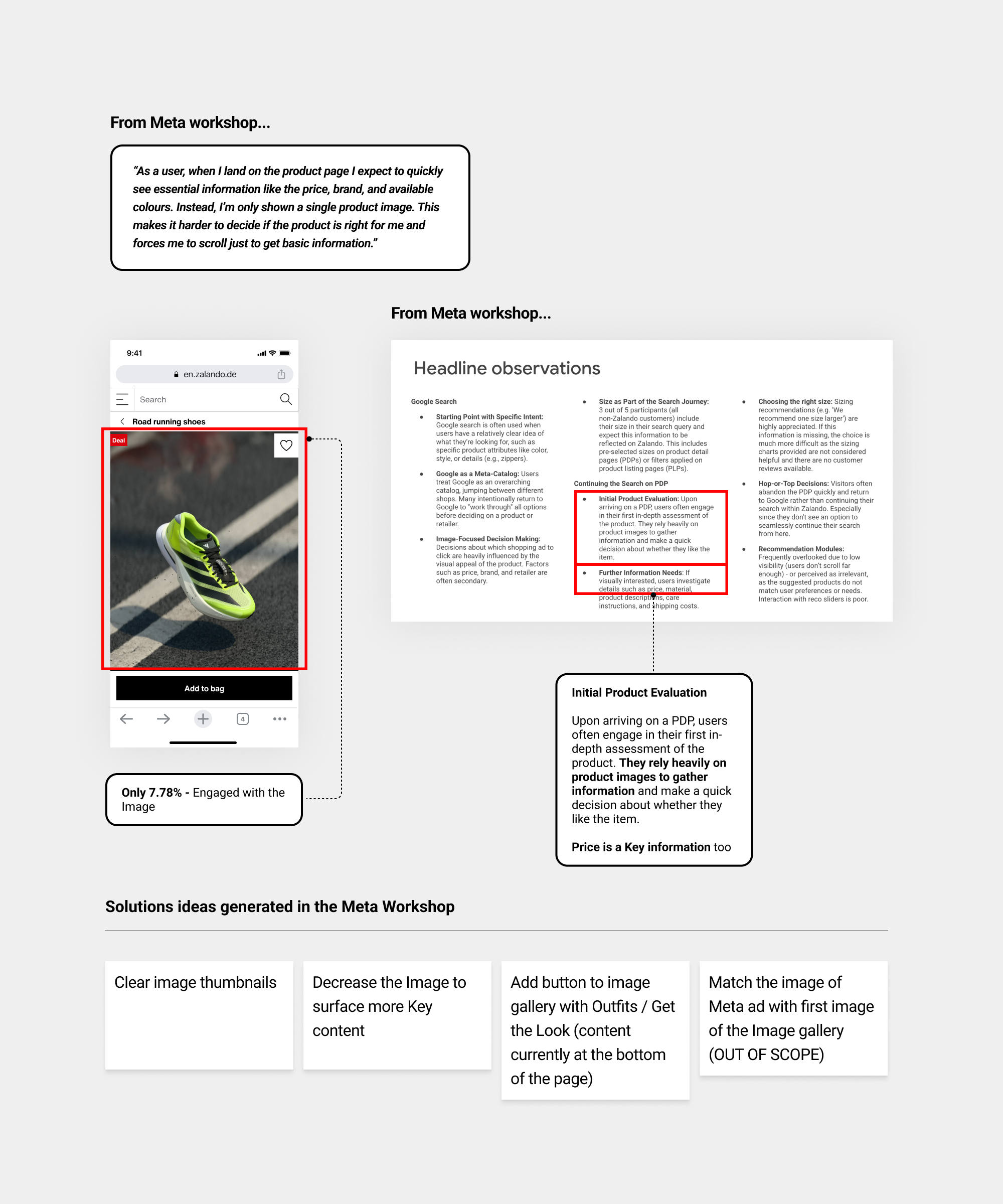
• Meta workshop
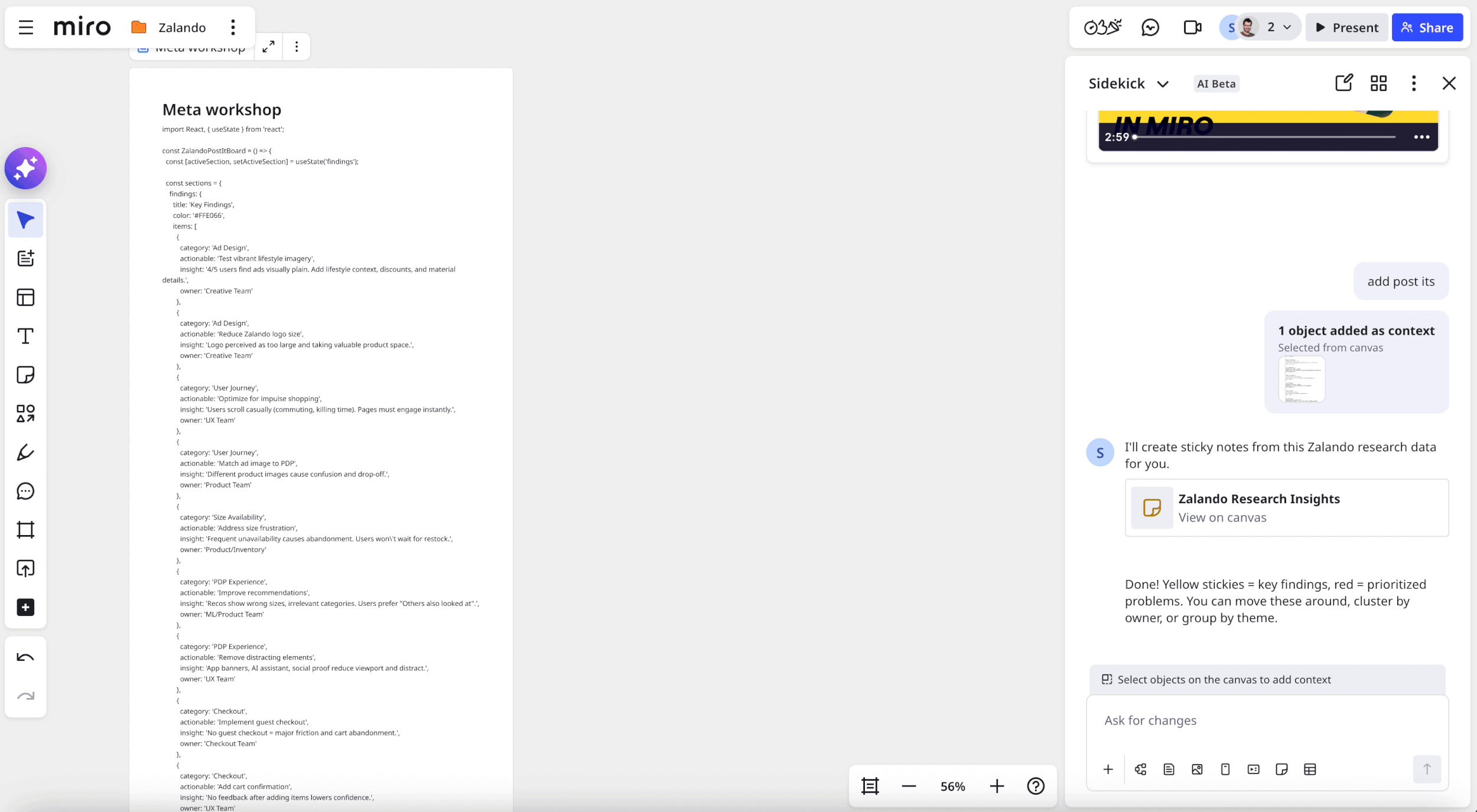
After the roll ou of cumulative Bundles , In July, Meta ran a workshop with the LPO team to improve the end-to-end journey from Facebook/Instagram ads to conversion, using insights from five user tests to identify key problems and testable hypotheses.
So I used ✦ Claude Opus 4.5 to extract all this information from a PDF report that meta created...So I pasted it in Miro for better visibility using ✦ AI sidekicks and reviewing it and polish it...
• Bundle 4 internal workshop brainstorming
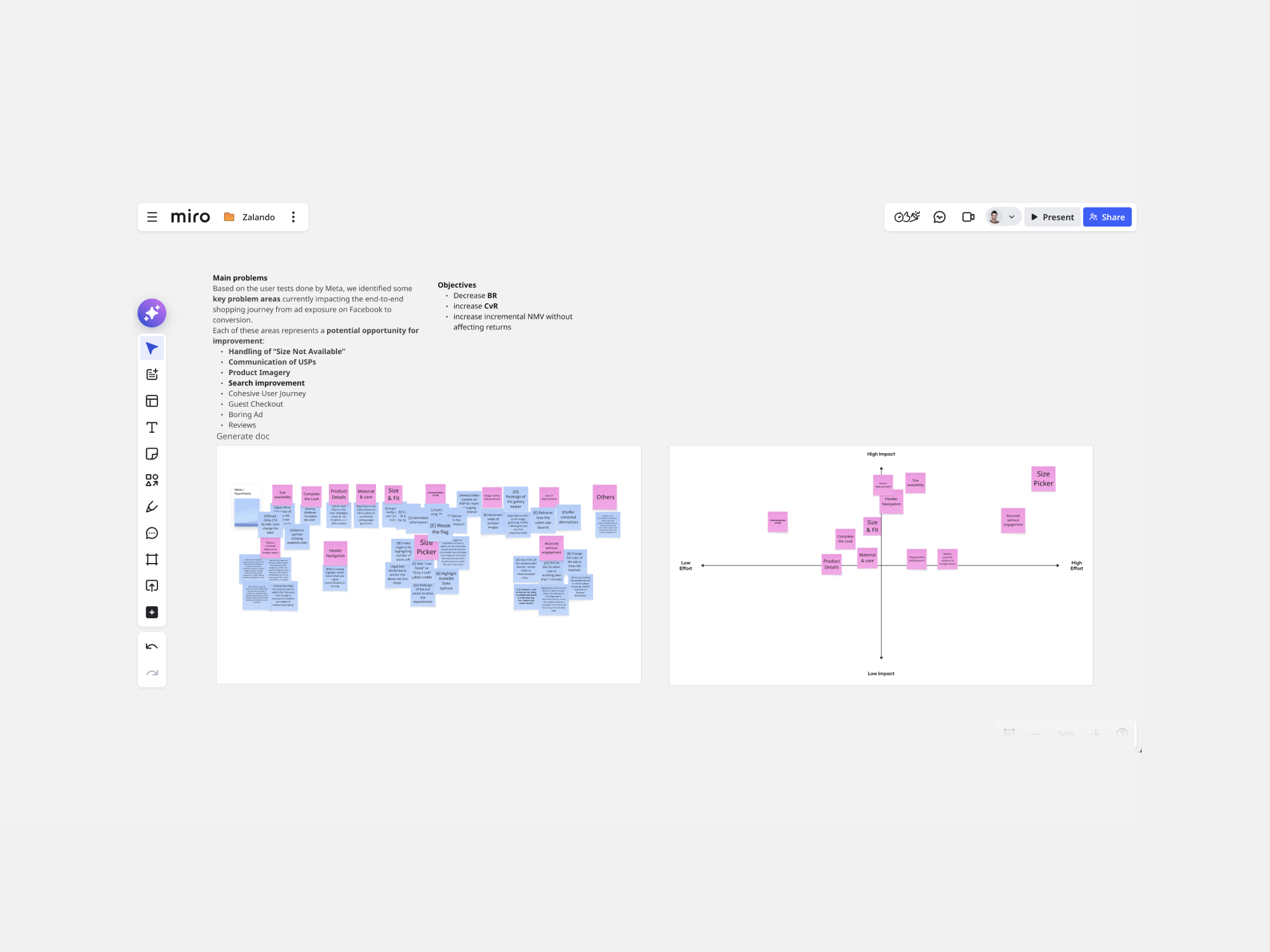
After the Meta workshop, I co-led an internal session with the PM to translate insights from Meta’s user testing into testable hypotheses. We brought the full LPO team together to align on these insights and start building a shared backlog of ideas.
While two key opportunities from Meta’s workshop—handling “Size Not Available” and improving USP communication—anchored the discussion, we also explored additional ideas informed by the broader set of user tests conducted by Meta.
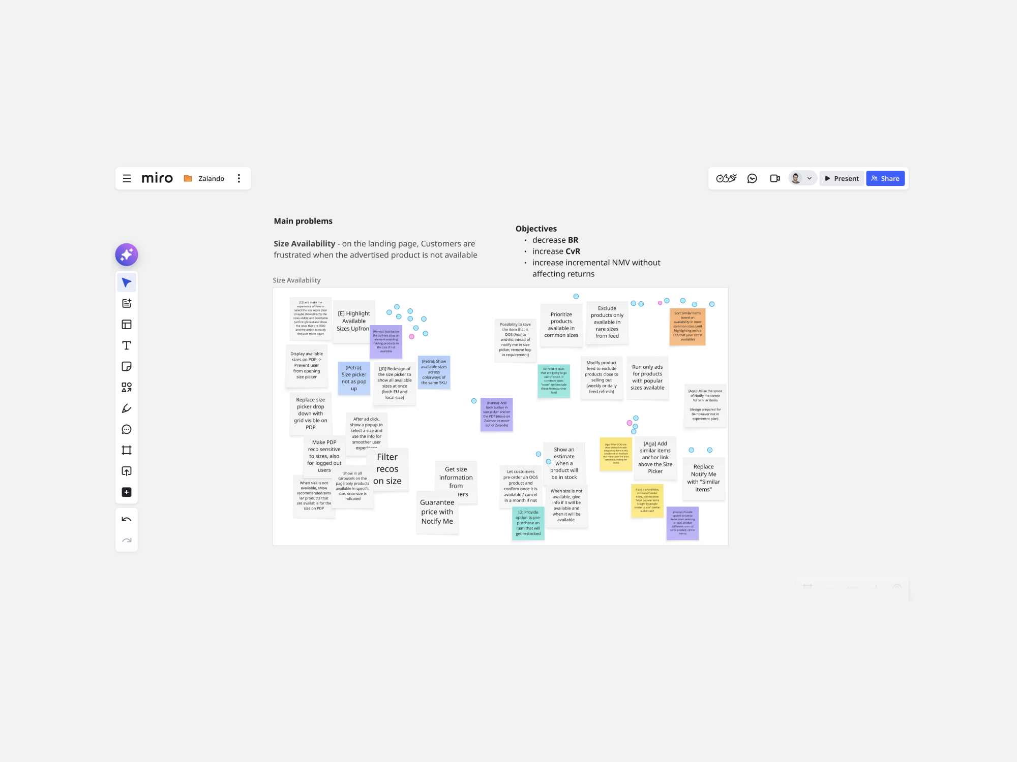
Bundle 4 (Check available sizes)
• Context
After Meta and internal workshop and the rollout of Bundles 1, 2, and 3, we explored how to make size availability more visible (Priority), working within existing constraints while targeting a quick win.
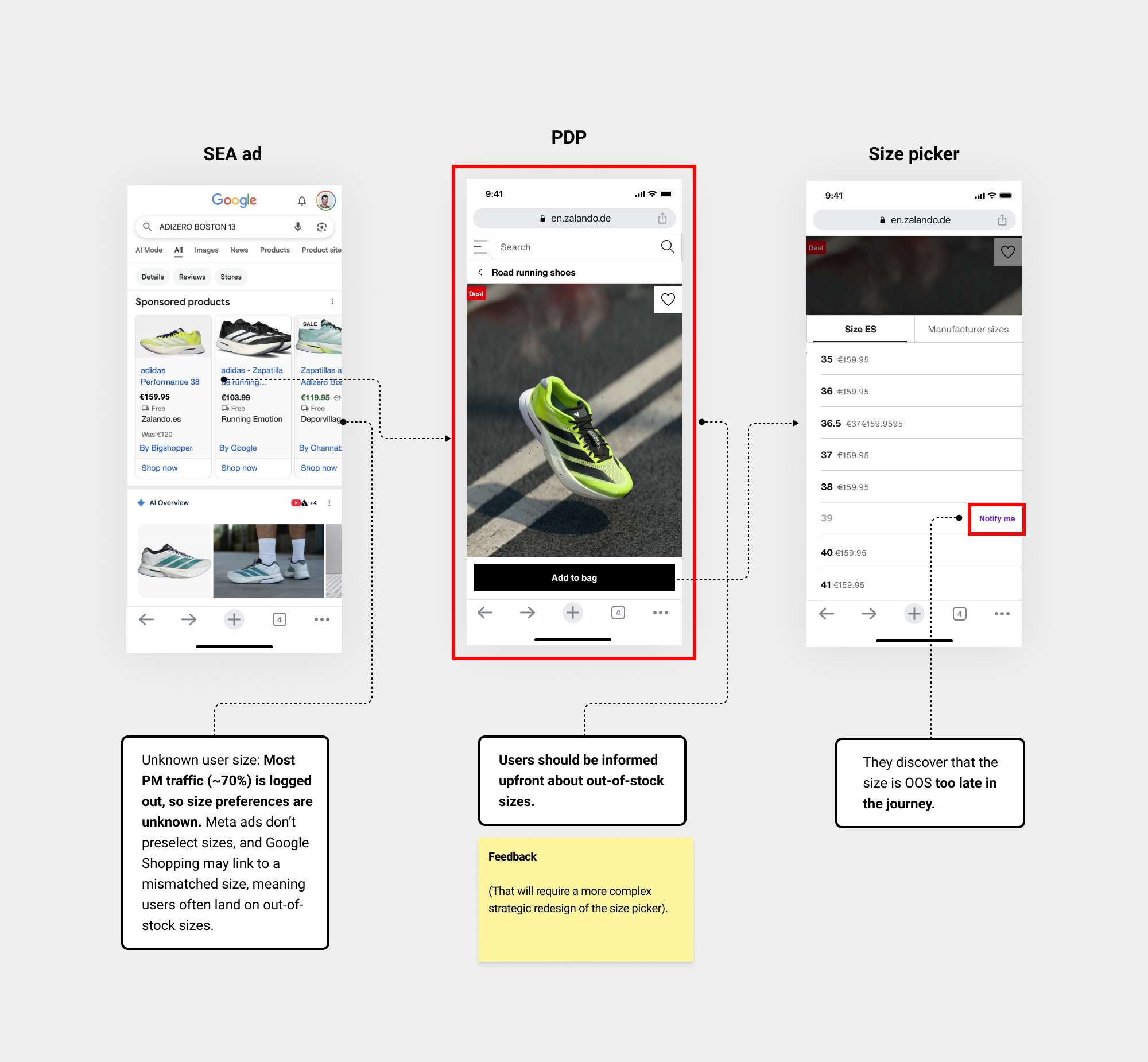
• Data/Insights
Insights from Meta workshops, supported by internal data, showed that…
• Iteration
I explored several hypotheses, but I’m highlighting the most representative one to focus on the key learnings.
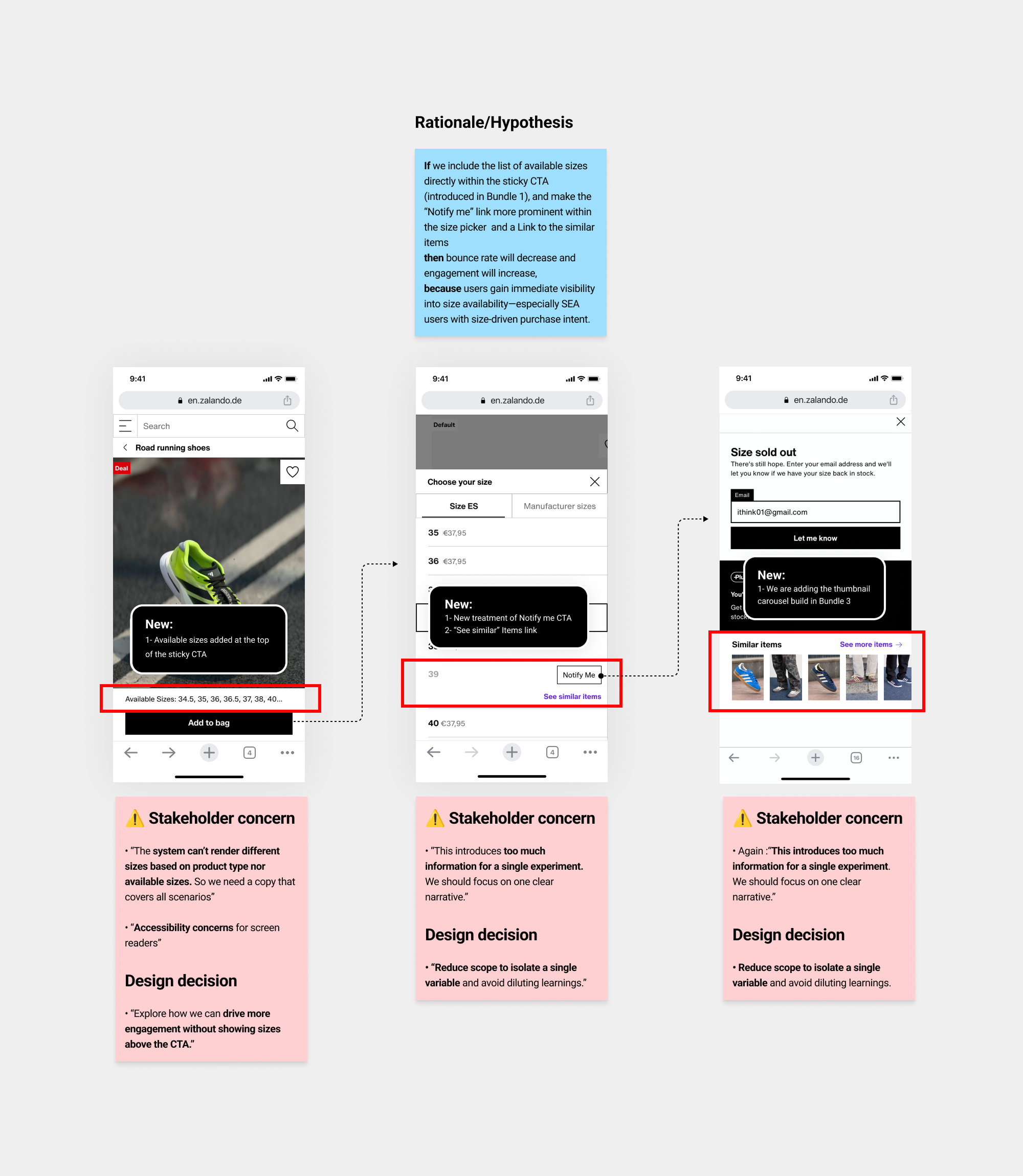
• Prototype
So after several iterations I arrived at a more tactical solution to anticipate size availability. Variant B became an iteration of Bundle 1, allowing us to keep the scope simple and focus on validating the core test objective and learnings.
• Design solution
• Experiment / Hypothesis-led
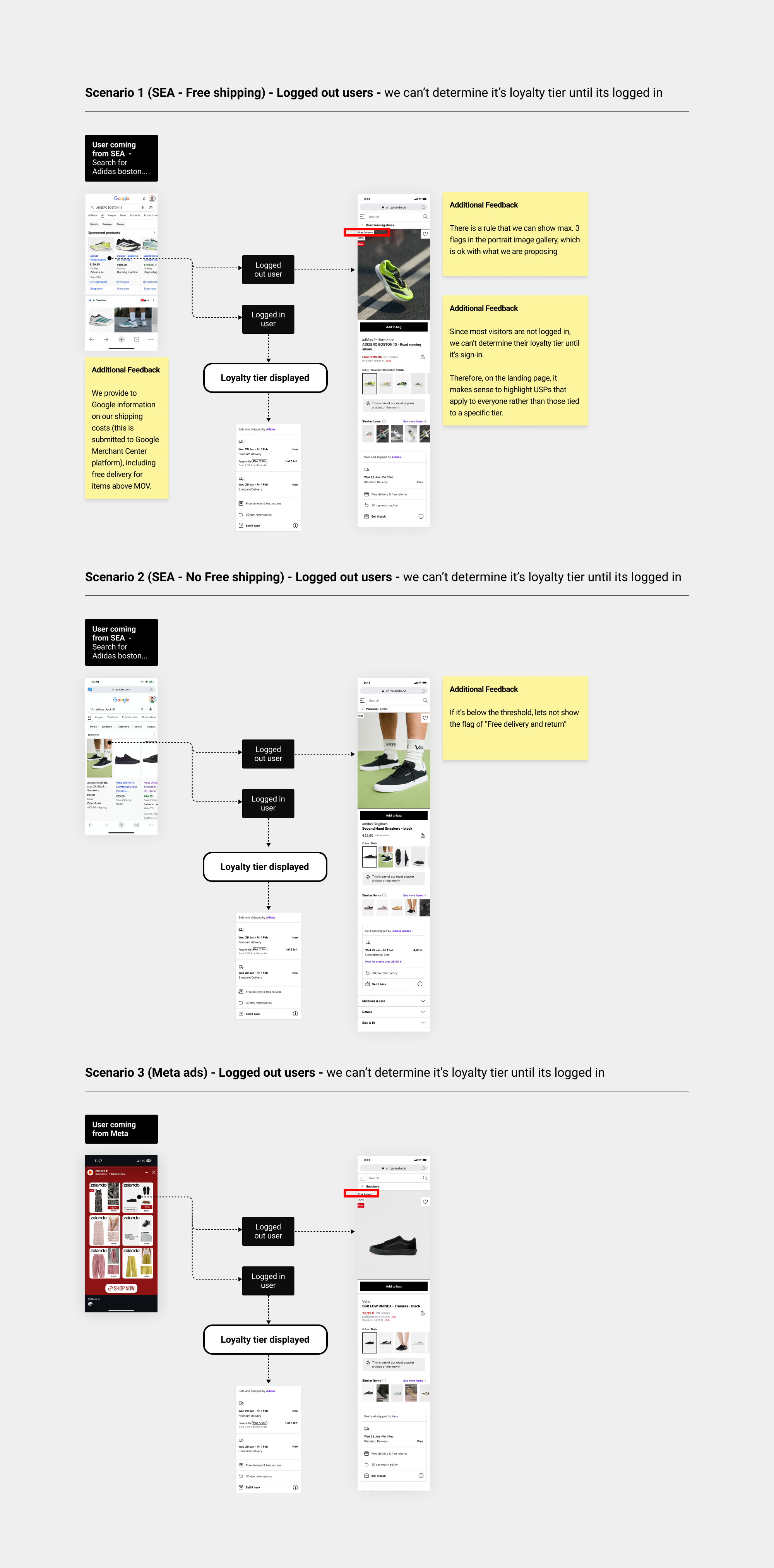
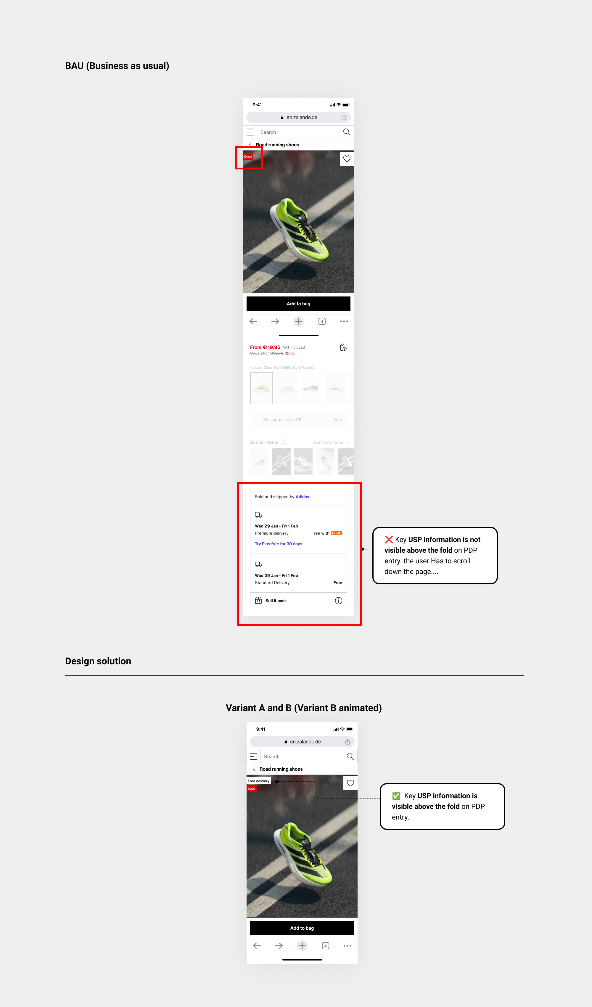
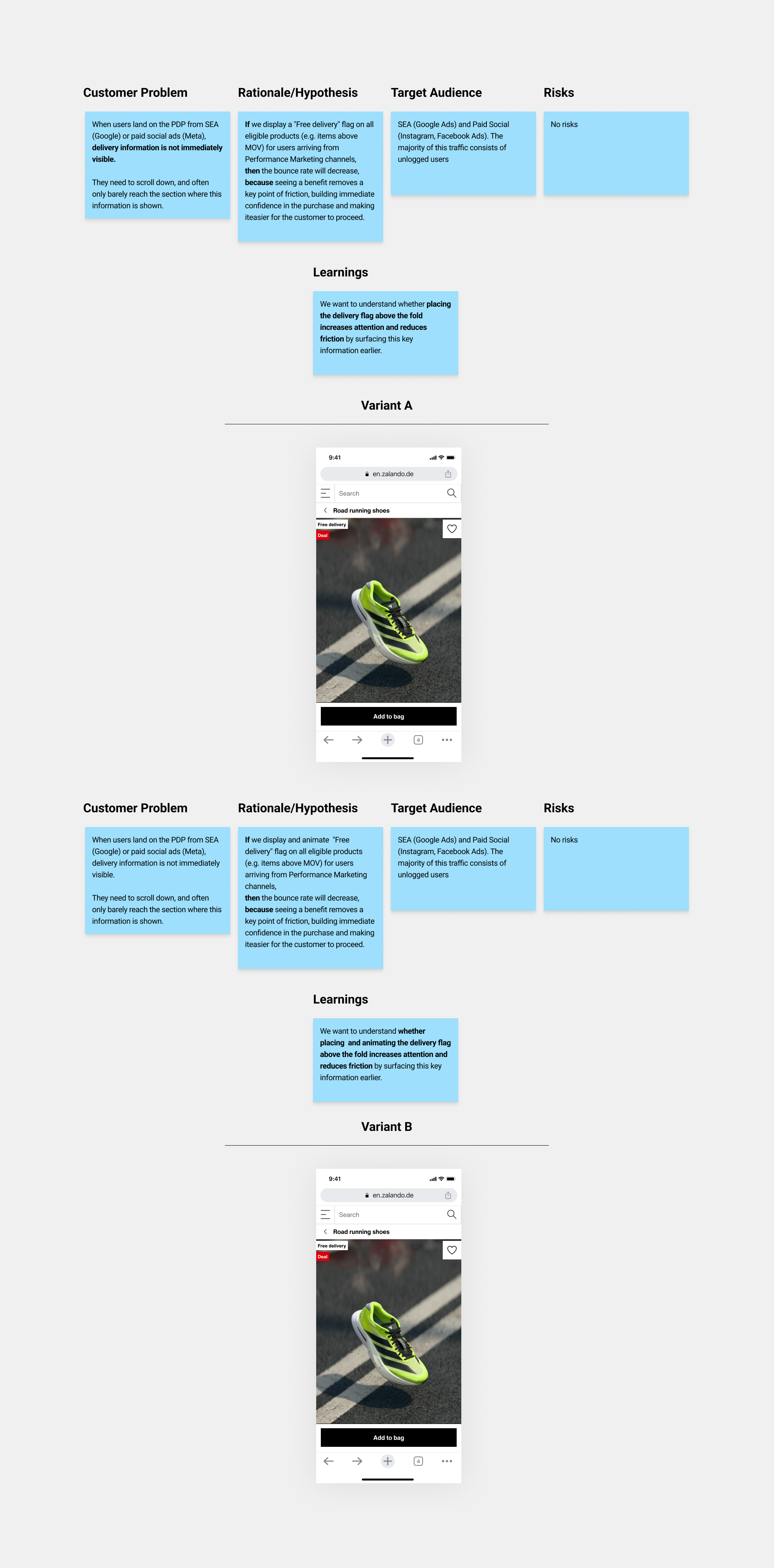
Bundle 5 (Free delivery Flag)
• Context
Users landing directly on the PDP need instant access to key USP information to validate their decision; delaying this increases bounce and early abandonment.
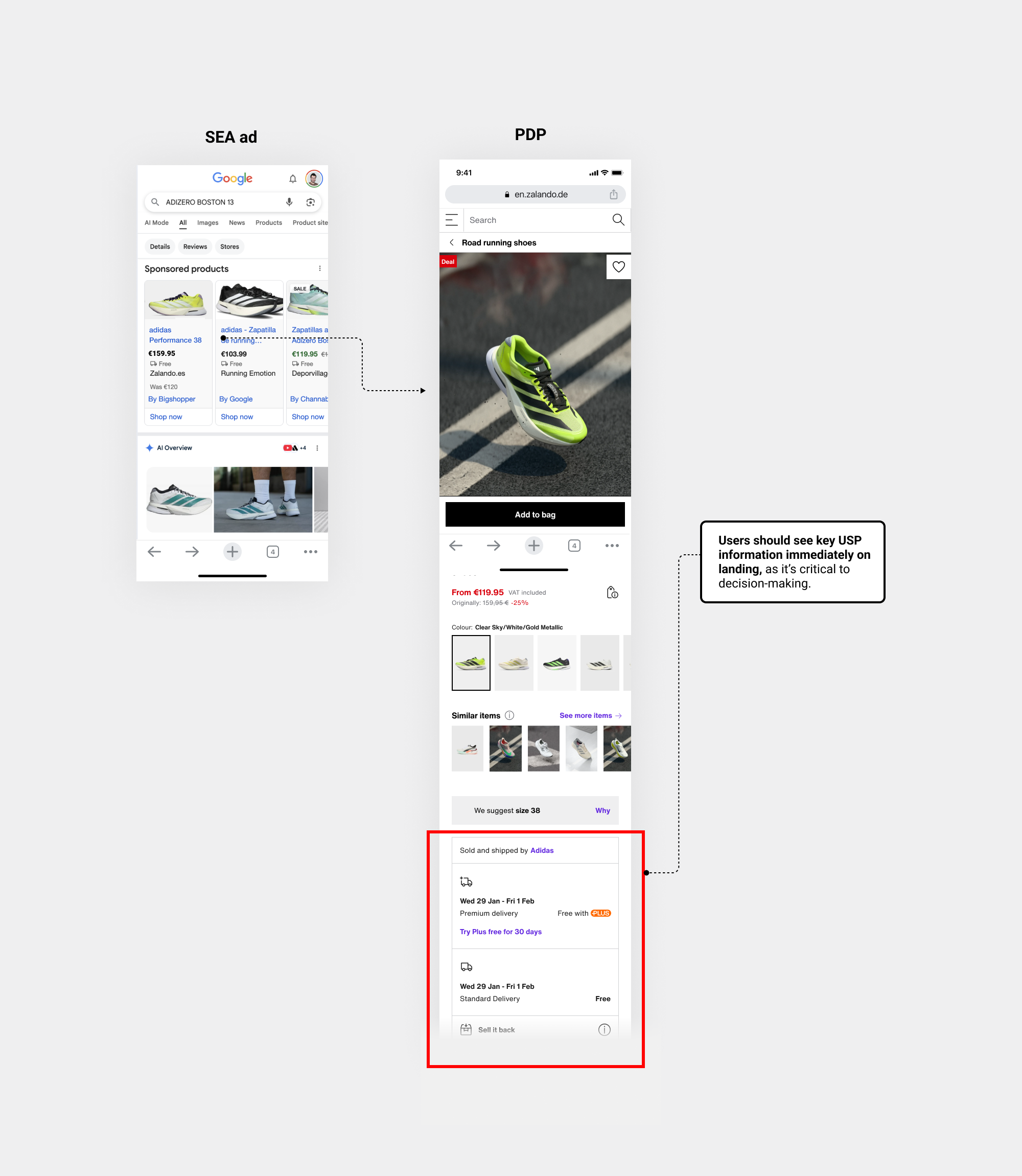
• Data/Insights
Insights from Meta workshops, supported by internal data, showed that…
• Iteration
I explored several hypotheses, but I’m highlighting the most representative one to focus on the key learnings.
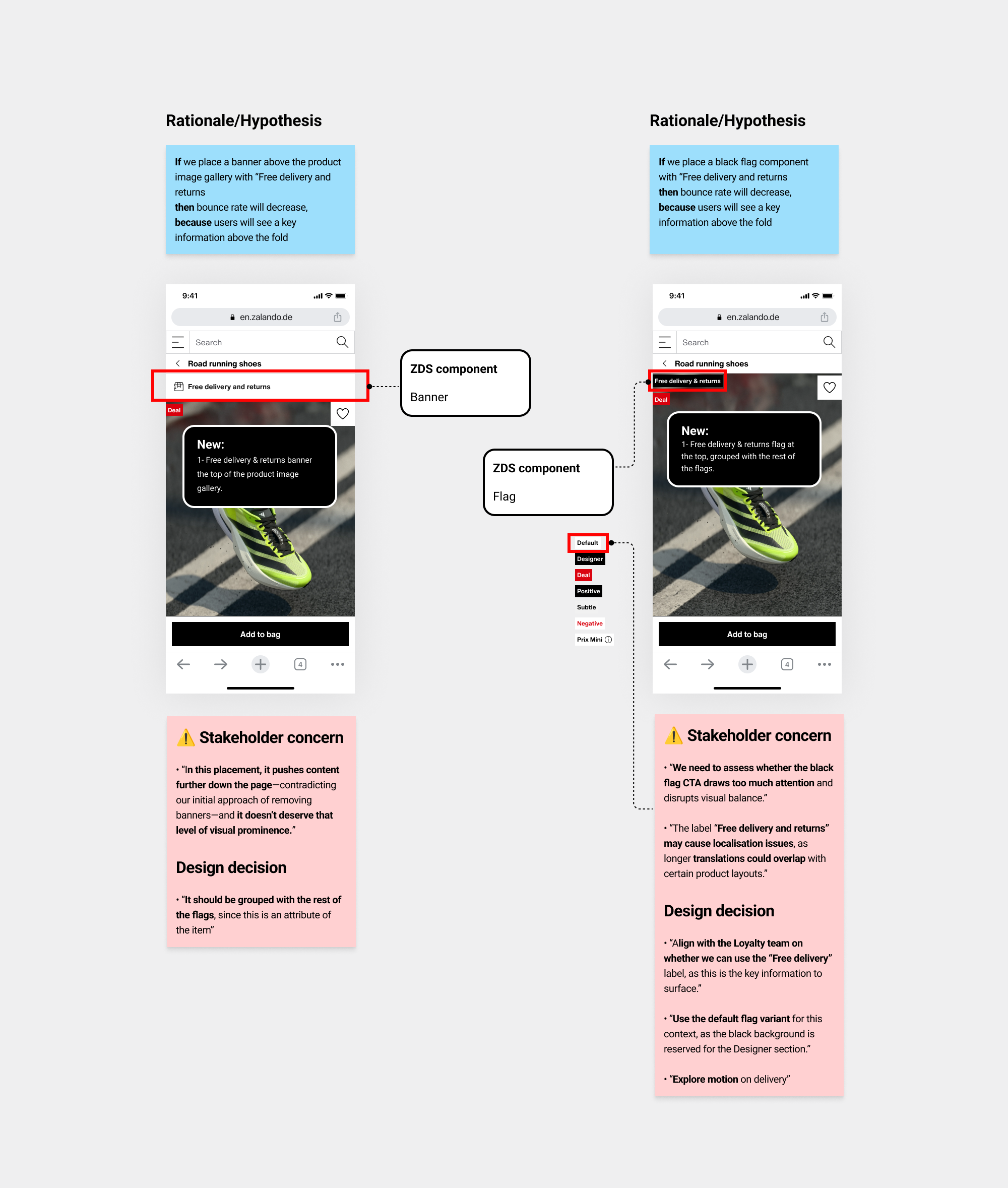
I iterated using the “Default” variant of the flag component, I had several iterations with Ref.Store engineers and designers to understand when and how the loyalty tier can be determined for both logged in and logged out users.
• Prototype
After aligning with the ZDS and Ref.Store team on using the Flag component, I explored two variants and I aligned with them on the motion guidelines for Variant B, aligning with the 2026 rebranding direction.
• Design solution
• Experiment / Hypothesis-led
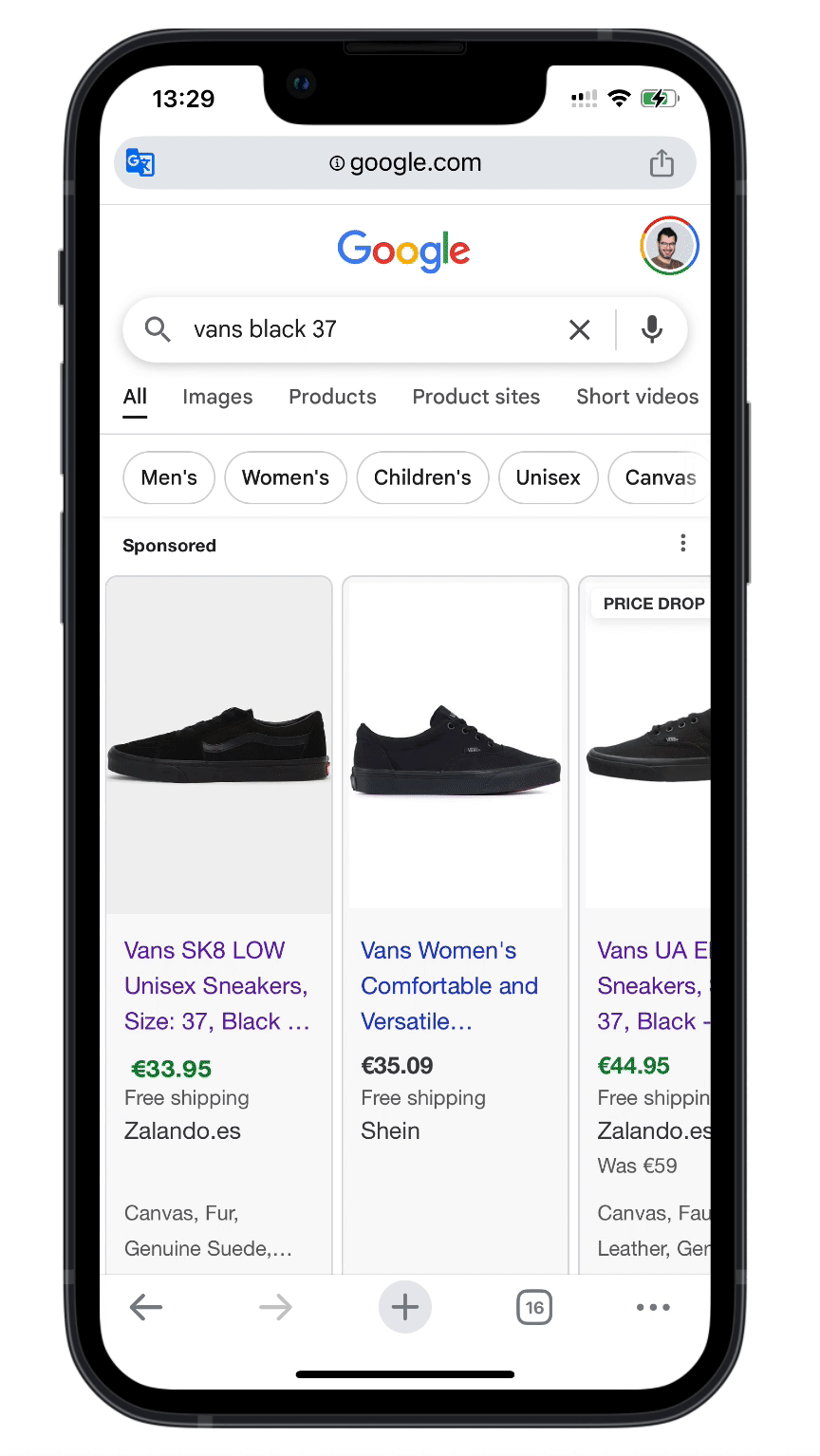
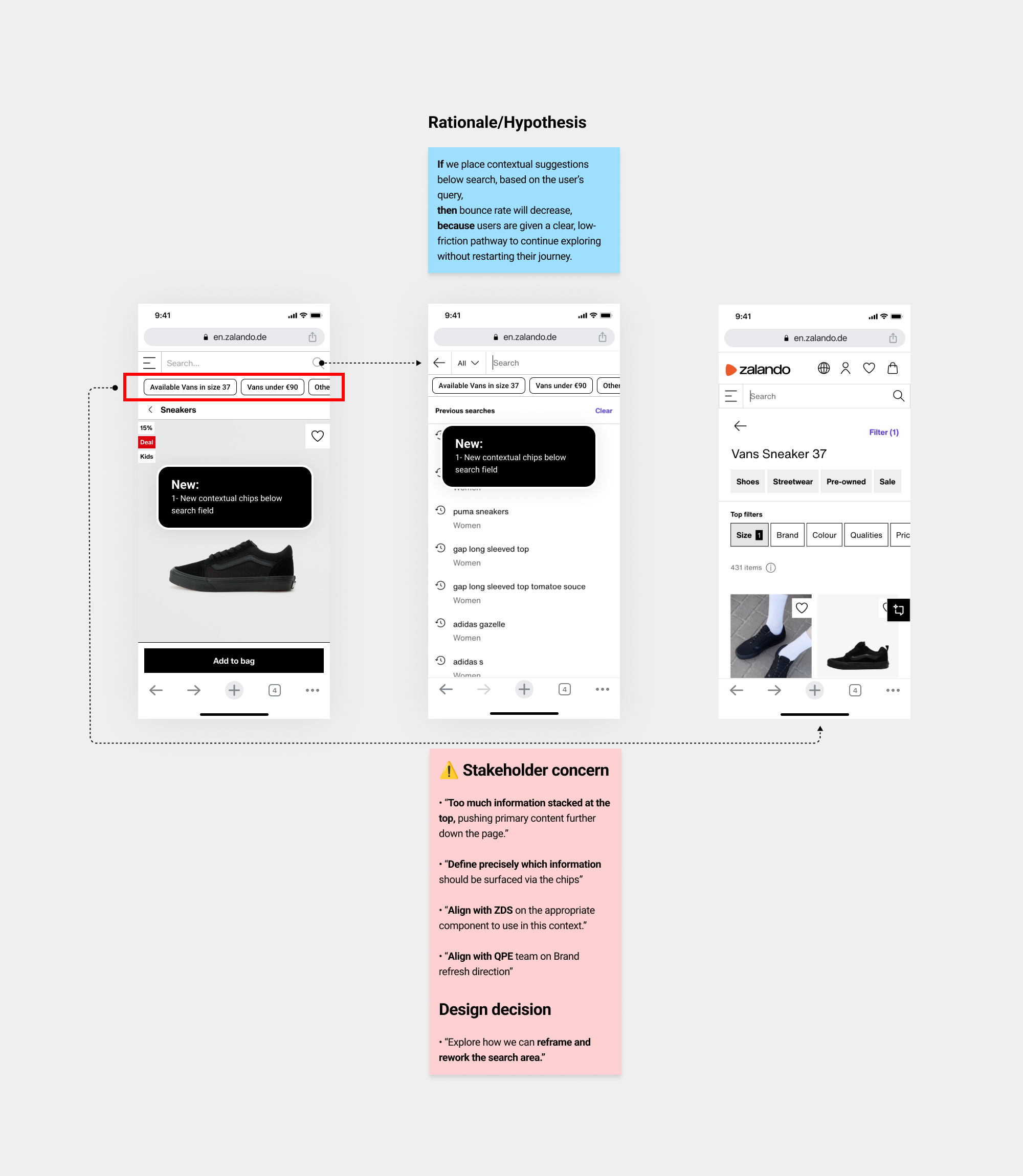
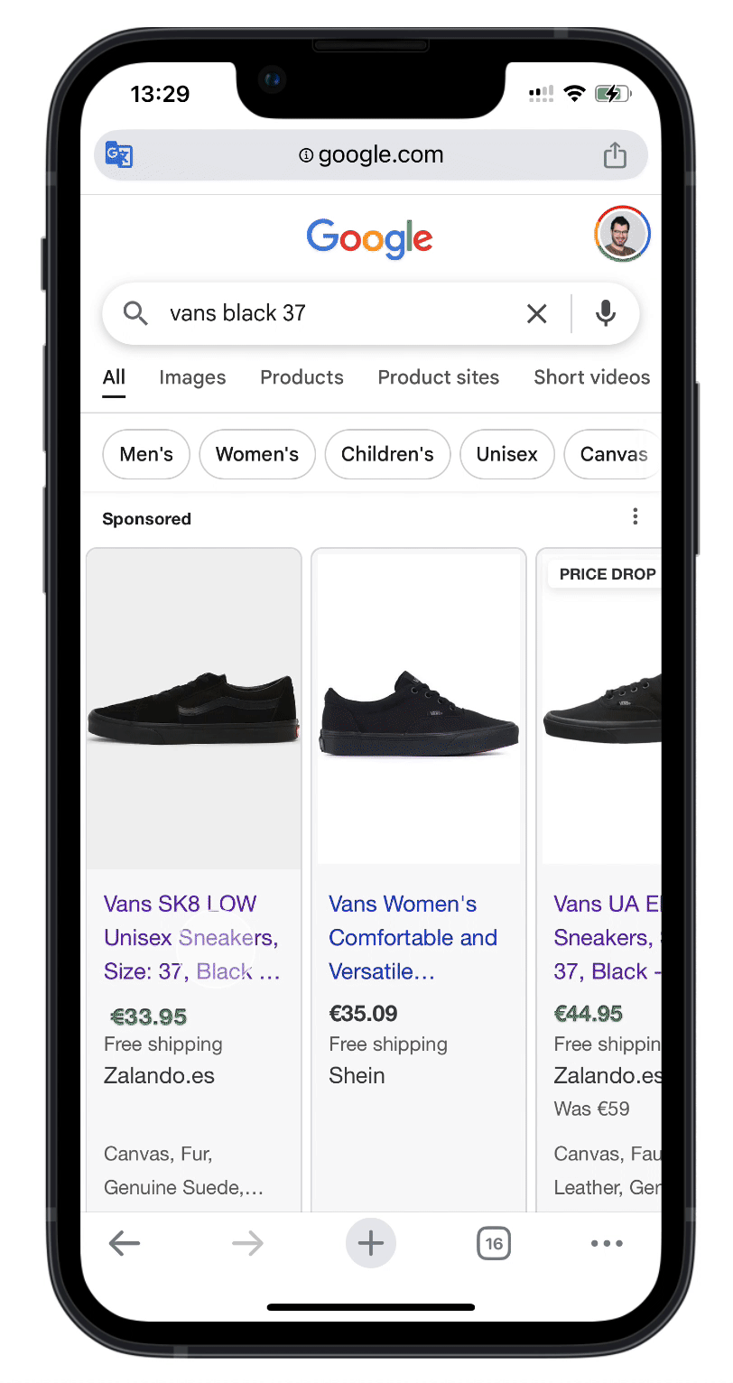
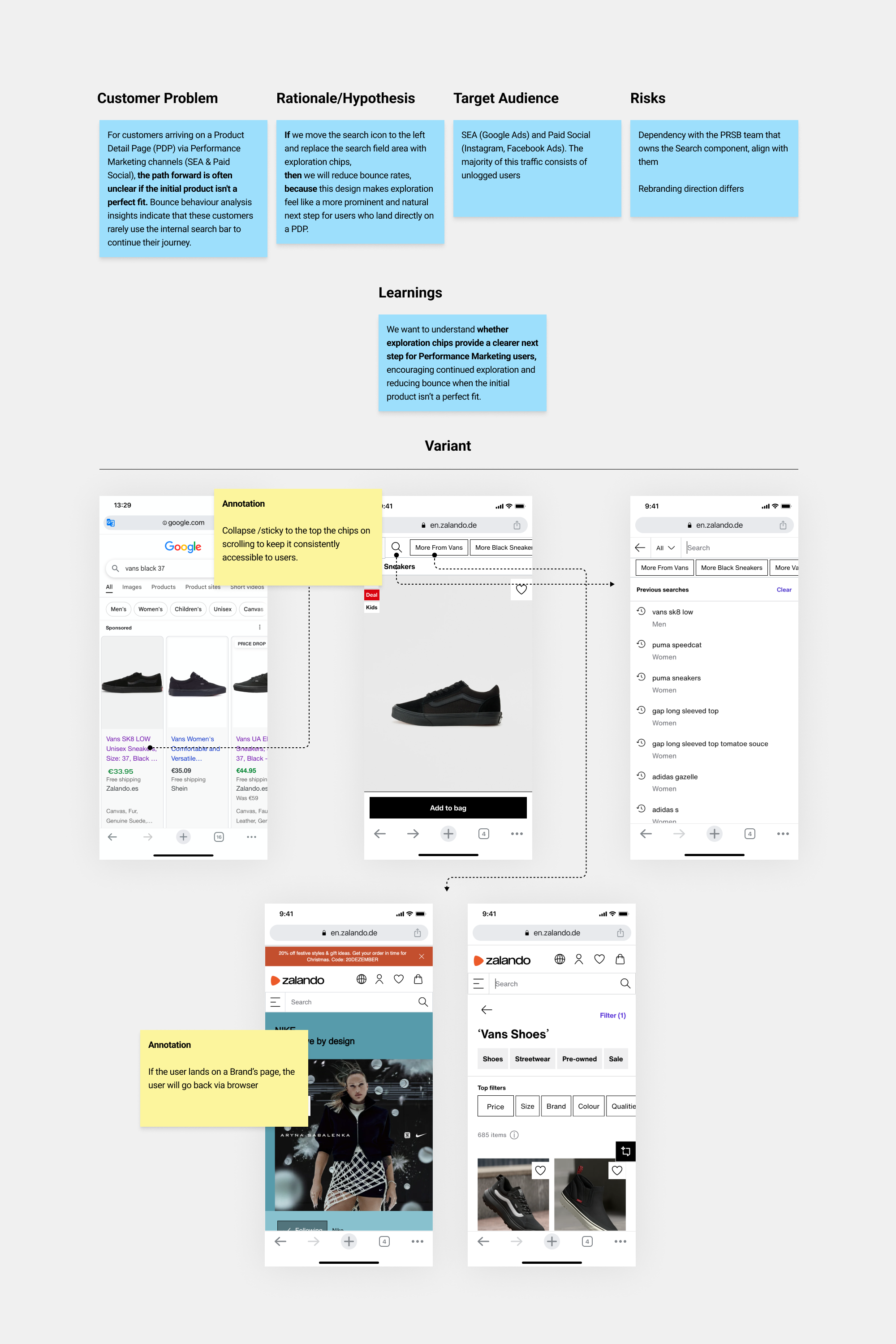
Bundle 6 (Contextual chips)
• Context
Users landing on PDPs from Performance Marketing channels often lack a clear, low-friction path to continue exploring if the initial product isn’t a good fit.
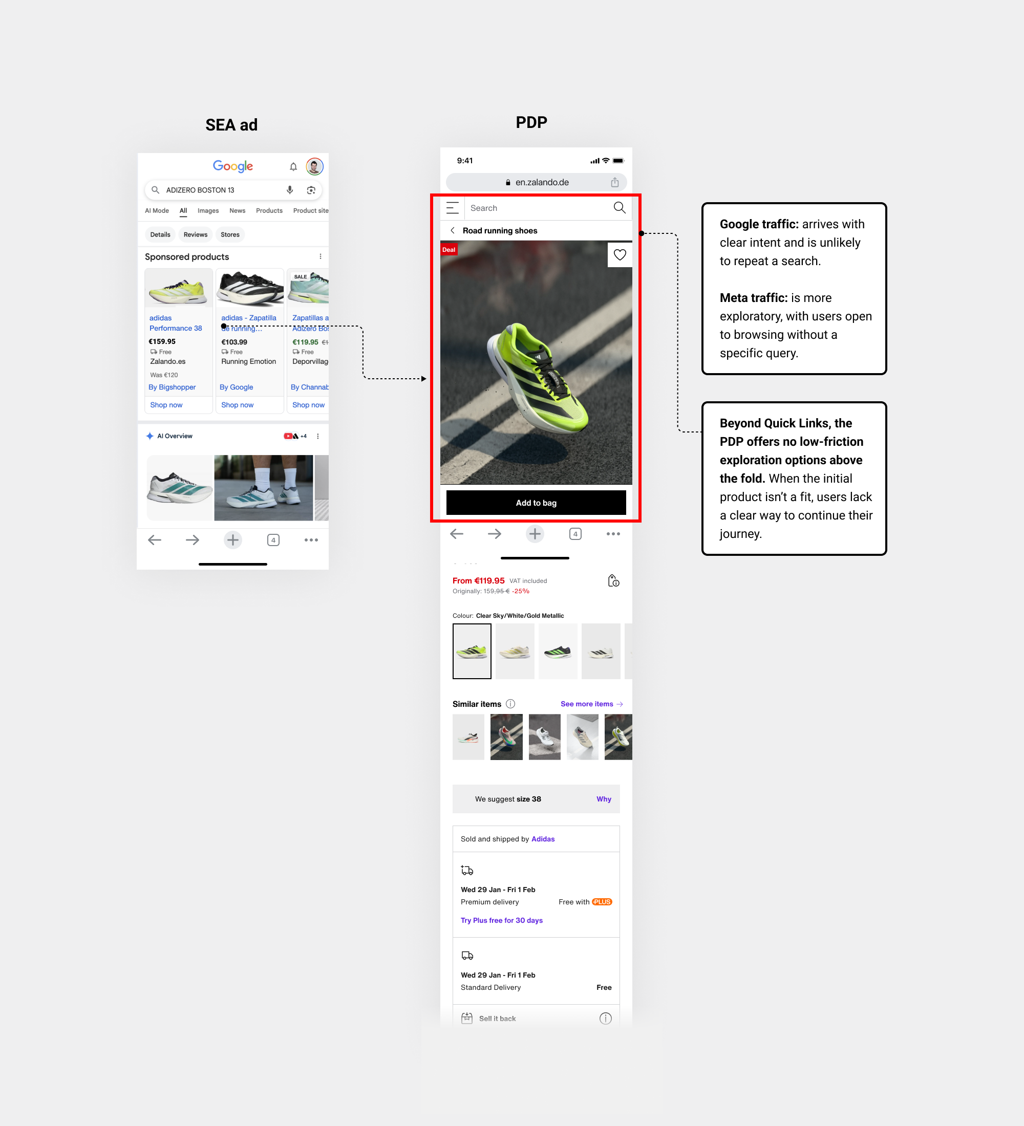
• Data/Insights
Early research signals and insights from the initial Google workshop pointed to this behaviour...
• Iteration
I explored several hypotheses, but I’m highlighting the most representative one to focus on the key learnings, so I created a quick prototype in Figma to gather early feedback...
So iterated based on feedback...
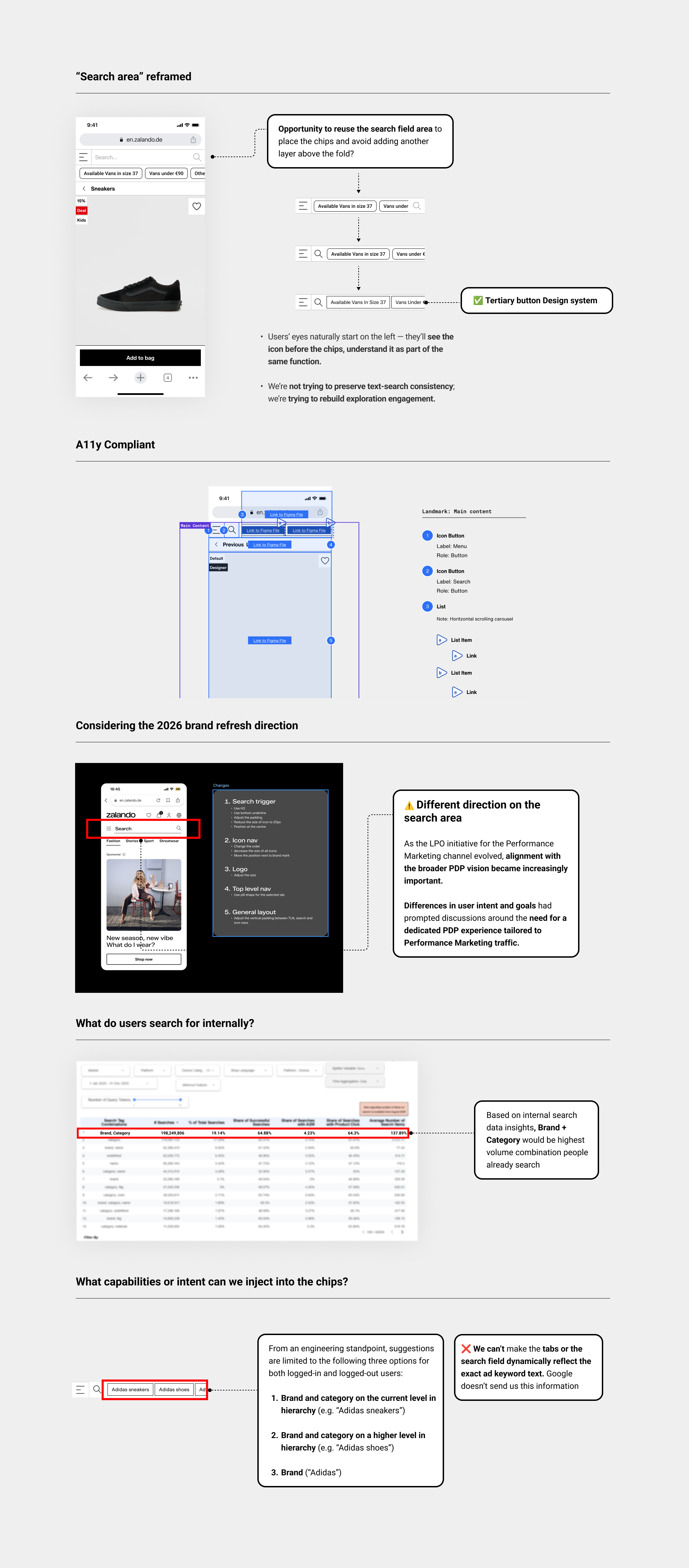
• Prototype
Incorporating the feedback gathered from internal reviews and broader cross-departmental discussions, I presented the final prototype.
Personalisation 2026: What models can be leveraged in 2026 for Bundle 6?
I designed the contextual chips as a system-level architecture, enabling the strategic rollout of personalisation models planned for 2026 and how we can anticipate from user actions. That’s exactly how we wanted scale learning without UX debt.
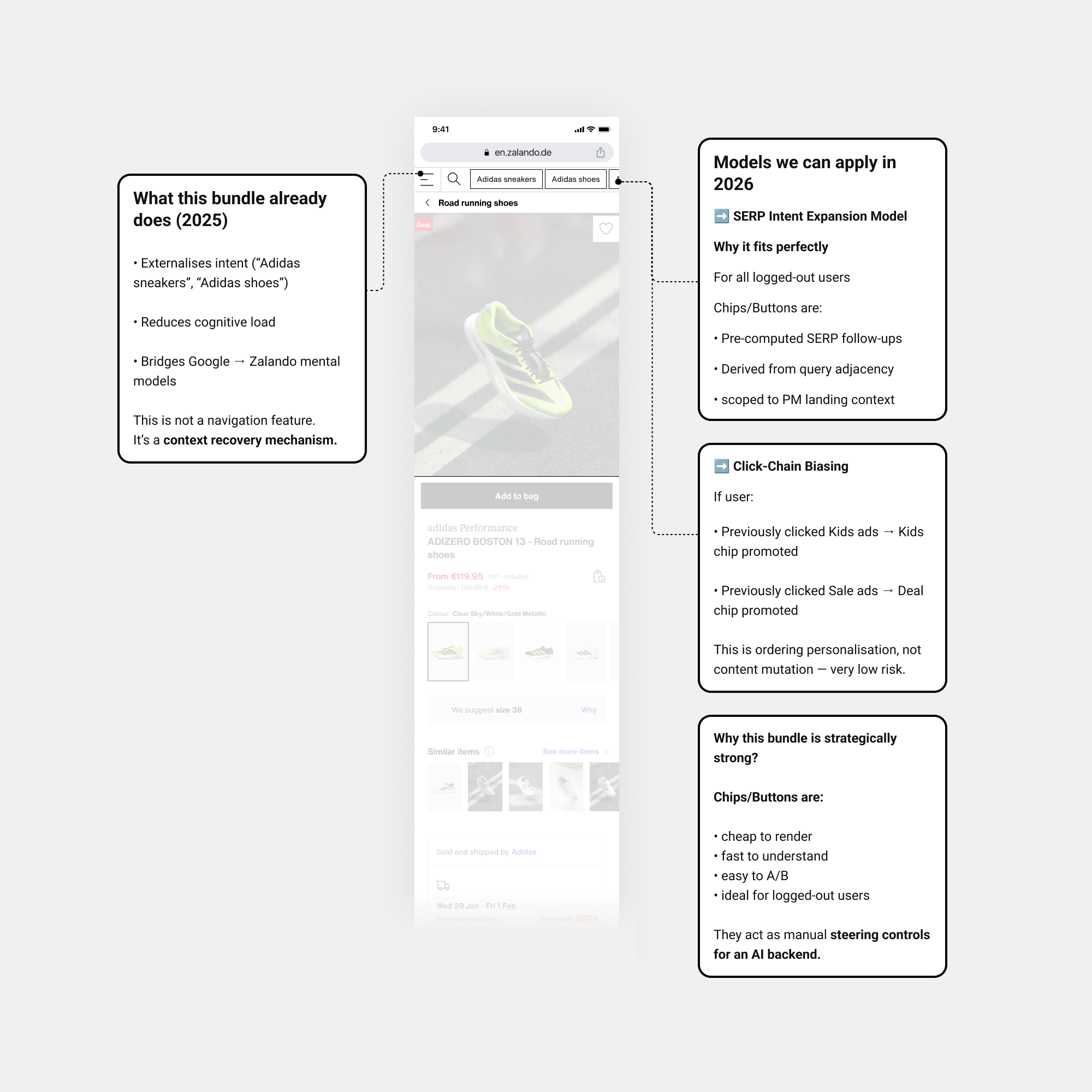
• Design solution
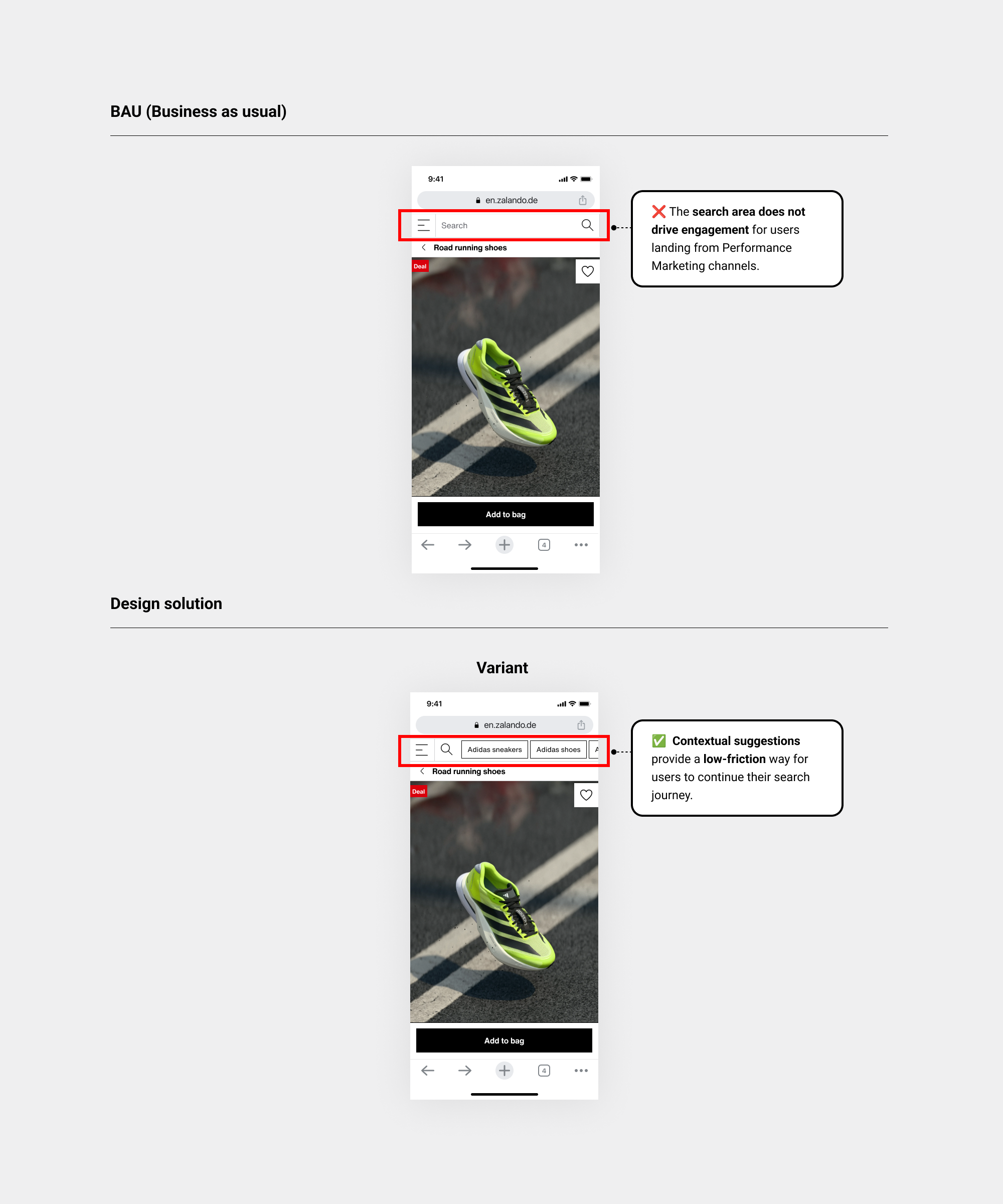
• Experiment / Hypothesis-led
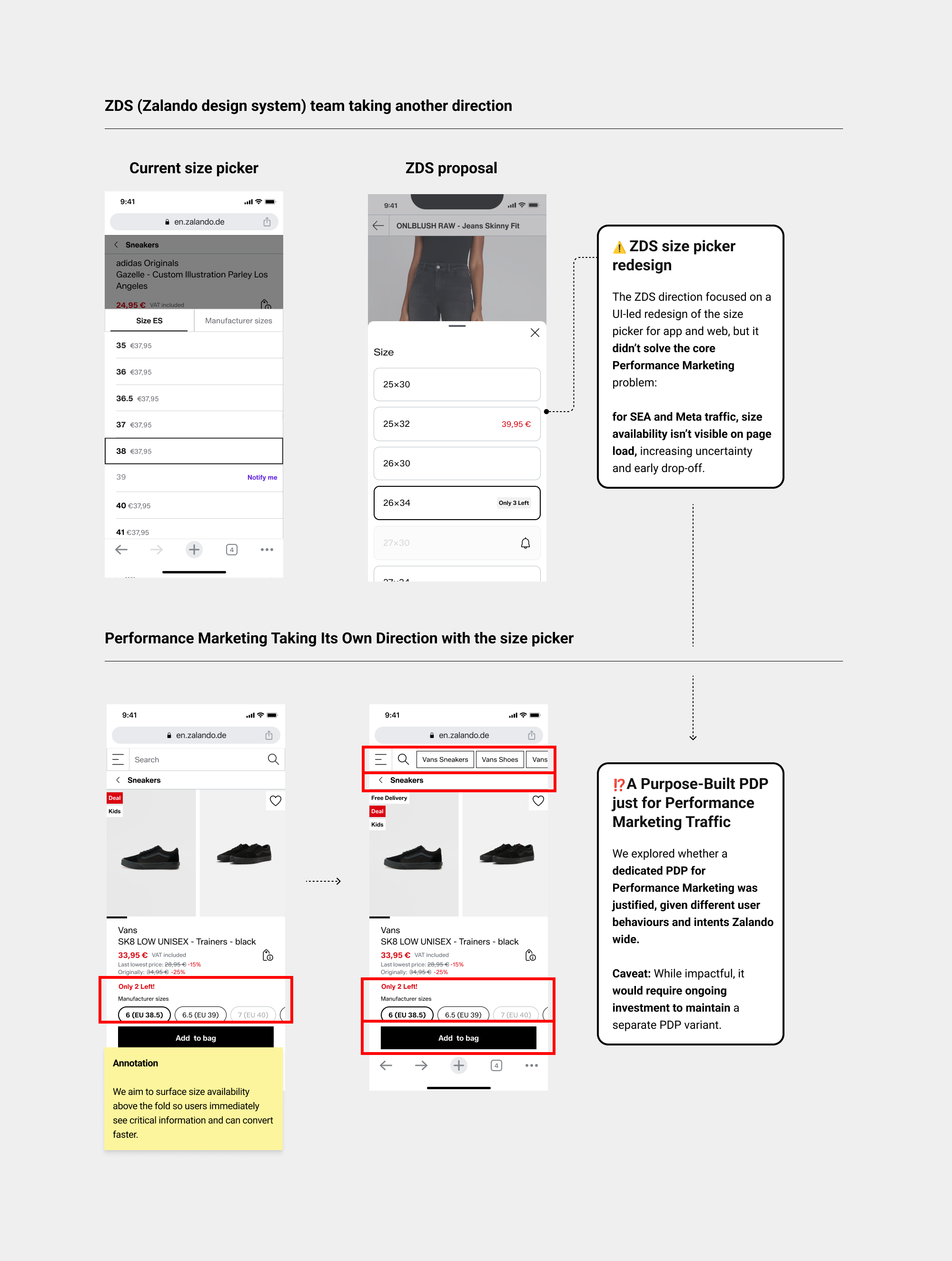
• Size availability Brainstorming workshop
Building on this, Bundle 4 iterated on Bundle 1 to address size availability, but knowing larger gains required a more impactful change, I co-led an LPO team brainstorming session to generate new hypotheses for the size availability problem.
• Strategic vision prototype
I built a strategic prototype in ✦ Figma Make to visualise the future PDP for the Performance Marketing channel, which was validated with LPO and senior stakeholders and informed the next phase of bundle ideation (Work on Product Image gallery size)
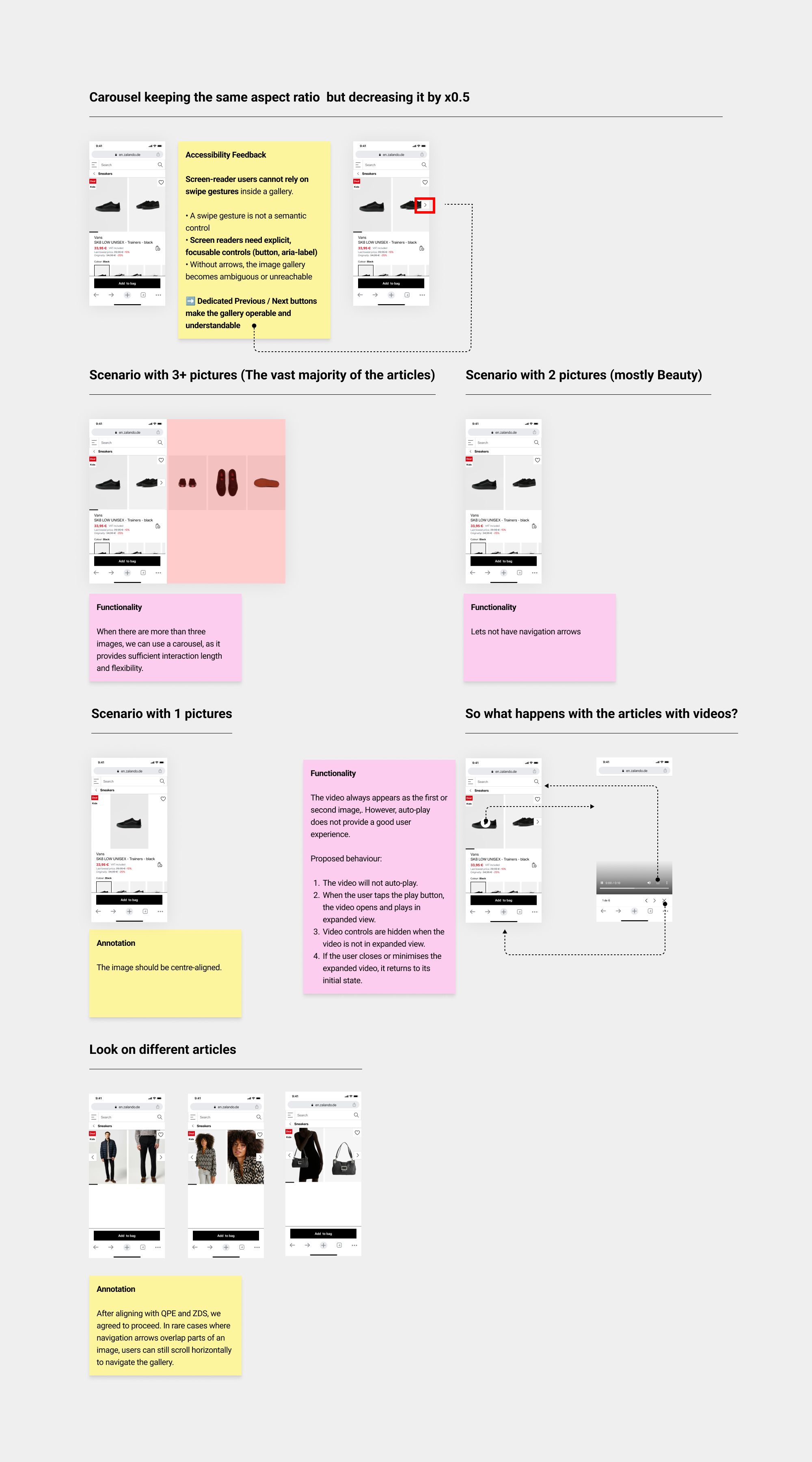
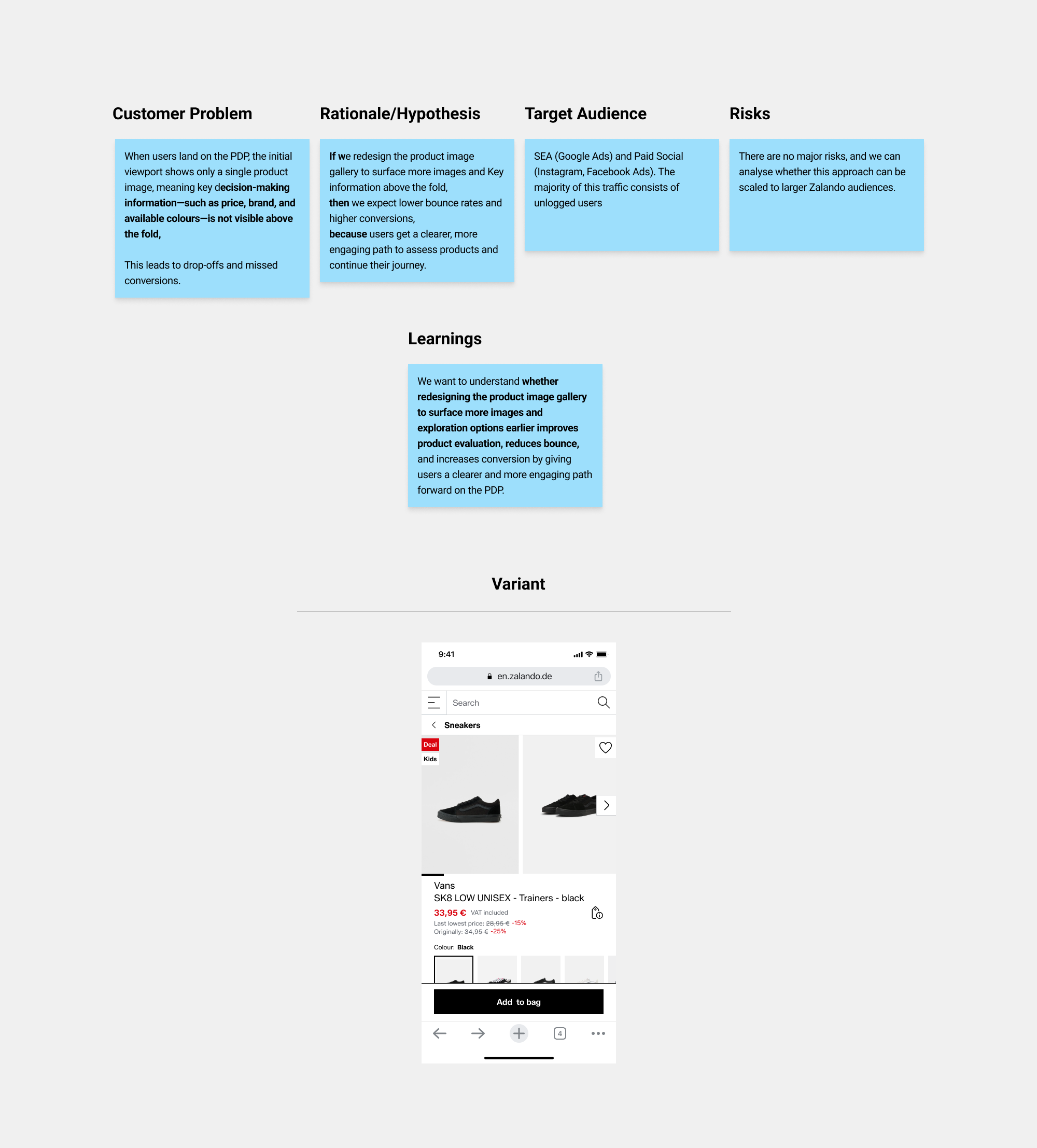
Bundle 7 (Product image gallery)
• Context
The current image gallery prioritises visuals but limits the visibility of key decision-making information above the fold. This creates friction and delays users from accessing the details they need to make a confident decision.
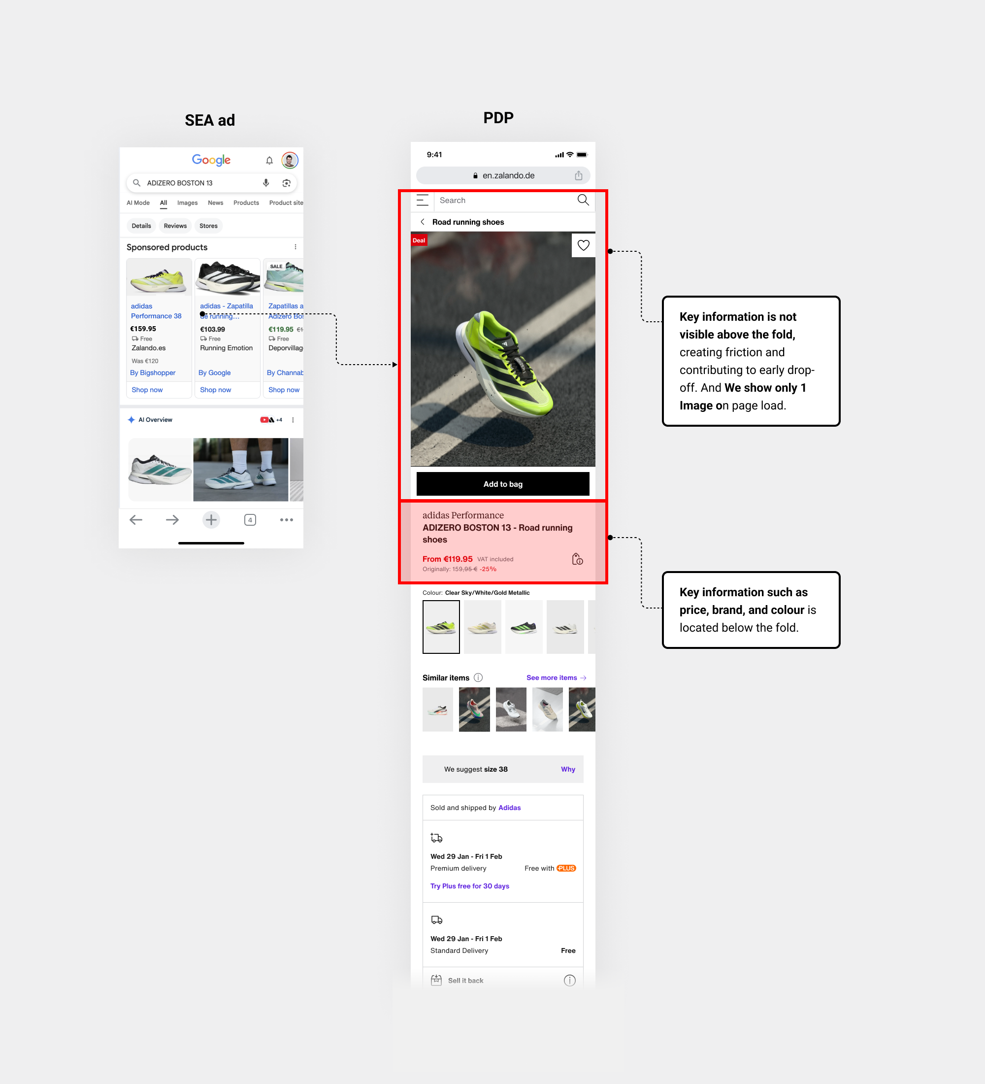
• Data/Insights
Insights from Meta workshops, supported by internal data, showed that…
• Strategic exploration based on current Product Image Gallery
A key hypothesis from the Meta and internal workshops was that redesigning the size picker could be a strategic lever, as size availability wasn’t visible upfront.
• Align with cross-functional teams on redesign directions.
• Prepare the PDP to surface the size picker above the fold by reducing the image aspect ratio and freeing up viewport space .
• Exploration Product Image gallery
I analysed various aspect ratios in ZDS, ensuring the proposal was accessible, scalable across all Zalando products, and covered all relevant scenarios.
• Experiment / Hypothesis-led
-Appendix-
Web to App Fix experiment
As part of the LPO project, we analysed the Meta ads journey and identified a key drop-off: around 18% of users were redirected to the in-app browser instead of the app, contributing to higher bounce rates.
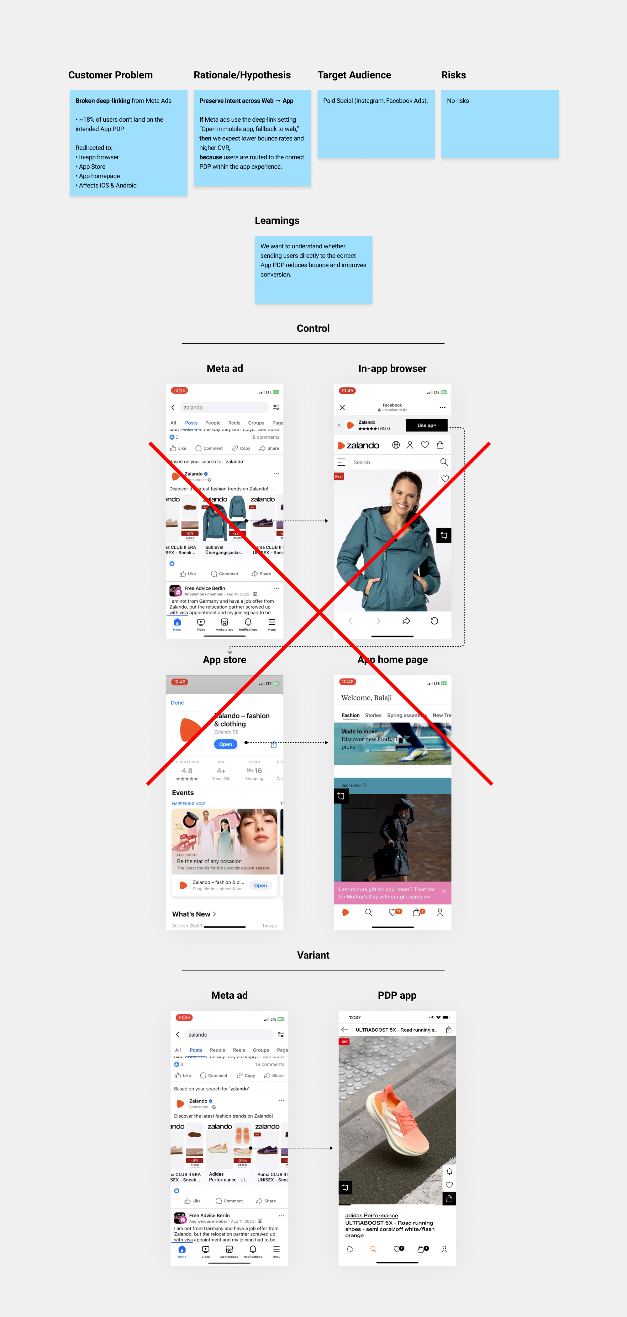
• 🚀 Learnings and Rollout decision
We learned that preserving intent behaviour from Web → App by fixing deep-link behaviour removes redirections and friction. Users land directly on the correct App PDP, improving continuity for PM traffic.
• CVR: +4%
• BR: -2%
Rollout decision: The hypothesis was validated and we rolled out this feature to PM channel.
☝ This was a key contributor to the +4% CVR uplift in 2025 Goals, as other tests introduced a login wall for logged-out users, increasing friction.
Zalando assistant experiment
In Bundles 1-3 we reduced bounce rate by deliberately removing distracting elements on PDPs. As part of the rollout conditions, a follow-up confirmatory test was required to:
• Validate whether removing the Zalando Assistant improves performance.
• Quantify its impact on Bounce Rate and Conversion Rate.
➡ I challenged the PM to extend the KPI set beyond Add-to-Bag CTR to also include CTR on Quick Links, Search, and the Favourites icon, ensuring we could accurately assess how much other PDP elements were competing the Zalando Assistant.
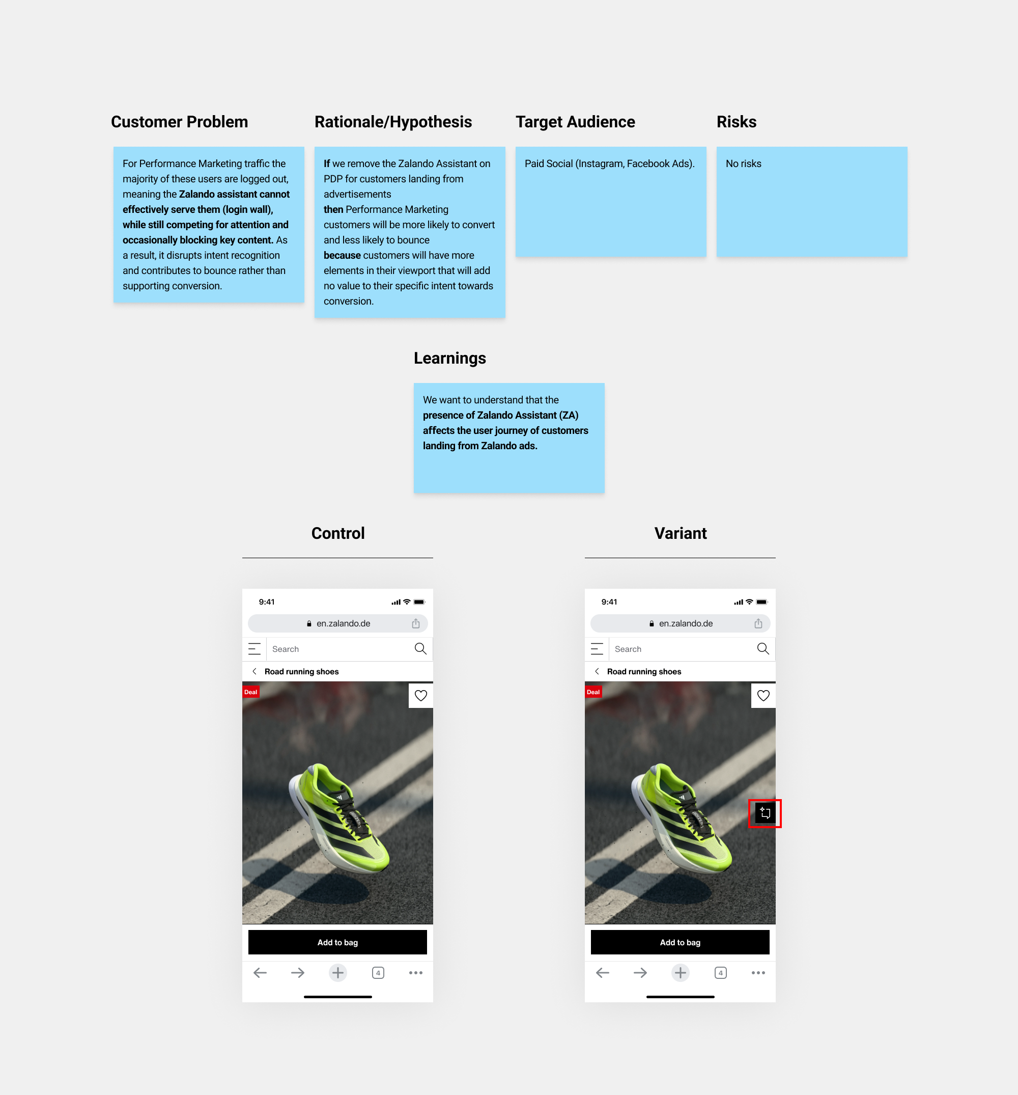
• 🚀 Learnings and Rollout decision
We learned that the presence of the Zalando Assistant increased bounce rates for Performance Marketing traffic and Displaying the Assistant negatively impacted conversion, reducing purchase completion likelihood.
Rollout decision: The hypothesis was validated and the AI assistant was excluded from the PDP rollout.
Lessons Learned
• With tight testing deadlines at Zalando, I had to simplify how I gathered feedback from Ref Store, ZDS, and Accessibility. Their limited weekly slots meant I needed to build relationships, align asynchronously, and move quickly.
• The LPO team had no established design culture, as it was their first time working with a Product Designer. I set up processes, ways of working, clear roles, bundle strategies while delivering against strict 2025 objectives.
• Aligning with QPE (Quality Product Experience) and PRSB was a major challenge (operational risks and dependencies). Their PDP long-term visions often differed with ours (Performance marketing channel), so coordinating roadmaps while keeping LPO releases on track required constant alignment. As we progressed, the business questioned whether a single PDP for Performance Marketing was viable.
• What was really challenging is to demonstrate impact the first 3 months, we had pressure to show results, so one of the things that I learned is not to lose focus in each Bundle about the Business goals , thanks god we had good results and this Initiative LPO directly improved conversion and bounce rates on high-volume Performance Marketing PDP traffic, translating small UX gains into significant incremental GMV, making it a Priority 1 financial initiative.
• I’ve learned that tools like Figma Make, Claude Opus 4.5, and ChatGPT 5.2 are powerful for accelerating UI workflows and supporting reasoning and forecasting—when used intentionally, with a clear understanding of when and why to apply them.