
🚀 My Impact
• KR 1: By making the benefits of Lyst membership clearer to customers when they try to wishlist a product We haveincreased +5% in web member sign up rate .
• KR 2: By clarifying to customers the benefitsthey can get from LYST alerts and emails (A/B test), We have increased 2% in member 7 day retention rate.
Background
Upon joining Lyst, the company underwent a restructuring that transitioned the App Growth squad into the Member Growth team. After the departure of several product designers, I stepped in to bridge the gap during Q3, ensuring continuity in design efforts. I filled the gap from September to the end of December, stepping in as a contract product designer for LYST during their period without permanent design staff.
The Challenge
We knew from research that our value proposition was unclear to new customers. New customers didnt ’t understand what Lyst is until they track out. This created a barrier to purchasing, and therefore signing up and returning to Lyst. Fixing this was fundamental if we wanted to grow membership and become profitable.
Role
Senior Freelance Product Designer
I led alongside the PM the Q3 initiatives for member growth based on make the value proposition more clear to our “Aspirer” users
a) Incentivise users to opt into comms from Lyst.
b) Incentivise users to sign up to Lyst when wishlisting a product.
• Product Designer
• User Experience (UX) Designer
• User Interface (UI) Designer
• Visual Designer
Deliverables
These are all the deliverables:
• Workshop LYST value proposition
• Experiment App notification to drive more opt in rates.
• Experiment to Incentivise users to sign up to Lyst when wishlisting a product.
• Workshop Wishlist Customer flow.
• Workshop focused on the Wishlist → Notifications/Email flow.
Tools
Figma, “First draft” AI feature, Chat GPT 4o, Miro AI, Jira
Final UI
The final UI for these screens incorporates the Brand Expression initiative introduced by LYST for Q4 2025. Although the overall strategy for Brand Expression has not yet been finalised, we opted to apply the colour variables and tokens from this new branding to these two experiments.

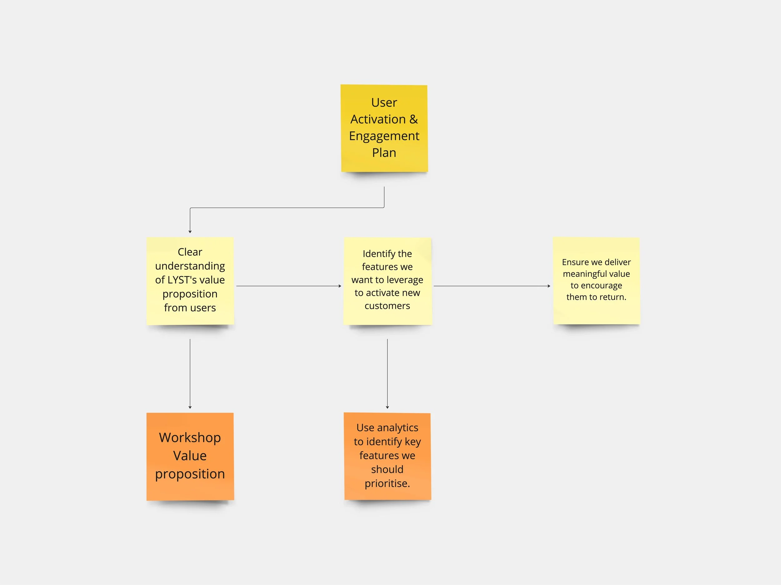
✅ UX Strategy
Recognising the challenge we faced with the value proposition, I was able to map out a structure as we progressed. This helped me organise my thoughts and start outlining the initial UX initiatives (plan) to achieve these goals...

✅ Empathise
• What is the value proposition?
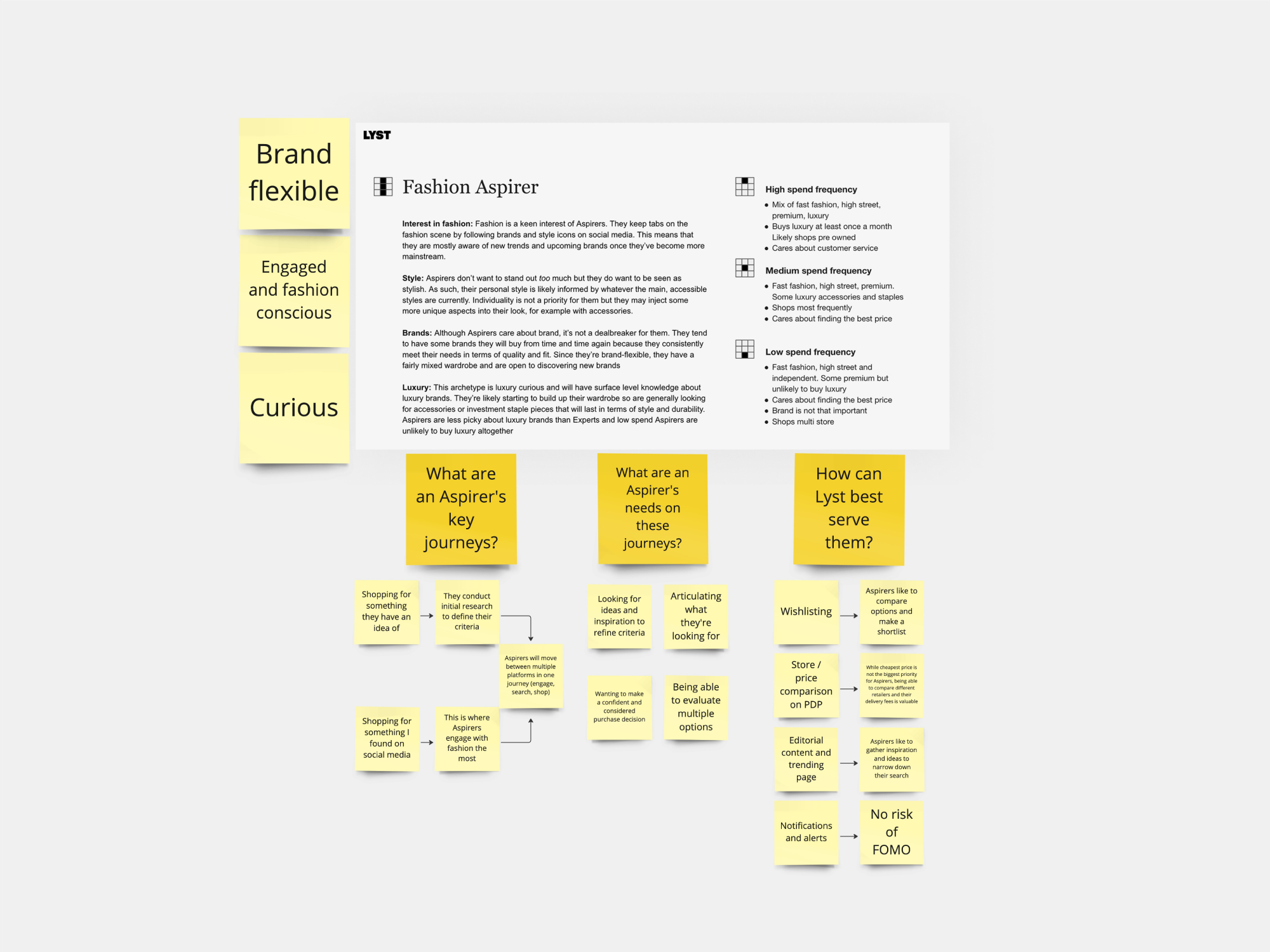
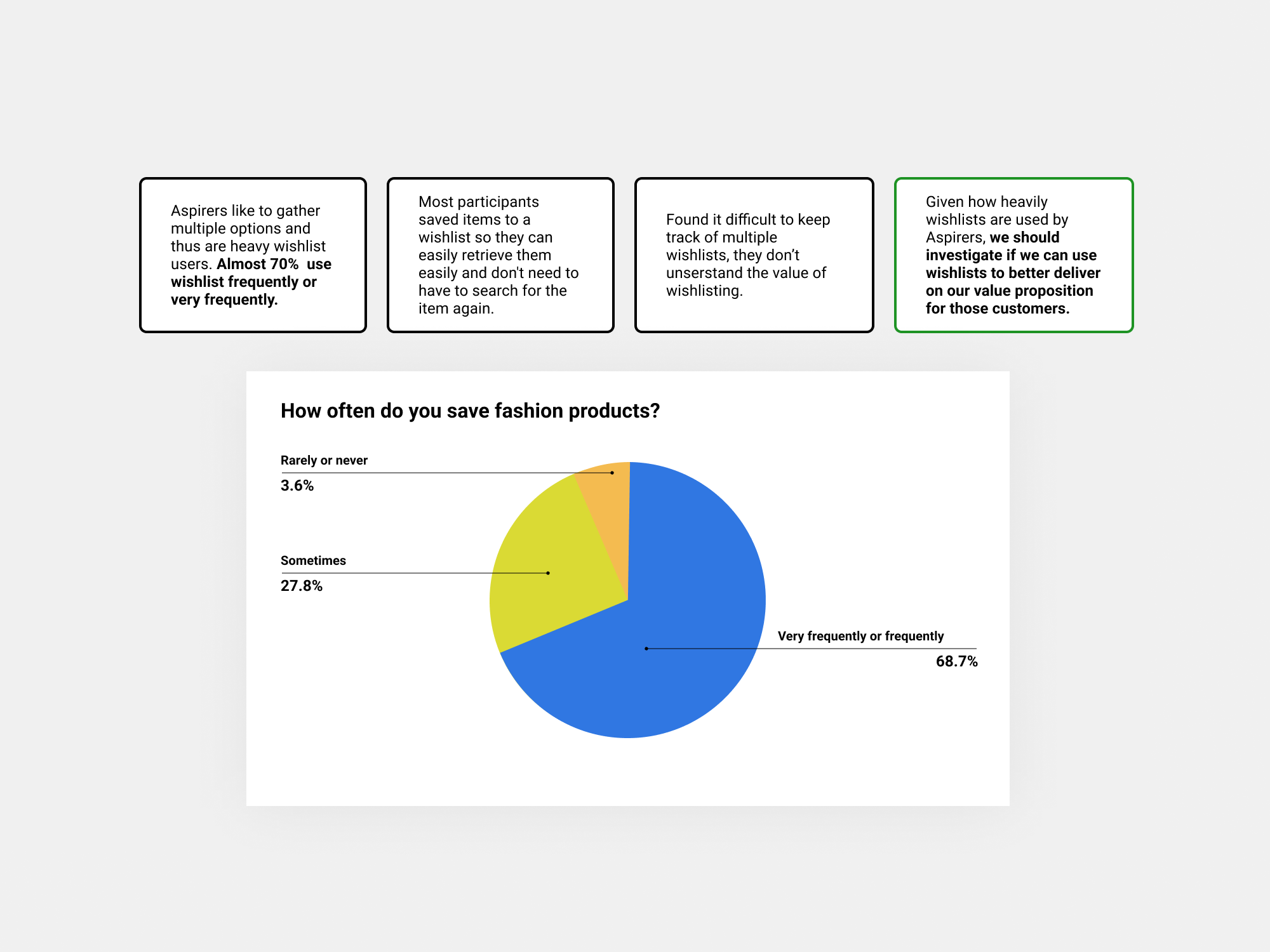
First of all I needed to understand who is our target user. From the research we had 3 segmented users: Neutral, Aspirers, Experts, so we focused on Aspirer user since...
• Aspirers love fashion and love shopping.
• There are a lot of them; we have head room to expand our customer base.
• The Aspirer is an attractive audience to our partners, who want to find quality (high frequency, high spend) fashion shoppers.
We conducted a workshop with the Product Manager, with participation from the Member Growth team, to brainstorm and align on LYST's value proposition. The goal of the workshop was to generate ideas and create a shared understanding of how to effectively communicate and leverage LYST's unique strengths.
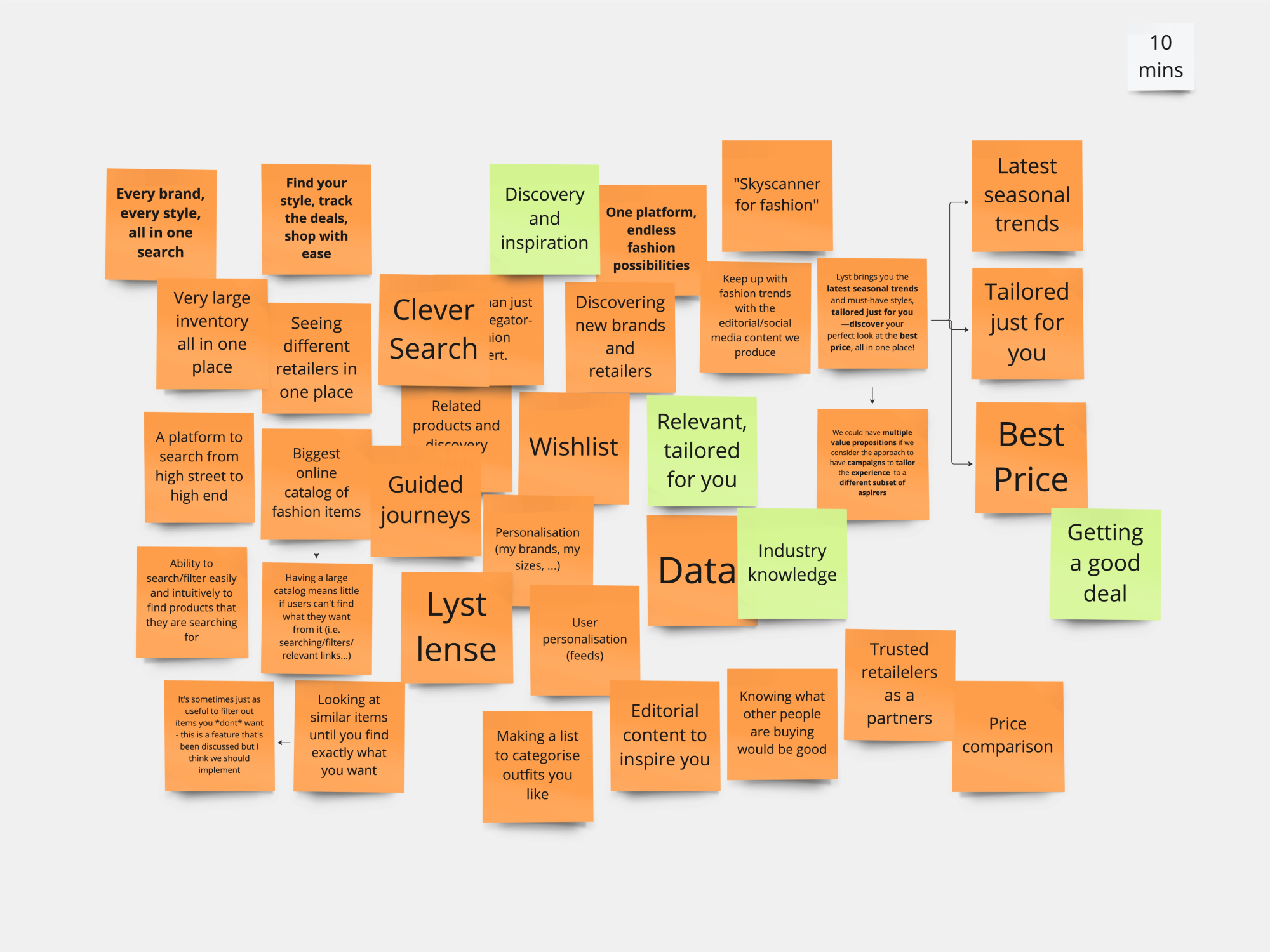
We refined the outcomes and summarised them into four core value propositions, member growth team prioritising the first one. This focus aligns with the features we aim to activate and deliver value to the user.

• What are the features that we should activate?
Using data gathered from Kubit and the analytics team, I collaborated with the PM to identify which features we could begin exploring...
1. App Notifications
2. Whishlist
🔴 Problem 1 - Users not opting in app notifications
Customers are unclear about the benefits of Lyst notifications
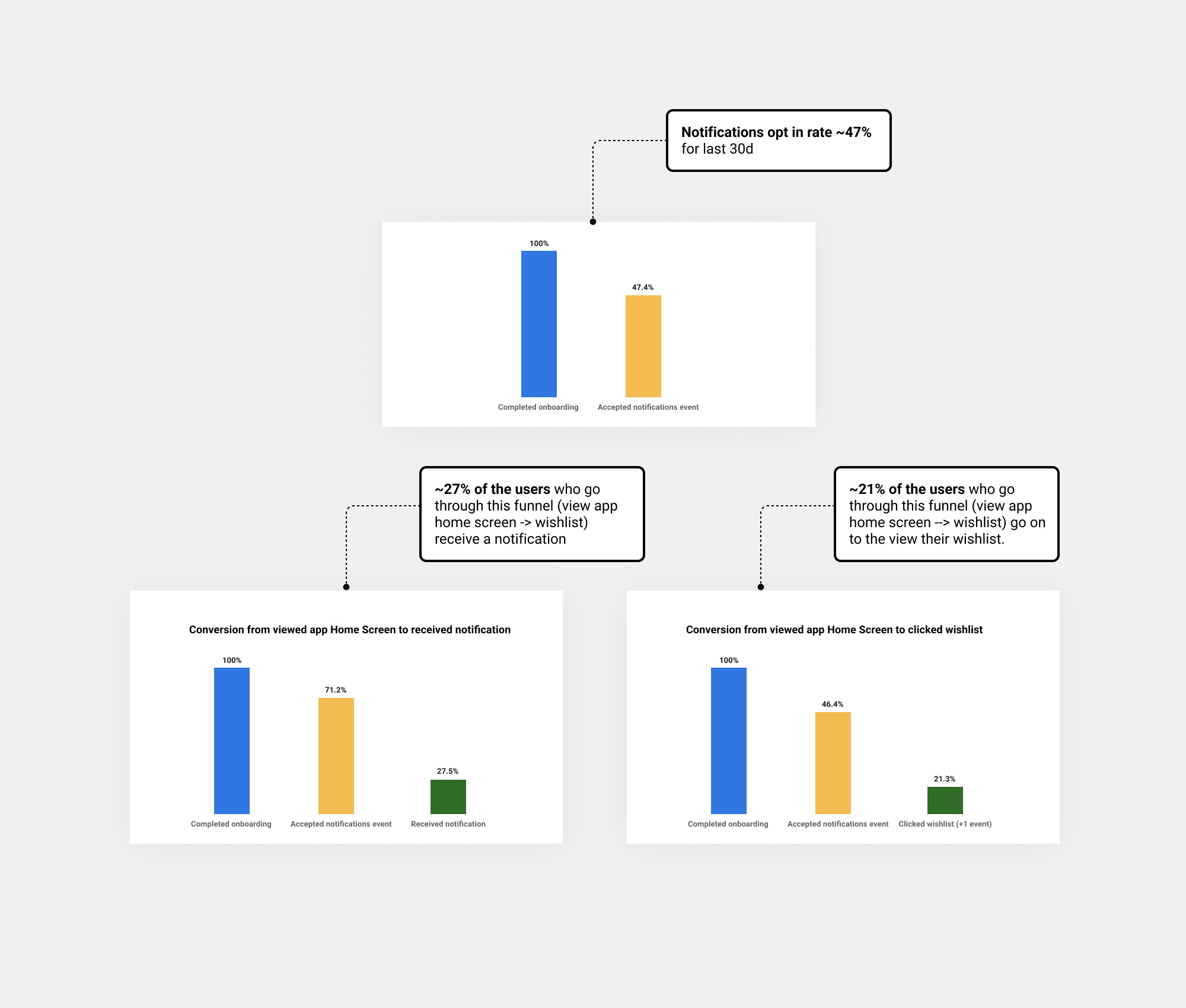
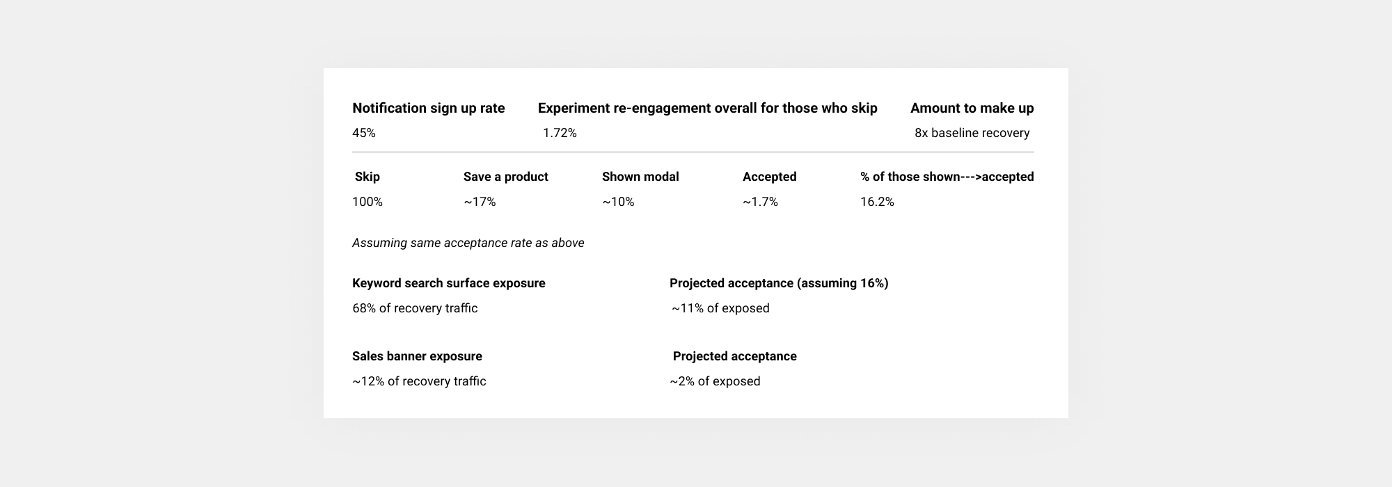
• Rough estimates suggest signup rate notifications: 17%
• There is also a spike in daily active users whenever notifications are sent, suggesting that notifications are driving user engagement and retention.
• Assumption: most users do not understand the benefits they could have by receiving notifications and emails from Lyst.
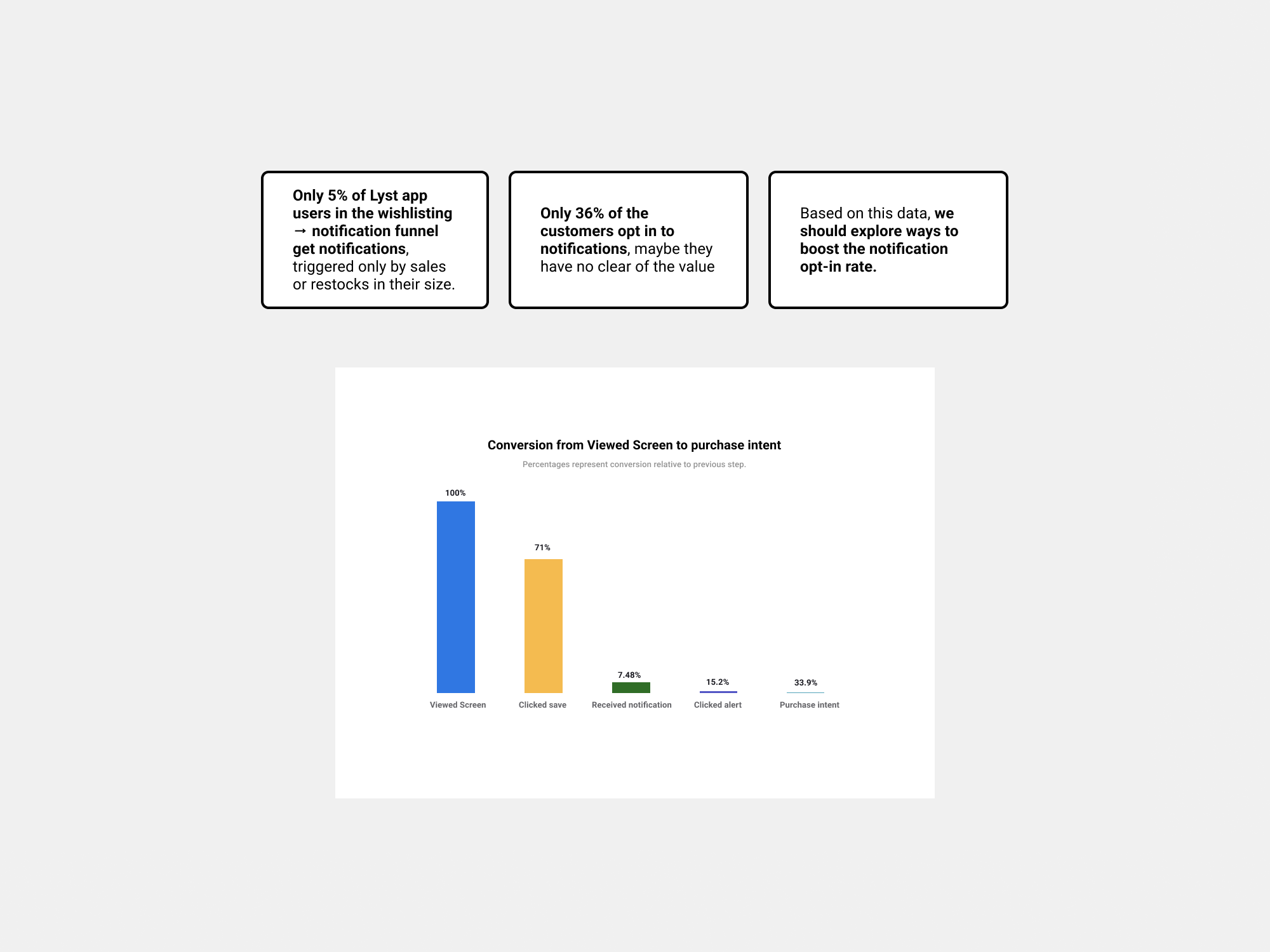
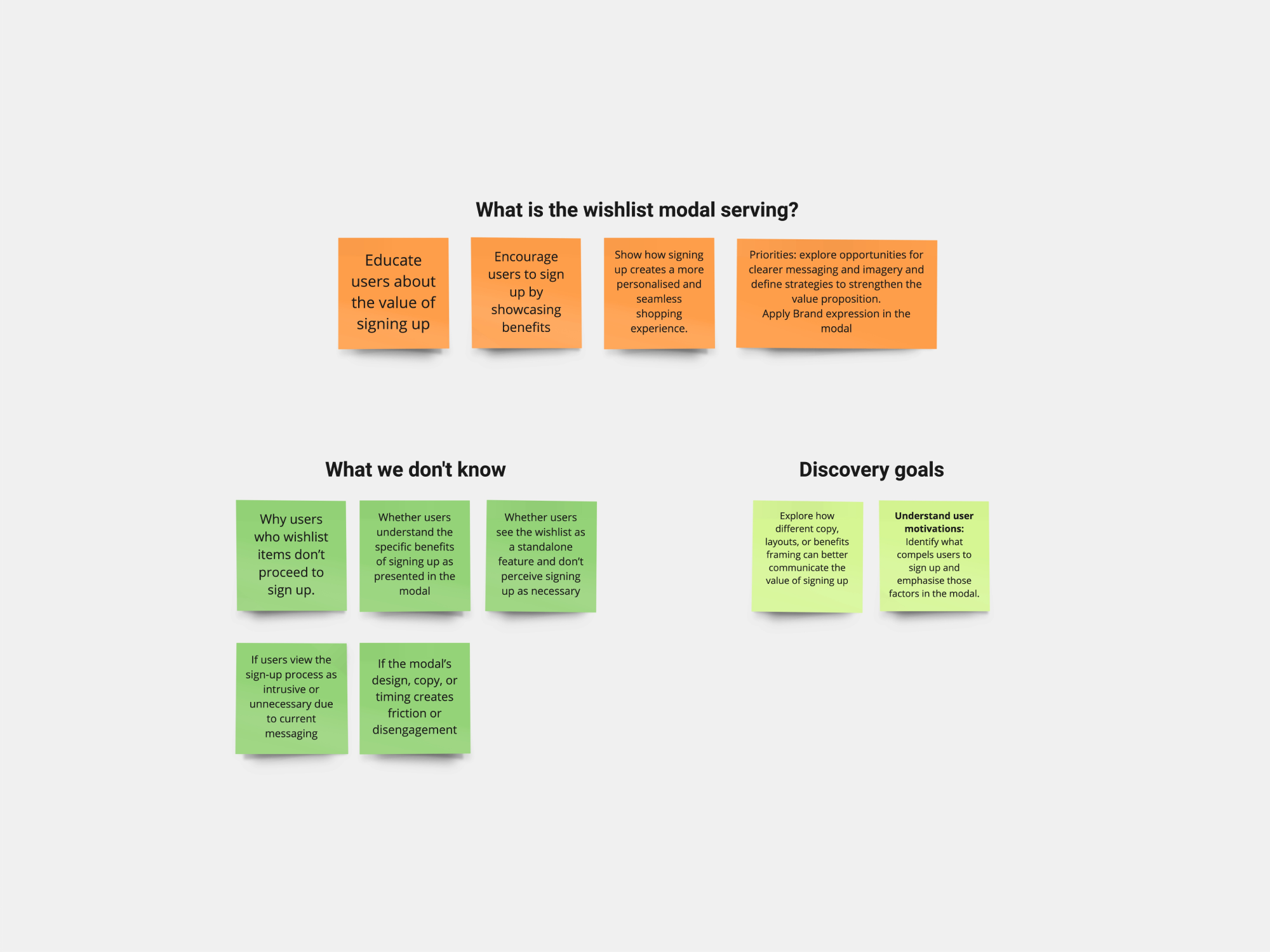
🔴 Problem 2 - Improve the value proposition for wishlisting.
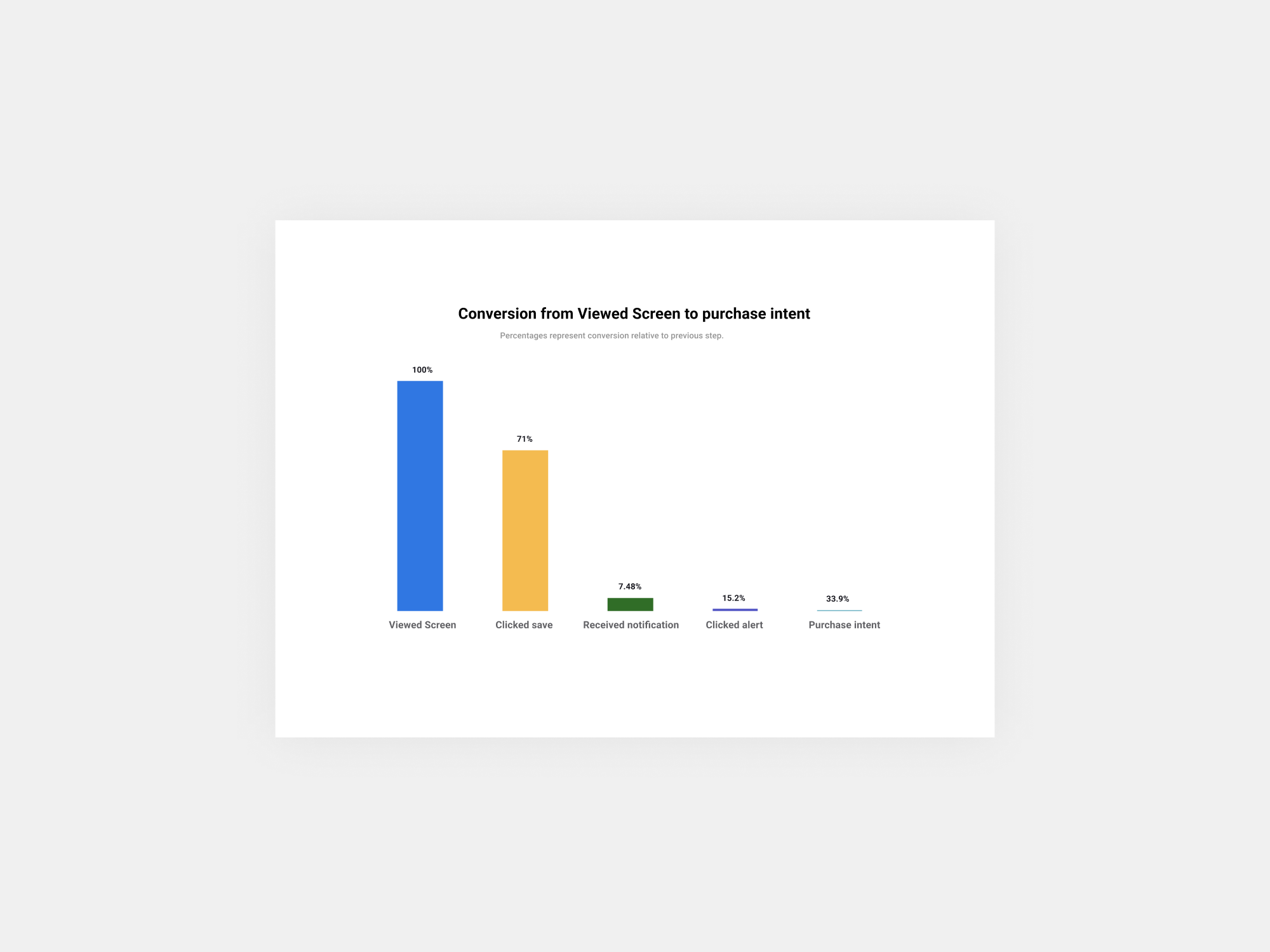
• Research indicates that only 17% of users who wishlist a product ultimately sign up.
• In the Wishlist → Notifications funnel, data shows that 71% of users viewed or wishlisted a product, but only 7.48% received a notification.
• Assumption: This suggests that there may be an issue either with the value proposition presented in the sign-up modal or with the design and functionality of the modal itself.
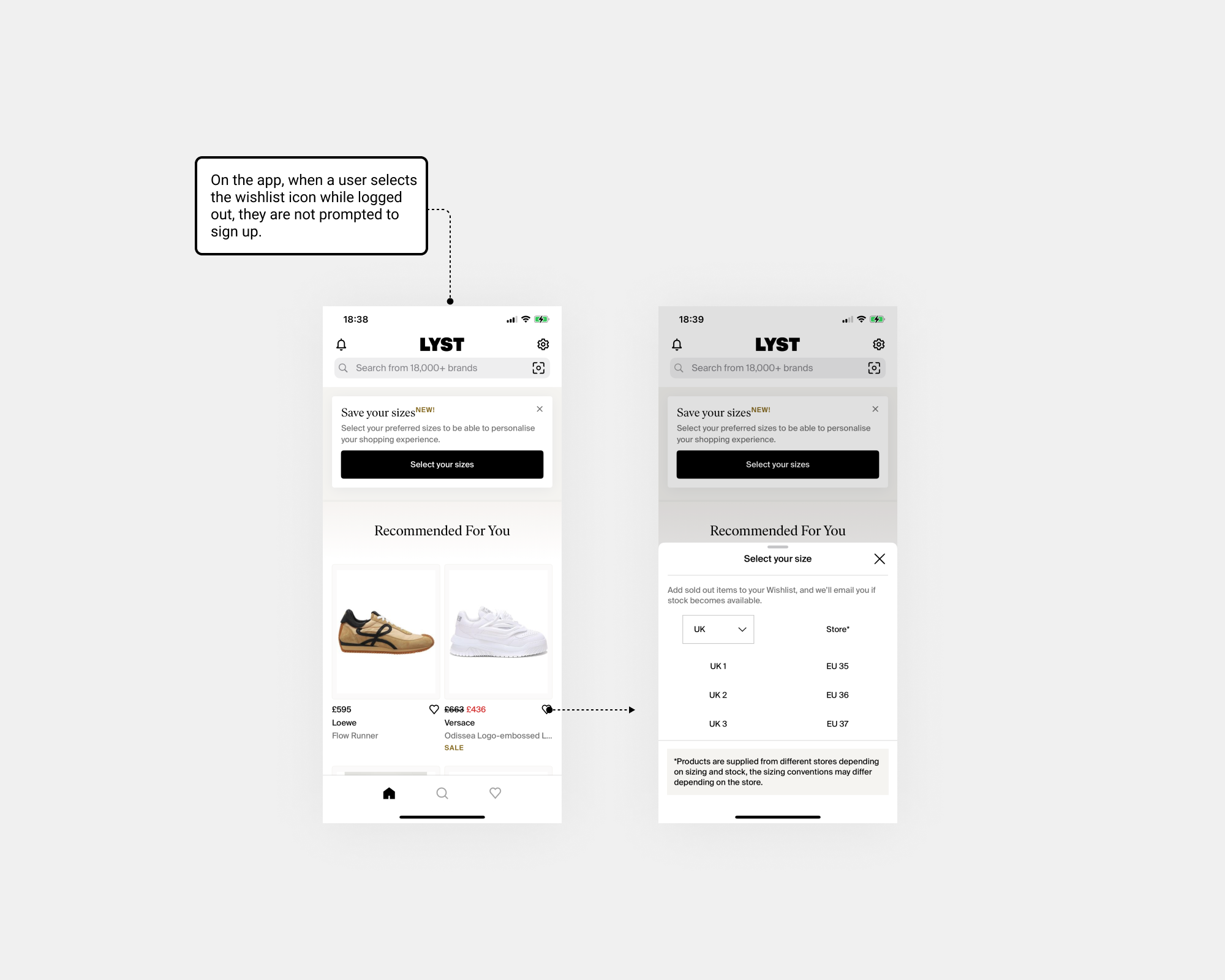
Analytics showed that web users frequently skip signing up when clicking the heart icon, unlike mobile users who expect a seamless experience. Enabling logged-out users to favourite items promoted faster engagement without requiring an immediate sign-up.
✅ Define
User: Aspirer users are those who actively explore and wishlist items, receive notifications and alerts, and demonstrate a strong interest in products.
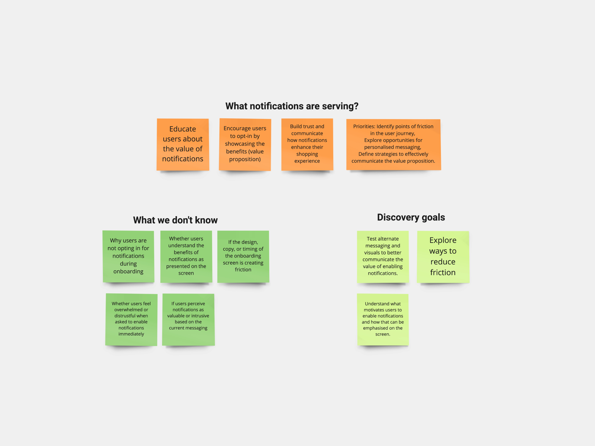
Needs: Analyse LYST’s value propositions for the app onboarding notification screen and wishlist sign-up modal to identify and highlight their unique benefits/value proposition
Insights: The data we have indicates low rates of users granting notification permissions and low rates on the CVR sign up modal.
✅ Ideation app notifications
Before jumping into ideation, it's always good to ask these four questions to gain clarity and gather any relevant past data, if available

🔴 Problem 1 - Users not opting in app notifications
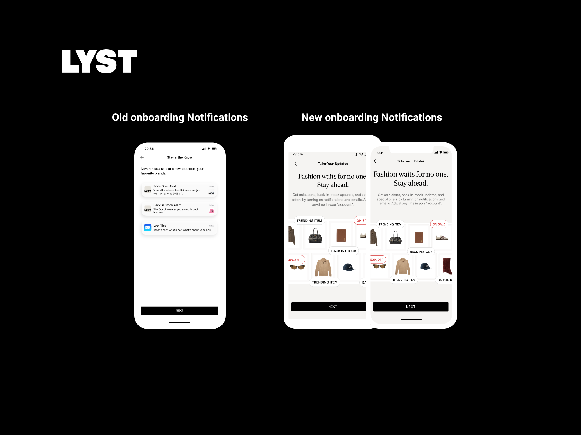
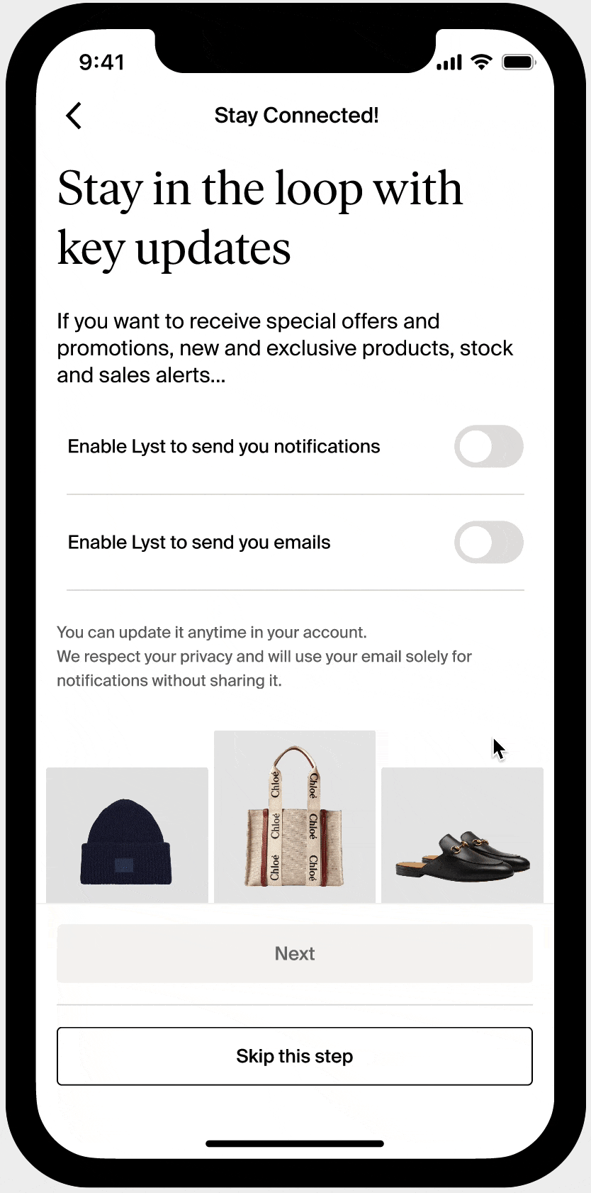
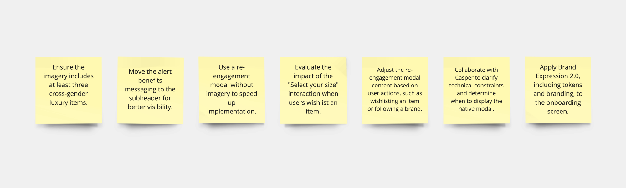
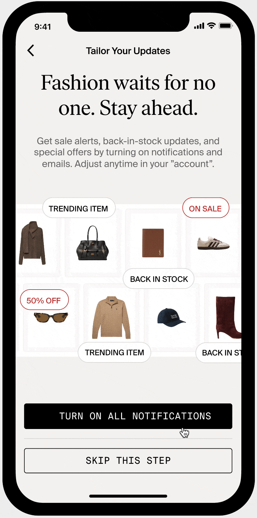
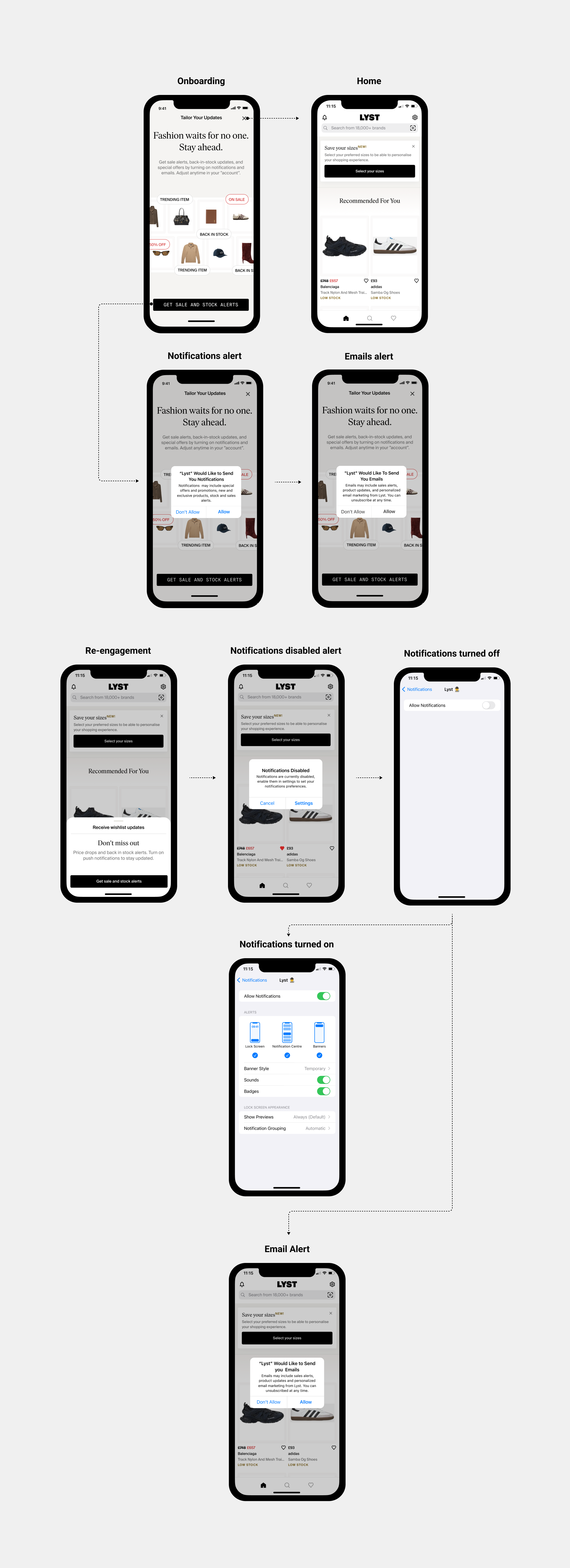
App Notifications onboarding: Here’s the onboarding flow we had in the app. We identified the notification screen as a potential issue because the UI wasn’t resonating with users, or the messaging wasn’t effectively highlighting the benefits of opting in for notifications.
First, I want to introduce the design system we had in place. I used all the tokens and variables to create the notifications screen and the wishlist sign-up modal. However, both were experimental designs, so we avoided systematising components until we had results to validate.

• Analysis: I started analysing the areas where the UI and messaging on the notifications screen were falling short. That said, the rest of the onboarding screens were also not aligned with the overall look and feel of the app. However, aligning them was not within the scope of this phase.

I leveraged Miro AI to brainstorm ideas…
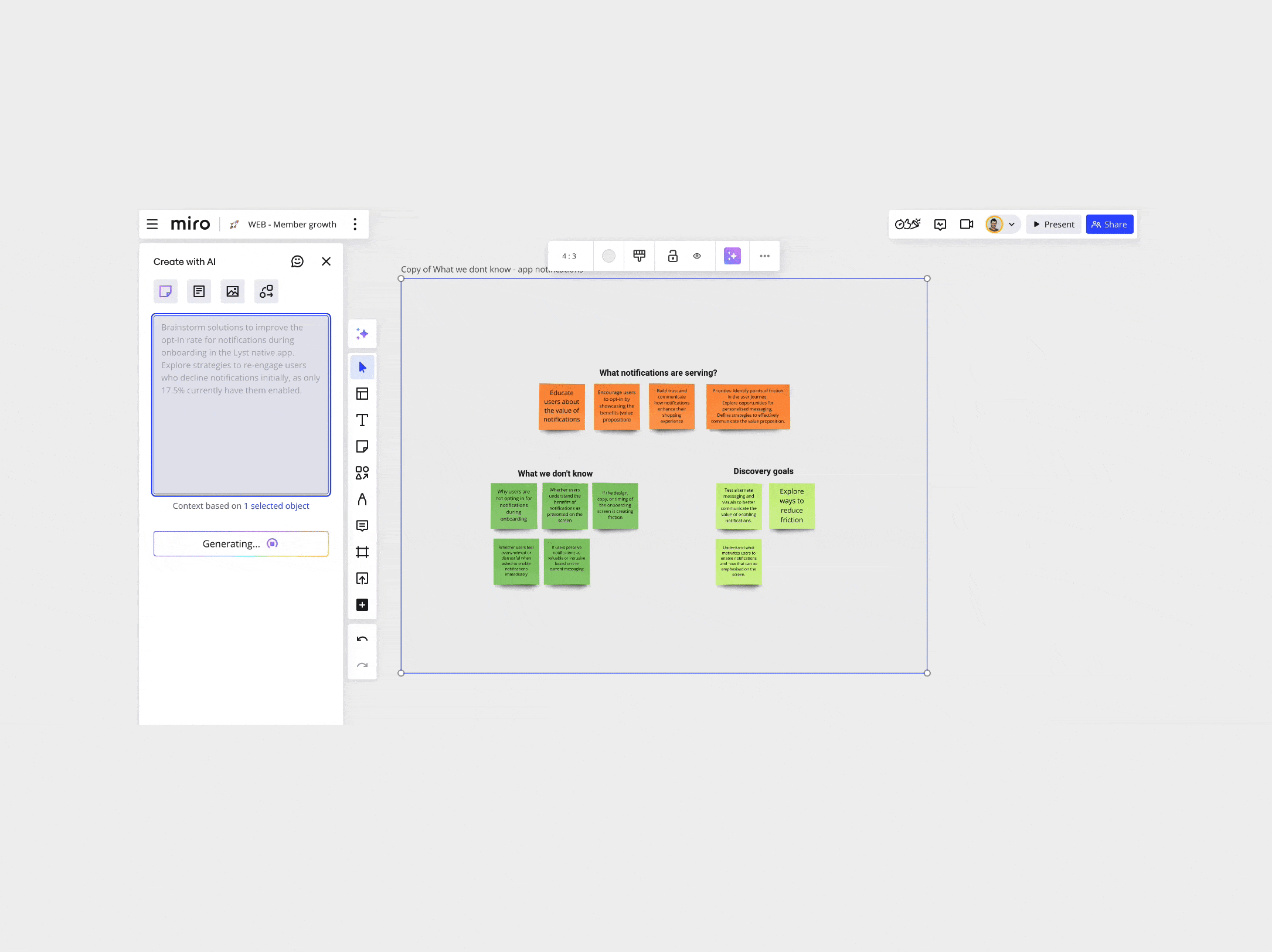
After the brainstorming, I wanted to understand and receive feedback if users can choose their preferred communication channel upfront (adding 2 toggles), reducing frustration from unwanted notifications or emails.
I used "First Draft" AI to generate and speed up the initial framework and layout for this design iteration. Then, I replaced everything with our design system tokens, colour variables...that said, “First draft” is still not accurate enough...I worked with marketing to refine the text.

✅ Prototype - Test
I adopted lean UX approach-Rapid prototyping to engage stakeholders and refine the direction through iterative improvements. I wanted to understand and receive feedback if users can choose their preferred communication channel upfront (adding 2 toggles), reducing frustration from unwanted notifications or emails. Intuition, research, and data led me to choose the following approach.
• "Skip this step" option lets users opt out for now.
• Re-engagement triggers when users:
• Wishlist an item (let’s prioritise that)
• Select "Buy" and return to the LYST app
• Search, browse, or land on a top-visited page.
Hypothesis
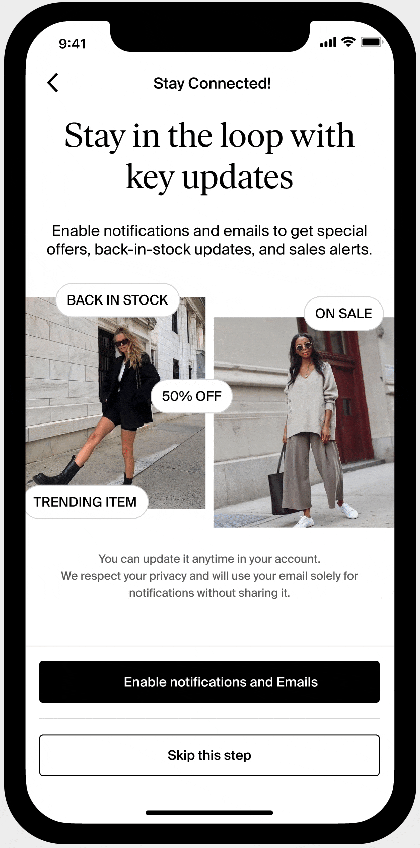
Using luxury (research says that 80% of our user are looking for luxury Items) and mix-gender imagery, alongside a compelling message about the benefits of enabling notifications will help boost opt-in rates. If not, our re-engagement mechanisms will capture users at later stages.
Feedback iteration 1

Feedback iteration 2
We faced dependencies, like applying Brand Expression to the notifications screen. While the company lacked from strategy at that point, some elements (e.g., Type Tokens 2.0 for buttons and background colours) existed in the Design System and I applied then into this notification screen. We acknowledged inconsistencies until Brand Expression was fully implemented.
Another dependency was the “Select your size” feature it was released when I was doing all these iterations.
We narrow the re-engagement to this action below, as data indicates they have a strong correlation with user retention and repeated engagement.
• Wishlisting an item (PDP)
• Following a brand

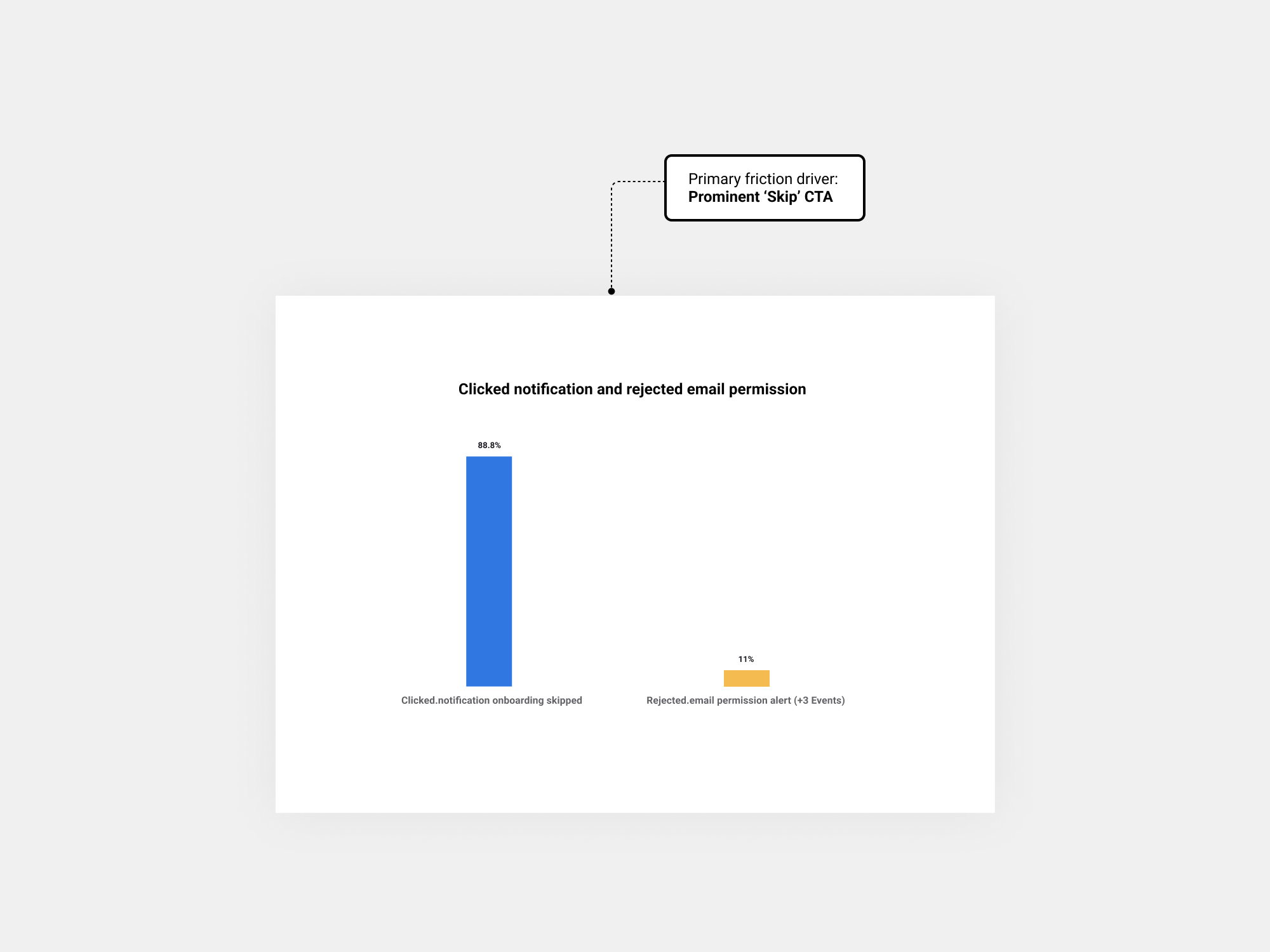
On 27 November, we decided to pause the experiment. This was because we saw a sudden and significant drop in users signing up to notifications and more users skipping sign up.
While this was expected due to the inclusion of a prominent ‘skip’ button on the onboarding screen, we were also not seeing the re-engagement happening quickly enough to recover this loss: Only a small percentage of users who skipped were later successfully re-engaged when prompted.
We explored other potential re-engagement surfaces:
• Search results page - ~68%of new users in the test went through this funnel
• Search --> sales banner - ~12% new users in the test went through this funnel
• When users click buy now - ~20% new users in the test went through this funnel
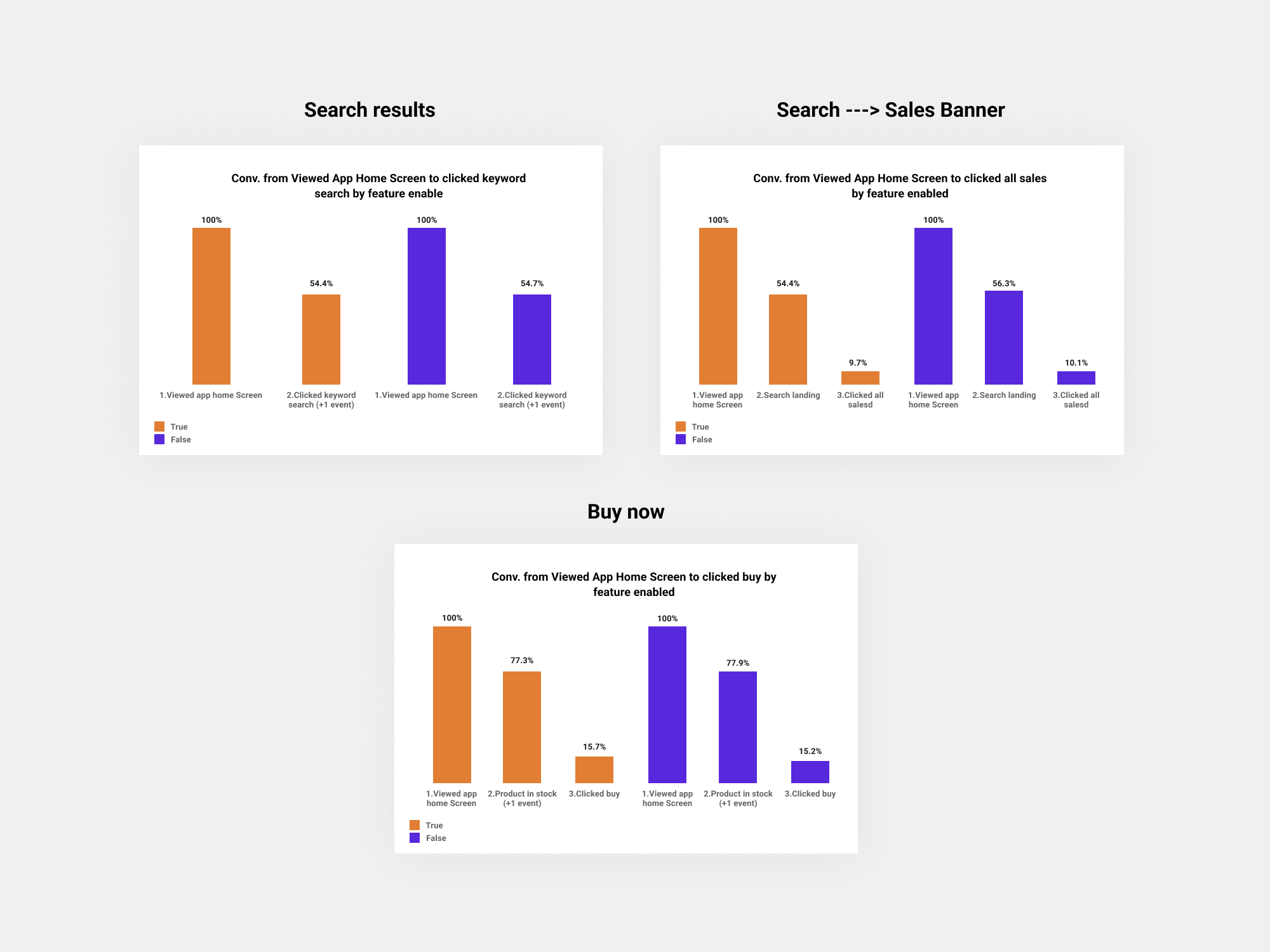
None of these provide sufficient volumes on their own to recover the above loss without other design changes to the experiment.
⚠ Updated approach 16/12: My proposal was to go back to the initial screen design, and iterate on this experiment in the following way to see if it improves notification sign up rates:
Control: Current Experience
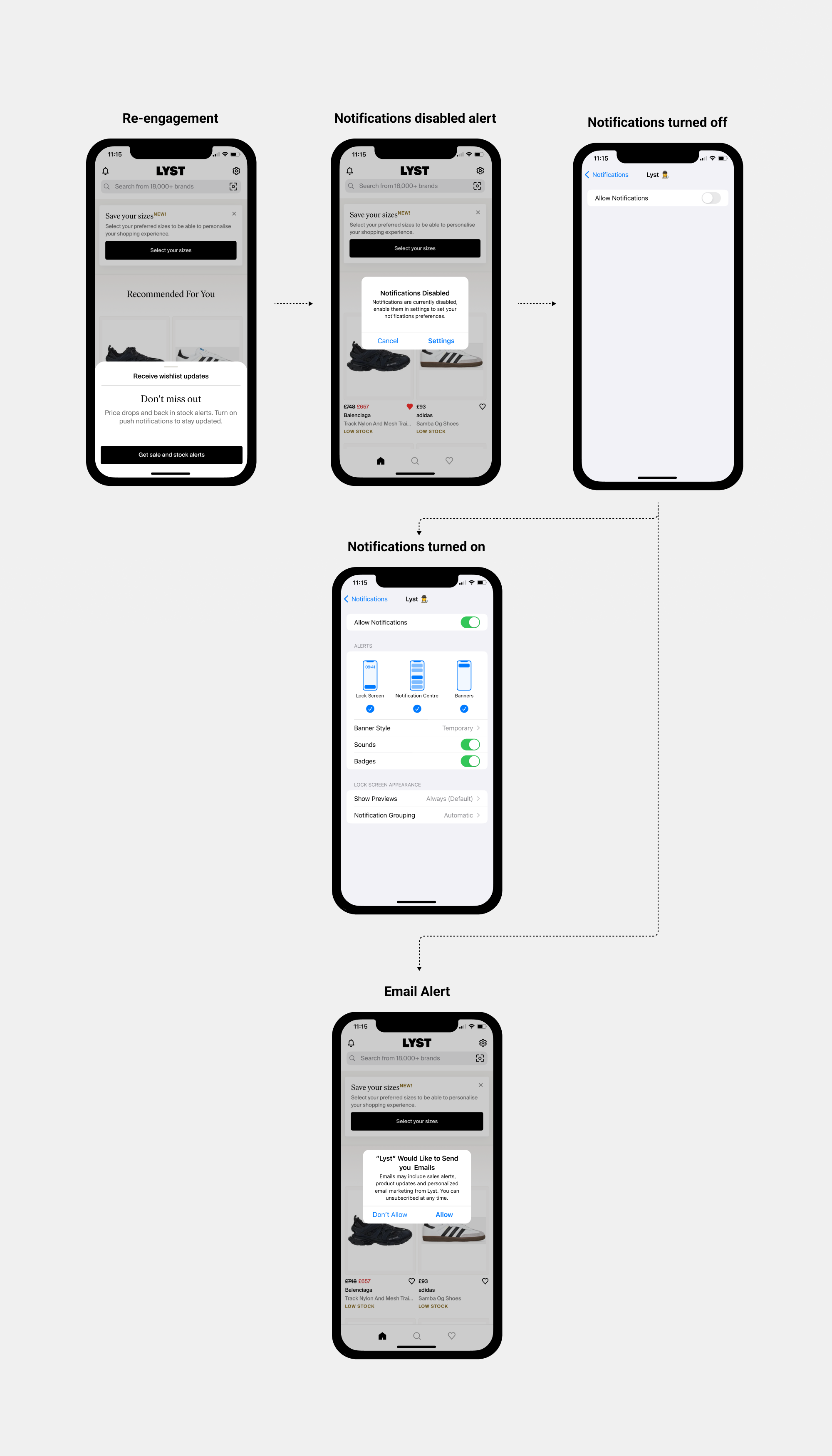
Variant A/Treatment: The initial screen would remove the ‘Skip’ button but have a small X in the corner, and have a clearer CTA of ‘Get sale and stock alerts’. Customers can then allow or disallow notifications and emails in the native prompt. We would then re-engage them when they wishlist on home, feeds and the PDP by navigating the user to their system settings, and we would increase the rate at which we do this to max 3 times per week.
Rationale:
• A less prominent skip option (“X” close button) would reduce the chance of users simply rejecting notifications immediately, coupled with a clearer CTA of what they would be opting into
• By navigating to their system settings, it would give us a way to try to re-engage users with push notifications (since we can only show the native prompt once -iOS technical limitation)
• We’re giving ourselves a bigger opportunity to try to re-engage the user at relevant points (and will be doing so more frequently than before, to try to increase this likelihood)
⚠ Updated approach 20/12: Following our Product Review, we agreed to iterate by running two separate A/B tests, given that we are ultimately testing two different things.
A/B Test 1: Initial screen
Control: Current Experience
Variant A/Treatment: The initial screen would have no ‘Skip’ button or option to close the overlay, but customers would have the option to allow / disallow notifications via the native prompt, which will be triggered by clicking the ‘Next’ CTA. We would not try to re-engage the user in this test.
Rationale:
Given that the prior experiment taught us that the majority of users are clicking ‘Skip’, it would be sensible to remove it. Further, only 5% of users drop off after being presented with the notifications screen, therefore there is minimal risk of users abandoning
their journey if we remove the “X” to close the overlay entirely.

A/B Test 2: Re-engagement
Control: Current Experience
Variant A/Treatment: If a user has not opted into email or push notifications via the native prompts above, then we would prompt them with the below modal when they wishlist on home, feeds and a PDP. This would navigate the user to their system settings, and we would increase the rate at which we do this re-engagement to max 3 times per week. If users change notification settings outside the app, they'll see the email prompt next time they open Lyst app.
Note: The redesigned initial screen we are testing in A/B Test 1 will not be tested in this experiment.
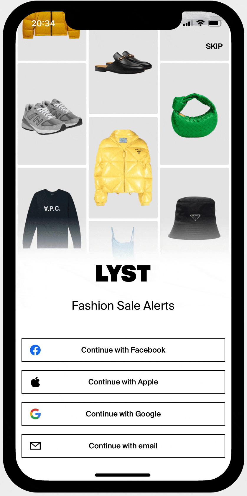
✅ Ideation and test for sign up modal
🔴 Problem 2 - Incentivise customers to sign up to Lyst when wishlisting a product
The strategic outcome was to clearly articulate Lyst’s value proposition to activate prospective members.
Opportunity: We believed that by making the benefits of Lyst membership clearer to customers when they try to wishlist a product, we will boost the volume of web member sign-ups.
Evidence: Only 17% of users who attempt to wishlist an item while browsing anonymously on our website complete the action. We believe that we have an opportunity to improve this rate by clarifying our value proposition to customers when they try to wishlist an item.
Analysis: I started analysing the pathways/entry points when a user selects "Wishlist" and identifying our target user.

So, I analysed the key differences between the app and the web


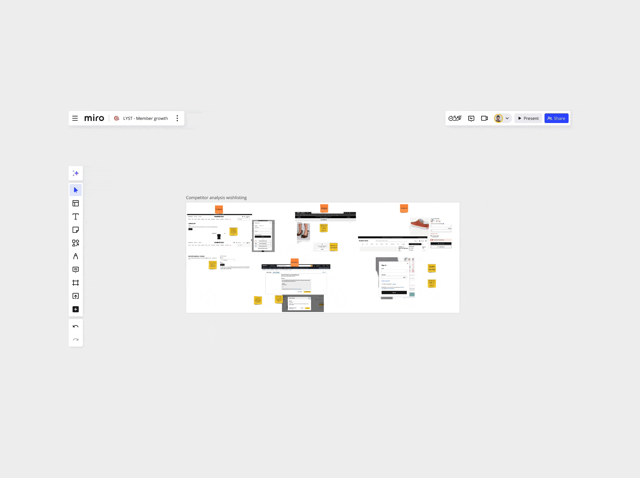
Right after I analysed also what the competitors do...knowing the different approaches that we have in both platforms…
On the app, users can complete all actions without signing up, whereas on the web, sign-up is required. Given this, we (business) focused on the website, aiming to improve conversion rates for the sign-up modal.
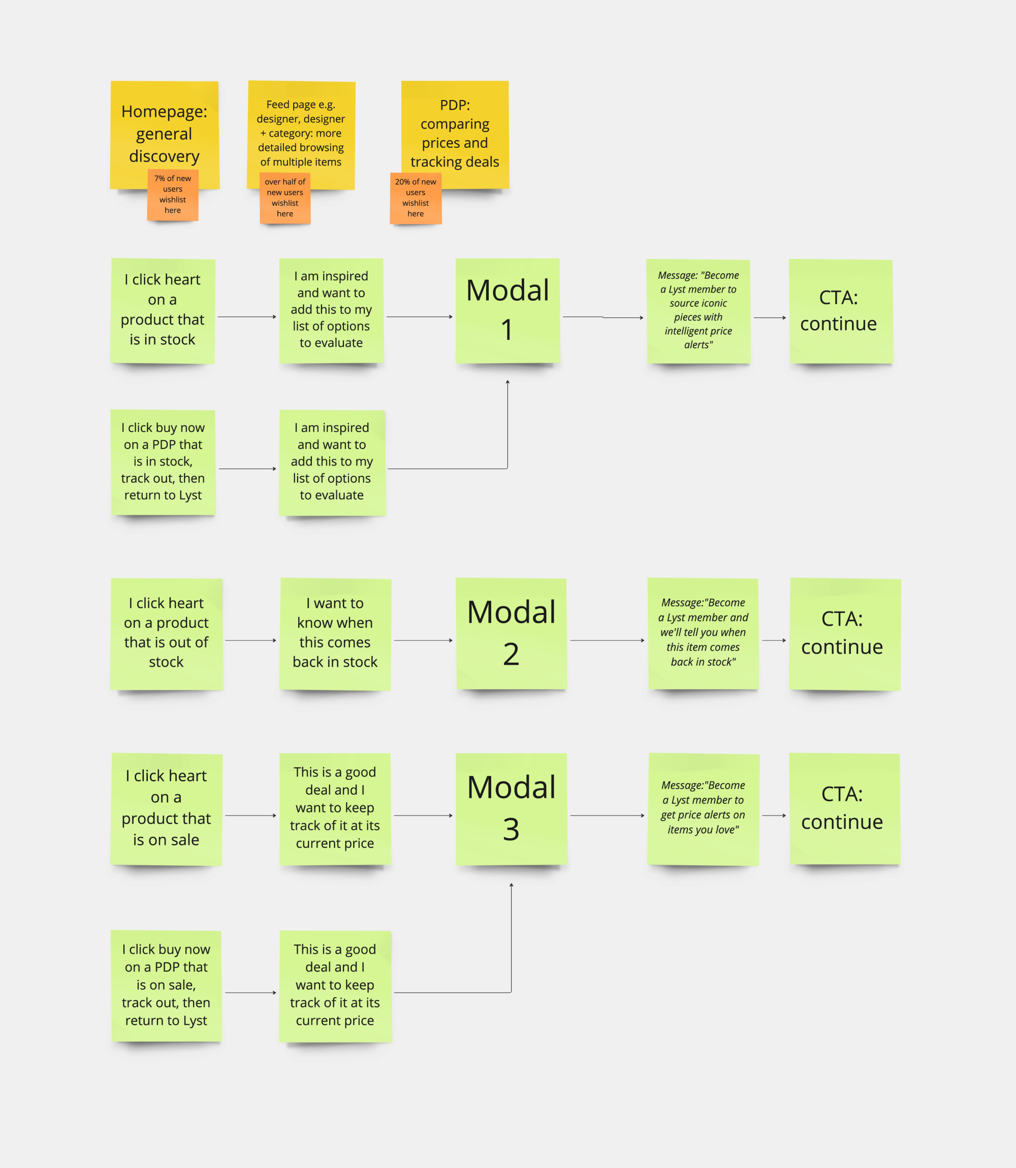
To tailor the wishlist sign-up message , based on how they arrive at a concrete brand or product page and the different states of an item (on sale, sponsored, out of stock, in stock), We will need to consider the following variables:
1- Pathway (motivation)
2- Item status
3- User intent or motivation behind the item status
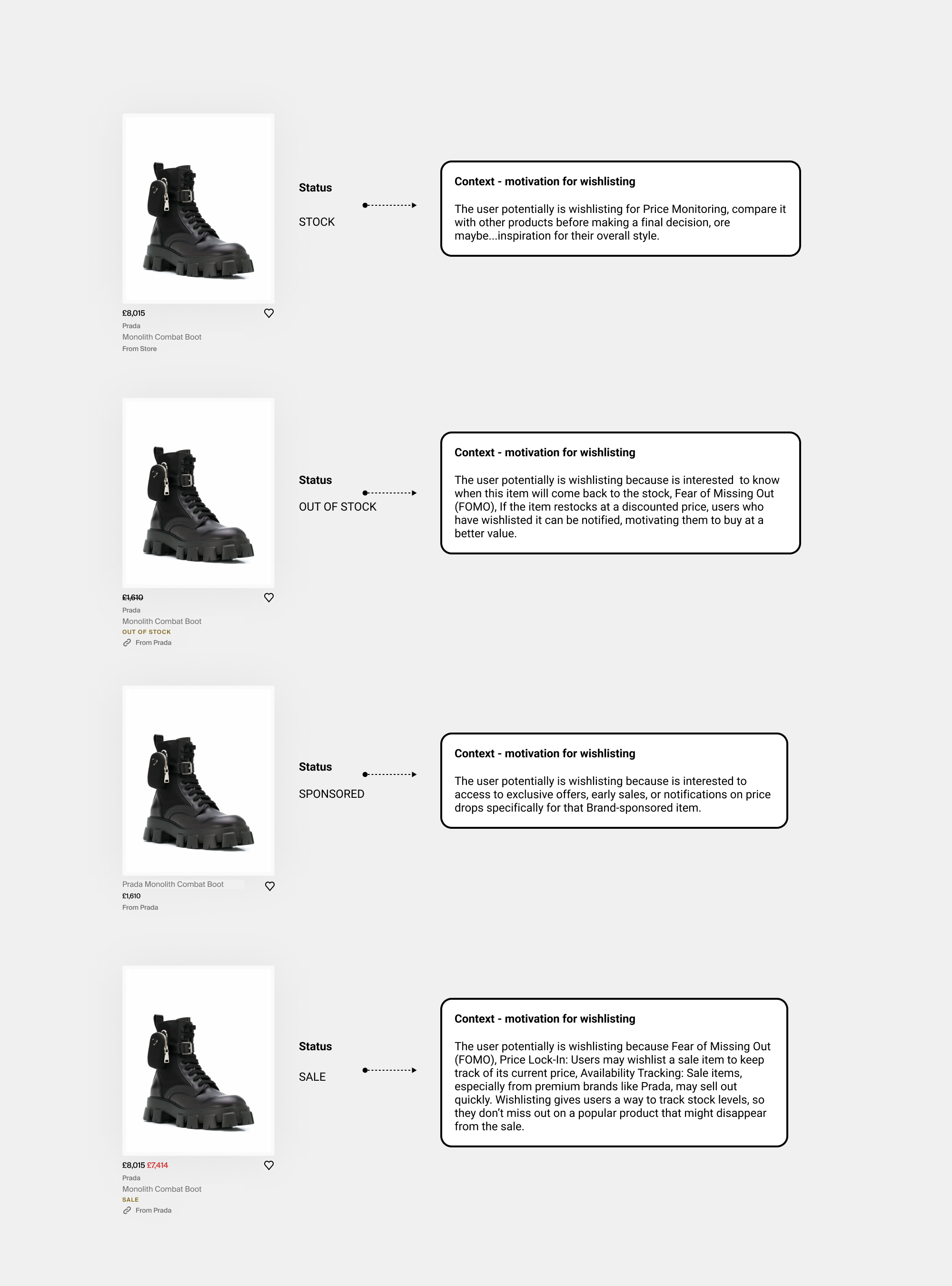
After engaging with analytics, we found that tracking Aspirers segmented users from a back-end perspective at entry points wasn’t feasible. The most reliable way to refine the value proposition message for wishlisting is the item’s status, though understanding the motivation behind it is also important. The pathway matters, but item status determines the message.

I considered the soft sign-up and returned user flows, but they did not impact the modal's message. All the pathways below.
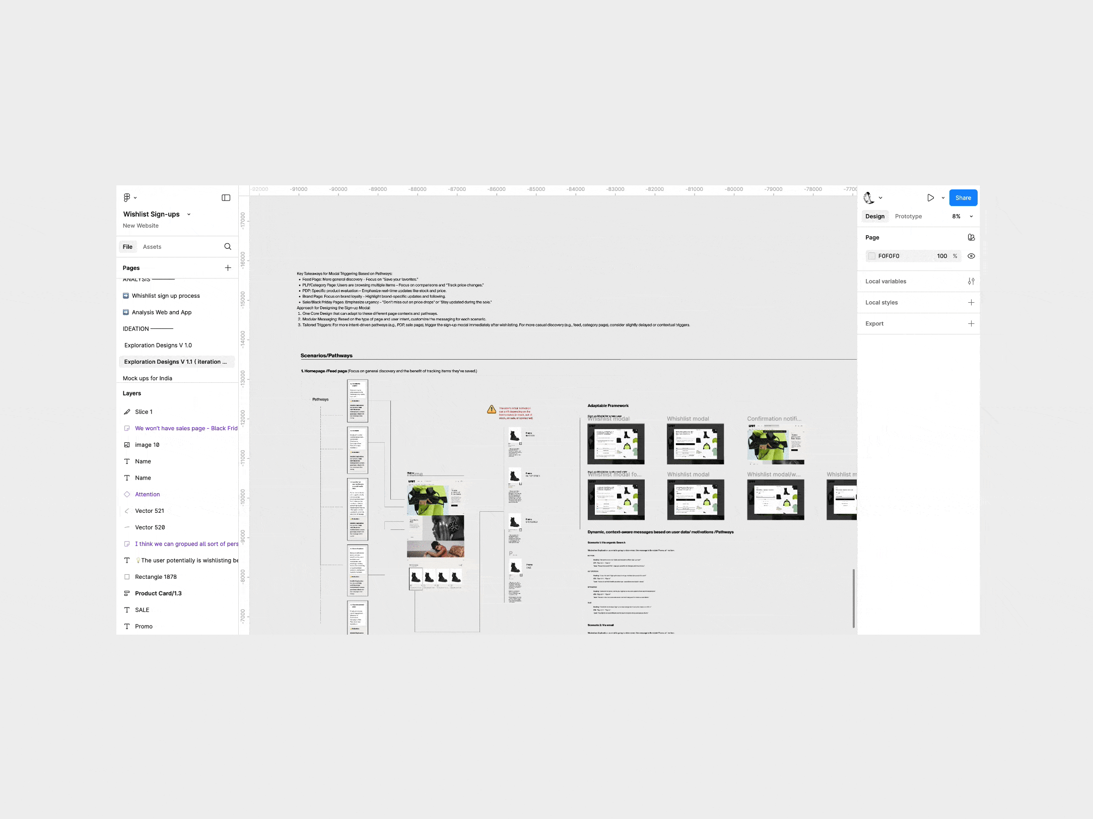
To synthesise the exploration and present it to the PM and board team, I simplified it to the sign up modal messaging as follows...

How we can acquire more users?
We recognised from data that wishlisting is a crucial user action, so we aimed to broaden its scope and fully explore how we could enhance and maximise its value proposition and acquire more users.

I facilitated a workshop with the team to pinpoint friction points in the current wishlisting flow, evaluate which issues offer the most valuable opportunities for improvement, and prioritise a list of hypothesis to test using an Impact/Effort matrix.
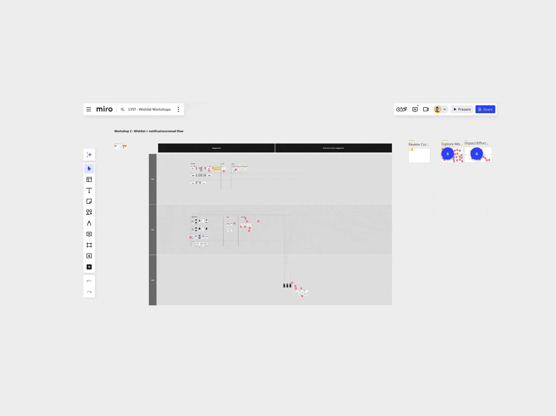
I facilitated a second workshop focused on the Wishlist → Notifications/Email flow, aiming to brainstorm strategies for enhancing the relevance of notifications and email alerts. The goal was to generate a prioritised list of improvements or new notifications/alerts, addressing gaps or friction points by organising them into an impact/effort matrix.
Lessons Learned
• One of the key lessons learned is the importance of analysing the existing data and do some maths before proposing any A/B test. Running the numbers first helps determine whether conducting the test is worthwhile and ensures it aligns with our goals.
• Another improvement we implemented after some retros was incorporating design reviews before releases. We established a QA design review as a standard part of the process to ensure quality and alignment. Before I joined, this process was not there.