
🚀 My Impact
Lifehub landing page 30-day Trial at $3.99/month (Trial 4) emerged as the top performer:
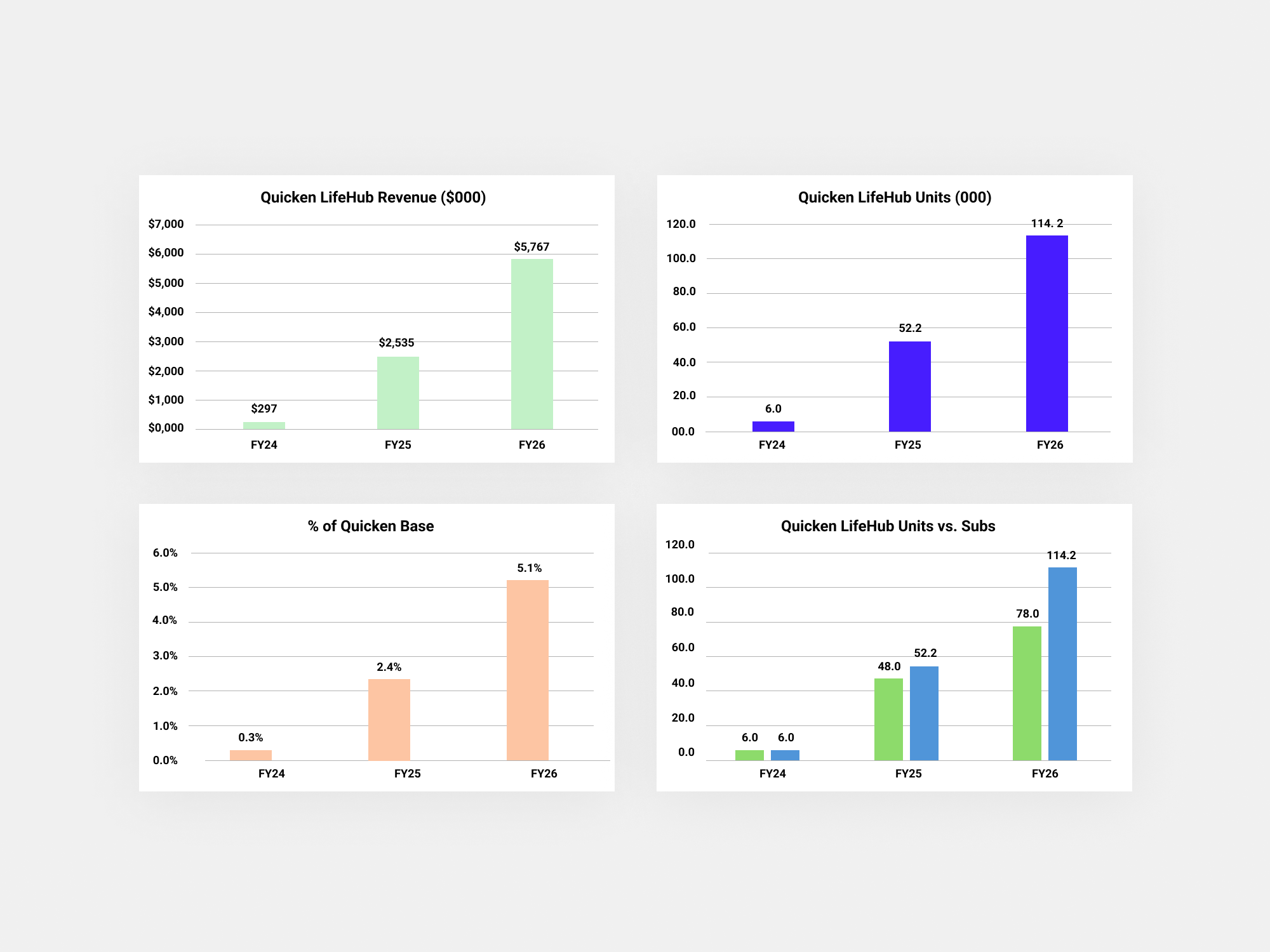
• Revenue: Highest at $243,000 / FY24: $297 K - Projection FY25: $2,535 K ($2.535 M) / FY26: $5,767 K ($5.767 M)
• CVR: Strong at 6.67%, driving meaningful customer retention.
• Bounce Rate: Moderately low at 37.7%, reflecting effective landing page engagement.
• Engagement: High at 62.3%, demonstrating strong audience interest and retention.
Short-term CRO Goal: FY24: 5.3%,Targeting a 6% CVR by the end of October 2024, with a long-term strategy in place to sustain and build upon this growth throughout 2025.
Background
Quicken, a renowned FinTech platform in personal financial management (PFM), planned to expand by launching new products and a revised subscription model. Simultaneously, they focused on enhancing quicken.com’s scalability to support these offerings and developed a comprehensive strategy to optimise conversion rates (CVR) across the site for a seamless user experience.
The Challenge
We aimed to introduce new products for existing subscribers while developing a scalable site and a new subscription model that incorporate bundles. This involved mapping use cases, designing user journey maps for the initial product phases, and ensuring a seamless user experience. Additionally, it required optimising website scalability to support the new products, applying conversion rate optimisation (CRO) tactics to drive engagement and achieve targeted CVR improvements for the upcoming financial year.
Role
Senior Freelance Product Designer
I led the user experience design for new products at Quicken, focusing on driving trial conversions for Lifehub (retention) and shaping the new subscription model, including cross-selling and upselling bundles (growth). Additionally, I contributed to short-term conversion rate optimisation (CRO) efforts and collaborated on mapping out the long-term CMS site structure and user experience, considering the new bundles offering.
• Product Designer
• User Experience (UX) Designer
• User Interface (UI) Designer
• Visual Designer
Deliverables
These are all the deliverables:
• End to end User journey map from the Workshop for the ‘new products’
• ‘New products’ phases, alongside the PM
• Different use cases and user journey map for the new products for each phase
• Competitor analysis landing pages
• Trial Designs (Landing Page) for new product
• Design Specs for the new product
• Competitor Analysis of different subscription models
• Map out the New Subscription Model alongside the PM
• Workshop for the new site, alongside the lead designer
• CRO strategy, short-term and long-term tests, alongside the lead designer
• Short-term tests, alongside the lead designer
• Home screen and cart flow proposals for the new architecture
• Core User Journeys and scalability Long-term, alongside the lead designer (New CMS site architecture)
Tools
Figma, Attention Insight Heatmaps | AI-Driven Pre-Launch Analytics, Relume.io, Chat GPT 4o, Advanced Data Analysis (ADA), Wevo AI pulse, Glassbox (AI insights), GA4, Optimizely, Monday.com, Jira.
Final UI
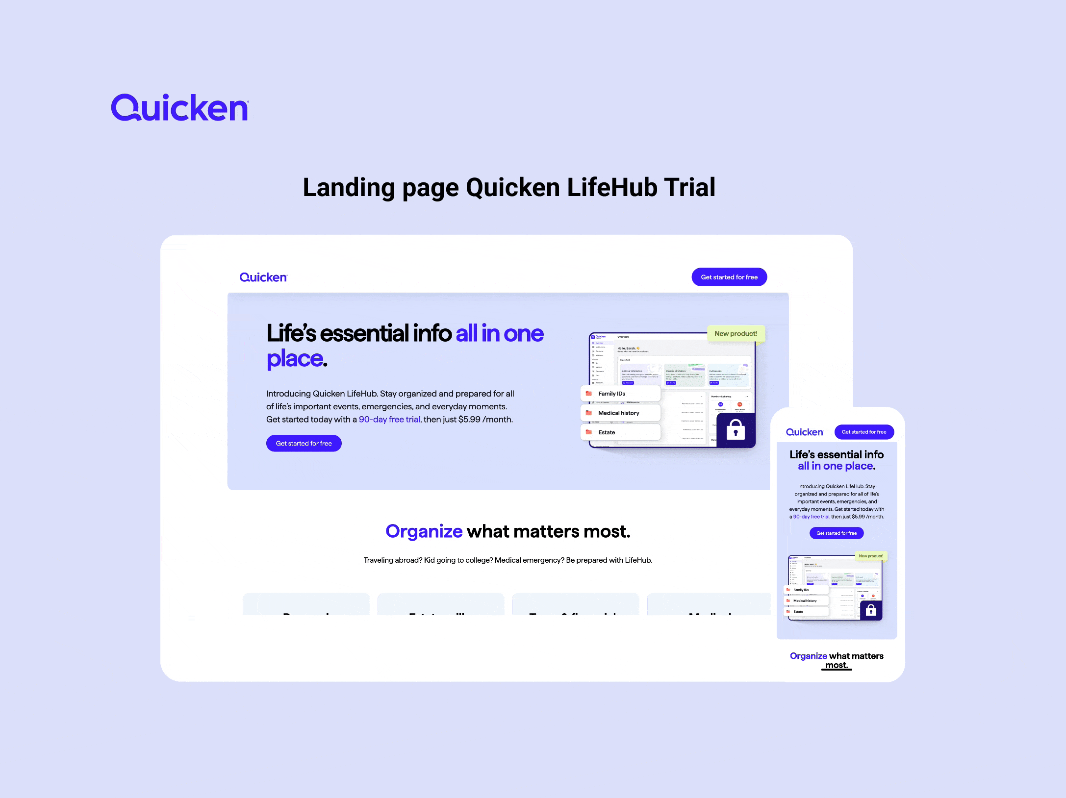
New Landing page for Lifehub trials (new product)
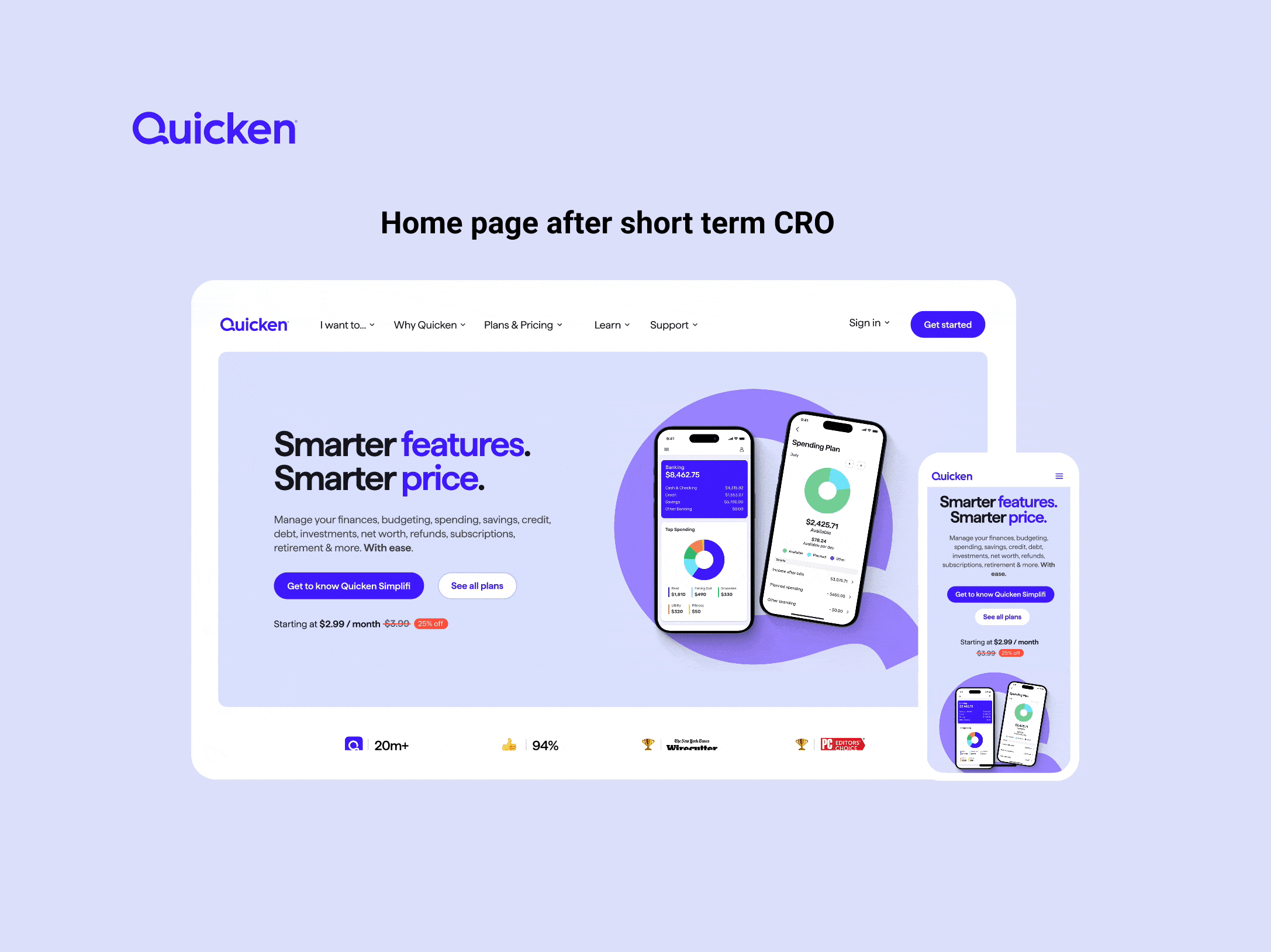
Home page after short-term Tests
✅ UX Strategy
Whenever I join a new company for a project-based mission, It’s important to me to understand or create/align a UX strategy alongside the PM, particularly focusing on the vision, business goals, and user goals. This helps me start mapping out a plan from the beginning. That said, since these were brand-new products, we were developing the plan as we progressed.
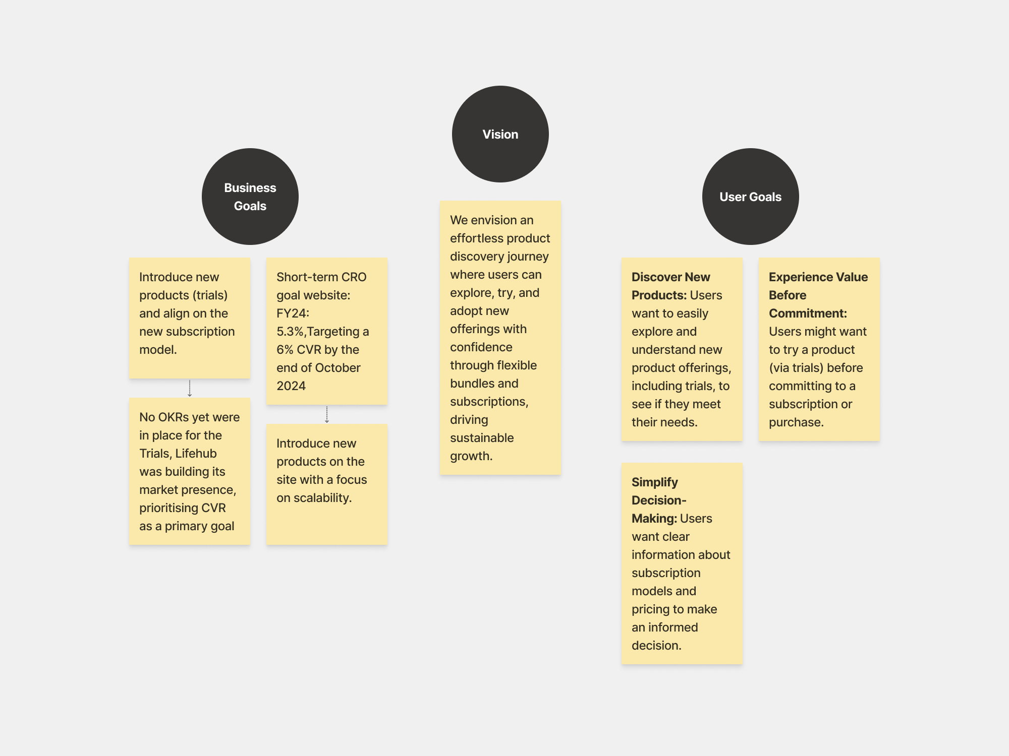

The cross-sell initiative aims to drive growth through bundled offerings. This is a projected growth estimate for the coming years.
✅ Empathise
Vector 1-Sell Quicken LifeHub to existing subscribers
• Initial customer Journey map
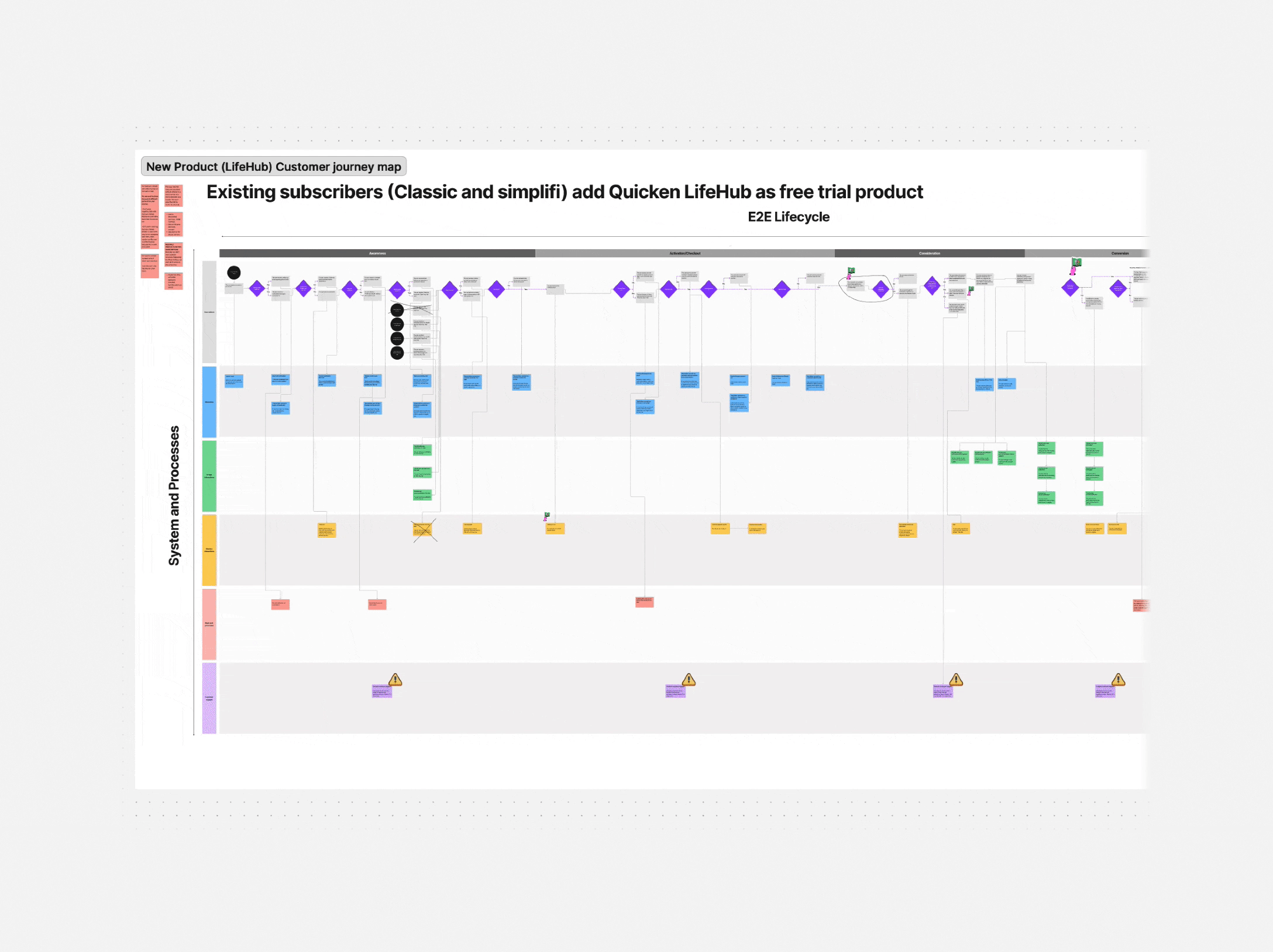
When I joined the company, the Design Lead and the PM had already set this up. They ran a high level workshop to map out the end-to-end flow for existing subscribers adding a new product -LifeHub (Free Trial). This is a rough outline of the flow.
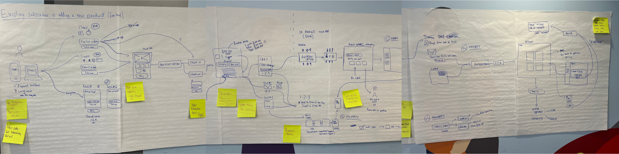
• I mapped the end-to-end customer journey, analysing user actions, interactions, marketing, and backend processes. Using ChatGPT, I built the framework and translated it into FigJam. I collaborated across departments to understand processes, limitations, and workflows.
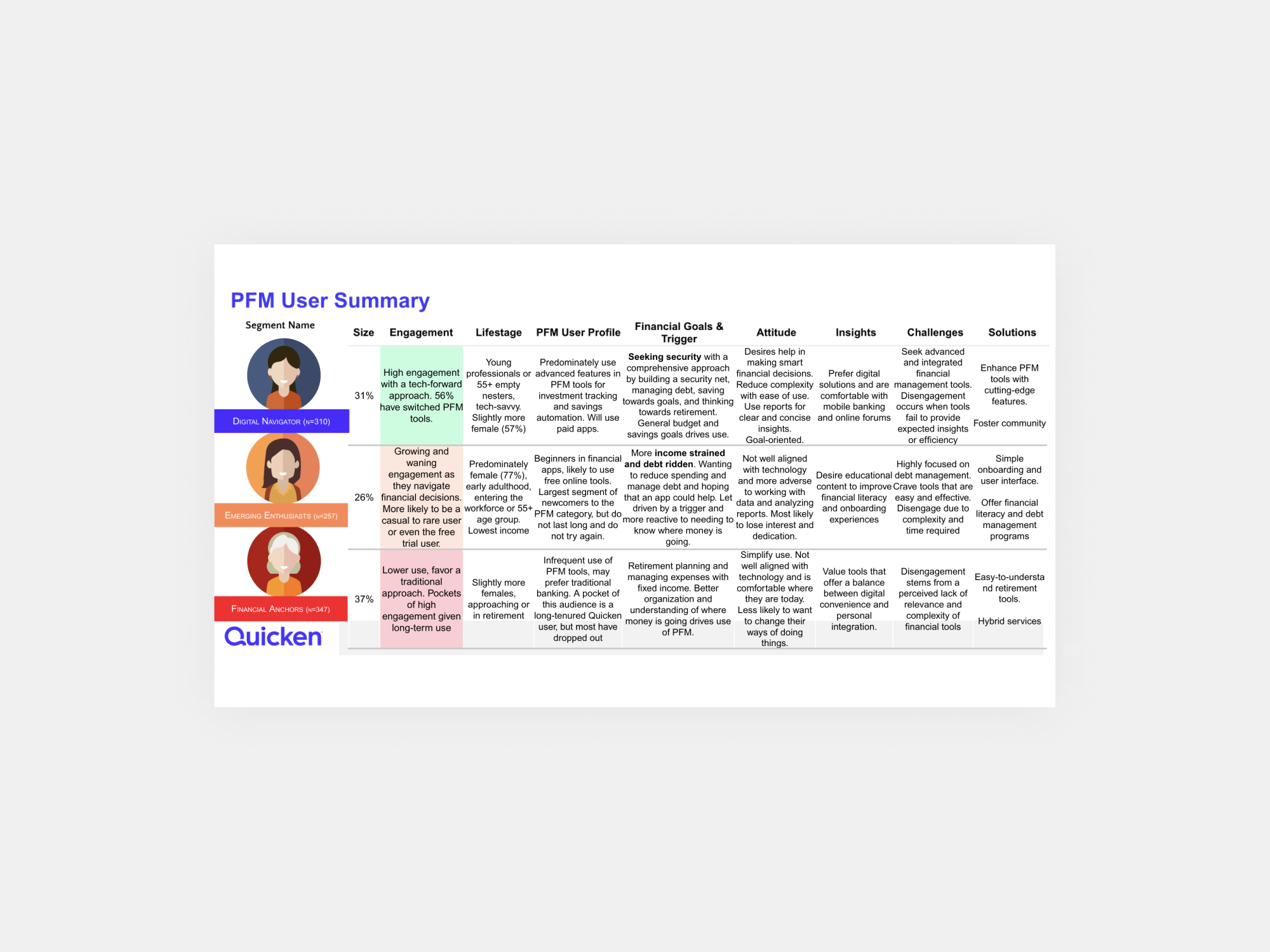
Research showed Quicken LifeHub users fell into three segmented users: Digital Navigators (our primary target), Emerging Enthusiasts, and Financial Anchors.
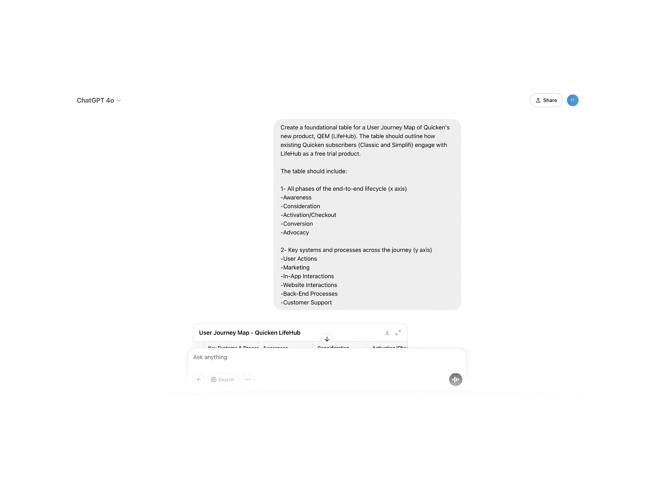
• I used ChatGPT to outline user journey stages for a new PFM product, refining them with the PM. Without a Miro account, I built the framework in FigJam.

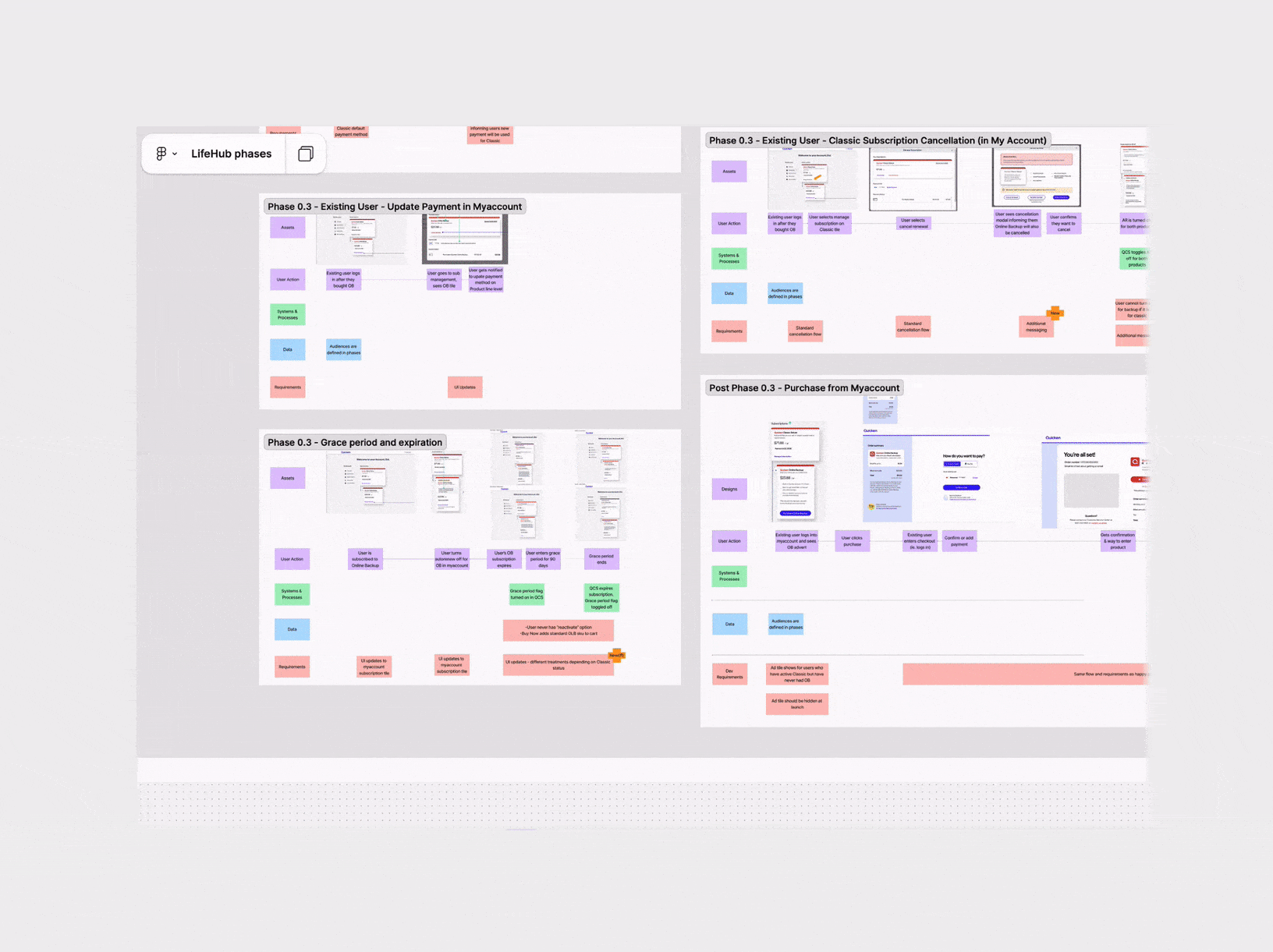
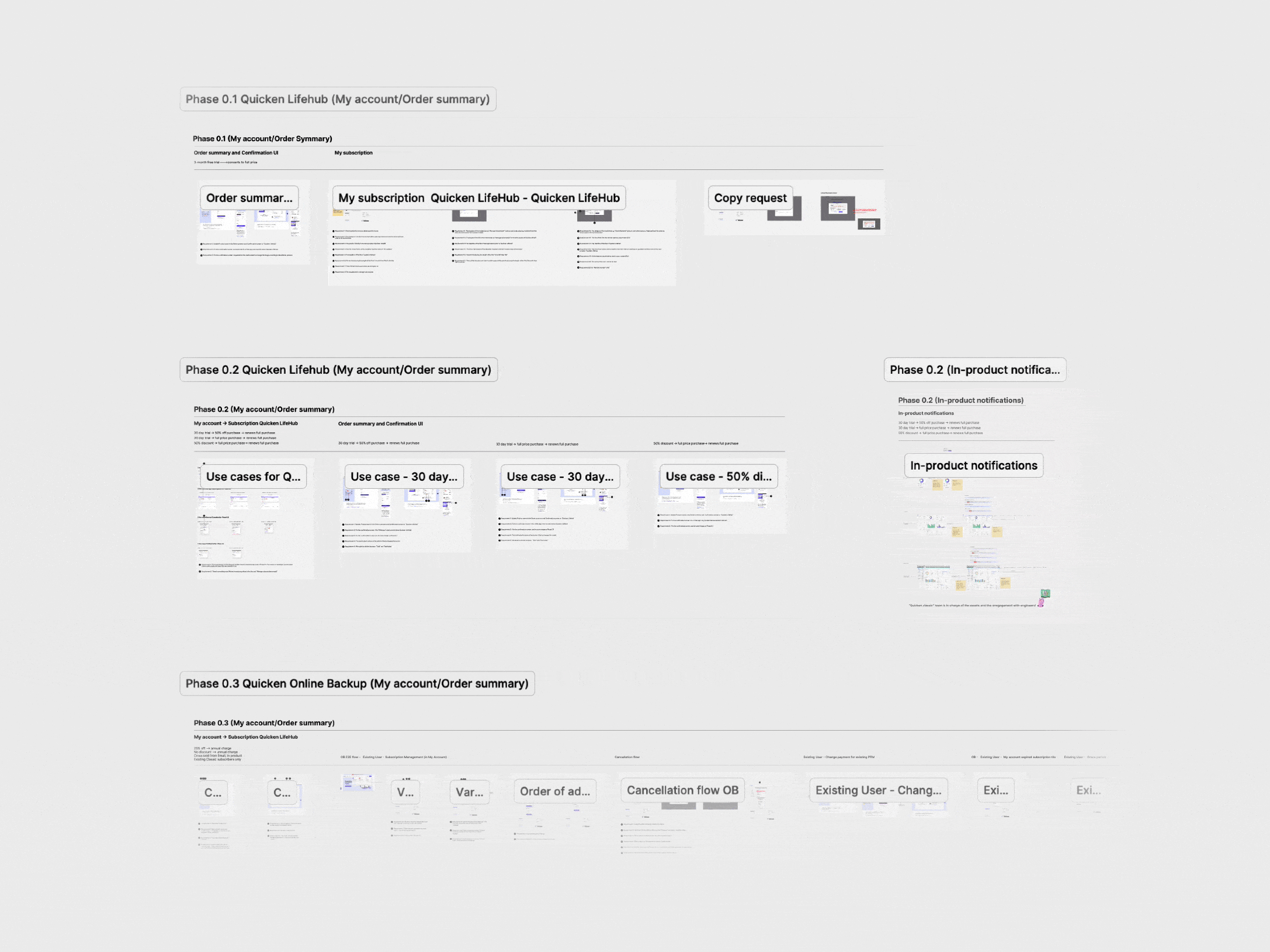
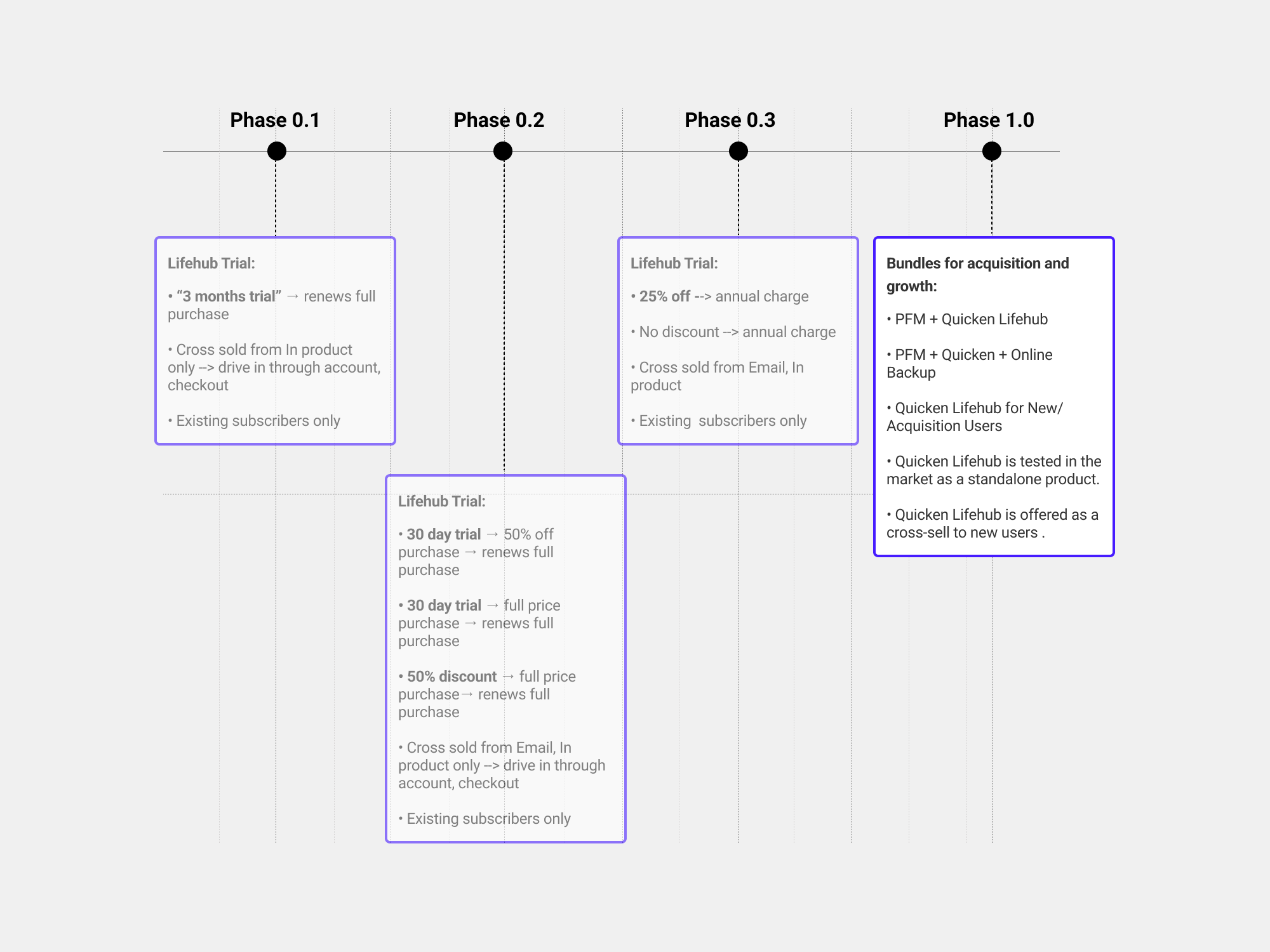
• Phasing out new products
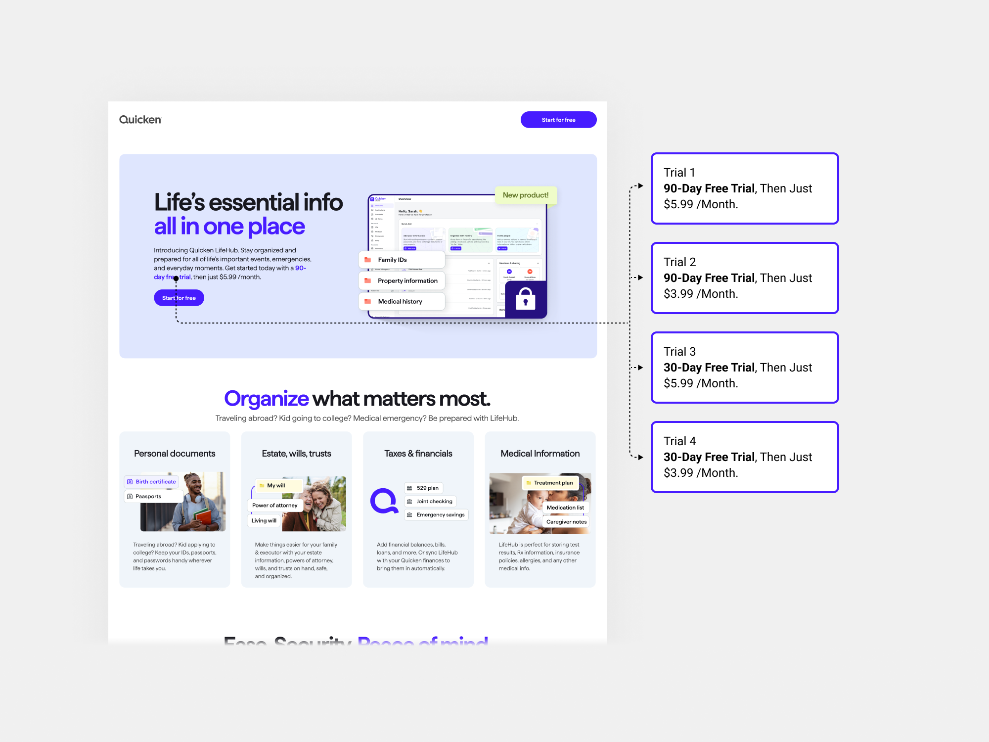
I mapped the Quicken LifeHub trial journey, identifying key impacts and business opportunities. Collaborating with the PM and marketing team, I outlined product phases, factoring in use cases, user journeys, and their impact on UX, Q.com/Checkout, My Account, and e-commerce.
We planned a test comparing sign-ups, retention, and conversion between 30-day and 90-day trials.
Phase 0.1

Phase 0.2

Phase 0.3

• Lifehub landing Page for Phase 0.2 (Competitor analysis)
The landing page was a critical component of our user journeys in phase 0.2, as it played a key role in driving conversions. To optimise its effectiveness, I conducted a competitor analysis using ChatGPT. I asked questions like, "What does this page do well?" and "What could this page change or A/B test?" leveraging AI significantly accelerated the analysis process to understand potential improvements.

✅ Define
User: Digital navigator segmented user who is already a subscriber of “Classic” or “Simplifi” product.
Needs: Understand the value proposition of the new product (Lifehub) and its offerings.
Insights: Lifehub integrates various life aspects (e.g., health, finances, estate) under one roof, reducing the need for multiple apps or tools.
✅ Ideate
Before ideation, I want to highlight that we had a design system in place, which I used for the landing page and updates in the "My Account" and checkout sections. All components were built on a CMS platform with a associated component library, allowing us to maximise reuse.
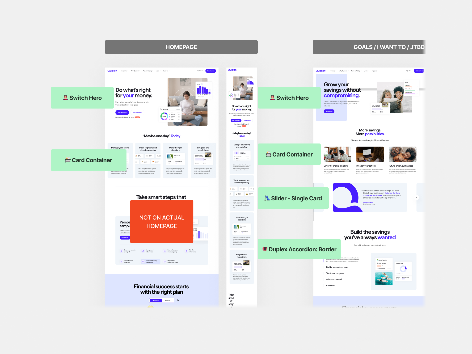
• After defining use cases and user flows, I updated checkout and account screens, adapting "Simplifi" and "Classic" for LifeHub and Online Backup. I collaborated with the PM and lead developer to align design variables and tokens with the Design System. Working with marketing and product teams, I ensured content and visuals were consistent, while marketing handled emails.
Designs Account and checkout for Phases 0.1, 0.2 and 0.3

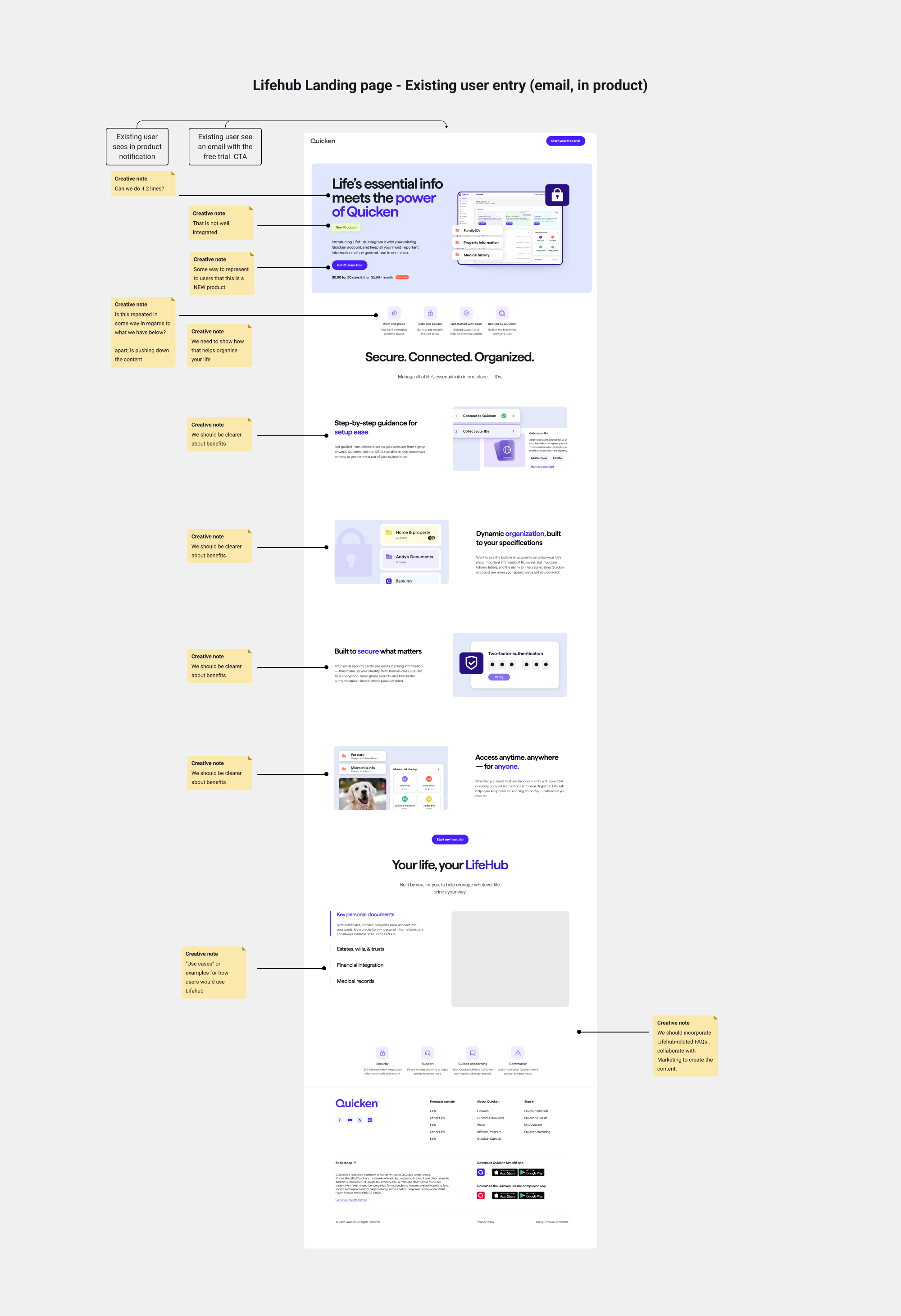
• Lifehub landing Page for Phase 0.2
The landing page (phase 0.2) was likely the most critical element among the new products, as it directly impacts conversions and revenue. Considering the existing CMS components already implemented in the codebase, along with all the variables and tokens, I collaborated closely with the creative and marketing teams to refine both the architecture and content of this page.
To make informed design decisions, I relied on two key resources provided by the marketing team: the Creative Brief and the Messaging Framework, both part of the Go-to-Market Plans

• Kick off wireframes using CMS components already built and initial notes for the creative team....
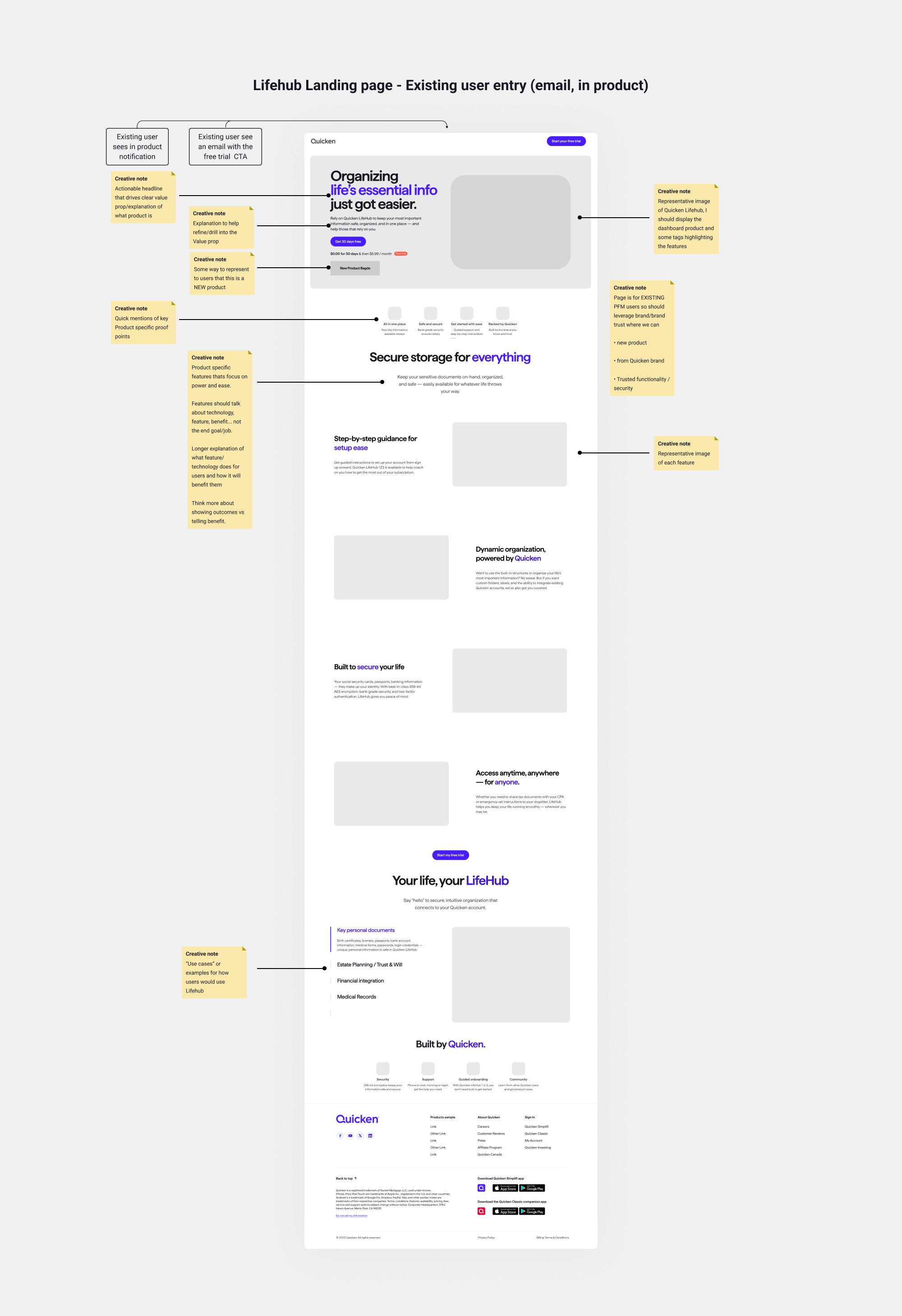
Iteration 1
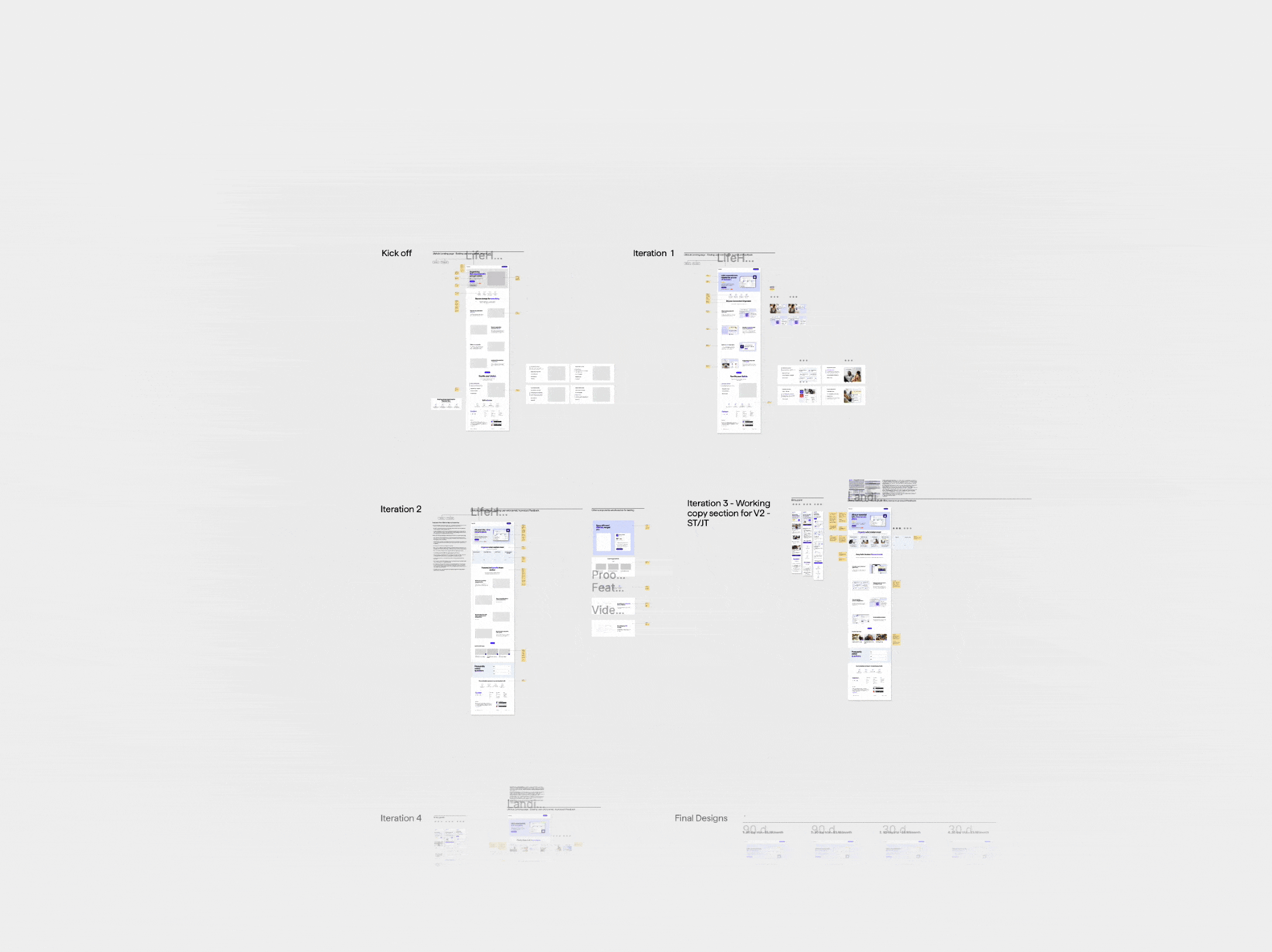
• To evaluate how consumers would engage with the designs before launch, I used a Figma AI plugin called Attention Insight. This tool provided valuable insights to validate my concepts for performance during the design stage with AI-generated attention analytics, complementing feedback gathered from iterations with various departments.

• I turned AI for suggestions for potential enhancements.
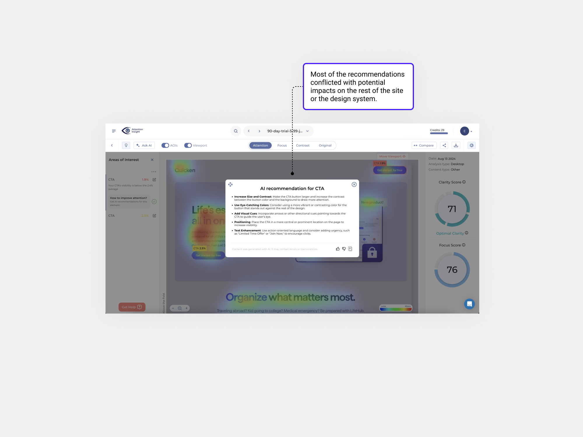
The AI suggestions conflicted with our Design System, as changes to size, contrast, tokens would disrupt the entire system. Visual cues, positioning, and text enhancements were also declined, as the navigation bar button follows a common pattern, and the text was finalised in collaboration with marketing to align with our branding.
✅ Test
After collaborating with various departments and validating our hypothesis with AI and ourselves, We launched the landing page. The goal was to test how different trial lengths and pricing variations impacted CVRs, identifying the option that drives the highest conversion rate to full-priced subscriptions.
• Analysis results landing page trials
We had our analytics team ready to evaluate the results of the four different trials, supported by the Quicken GA dashboard. At the same time, we were curious to explore ChatGPT's "Advanced Data Analysis" (ADA) feature to assess its accuracy compared to human analysis.

So I gave it a try...
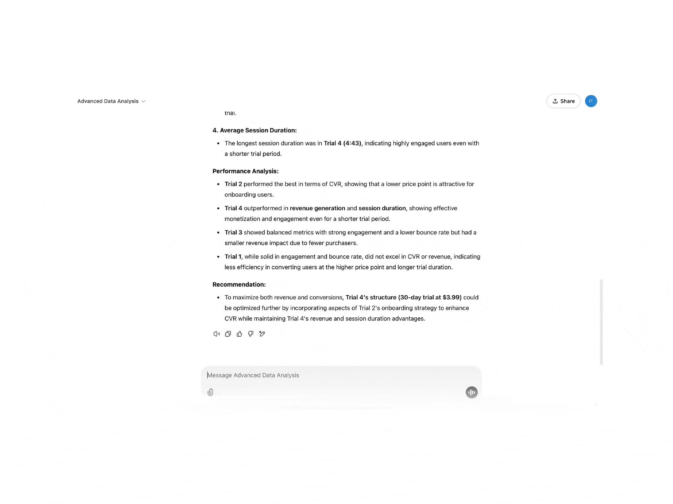
So the analysis results were accurate. As a business we prioritised Trial 4, since was outperforming the others, and was likely align well with user willingness to try and convert before Transition to a Paid Plan and maximise revenue.
Winning Trial:
• 30-day trial at $3.99/month (Trial 4) outperformed all other trials:
• Revenue: Highest at $243000
• Conversion Rate (CVR): Strong at 6.67%.
• Bounce Rate: Moderately low at 37.7%
• Engagement: High with a 62.3%
engagement rate
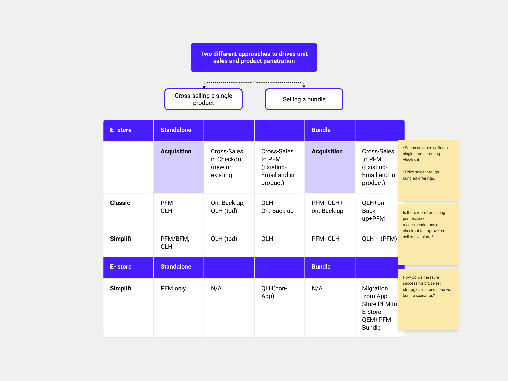
Vector 2-New subscription model (bundles) Scalable Site Architecture + and CVR improvement short-term/long-term
One of the key drivers for these products was growth, which was envisioned as a long-term goal following initial trials. Our approach was focused on developing a new subscription model exploring opportunities for cross-selling and upselling products as bundled offerings.
• Subscription model competitor analysis
For the Long-term one of the things that we wanted to define as a business is...if we want a site...
a) “Tiered” subscription model
b) “Featured” subscription model
c) The “everything” Option
Here some examples of direct and indirect competitors.
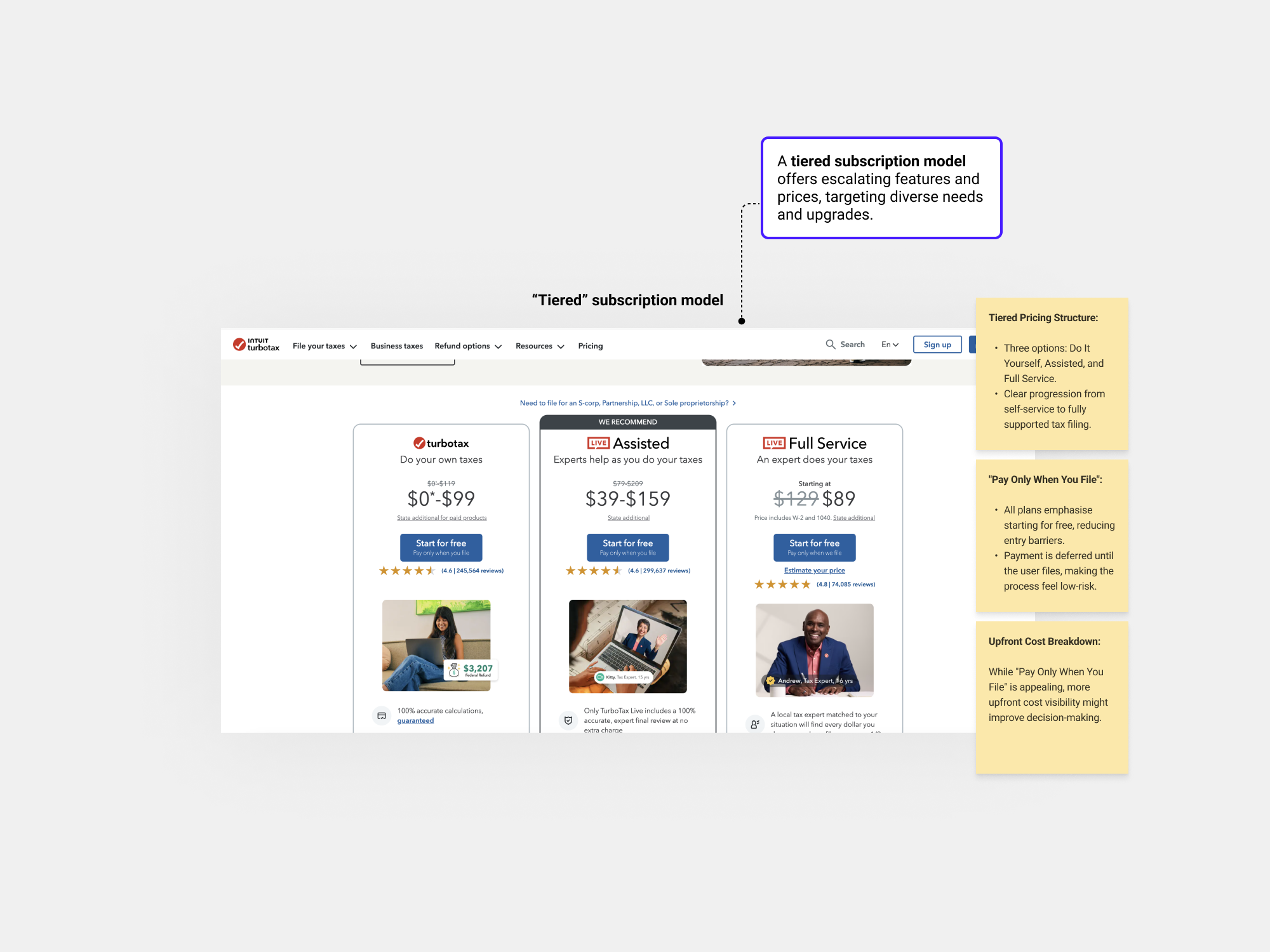


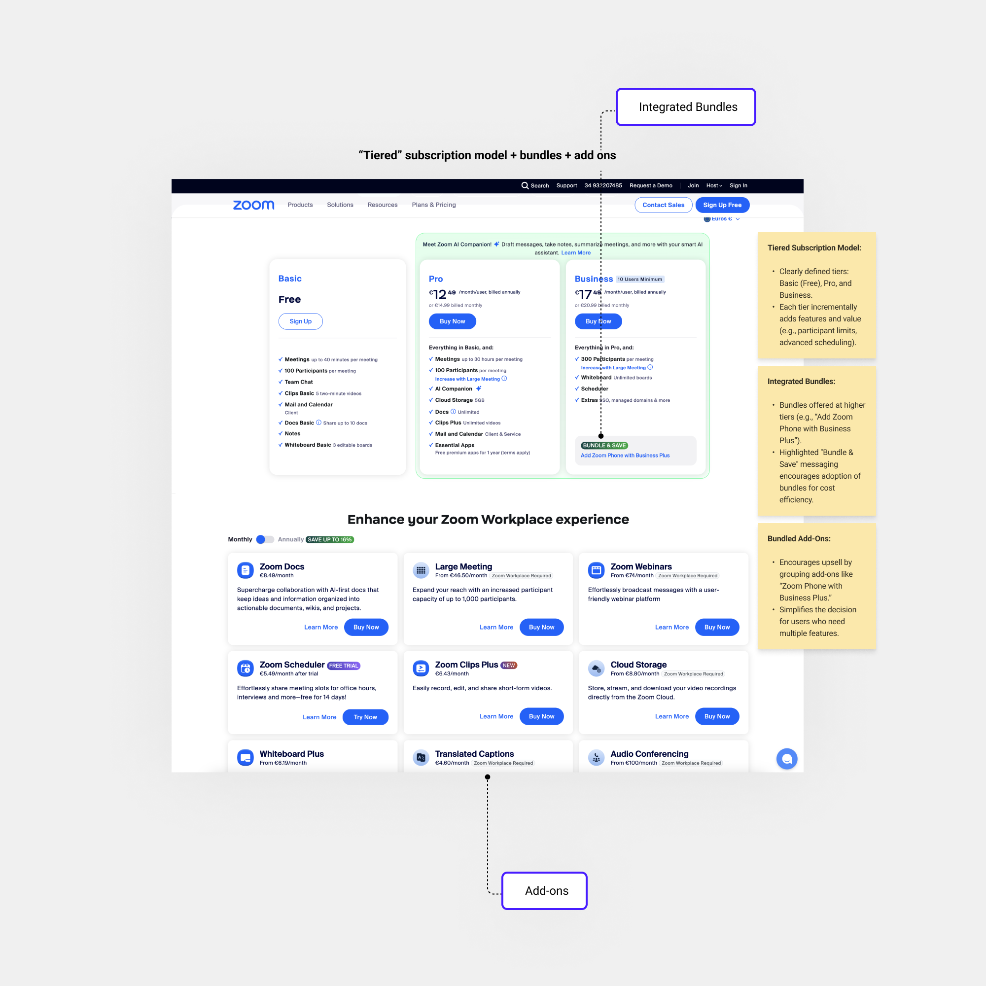
Given our goals, a tiered subscription model with bundles and add-ons was ideal, allowing:
• Seamless integration without customer confusion.
• A clear growth path within the offerings.
• Increased revenue via upselling, cross-selling, and bundling.
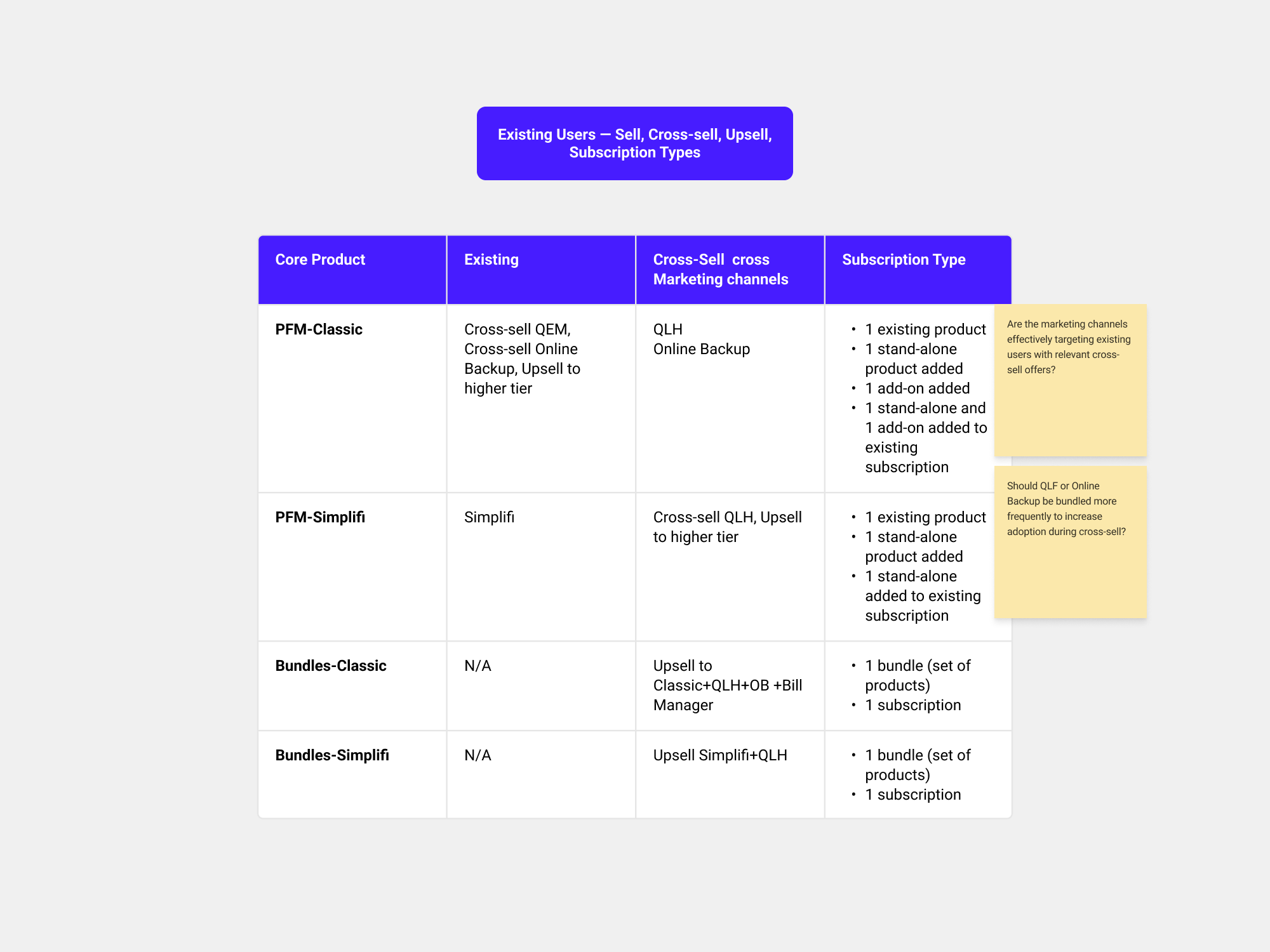
As a business, we planned to cross-sell or up-sell Online Backup at various site touchpoints—or offer it in a bundle. Simplifi, Classic, and QEM (Quicken Lifehub) would remain standalone products; however, we also considered the potential to bundle Simplifi with Lifehub or Classic with Lifehub.
• I drafted an initial diagram to outline the subscription model for stakeholder discussions, focusing on tiers while considering cross-sell and upsell opportunities for long-term testing.
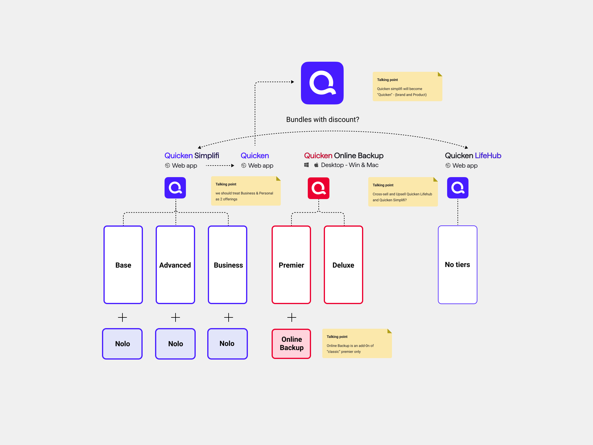
• To refine the strategy, I explored how different users are introduced to new products via cross-selling and whether to consolidate subscriptions under a single renewal.

• We defined the subscription model strategy, but pricing, offers, and customer journey details were still in progress. Despite this, it provided a strong foundation for mapping the long-term site structure with CMS components.

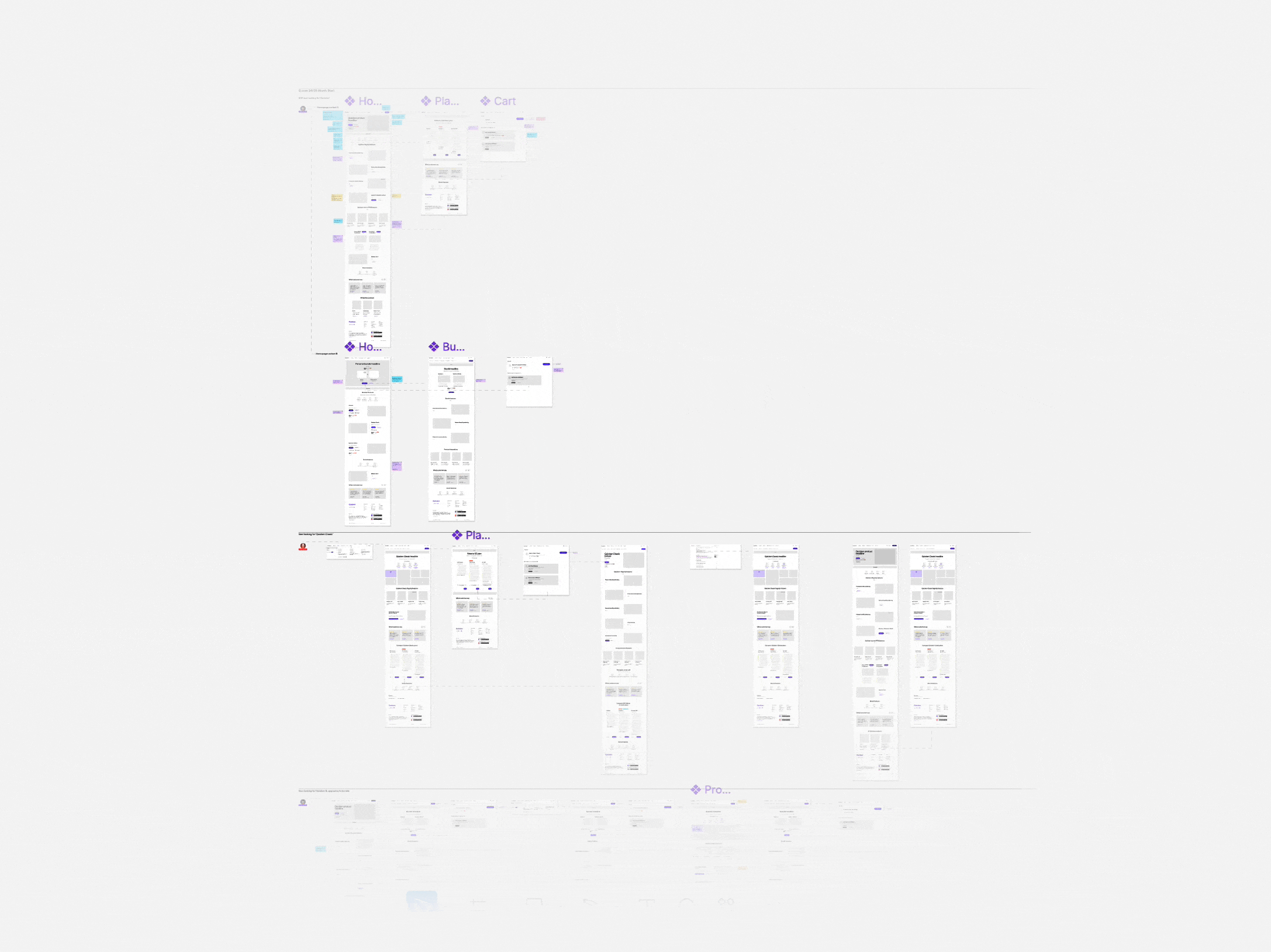
• Workshop new site architecture and scalability
We traveled to London for a workshop on site architecture and long-term scalability, led by the Design Lead. The solution? A full site redesign to tackle poor CVR, leveraging new bundles and a subscription model and scalability.

We planned CRO improvements with short- and long-term goals, aiming to raise CVR from 5.3% to 6% by October and sustain growth beyond. I worked with the Lead Designer on core website tests, releases, and North Star journeys.


As a business, we recognised that the home screen was a significant factor contributing to low conversion rates. Data from the Glassbox user journey map confirmed this, showing that several initial key metrics were below the desired benchmarks.

• I analysed some recorded sessions in Glassbox and I used the GIA sessions insights tool to understand/summarise were may be the frictions...and writing down some potential solutions…
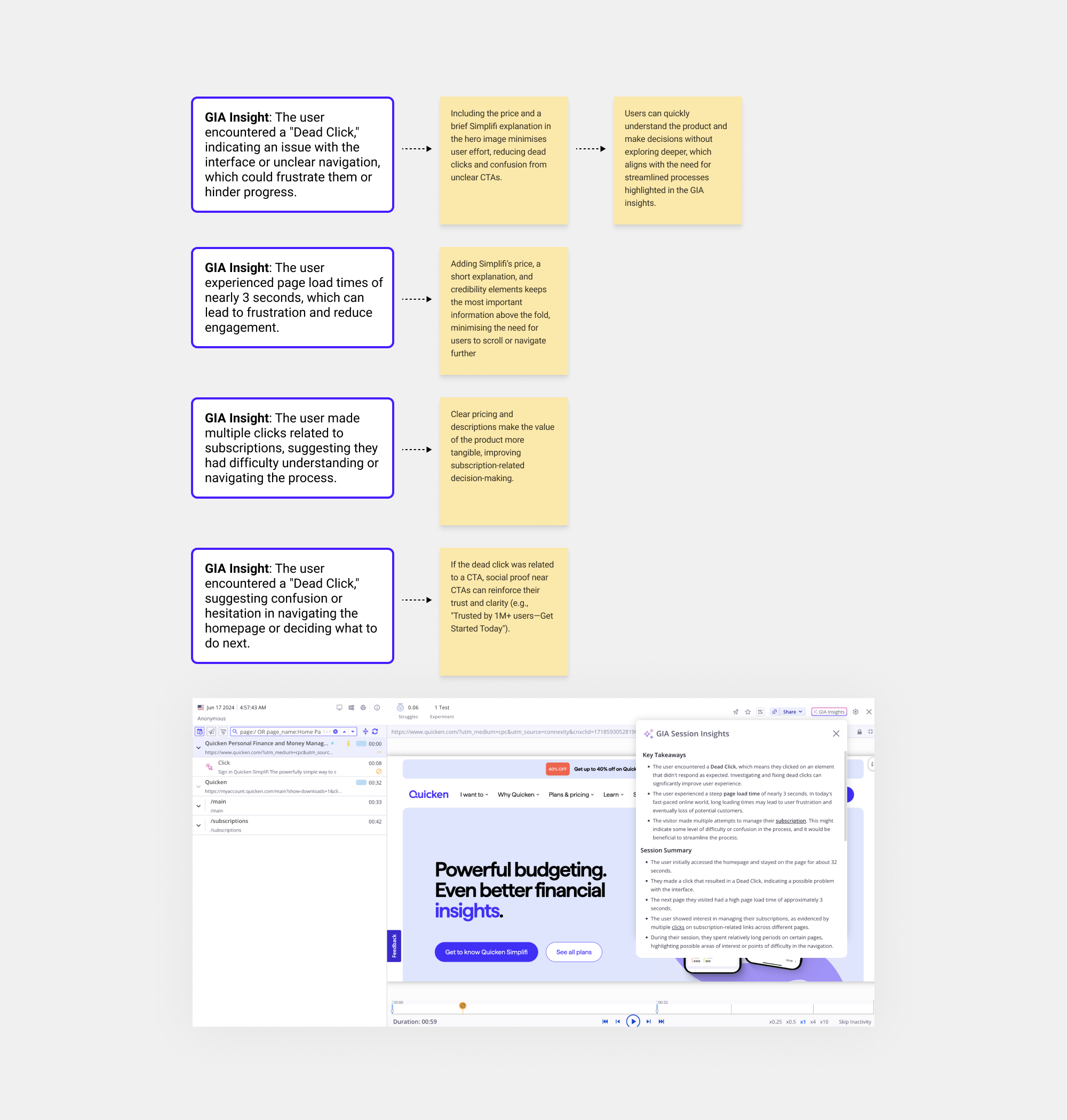
So the main problems in home screen but also in the Simplifi page:
• Value Proposition
•Trust
• Navigation (we will tackle that in the long-term afterwards)
• Home screen not optimised (we will tackle part of that in the long-term afterwards)
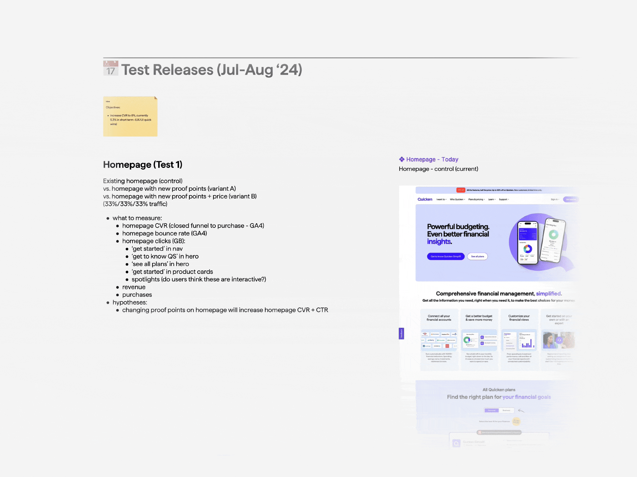
To achieve quick wins, we created a test release plan for July-August 2024 and another for September 2024. I collaborated with the design lead on the Homepage and Simplifi product pages, as Glassbox data identified these pages as poor performers, with the Homepage being the root of the poor performance.
Short-term Tests
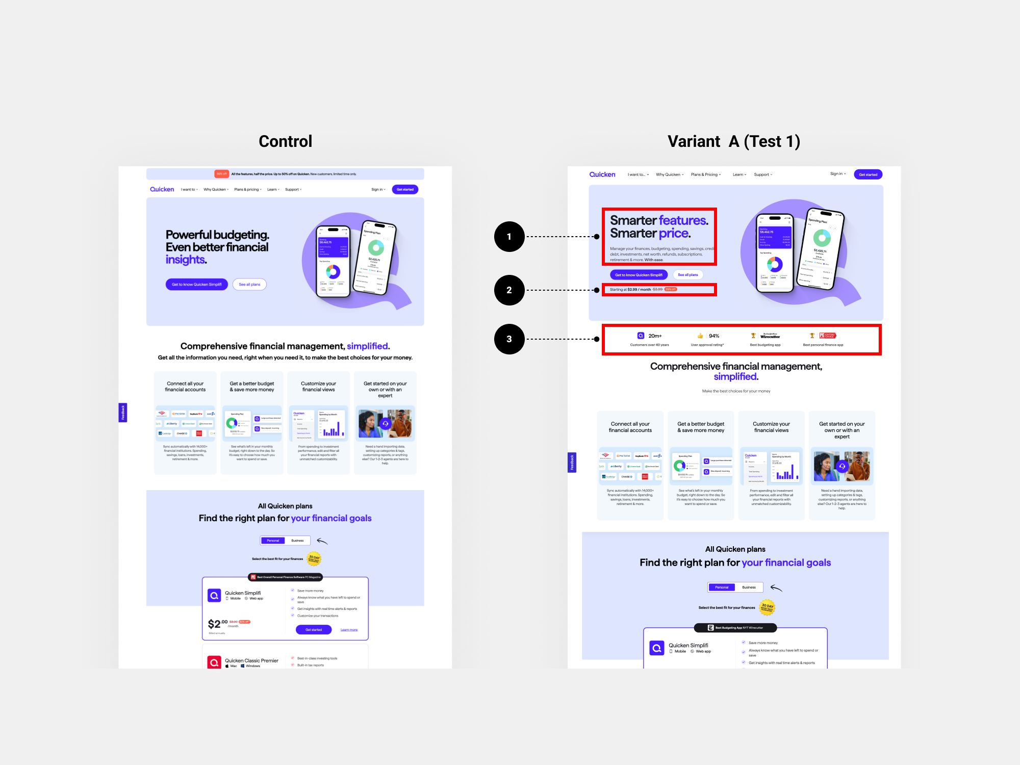
📅 Test Releases (Jul-Aug '24)
• Homepage (Test 1)
Existing homepage (control)
vs. homepage with new proof points (variant A) vs. homepage with new proof points + price and more “benefit” header (variant B) - (33%/33%/33% traffic).
Hypothesis: Changing proof points on homepage and adding price and more “benefit” header will increase homepage CVR + CTR.
• Simplifi Product Page (Test 2)
Existing Simplifi PP (control)
vs. Simplifi PP with different hero, no video, no Classic CTA (variant A)
(50%/50% traffic).
Hypothesis: Adding proof points & removing elements on product page will increase product page CVR.
• Simplifi Product Page (Test 3)
Existing Simplifi PP (control)
vs. new Simplifi PP with no ‘starting at’ (variant A)
vs. new Simplifi PP with ‘all features included for’ (variant B)
(33%/33%/33% traffic).
Hypothesis: Removing ‘starting at’ will make users feel they are getting the best version of this product for the price displayed and improve CVR.
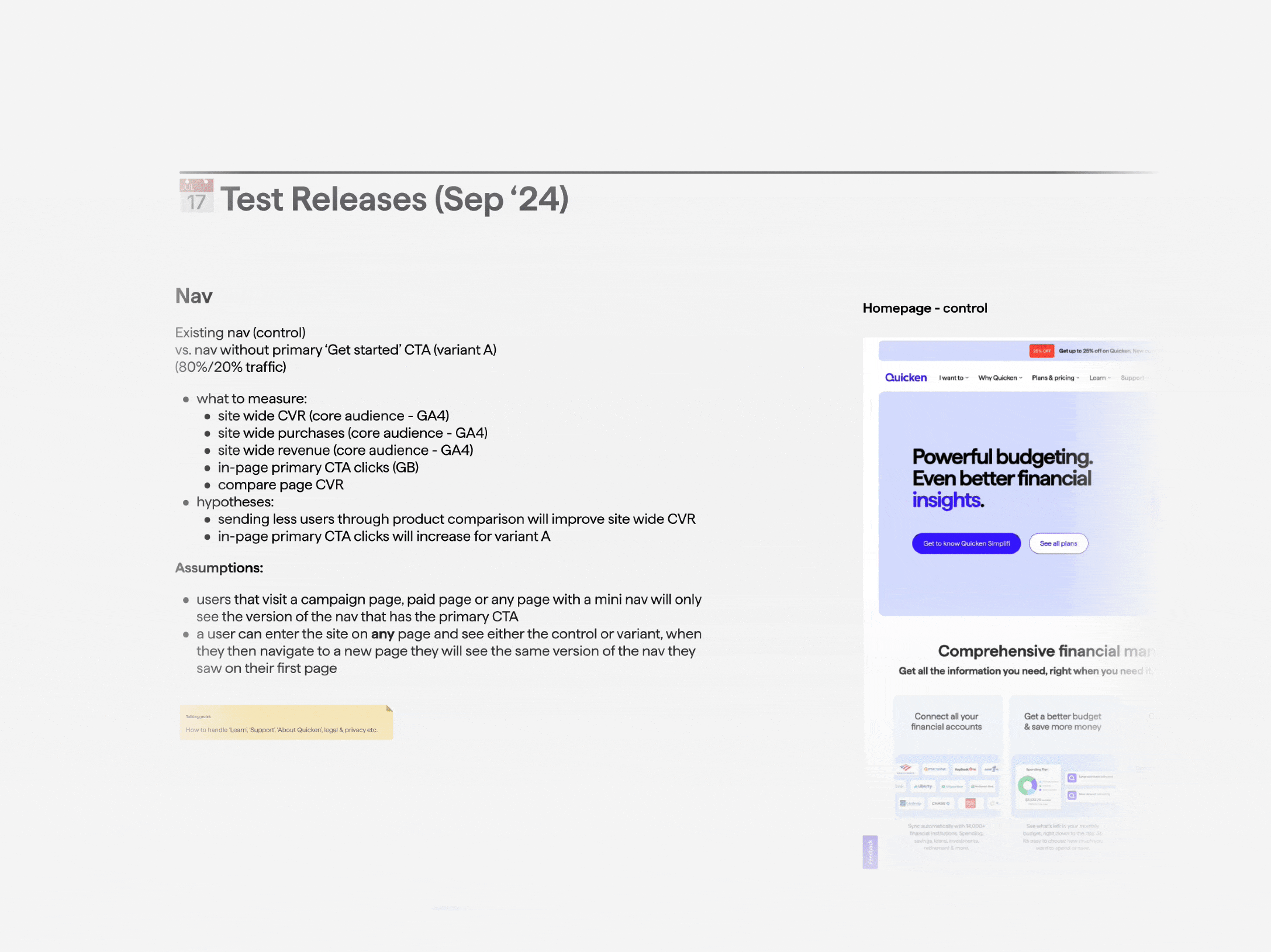
📅 Test Releases (Sep '24)
• Nav (Test 4)
Existing nav (control)
vs. nav without primary ‘Get started’ CTA (variant A)
- (80%/20% traffic)
Hypothesis: Sending less users through product comparison will improve site wide CVR and in-page primary CTA clicks will increase for variant A
• Homepage headline test (Test 5)
Existing headline (control)
vs. new headline (variant A)
vs. new headline (variant B)
vs. new headline (variant C)
(25%/25%/25%/25% traffic)
Hypothesis: none
📅 Test Releases (After '24)
• Scroll hint (Test 5)
Existing Website (control)
vs. Website with scroll hint (variant B) -
(50%/50% traffic)
Hypothesis: Adding a scroll hint on heavy content site like Q.com will improve CVR. This visual cue can increase engagement with key information, helping users make more informed decisions. I prototyped and supplied the .JSON file to implement.
Results
Variant B (Test 1) performed slightly better but failed to raise CVR to 6%, even with Yahoo campaigns. However, key insights informed long-term scalability wireframes and user journeys. Some tests were ongoing when my contract ended, but hitting the 6% target by October seemed unlikely.
1- Compelling Headline & Product Description – Clearly communicate the product’s value and how it solves a specific problem.
2- Pricing & Special Offer in the Hero Section – Highlight the pricing structure along with any discounts or promotional offers upfront.
3- Social Proof & Third-Party Validation – Showcase endorsements from credible sources to build trust.
North Star journeys CRO and Scalability
After focusing on trial sales, we were now positioning Quicken Lifehub as a standalone product under a new subscription model (PHASE 1.0). This exercise aimed to validate user journeys for testing, not build the Lifehub page, while also introducing new product bundles and ensuring scalability.
We referred to the long-term plan as our “North Star” for mapping out new scalability and site architecture. We decided to wireframe the main user journeys, taking into account:
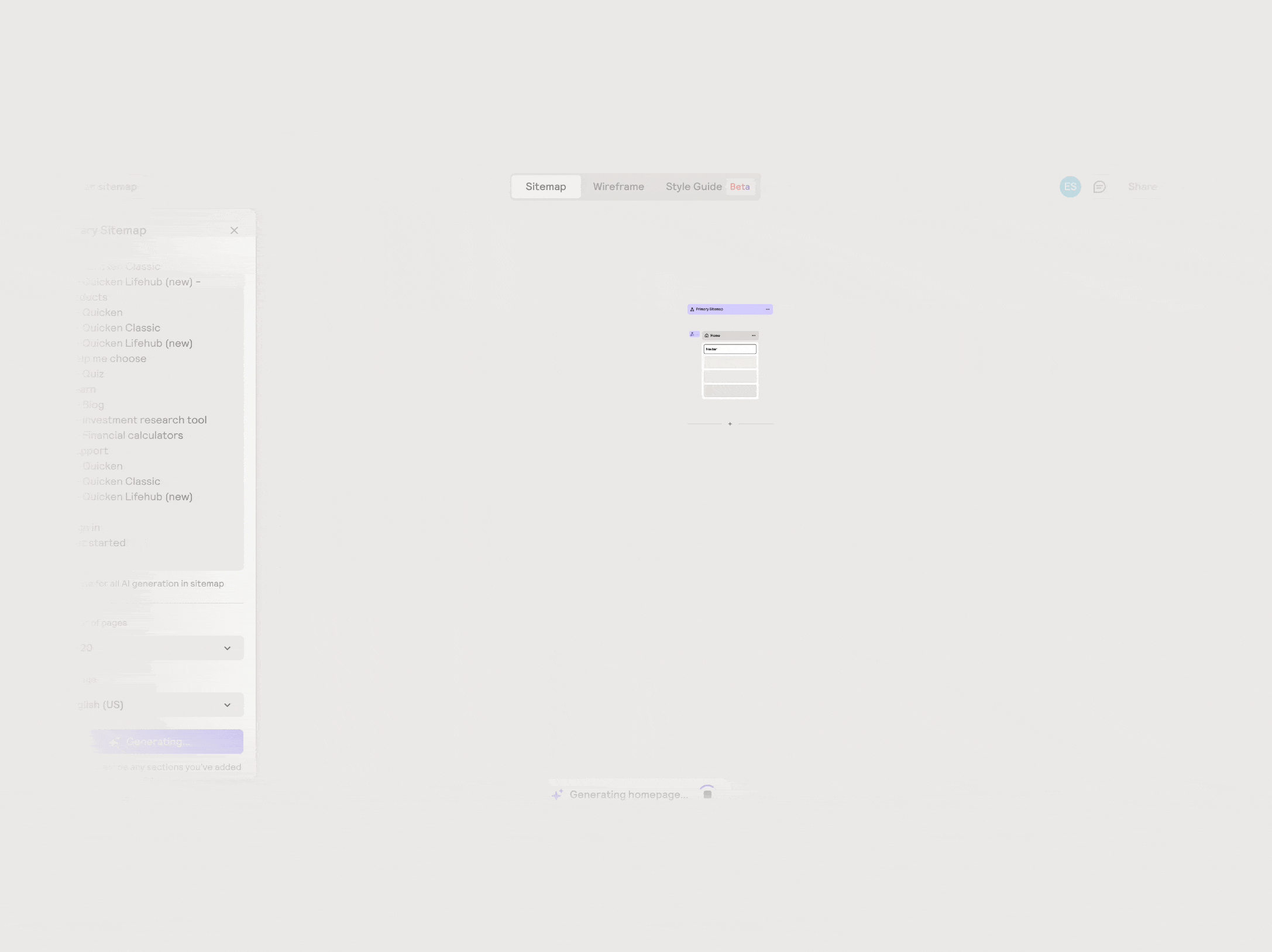
• Step 1. Site map: I used Relume.io, an AI-powered tool, to assist in structuring the high-level site map architecture. Based on insights from the workshop, I identified the main sections and defined the architecture information for each part of the navigation menu. I started with a prompt describing our site, sections menu nav..

• Step 2. Templates: From the London workshop, we identified the need for multiple templates to test user journeys. Three product designers took part on this, using existing CMS components to build them, leaving only images and some copy to be finalised. My focus was on the homepage and cart upsell page, ensuring home, navigation, and overall site scalability.
Home: Variant A. I incorporated insights from the short-term tests, such as displaying pricing, adding a text introduction to the product, and including social proof... I also introduced the business option as part of the product/tier offering.

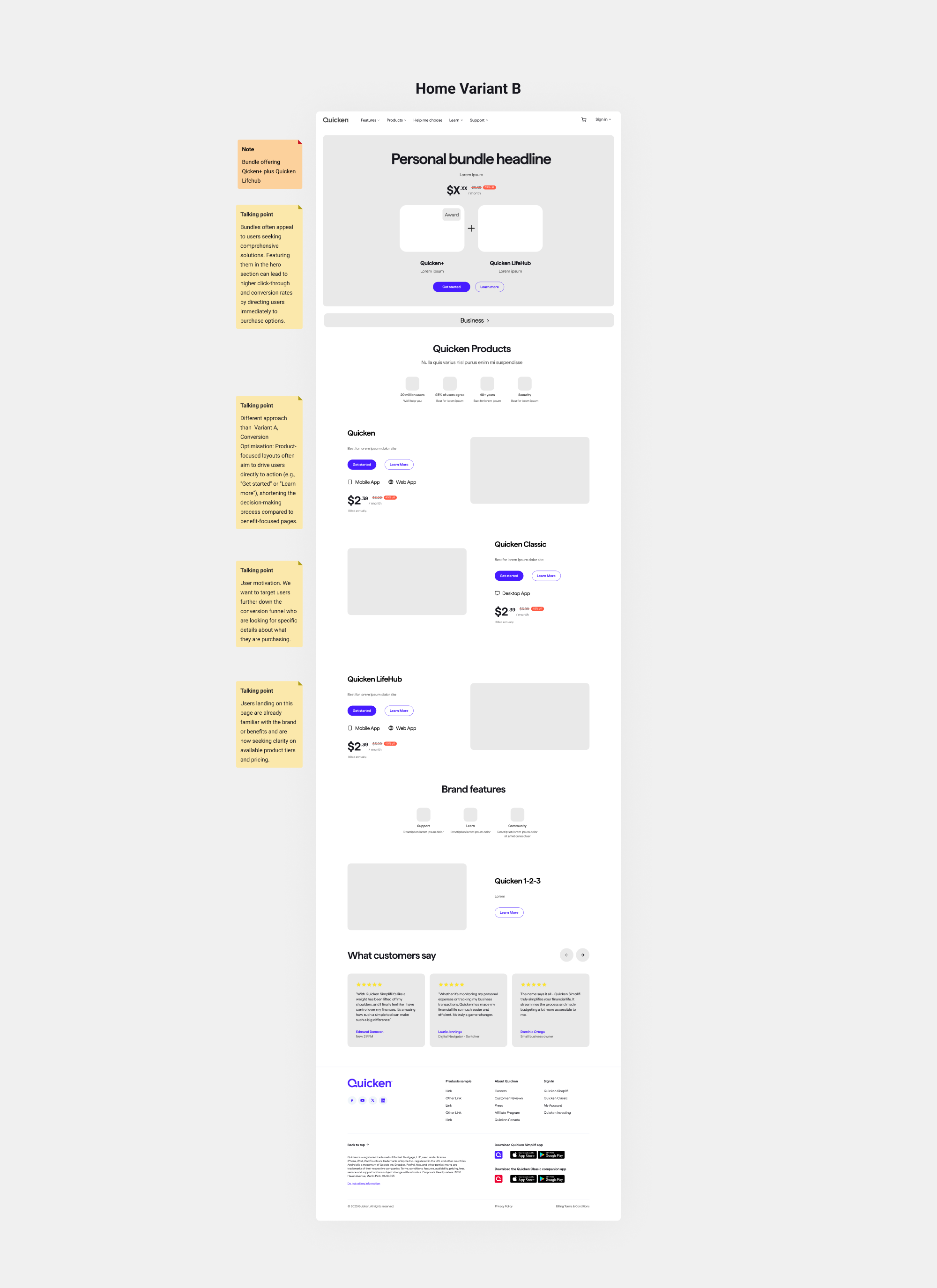
Variant B. In Variant B, we aimed to test whether adding bundles directly in the hero section could drive higher conversions, as this would guide users straight to the cart.
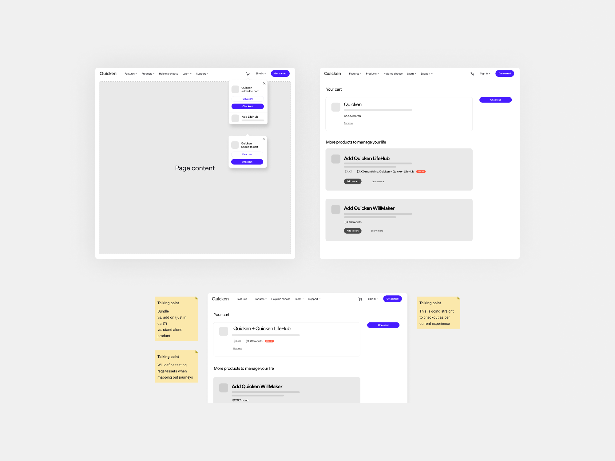
Cart Upsell page: This was a new approach, as we previously didn’t have a cart feature in the live version. We aimed to introduce the concept of "upselling" through this implementation.
Navigation: I wasn’t directly responsible for this part, but I collaborated closely with another product designer to ensure future scalability was accounted for. We wanted to test different versions of the Nav bar and the Mega menu

• Step 3. User Journeys to test. Once the templates were created, I collaborated with the design lead to refine the key user journeys for testing. My primary focus remained on the homepage and the cart upsell page user journeys.
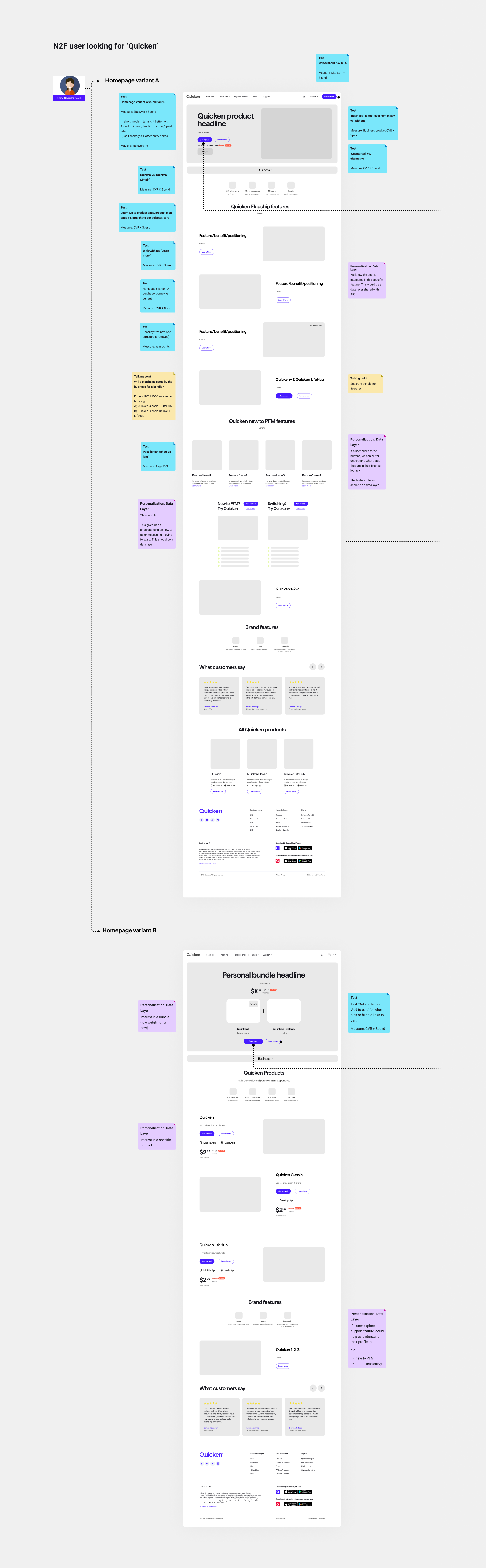
We identified 16 user journeys to test and validate, aiming to understand:
1-Whether the new flows to the cart are intuitive for both new and existing users.
2-If structuring the home screen around bundle offerings and highlighting benefits (instead of
features) improves user engagement.
3-Whether the redesigned navigation menu could be a strong candidate for driving higher conversion rates (CVRs).
Lessons Learned
• At times, the roles and ownership were unclear. However, close collaboration with the marketing team ensured that design and messaging were aligned across all touch-points—from in-app notifications to email campaigns—creating a cohesive trial-to-subscription journey. Defining roles and ownership from the beginning is essential for success.
• It was challenging to map out the various phases (use cases and flows) of Lifehub in my account and confirmation screens because we lacked a complete understanding of the different scenarios (due to back-end restrictions) until the project was already well advanced. This highlights the critical importance of thorough planning from the beginning and have a contingency plan.
• Some AI tools still require double-checking to ensure they produce realistic and reliable results. The level of accuracy often depends on the specific tool, and this can lead to confusion, especially when the AI is unaware of the dependencies within the layout it is analysing. While AI is excellent for accelerating processes and generating outputs quickly, it still falls short when it comes to delivering consistently accurate outcomes. For now, human review remains essential, particularly when dealing with data.